My content is reader-supported by awesome people like you. Which means I could earn a commission. Learn more here!
If you are looking to build out a SAAS website Webflow may be the platform for you
Let’s go ahead and check out some examples that were built right off of it for some design inspiration.
Are you ready?
Timely App
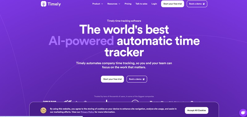
Website Description
Timely App is AI-powered software designed to track time spent on tasks automatically.
The website’s main role is to provide information about this amazing software and its numerous applications.
With tools for managing tasks, recording billable hours, and even generating invoices, it’s an excellent resource for businesses of all shapes and sizes.
Engaging Design Features
Timely App’s web design is easy to comprehend, clean, and modern. Here’s what stands out:
- Simplicity: The website is uncluttered and easy to navigate.
- Visual Highlights: Bright colors make it visually appealing and make important points pop!
- Intuitive Navigation: The site has a user-friendly layout with clearly labeled sections.
- Graphics: Infographics and images provide quick and easy-to-understand information.
Kajabi
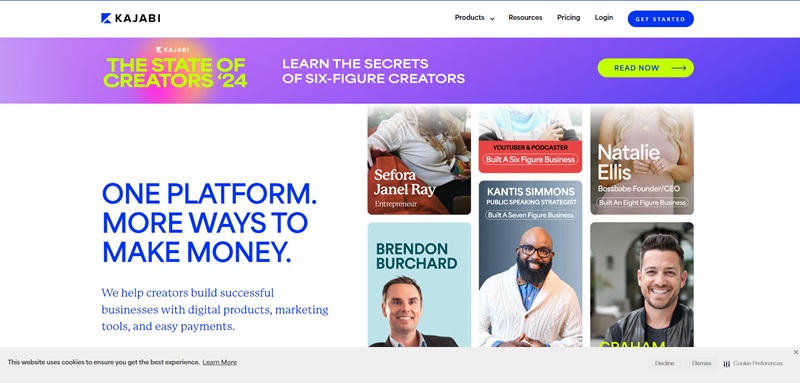
Website Description
Kajabi’s website provides information on all the features and functions that the platform has to offer.
From online courses to downloadable products to membership sites, users can create a multitude of product types.
There are also detailed features for email marketing, analytics, and website building.
Inviting Design Features
Kajabi showcases a web design that is modern, bold, and visually appealing.
Here’s what makes it special:
- Color Palette: The use of contrasting colors like blues, whites, and grays creates a visually engaging experience.
- User-Friendly Interface: The layout is straightforward and easy to navigate.
- Bright Imagery: Vibrant images and graphics are used throughout to illustrate the platform’s features.
- Interactive Elements: There are also interactive buttons and forms to engage users.
Marker.io
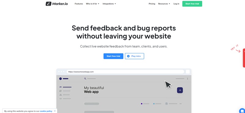
Marker.io is a website where people can report bugs and give feedback right from the website they are using.
It’s like having a helpful assistant who tells the website team what needs fixing so they can make the website even better.
Businesses and teams who make websites find Marker.io super helpful!
What it’s all about
Marker.io gives tools to people who make websites to track down and solve internet bugs.
This makes it faster for them to make their websites awesome. Here are some cool things the website offers:
- You can draw and write on web pages to show where the problem is.
- It connects with other project management tools, so staying organized is a breeze.
Neat Website Design
The design of Marker.io is full of color and easy to move through.
Here’s why the design is great:
- Colors and Graphics: The website uses fun colors and pictures that help explain things.
- Easy to Use: Directions on how to use tools are clear, even for people who don’t make websites.
- Customer Praise: Lots of good reviews shows that people who use Marker.io really like it.
Jasper.ai
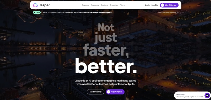
Jasper.ai is a place on the internet that helps people write all sorts of things, like stories, ads, or school papers.
It’s like having a smart robot that helps you come up with words to write down.
What it does
Jasper.ai uses a smart computer brain to help you write stuff.
It makes writing easier and faster, and it’s perfect for anyone who needs help getting their ideas into words. Here’s what Jasper.ai can do:
- It helps you write by giving you ideas on what to write.
- You can use it to make your writing better and check for mistakes.
Why the Website Rocks
The Jasper.ai website is friendly and makes you want to start writing!
These are some cool features:
- How it Looks: It’s bright, has big text, and friendly pictures that make you feel welcome.
- Simple Steps: This shows you exactly what to do to start using the smart writing help.
- Helpful Examples: Gives you peeks at what you can create, like blog posts and emails.
Surfer SEO
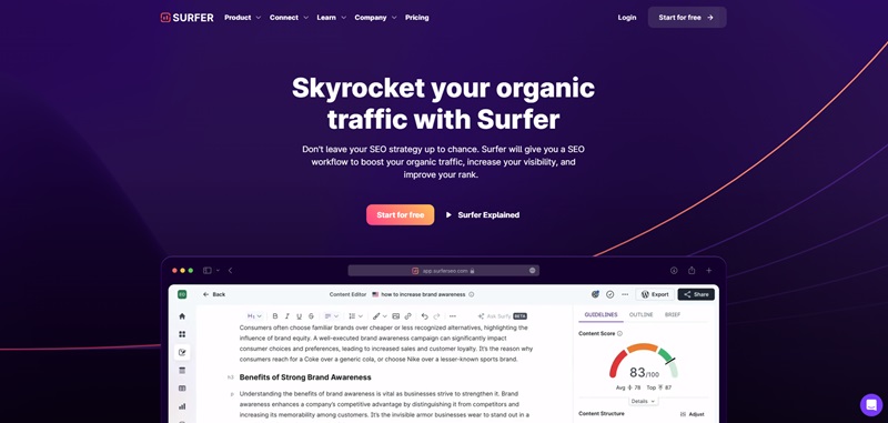
Surfer SEO is a powerful tool that helps make websites rock!
If you have a website and want more people to visit it, Surfer SEO is like a secret weapon.
It helps make your website show up more in searches by improving your SEO, which means “search engine optimization.”
What’s it for?
Surfer SEO has many tools that help your website become more popular. These are different ways it helps:
- Helps you write articles that more people want to read.
- Gives you keywords that help more people find your stuff.
- Even checks to make sure your stuff isn’t too similar to someone else’s.
Cool website design
Surfer SEO website is fun and easy to use.
Here are some ways it shines:
- Bold colors: The bright blue and white theme is easy on the eyes.
- Clear instruction: Shows exactly how to use it, with pictures!
- Easy signup: It’s not hard to start using it. Just click the ‘Start for free’ button!
Next up, let’s check out Petal Card.
Petal Card
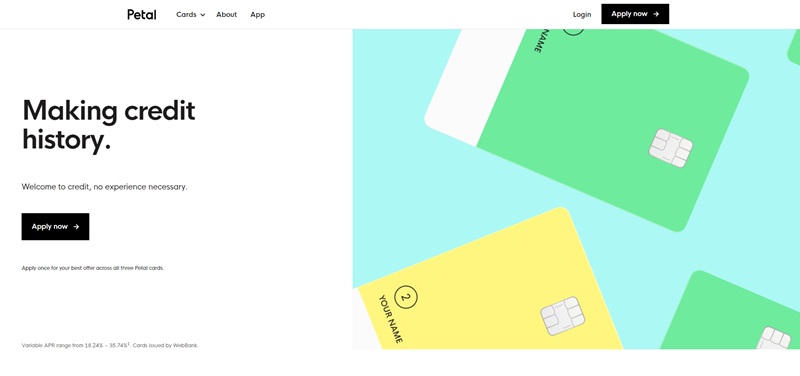
Petal Card is all about making credit easy and fair for everyone.
It’s a neat place on the internet where you can get a credit card that helps you build credit, even if you’re just starting out.
What’s it for?
Petal Card offers some awesome things:
- It provides a credit card that doesn’t need a credit score to get started.
- Helps keep track of payments, so you know how much you’re spending.
- Shows you how to build credit in a way that’s easy to understand.
Neat website design
The Petal Card site stands out with its simple and welcoming design.
Here are some reasons it’s great:
- Young and fresh: The design is modern and light, with lots of white space and simple line drawings.
- Easy to understand: The site explains everything in clear, simple language.
- Step-by-step: Shows you exactly how to sign up and get started in a few easy steps.
Outseta
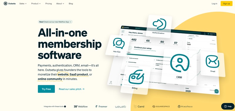
Outseta is a super cool website for people who are creating their own businesses on the internet.
If you’re making a website to share your ideas, sell products, or build an online community, Outseta has tools to help you do it all in one place.
They have everything from setting up payments, managing customers, sending emails, and even helping your customers right when they need it.
What it does
Outseta is like a Swiss Army knife for online businesses. Here’s what they offer:
- Billing: Take payments quickly and easily.
- CRM (Customer Relationship Management): Keep track of your customers.
- Email: Send out newsletters or automated email messages.
- Help Desk: Answer your customer’s questions and help them when they need it.
- Authentication: Sign up new users and log them in.
Cool website features
Outseta’s website is clean, easy to understand, and has some awesome features.
Let’s talk about a few:
- Bright and Clear Design: The website uses white and bright colors that make it look fresh and easy to read.
- Simple Navigation: It’s really easy to find what you’re looking for on the website.
- Customer Reviews: You can read stories from happy users which shows how good Outseta is.
FlutterFlow
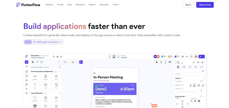
FlutterFlow is a magical place on the internet where you can build your own mobile app without needing to know how to code!
Imagine making an app just by moving things around on your screen.
That’s what FlutterFlow lets you do.
It’s perfect for people who have great ideas for apps but don’t know how to write computer code.
What it does
FlutterFlow makes building apps as easy as playing with building blocks.
Here are some neat things it does:
- Lets you design your app with a drag-and-drop interface.
- You can see how your app looks on different devices while you build it.
- When you’re done, it turns your design into a real app that people can download.
Cool website features
FlutterFlow’s website is just as user-friendly and inspiring as the tool itself.
Here are some highlights:
- Interactive Design: The website lets you see exactly how FlutterFlow works with demos.
- Bright and Engaging Colors: The use of colorful and energetic design gets you excited about creating.
- Easy Start: They make it really simple to sign up and start making your own app.
Dropbox Sign
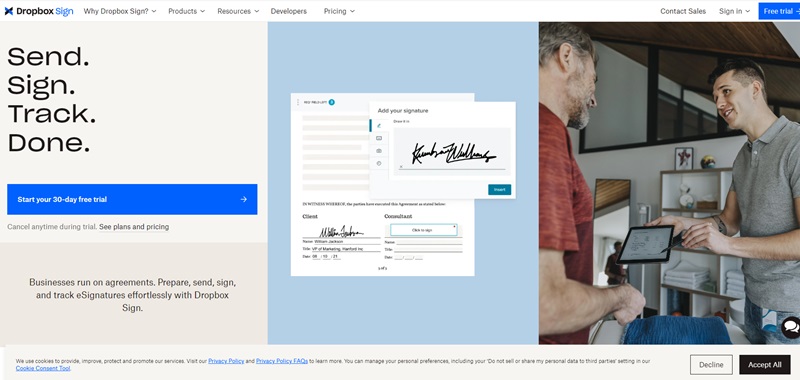
Dropbox Sign is a part of Dropbox that lets you send and sign documents online.
No need for printing or mailing stuff.
It’s perfect for when you need someone’s signature fast and without a hassle.
What it does
Dropbox Sign makes life easier by helping you:
- Send Documents: You can send documents out to get signed by others.
- E-signatures: People can sign documents from anywhere, on any device.
- Track Progress: You get to see who signed the document and who didn’t yet.
Cool website features
The Dropbox Sign website is neat and friendly.
Here’s why:
- Clean Layout: The website is easy to look at with lots of space and clear sections.
- Simple Instructions: They show you exactly how to sign or send a document.
- Friendly Colors: The use of colors is easy on the eyes, making it pleasant to use.
Kasheesh
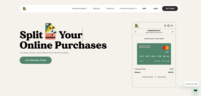
Kasheesh is a super cool website that helps you split payments anywhere online.
Imagine shopping with friends or planning a trip, and you want to share the cost.
Kasheesh makes it super easy to do that without any extra headaches.
What it does
Kasheesh lets you:
- Split Payments: Share the cost of an online purchase with friends or family.
- Instant Payments: Send your part of the payment right away.
- Shop Anywhere: Use it on lots of different websites for lots of different things.
Cool website features
The Kasheesh website stands out because:
- Fun and Engaging: The design is full of fun illustrations that show you how Kasheesh works.
- Easy Navigation: It’s super easy to find information on how to start splitting payments.
- Bold Colors and Text: The website uses bright colors and big text to catch your eye and keep information clear.
Hookdeck
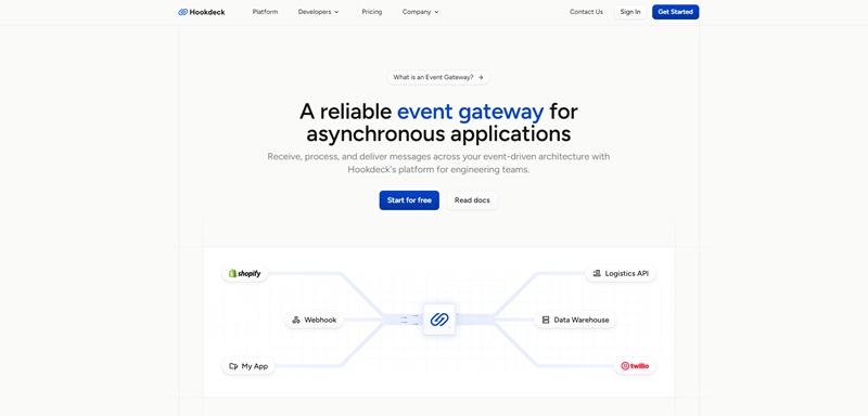
Over at Hookdeck, they have a pretty important job helping computers talk to each other—especially when you need computers to send messages back and forth.
It’s a website for engineers and developers who want to make sure that all the important updates, like payment info, get exactly where they need to go without getting lost.
They call this being ‘event-driven’ because it deals with events or things that happen, like when you buy something online.
Hookdeck is like a post office for your apps, making sure these updates don’t get lost when the internet gets busy.
What it’s for
Hookdeck is there to make sure messages between apps are delivered smoothly:
- Catch Everything: It catches all the messages and doesn’t let any get lost.
- Keep Things in Order: It puts all the different messages in one place to keep things simple.
- Make Sure Messages are Safe: It checks messages to make sure they’re from who they say they are.
Neat Website Features
The Hookdeck website is really smart and neat. Here are some cool parts:
- Bright and Fun: The colors on the site are vibrant and make you want to explore more.
- Easy Peasy Instructions: They show you what to do step by step so you can use Hookdeck without getting lost.
- Stories from Fans: There are lots of words from happy people who use Hookdeck, and that helps you trust them.
FAQ On Webflow SaaS Website Examples
What’s the big deal with Webflow for SaaS websites?
It’s a no-code platform that gives you the superpower to design, build, and launch powerful websites without ever touching a line of code. For SaaS sites, it’s like finding a cheat code that accelerates your go-to-market strategy while keeping things sleek, responsive, and utterly customizable. The cherry on top? It’s SEO-friendly, making Google fall head over heels for your site.
Can I really build a high-functioning SaaS site with Webflow without coding?
From intricate animations to complex user interactions, you can craft it all through its visual interface. Forget about the nightmares of coding; focus on creating experiences that stick. Plus, with Webflow’s CMS, managing content becomes as easy as updating your Facebook status.
How do Webflow SaaS sites fare in search engine rankings?
Using Webflow’s built-in SEO tools, you can tweak meta titles, and descriptions, or use rich snippets to make your content more discoverable. So, in the crowded cafeteria of the internet, Webflow helps your site get spotted first by the cool kids (aka your target audience).
Are there any standout SaaS websites built with Webflow I can check out?
Take HelloSign, for instance. It’s slick, intuitive, and makes you want to e-sign your life away. Or Lattice, a people management platform that’s as captivating as that season finale you can’t stop thinking about. These sites don’t just sit pretty; they engage users and drive action, showcasing the versatility and power of Webflow.
Is transitioning my existing SaaS website to Webflow a hassle?
Think of it as moving houses. Sure, packing and unpacking can be a bit of a drag, but the excitement of setting up a new place makes it all worthwhile. Transitioning to Webflow might feel daunting, but its user-friendly interface and community resources are like your moving team, ready to make the process smooth. Plus, the end result – a stunning, high-functioning website – will have you wondering why you didn’t move sooner.
How customizable are Webflow templates for SaaS businesses?
Whether it’s rebranding a template to fit your SaaS business’s unique style or tweaking the user experience to better suit your audience’s needs, the sky’s the limit. You can adjust layouts, color schemes, typographies, and much more without ever feeling boxed in. It’s like having a tailor on speed dial, but for your website.
Can I integrate other tools with my Webflow SaaS site?
Oh, absolutely! Webflow plays well with others. Whether you’re looking to add marketing tools, customer support chatbots, or analytics to pick apart traffic like an FBI profiler, integrations are a breeze. It’s like having a Swiss Army knife for your digital presence, ensuring that you’re equipped to engage, analyze, and grow your audience with the efficiency of a tech-savvy octopus.


Leave a Reply