My content is reader-supported by awesome people like you. Which means I could earn a commission. Learn more here!
Got Webflow at your fingertips and need some inspiration to create a masterpiece?
Say no more.
We’ve put together a curated selection of striking Webflow blog examples that not only wow, but teach too.
We’ll take a deep dive into each one, teasing out the design decisions that took them from good to mind-blowingly awesome.
With these insights, you’ll be able to craft a Webflow blog that’s visually stunning and user-friendly, balancing style with substance.
Let’s get checking out these Webflow blogs
Pinch of Yum
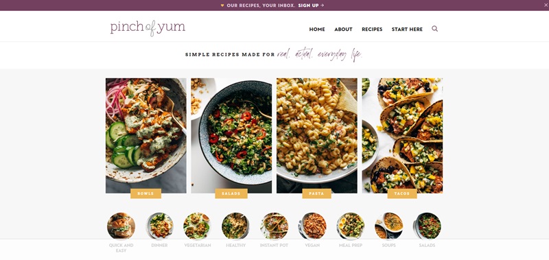
Pinch of Yum is a fun and colorful website that shares recipes.
People who love to cook or just enjoy good food will find this site really helpful.
The site has lots of recipes you can try, from tasty dinners to sweet treats.
Cool Design Features
- Bright Photos: Every recipe has big, beautiful pictures that make you want to try cooking the dish.
- Easy Navigation: Finding what you’re looking for is easy because of how well-organized the site is.
- Friendly Fonts and Colors: The website uses fonts and colors that make you feel happy and welcome.
What Makes It Special
- Variety of Recipes: They have a lot of different recipes. Whether you’re craving something sweet or looking for a healthy meal, they’ve got it.
- Helpful Tips: Next to the recipes, there are tips and tricks that help make cooking easier.
- Community Feel: The site has a warm, inviting feel, like you’re getting recipes from a friend.
Hey Colombia
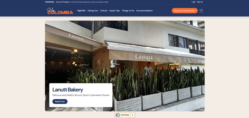
Hey Colombia is a vibrant website that invites visitors to explore Colombia’s beauty and diversity.
It’s all about traveling and discovering the wonders of Colombia, from its cities to its countryside.
Cool Design Features
- Vivid Images: The site uses stunning photos that capture the spirit of Colombia, making you want to visit.
- Smooth Navigation: It’s easy to find information about different places and activities in Colombia.
- Cultural Highlights: The website does a great job of showcasing what makes Colombia unique, including its food, music, and festivals.
What Makes It Special
- Travel Guides: They offer guides that are full of useful tips for travelers.
- Local Insights: The site shares insider knowledge that can help you see Colombia like a local.
- Updates and Events: If there’s a festival or an event happening, you’ll find information about it here, making it easier to plan your trip.
Zirkzine
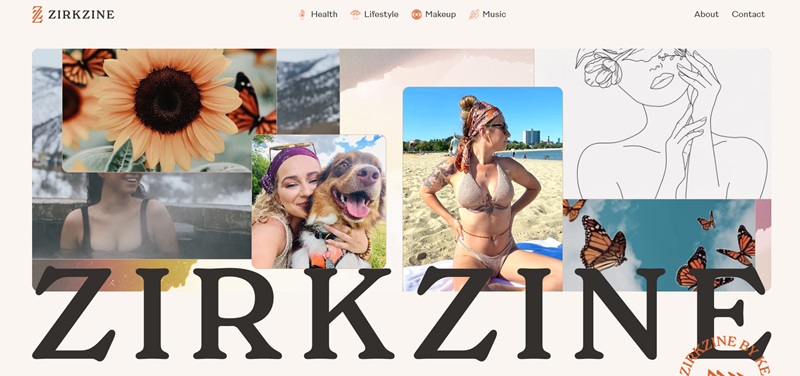
Zirkzine is a website where you can find interesting articles written by Kenzie Zirkelbach.
This website is like a treasure chest filled with cool stuff about self-care, beauty tips, and even ways to enjoy music festivals without any stress.
What’s Cool About Zirkzine
- Personal Insights: The articles feel like you’re getting advice from a friend. Kenzie shares her favorite things and personal tips.
- Focus on Well-being: Many articles talk about how to take better care of yourself, which is super important.
- Fun Topics: From talking about planners to rave stereotypes, there’s always something new and exciting to read.
Design Highlights
- Clear Layout: It’s easy to find and read articles. You won’t get lost trying to navigate the site.
- Bright and Cheerful: The website uses colors and pictures that make you feel positive and happy.
Hive Blog
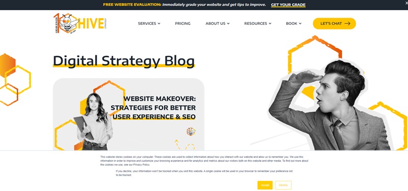
The Hive Blog is all about the world of email marketing and customer engagement.
If you’ve ever wondered how companies make sure their emails don’t just end up in the trash, this is the place to learn all those secrets.
What Makes Hive Blog Awesome
- Helpful Tips: The blog is packed with advice on how to make your emails stand out and keep customers happy.
- Latest Trends: They talk about what’s new in email marketing, so you’re always up to date.
- Success Stories: You can read about how other companies succeeded with their strategies, which can give you great ideas.
Design Features
- Professional Look: The website has a clean, professional design, making it easy to take seriously and trust.
- Smooth Navigation: Finding different subjects and articles is a piece of cake.
Rahel & Ron
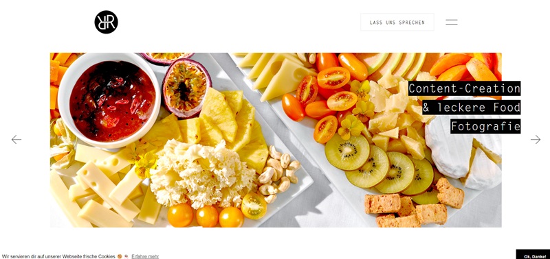
Rahel & Ron’s website is like a window into the world of two creative photographers.
They share their adventures, projects, and the beautiful moments they capture with their cameras.
What’s Special About Rahel & Ron
- Stunning Photography: Of course, the photos are the stars here. Each one tells a story.
- Personal Touch: The website lets us peek into their personal journeys and the passion they have for photography.
- Diverse Projects: They work on a bunch of different projects, which means there’s always something new to see.
Design Elements
- Gallery Style: The website is set up like an art gallery, making it super easy and enjoyable to look at all the photos.
- Simple, Yet Elegant: The design doesn’t distract from the photography, which is the main focus.
Coach Mike
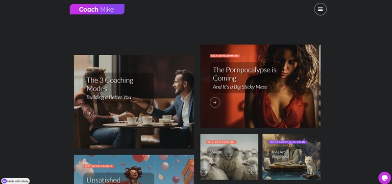
Coach Mike’s website is a place where you can learn how Michael Wells helps people get better at what they do.
It shows that he knows a lot about coaching, and he’s ready to help you grow your skills and confidence.
What You Find on Coach Mike’s Site
- About the Coach: There’s information on who Michael Wells is and what he’s done to become a coach.
- Services Offered: You get to see the different ways he can help you or your team.
Cool Design Features
- Clean Layout: The site has a simple design, so you can find things without trouble.
- Personal Photos: The website includes photos of Michael Wells, which gives it a personal feel.
Teambuilding Kits Blog
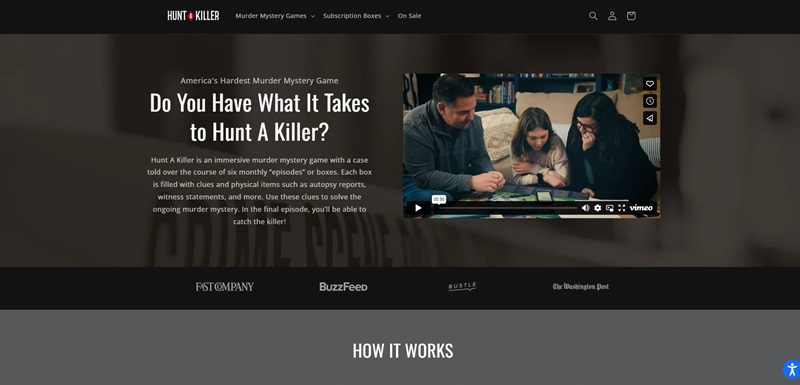
This blog from Teambuilding Kits is full of great tips for people who want to make their work teams stronger and more connected.
Awesome Things About the Teambuilding Blog
- Team Activities: The blog gives you plenty of fun ideas for team-building exercises.
- Advice Articles: You get helpful advice on how to work better with others.
Nice Design Aspects
- Organized Categories: Each blog post is sorted into categories so you can easily find what you’re looking for.
- Inviting Layout: Pictures and headlines are clear and welcoming, drawing you to read more.
Fashion Latte
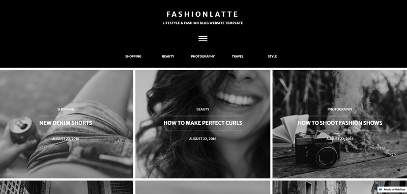
Fashion Latte is all about sharing cool fashion tips and styles.
If you love clothes and want to know more about making your outfits look awesome, you’ll enjoy this web zone.
What Makes Fashion Latte Stylish
- Fashion Tips: The site is loaded with suggestions on how to dress fashionably.
- Outfit Ideas: You can find lots of outfit inspirations to suit your own style.
Cool Visual Features
- Stylish Design: This site is super stylish, with a modern look that matches the fashion theme.
- Great Photos: There are lots of pictures showing off different styles to get ideas from.
Rahel & Ron
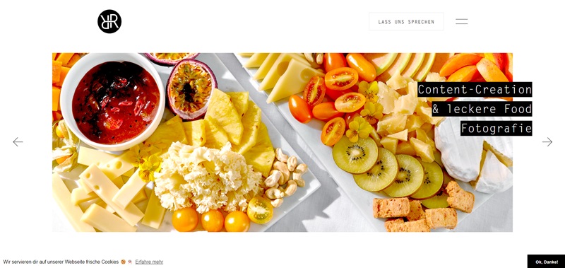
Rahel & Ron’s website is like a window into a world where photography combines with food and interior design.
They capture the beauty of food, like mouth-watering gelato from Gelateria dell’ Alpi or a delicious meal at Elmira Fine Dining.
They don’t just stop at food – they also capture interior designs and commercial products with the same love and focus.
The Magic in Rahel & Ron’s Site
- Tantalizing Food Photos: From gourmet cheese to delightful pastries, they bring food to life with their photography.
- Stylish Interior Shots: Along with food, they beautifully capture interior designs.
- Wow Product Photography: They excellently picture products like chocolates and beverages, making them look incredibly tempting.
Website Design Highlights
- Gallery-Style Approach: Pictures reign supreme here, presented in high resolution for maximum impact.
- Easy Navigation: You can smoothly move around, and every click presents a new visual treat.
- Minimalist Design: The site keeps everything simple, letting the pictures do the talking.
I Ate Oklahoma
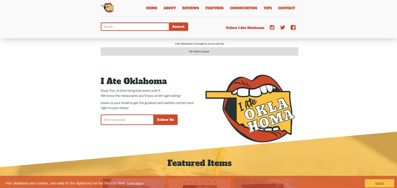
I Ate Oklahoma is a food blog that takes you on a culinary trip around the state of Oklahoma!
It’s written by a guy who clearly loves food, and he’s ready to show you all the tasty places you should try in Oklahoma.
Yummy Aspects of I Ate Oklahoma
- Restaurant Reviews: Find honest, in-depth, and mouth-watering reviews of Oklahoma’s eateries.
- Foodie News: Stay updated on the latest happening in the Oklahoma food scene.
- Popular Recipes: Try your hand at cooking some regional favorites with the blog’s shared recipes.
Website Design Features
- Food-Centric Layout: The website’s design will get you thinking about your next meal with its plentiful food pictures.
- Ease of Usage: The site is super easy to navigate, you won’t have trouble finding the best food in town.
- Enjoyable Content: The writing style is light and engaging, making it a pleasure to read each post.
Frequently Asked Questions about Webflow Blog Examples
What’s the big deal with Webflow for blogging?
With Webflow, you get the freedom to craft your blog visually while the platform translates it into clean code. It’s like having a magic wand for web design.
Can my Webflow blog rank high on Google?
Webflow is SEO-friendly, allowing you to tweak all the SEO settings, like meta titles and descriptions, to charm those search engine spiders. Blogs created with Webflow, when optimized correctly, stand a great chance to climb up the SERP ladder.
How customizable are Webflow blogs?
Whether it’s fonts, layouts, animations, or interactions, your creativity’s the only limit.
What are rich results, and can my Webflow blog get them?
Rich results are Google’s way of giving users a sneak peek of your content directly on the SERP – kind of like movie trailers for your blog. With proper schema markup (which Webflow supports, high-five!), your blog could totally score these eye-catching results.
Do I need to code to create a Webflow blog that’s rich result-friendly?
Nope, no code is necessary. Webflow’s designer interface lets you insert and structure content in ways that can help you achieve rich results. Think of it as a fill-in-the-blanks for complex data that Google loves.
Will using Webflow help with my blog’s loading speed?
Webflow is designed to optimize loading times, which is crucial for user experience and SEO. Trim the fat by minimizing redirects and optimizing images, and watch your Webflow blog zip past the competition.



Leave a Reply