My content is reader-supported by awesome people like you. Which means I could earn a commission. Learn more here!
In the massively competitive digital marketing sphere, the impact of a well-structured landing page is absolutely non-negotiable.
To hit those high conversion rates and lead generation goals, marketers must leverage robust tools adept at crafting pages that not only attract eyeballs but effectively bring conversions home.
This is where Unbounce, a renowned landing page platform, makes its grand entrance.
Unbounce Quick Summary
| Are there any free trials? | You’re going to get 14 days to test it out |
| Top Pro | Tons of customization options |
| Top Con | Feels a bit cluttered when navigating |
| How easy to get started | 14 Days is free but you have to input credit card info. Once in though they really help you out to get going. |
| Other thoughts | Look for Unbounce coupons on the web. I saw a spot to enter it. |
How I Like To Test These Platforms
| Ease of use | Is it easy to sign up for and is guidance there to not fail |
| Customer Support | I gotta see this somehow |
| Tools it offers (Marketing, SEO, Product Tools) | We need tools without venturing out to other companies all the time |
| 25-point feature checklist | It can be my secret sauce. It includes other areas but it lets me know how it’s doing. |
| Actual customer user ratings | I set out and find actual other users that use this product for their business. These can be on review sites, forums, or my reader’s opinions to give you an idea. |
| Testing project | I try to run it through a project I feel good about |
| Overall rating | After compiling data I give it a rating. |
Unbounce Rating Breakdown
| Ease of use | 4.5 out of 5 |
| Customer Support | 4.3 out of 5 |
| Tools it offers (Marketing, SEO, Product Tools) | 4.6 out of 5 |
| 25-point feature checklist | 4.2 out of 5 |
| Testing project | 4.3 out of 5 |
| Customer User Rating Score | 4.5 out of 5 based on 613 Users |
| Overall rating Of Unbounce | 4.4 out of 5 |
What Is Unbounce?
Unbounce, a Software as a Service (SaaS) powerhouse, specializes in crafting optimized marketing campaigns with its landing pages, sticky bars, and an array of conversion tools.
Geared towards a broad user base, from individuals to corporates, the platform serves over 120,000 active customers, aligning with the needs of top-tier clients including the likes of New Balance and Campaign Monitor.
The Underlying Features: A Closer Inspection
Classic Landing Page Builder
Starting with the Classic Landing Page Builder, my firsthand interaction with Unbounce’s editor revealed a mixture of familiarity and sophistication.
While the template designs exude polish and professionalism, the UI could benefit from a more spacious and less compressed layout.
Nevertheless, let’s delve into the specifics of this tool:
- Templates: The 101 template options lie in the industry standard range, but the discerning layouts tailored for click-throughs, lead generation, and industry verticals are commendable. A more extensive template library, similar to its competitor Instapage, might enhance the user value proposition.
- Drag-and-Drop Editing: The actual editing process could initially feel cluttered; however, once mastered, it opens a realm of possibilities with its customization prowess. The addition of custom CSS and JavaScript capabilities ensures that Marketers are armed with tools to bring their unique aesthetic and functional vision to life.
Smart Builder
The Smart Builder stood out for its speed and simplicity.
It strikes me as an AI-powered aide – a friend to those in a marketing sprint.
This feature is a testament to Unbounce’s understanding of time-crunch scenarios where marketers seek swift, efficient solutions without intricate frills.
Here’s how it performs:
- AI Generation: After you input a brief campaign description, the AI steps in to supply you with content for your landing page. Though limited in customization, this can be an asset for users with limited design experience or under tight deadlines.
- App Integrations: What fascinated me about Unbounce is how seamlessly it invites users to enhance their landing pages by integrating with other applications. You can virtually connect to an array of plugins and platforms like Shopify, Google Analytics, and Facebook fairly easily.
Pop-ups and Sticky Bars
Building beyond landing pages, Unbounce’s repertoire includes pop-ups and sticky bars – tools that inherently boost conversions when implemented shrewdly.
Pop-ups, for instance, are not solely interruption mechanisms; they can be tactfully crafted to match user intent and website narrative, thereby augmenting UX rather than detracting from it.
Unbounce Templates
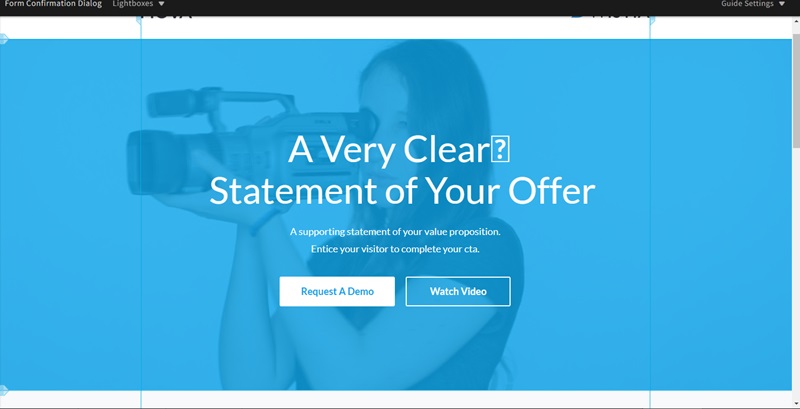
If you take a trip to the world of Unbounce Templates, you’ll discover an awesome portfolio of over 100 different designs!
These aren’t just any designs.
Oh no, they’re special because they come loaded with everything you need to make people visit your website and stick around.
What’s So Cool About Unbounce Templates?
To start with, here are a few things that make them awesome:
- Ready-to-use: No blank pages staring at you, waiting for your genius ideas. These ready-to-go templates make building a page as easy as pie.
- Categorized: Looking for something specific? They’ve got you. The templates are all neatly sorted by categories. Hunting for the perfect one has never been easier.
- High-converting: These templates aren’t just pretty faces. They’re designed to make visitors click around and stay longer. That’s a big thumbs up for your website!
- Drag-and-drop builder: You don’t need to be a tech wizard to use these. Just pick a template, drag what you like, and drop it where you want. Boom! Your page is ready.
Need Help Picking the Right One?
No worries if you’re not sure which template to choose.
Unbounce has thought of everything.
They’ll ask you a few questions and then suggest the best match for your needs.
Kind of like a helpful shop assistant, but online. Neat, huh?
Summary On Templates
To sum up, Unbounce isn’t just about giving you templates. It’s about setting you up for success.
With so many options, helpful support, and easy-to-use tools, building a fantastic page is simpler than ever.
Sounds exciting, doesn’t it?
Time to get started and make your page shine!
Detailed Features Unexplored in the Original Review
Let’s evaluate some important features and aspects that were not covered in the original review:
Responsive Design
In today’s mobile-first world, the responsiveness of landing pages cannot be overstated.
Unbounce guarantees that its templates are mobile-responsive, a key factor for Google’s page ranking and user retention.
From my tinkering with the platform, I discovered the landing pages maintain integrity across different screens, without the need for extensive adjustments.
Advanced Scripting
For users with coding prowess, Unbounce offers advanced scripting options.
The custom HTML, CSS, and JavaScript insertion points offer marketers and developers the latitude to introduce sophisticated functionalities or tracking scripts, enhancing the pages further.
User Experience (UX)
While the initial review pointed out issues with the UX, my dive revealed a fair amount of nuance.
The interface’s intuitiveness might take a dip for newcomers due to its packed toolsets and features, yet, Unbounce’s commitment to function over form serves well once you push past the learning curve.
Marketplace and Community
A gem often overlooked is Unbounce’s expansive marketplace and active community forums.
The platform promotes an ecosystem where users can explore third-party templates, scripts, and extensions, widening the horizon for customization and peer support.
This collaborative spirit fosters learning and innovation among users.
Security and Compliance
In my critical analysis of Unbounce, it must be highlighted that the platform adheres to stringent security standards, ensuring user data is protected and regulatory compliances like GDPR are met meticulously.
This should provide marketers and businesses peace of mind, especially in the face of increasing cyber threats and privacy concerns.
From Sign-Up to Publish: A Walkthrough Recap
The process of getting started with Unbounce is fairly straightforward if not slightly interrupted by the requirement for credit card information even for the free trial.
Though it’s a common practice among many SaaS platforms, alternatives without this prerequisite do exist and could help Unbounce improve its accessibility and user trust.
Creating a new group and landing page is a two-step process. Once inside, selecting the builder of choice – be it Classic or Smart – sets the stage.
From there, it’s a matter of picking a template, applying branded elements, integrating desired functionalities, and refining details until satisfied.
Analytical Tools and A/B Testing
The original review could have delved deeper into Unbounce’s analytical capabilities.
Having had the opportunity to experiment with this aspect, I found Unbounce’s A/B testing feature robust.
It allows you to create multiple versions of your page effortlessly, with real-time performance monitoring.
You can thus make data-driven decisions to tweak and improve your pages for optimum conversions.
Additionally, the dashboard which visualizes conversion metrics and visitor statistics is not only insightful but also motivates continuous enhancement through its clear depiction of user behavior and interaction.
Unbounce Pricing Plans
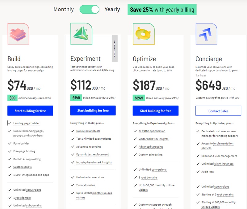
The range in pricing and included features demonstrates Unbounce’s understanding of varied marketing requirements.
Plan Overview
- Build Plan ($74/month annually)
- Pros: Ideal for startups and small businesses looking to create high-converting landing pages. Offers unlimited landing pages, popups, sticky bars, and access to integrations.
- Cons: Limited to 20,000 monthly unique visitors, which might not suffice for scaling businesses.
- Experiment Plan ($112/month annually)
- Pros: Includes everything in Build, plus unlimited A/B testing and advanced reporting—perfect for optimizing campaigns.
- Cons: Higher cost, still limited to 30,000 monthly visitors, making it slightly restrictive for medium-sized businesses.
- Optimize Plan ($187/month annually)
- Pros: Advanced features like AI optimization and visitor behavior insights. Allows for up to 50,000 monthly visitors, suitable for businesses aiming for growth.
- Cons: Might be costly for businesses not fully utilizing the advanced features.
- Concierge Plan (Starting at $649/month)
- Pros: Tailored service with dedicated support, ideal for enterprises with large-scale needs. Offers flexibility in visitor numbers and domain usage.
- Cons: Price point is a significant consideration. Only feasible for large organizations that can leverage the extensive suite of services.
Unbounce Examples To Inspire You
Promo.com
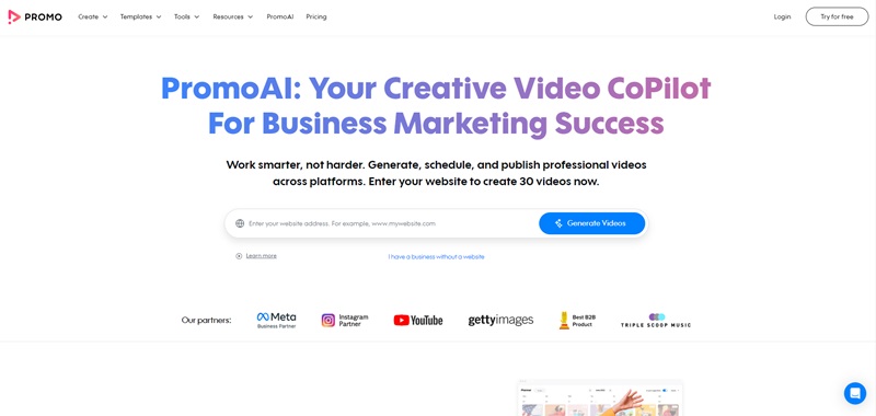
Immersed in the world of Promo.com, you’ll find the ultimate tool for creating genius video content.
Flaunting a neat layout that’s a cinch to use, the site’s design is equally as brilliant as its innovative concept.
What Does Promo.com Do?
Promo.com is an intelligent solution for designing stunning visual content.
It’s bolstered by the force of artificial intelligence, which partners with you in concocting engaging video posts.
More time for coffee, less time grinding over what to post next.
Features that Shine
- Artificial Intelligence (AI) at Work: With PromoAI, you have a diligent sidekick brainstorming video posts for every day of the month. Talk about efficiency!
- Chat-Based Editor: The site boasts a chat-based editor, providing precision tweaking for each content piece. You don’t have to be an editing whiz to navigate around this.
- All-In-One Platform: From concept to completion, Promo.com handles it all gracefully. Be it video production, scheduling, or actual posting, your trusty companion’s here.
- Premium Stock Footage and Music: Access unrestricted premium stock footage by renowned providers like Getty Images and iStock. Plus, there’s an arsenal of curated music tracks to give your videos that extra zest.
Your DIY Video-editor
Whether it’s crafting marketing masterpieces or holiday-themed goodies, Promo.com is up to the task.
The platform empowers you to create remarkable content pieces, making the entire process as fun as a ride in the park.
edX
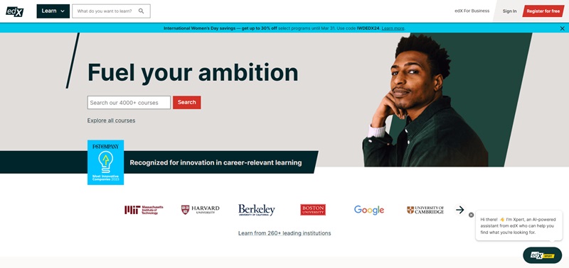
Over at edX, you’ll see a warm invite to equip yourself with invaluable knowledge.
The site’s sleek, well-organized design is a treat to your eyes, making the quest for learning even more engaging.
The edX Edge
edX is a ground-breaking educational platform, offering top-tier programs from internationally recognized universities.
Every visit feels like walking through the doors of an extensive digital library.
Here’s what Makes edX Stand Out
- Extensive Course Catalog: From science and math to languages and humanities, edX is packed with a plethora of wide-ranging courses. There’s something for everyone, really!
- Internationally Recognized Institutions: Imagine studying a course offered by Harvard while lounging in your pyjamas? edX makes this reality, connecting you with globally recognized institutions.
- Flexible Learning: Study at your own pace and on your own terms, that’s the edX way! Forget the traditional classroom setting; edX gives you 24/7 access to your chosen courses.
Never Stop Learning
In conclusion, edX is your gateway to a world-class education.
The platform enriches you with comprehensive learning resources perfect for expanding your skills or pursuing new interests.
Simply Business
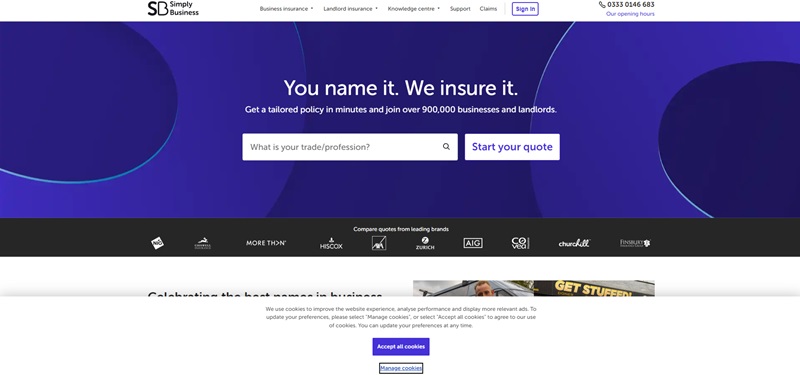
At SimplyBusiness, it’s… well, as simple as it gets!
The site’s minimalist design presents information clearly, cutting through the complexity.
Simplifying ‘Simply Business’
Simply Business is a breath of fresh air, offering diverse business insurance products in a hassle-free manner.
It’s your go-to site when you want things done, simply.
The Simply Business Experience
- Range of Insurance Products: From public liability and professional indemnity to landlord and shop insurance, they’ve got you covered.
- Tailored Coverage: Your needs differ from others, and Simply Business acknowledges that. They provide customized coverage for diverse business needs.
- Top-notch Customer Service: Boasting excellent customer service, Simply Business ensures an efficient and pleasing experience for every user.
Insurance Made Simple
In other words, Simply Business takes the burden of insurance off your shoulders.
With a broad array of products and exceptional customer service, they deliver all you need and more.
Take it from a seasoned pro, getting insured couldn’t get simpler!
The Best Unbounce Alternatives
Instapage
This tool is distinguished by its AI abilities that dynamically match ad traffic to landing pages based on user’s interests, contributing a great deal to conversion rate optimization.
Highlighted Features
- AMP pages and experiences integration for better user engagement
- The use of AI for compelling content creation
- GDPR Compliance for data protection
Instapage however, may be a bit expensive for small and medium-sized businesses and lacks advanced lead generation pop-ups.
Landingi
One of Landingi’s distinguishing features is its user-friendly drag-and-drop editor and a robust template library.
However, mobile responsiveness can sometimes be clunky.
Highlighted Features
- Access to a library of customizable templates
- Intuitive pop-ups and overlays to improve engagement
- Event trackers to understand user behavior and optimize journeys
Hubspot Marketing Hub
This solution integrates landing page creation into a comprehensive digital marketing ecosystem, offering the promise of a cohesive and personalized user experience.
Highlighted Features
- Full-stack marketing capabilities
- Seamless CRM integration to streamline data management
- Advanced analytics and reporting for tracking marketing efforts
One downside is that Hubspot’s pricing tends to be higher when compared to other marketing tools.
LeadPages
Many marketers favor LeadPages for its sophisticated yet user-friendly landing page templates.
One impressive feature is its ‘lead meter’ which helps assess the effectiveness of pages in generating leads.
Highlighted Features
- Focus on lead generation with a simplified platform
- Integrated major email marketing services and CRM platforms
LeadPages, however, could use some work in its customization options and more advanced analytics/reporting features.
In Conclusion…
When I look into these alternatives, their unique selling points greatly impress me.
Each has a distinct way of addressing the user’s needs.
While deciding, it’s crucial that you clearly understand these points and choose the one that best fits your business requirements. Happy hunting!
FAQ Section for Unbounce Landing Page Maker
Can I create a landing page without having design skills?
They’ve got this super intuitive drag-and-drop builder that’s basically a lifesaver. You just pick what elements you want – be it a headline, image, or even a fancy form – and plop it right where you need it. Plus, they’ve got a ton of templates that are not just easy on the eyes but optimized for conversions too. Seriously, you can whip up something gorgeous without knowing a pixel from a vector.
How does Unbounce help with conversion rates?
This is where Unbounce’s magic potion comes in – conversion optimization features. We’re talking A/B testing, which lets you pit two versions of your page against each other to see which one’s winning hearts and clicks. Then there’s popups and sticky bars for those timely nudges, plus dynamic text replacement to keep things relevant to your visitors. It’s almost like having a chat with your visitors and fine-tuning your message on the go.
Is integrating my CRM with Unbounce a headache?
With Unbounce, it’s smooth sailing. They’ve got direct integrations with a bunch of the big players like Mailchimp, Salesforce, and HubSpot. So if you’re using one of those, it’s pretty much plug-and-play. And for anything else, there’s Zapier. Honestly, it’s like the Swiss Army knife for integrations. A few clicks and you’re set – your leads flow right into your CRM, ready for you to work your magic.
Can Unbounce handle a spike in traffic?
With Unbounce, you can chill. Their platform is designed to handle surges like a champ. They’ve got this autoscaling tech that makes sure your landing page stays up and running, no matter how many people are hitting it at once. It’s kind of like having an invisible bouncer, making sure your party doesn’t get too crazy.
What about mobile visitors? Will my pages look good on their screens?
Thankfully, Unbounce totally gets this. Every template they offer is responsive, which means whatever you create is going to look top-notch on any device. Desktop, tablet, smartphone – you name it. Plus, you can tweak your mobile layout separately, ensuring your mobile visitors get just as amazing an experience as desktop ones. It’s like making sure nobody feels left out at your party, no matter what device they’re rocking.
Is Unbounce’s pricing gonna break the bank?
Unbounce isn’t the cheapest option out there, but hear me out. What you’re getting here is a powerhouse tool that’s not just about building pages – it’s about boosting those conversion rates into orbit. They’ve got plans that cater to different needs and sizes, starting with a very reasonable one for small businesses or newbies just dipping their toes in. And honestly, the amount of time and headache you save? Plus the potential for more sales and leads? That’s some solid gold ROI right there.
Final Thoughts and Verdict
In conclusion, Unbounce is indeed a powerful and comprehensive tool for marketers who crave control, customization, and conversion-focused features.
Despite a user experience that could be streamlined and the lack of a credit-card-free trial, the platform’s rich functionalities, from the AI-driven Smart Builder to the detailed A/B testing capabilities, offer a substantial payoff.
Is it worth the hype?
From the meticulous dissection of its offerings, the overwhelming response leans towards a resounding yes.
For marketers poised to skyrocket their conversion rates with professional, highly optimized landing pages – Unbounce stands tall as a formidable ally.


Leave a Reply