My content is reader-supported by awesome people like you. Which means I could earn a commission. Learn more here!
If you’re considering Squarespace to be your restaurant website platform for your business.
I’d say…
You have chosen a solid platform to consider.
Let’s check out some awesome Squarespace Restaurant Websites to give you a little idea of what can be done on it.
Sophie’s Cuban Cuisine
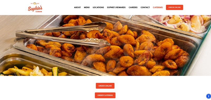
Sophie’s Cuban Cuisine brings the zesty flavors of Cuban food right to your table.
When you visit their website, it’s like taking a mini-vacation to Cuba, without ever leaving your house.
What’s This Website Cooking Up?
- Mouth-Watering Menus: Right away, I noticed they share their delicious menu filled with Cuban classics. They offer a variety of dishes that make you feel like you’re dining in Havana.
- Vivid Photos: The site boasts bright and colorful pictures of their dishes. These images grab your attention and almost let you smell the aroma of Cuban spices.
- Location Info: They clearly list their locations, making it super easy for you to find where you can enjoy their food.
- Ordering Made Easy: There’s a big button for online ordering. You can have your favorites delivered to your door with just a few clicks.
Cool Website Design Features
- Colorful Theme: The website uses a vibrant color scheme that reflects the lively Cuban culture. It’s eye-catching and joyful.
- Simple Navigation: The layout is user-friendly. You can easily find what you’re looking for without any hassle.
- Engaging Content: From their history to mouth-watering food photos, the site keeps you interested and scrolling for more.
Elma – Mediterranean Magic
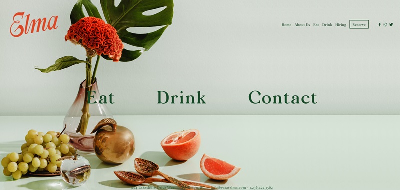
Elma’s website transports you to the sunny shores of the Mediterranean. They specialize in dishes that are not only tasty but also tell a story of thousands of years of culinary history.
What Elma Offers
- Unique Mediterranean Dishes: Elma highlights a menu that celebrates the rich flavors of the Mediterranean. From freshly baked bread to aromatic entrees, there’s something for everyone.
- Elegant Photos: Each dish is beautifully presented in photos that make your mouth water. It feels like you can reach out and take a bite.
- Event Hosting: They offer services for hosting private events, which shows they’re more than just a place to eat; they’re a place to make memories.
- Insightful About Us Page: Elma shares their passion for Mediterranean food and culture, giving you a glimpse into their world.
What Makes The Website Stand Out
- Warm Aesthetics: The website’s look brings the warmth of the Mediterranean sun. It’s inviting and makes you feel at ease.
- Interactive Menu: You can interact with the menu, getting details on each dish. It’s like having a virtual tour guide for Mediterranean cuisine.
- User-Friendly Design: Finding information is a breeze. Whether you’re looking to book a table or browse the menu, everything is just a click away.
Tacos Poncitlán
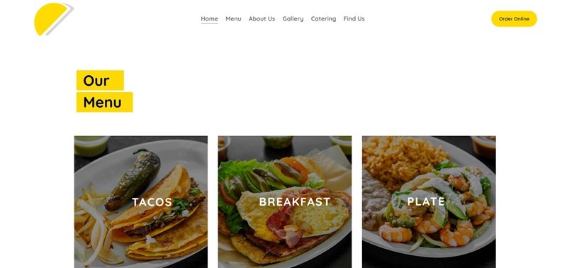
Tacos Poncitlán brings the heart of Mexican street food to your neighborhood with a fun and interactive website to match.
Dive Into Tacos Poncitlán
- Vibrant Menu: The menu is a celebration of Mexican street food, with a variety of tacos, quesadillas, and more that will make you want to try everything.
- Bright, Playful Photos: The site is filled with lively photos that showcase their delicious food and the joy it brings to people.
- Easy Online Ordering: With a clear section for online orders, getting your taco fix is easier than ever.
- Community Connection: They emphasize their love for the community and how they aim to bring people together through the love of tacos.
Website Features That Shine
- Energetic Design: The website uses bright colors and dynamic layouts that mimic the lively streets of Mexico.
- Engaging User Experience: Browsing the site is like going on an adventure. You explore different sections, each offering something new about their food and story.
- Simple Navigation: Even with all its vibrancy, the site is easy to navigate. You won’t get lost trying to find your way to the menu or contact info.
Imperial DC
What’s the Site?
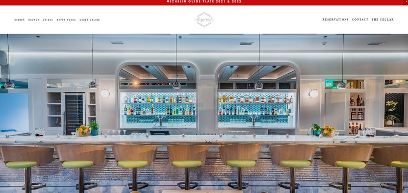
Imperial DC, a Washington DC-based restaurant, loves to treat visitors with Mid-Atlantic inspired cuisine.
There’s a noticeable French flair to the menu, which I feel adds a unique touch.
This business is more than just a restaurant.
It boasts a beautiful rooftop garden for alfresco dining and a downstairs “cellar” where patrons can enjoy a lively bar atmosphere.
What Makes It Nice?
- The website’s design mirrors the elegance of the restaurant. It’s as if the website tells us, “Expect sophistication when you dine with us.”
- Photographs give us a sneak peek of the delightful meals and the inviting ambiance. These images make your mouth water.
- The site is user-friendly. Important information, like location, hours of operation, and contact details, is easy to spot.
- The site’s design is accessible, welcoming individuals who require ADA-compliant entrances and restrooms.
The Saucy Cow
What’s the Site?
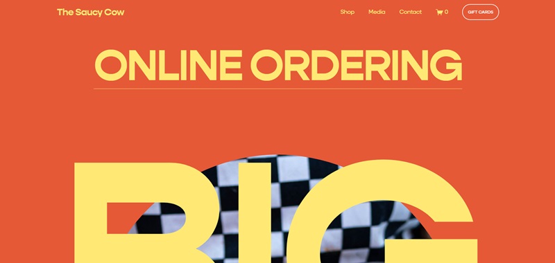
At The Saucy Cow, they give a complete makeover to your beloved grilled cheese sandwiches.
By using gourmet ingredients and creative recipes, they turn a simple meal into a culinary masterpiece.
When I look at this site, it’s clear to me that The Saucy Cow is where grilled cheese sandwiches get a fancy upgrade.
What Makes It Nice?
- The site perfectly captures the spirit of the business: fun, friendly, and a bit quirky.
- The site’s design plays with the cow and sauce motifs, making it visually entertaining.
- The menu is easy to navigate. It provides vivid descriptions that make you want to try everything.
- The website highlights their catering services. This makes it easy for users to see event options.
Soft Swerve NYC
What’s the Site?
Soft Swerve NYC is here to give you a sweet ride to ice cream heaven.
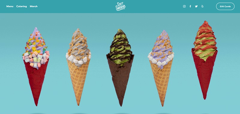
Their website introduces you to an array of wonderful and innovative soft-serve ice cream flavors.
The site reassures me that every visit to Soft Swerve will be a delightful adventure for your taste buds.
What Makes It Nice?
- The site’s design is simple but eye-catching with its use of bold, bright colors. This makes it a visual treat.
- Their online menu is well-organized, making it easy for you to pick your next sweet delight.
- The website prominently features images of their offerings, which are all enticing and drool-worthy.
- I really appreciate the focus on their story and origins. It makes your experience personal and more enjoyable.
Streetbird NYC
What’s the Site?
If you ever get hungry for some tasty fried chicken, Streetbird NYC is the spot that has people talking!
Chef Marcus Samuelsson, who has won big awards, shares his special take on spicy and hot fried chicken at this restaurant.
Also, they’re not just in one place; you can find them in Las Vegas, at Yankee Stadium, on the beach in the Bahamas, and even for delivery in New York, New Jersey, and Pennsylvania.
What Makes It Nice?
- Vibrant Photos: Right away, the site greets you with mouth-watering pictures. It’s like you can almost taste the crunchy chicken.
- Easy Navigation: The website makes it super simple to jump to locations, contact info, or merchandise. I like how clean and uncomplicated it is.
- Culture Blend: This isn’t your regular chicken spot. The website shows how the food mixes Harlem’s culture with the Caribbean, and that sounds really exciting.
- Merchandise Section: You can buy cool t-shirts and caps right from the website. It’s nice to see restaurants offering things you can wear.
Nice Touch
They make it fun and easy to sign up for a newsletter so you can keep up with what’s happening. Plus, all their contact info is clear and easy to find. This makes getting in touch a breeze.
Eat Nice Day
What’s the Site?
Over at Eat Nice Day, they’re dishing up Chinese home cooking that’ll remind you of a meal with your family.
The way their meals are put together is really creative and just looking at the website, I can tell their dishes are packed with homey flavors and traditions.
What Makes It Nice?
- Wholesome Ambiance: They’ve got this vibe on their site that feels friendly, just like the food they serve.
- Clear Menu Categories: When checking out what to eat, their menu categories are really easy to see, and that helps you choose what you want faster.
- Storytelling: There’s a part of the website that shares the story behind the food. This makes you feel connected to what you’re eating.
- Connecting with Visitors: They’ve set up an area for you to leave messages, which lets you chat with them without any fuss.
Nice Touch
What’s really cool is how they keep things fresh by letting you know about upcoming events and chances to see them around town.
The site feels like a warm invitation to come and try something delicious.
The Meatball & Wine Bar
This tasty spot is known for its fantastic food and delicious drinks.
If I were to guess, I’d say it’s not just the high-quality ingredients and Italian wines that make this place special.
It’s more than that.
Website Features
- Engaging images that make you go yum!
- Simple navigation menus for ease of use.
- Social media integrations for keeping up to date
- Newsletter sign-ups for receiving latest updates and offers
Blue Dog NYC
Blue Dog NYC has a bright and cool vibe.
Their focus is on fresh ingredients and unique recipes, which sounds delightful to me.
Website Features
- Beautiful full-screen images, making a powerful impact right from the start.
- The header menu for seamless navigation.
- Online ordering and delivery options for customer convenience.
King Restaurant NYC
King Restaurant NYC is all about (oops, ignore that, a tiny slip) providing a royal dining experience with a seasonal menu.
I’m sure it will delight the senses.
Website Features
- Chic and clean design keeping the focus purely on food.
- An easily accessible menu and reservation system.
- Social media links to stay connected with food lovers.
Fields Good Chicken
Imagine walking into a place that smells like happiness.
Fields Good Chicken is a restaurant that knows how to make your stomach smile.
They focus on chicken dishes, and trust me, they know how to do it right.
From what I gathered, their website makes you want to try everything!
Website Features
- User-Friendly Design: The website is super easy to navigate. You’ll find what you’re looking for in no time.
- Mouth-Watering Photos: The pictures of the food are so good. I almost tried to eat my screen!
- Clear Call to Action: Right away, you see an “Order Now” button. It’s perfect for when you’re too hungry to think.
- Location Information: They make it super easy to find where they are and how to get your chicken fix.
Now, let’s move on to the next cool spot.
Bandits NYC
Bandits NYC is a bit like stepping back in time but in a cool, modern way.
This place serves up amazing American classics, and their vibes are just as good as their food.
Website Features
- Retro Look: The website has this awesome vintage feel that matches the restaurant’s style. It’s like a mini-time-travel adventure.
- Easy Peasy Navigation: Finding your way around the site is a breeze. You can learn about their menu, find the location, and even about their story without any hassle.
- Cool Photos: The pictures on the site give you a peek into what it’s like to hang out there. It’s inviting and makes you want to be part of the fun.
Squarespace Restaurant Websites FAQ
Can I add my restaurant menu to my Squarespace site?
Squarespace allows you to upload your menu directly as a PDF, or you can use their built-in Content Blocks to craft a custom, click-friendly menu that’ll have your customers drooling before they even walk through the door. Plus, updating it is a breeze, so go ahead, test out that new truffle mac and cheese recipe and add it to your online menu!
Is there an option for online reservations on Squarespace?
For sure! Squarespace integrates seamlessly with OpenTable, among other booking systems. This means you can embed a reservation widget right on your site. Customers can book their table without ever having to leave your site, ensuring a smooth booking experience that doesn’t bounce them around like a pinball. It’s all about keeping it in the family—or in this case, on the website.
How can I use Squarespace to promote my restaurant’s events?
Promoting your events on Squarespace is like shouting from the digital rooftops, but way more effective. Use the Events Page feature to list all your upcoming shindigs, from wine tastings to live music nights. You can add details, images, and even a map to help people find your spot. And don’t forget to share these events on your social media directly from your Squarespace site. It’s part of the whole “make some noise” strategy without actually making any noise.
Can I sell my restaurant’s merch on Squarespace?
Oh, you most definitely can! Have a signature hot sauce that people can’t get enough of? Or maybe those quirky T-shirts with your logo? Set up an online store section on your Squarespace site and start selling. The platform supports inventory management, secure payments, and everything else you need to turn your swag into another revenue stream. Really, it’s about showing off your brand and making a few extra bucks while you’re at it.
How does Squarespace help with my restaurant’s SEO?
The platform is designed with best practices in mind, like automatically generating sitemaps and using clean HTML markup so search engines can crawl your site more effectively. Plus, you can customize URLs, page titles, and meta descriptions to make sure your restaurant ranks higher in search results. Think of it as leaving breadcrumbs for Google to find you, but in a more sophisticated, tech-savvy way.
Is it easy to post my restaurant’s daily specials on Squarespace?
Easier than deciding on the specials itself, I promise. Posting daily specials can be done in a snap by updating a Blog Page or creating an Announcement Bar at the top of your site. This keeps your patrons in the loop and your site fresh. It’s like the chalkboard outside your restaurant, but digital and without the risk of rain washing away today’s soufflé option.


Leave a Reply