My content is reader-supported by awesome people like you. Which means I could earn a commission. Learn more here!
If you’re considering building your church’s websites on Squarespace I feel these examples can really help you out.
Will check some very nice church websites built on the Squarespace platform to give you some design ideas and as well motivation to get started.
Let’s go!
Renew Church OC
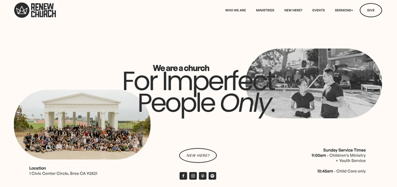
Renew Church OC is a community that warmly invites everyone, especially those who aren’t perfect.
Let me take you on a little tour of their website, which I looked at myself.
This website is built on Squarespace, showing that Squarespace can be a great choice for creating church websites.
What the website tells us
- The Heart of Renew Church OC: They emphasize being a family of imperfect people who are empowered by the Spirit to live in step with Jesus. They focus on three main values: God’s family, Jesus’ mission, and being empowered by the Spirit.
- Community and Support: The church offers numerous ministries for different age groups and stages in life, including children, youth, college students, young adults, and families. It’s clear they care deeply about supporting each group appropriately.
Cool Design Features
- Warm Welcoming Design: The first thing I noticed was how welcoming their website feels. The use of friendly fonts and warm colors makes you feel right at home.
- Easy Navigation: With clear, easy-to-find menus, finding information on their website is a breeze. Whether you’re looking for event times or interested in their various ministries, everything is just a click away.
- Personal Touch: A special touch is a personal welcome message from Pastor Wilson Wang, making the site feel more personal. He even offers to connect you directly with a pastor, showing they are truly there to support you.
Heritage Church
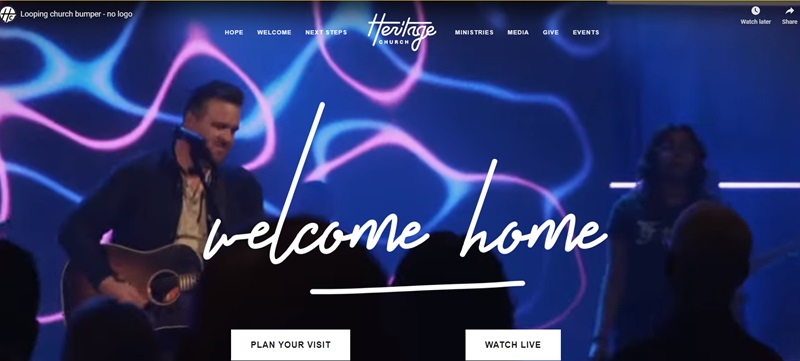
Now, let’s explore another amazing church website designed with Squarespace:
Heritage Church.
Like Renew Church OC, Heritage Church fully utilizes Squarespace to create a welcoming, easy-to-navigate site that reaches out to visitors and members alike.
What this website is about
- A Place for Everyone: Heritage Church’s main message is welcoming everyone to be part of their community. They stress the importance of family, belonging, and growing together in faith.
- Growth and Connection: It’s clear that they want to help people connect with each other and grow in their faith. They offer various groups and programs tailored for kids, youth, and adults.
Nice Design Features
- Beautiful Imagery: Right away, you’re greeted with beautiful, high-quality images that capture the spirit of the church. These visuals set a positive tone for the entire site.
- Streamlined Navigation: Like Renew Church OC, Heritage Church makes it super easy to find what you’re looking for. Their layout is user-friendly, and everything from events to sermon archives is easy to access.
- Engaging Content: The content on the website is engaging and informative, designed to answer visitors’ questions and draw them deeper into what Heritage Church offers.
Hill City Church

Walking through Hill City Church’s website, I got the feeling that this is a place where everyone is welcome.
They’ve made their website using Squarespace, and it’s a fine example of how this platform can create an inviting online space for a church.
What’s on the Website
- Open for Everyone: Hill City Church’s main theme seems to be inclusiveness and openness. They really want everyone to feel at home.
- Activities and Groups: They have a lot of different groups and activities for everyone at church – like discipleship, community groups, and stuff for kids and youth.
Design Features That Stand Out
- Friendly and Inviting: The design of the website feels really friendly. The moment you open the page, the colors and pictures make you feel like you’re part of the community.
- Simple to Use: It’s super easy to find your way around the site. If you need to find out when services are or how to get involved, the information is right there and clear as day.
- Connection is Key: They make it a snap to get connected. They encourage you to fill out a connection card, and they make a promise to help you with your next steps, no matter where you are in your faith journey.
Declaration Church
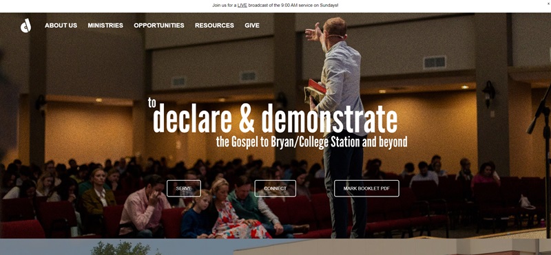
When I visited the Declaration Church’s website, the first thing I noticed was how inviting it was.
This church has utilized Squarespace to make a simple yet effective online home that reflects its welcoming atmosphere.
What’s on the Website
- Easy Connection: Right on the main page, they encourage you to subscribe to their mailing list. This makes it super easy for visitors to stay in touch and learn more about the church.
- Focus on Community: While the scrape provided limited information, it’s clear that communication with the community is a priority for Declaration Church. Engaging with members and visitors through a mailing list is a great way to keep everyone informed.
Design Features That Stand Out
- Simplicity and Clarity: The call to action for joining the mailing list is straightforward, showing they value clarity in how they communicate.
- Welcoming to Newcomers: By placing a sign-up form front and center, it tells me they really want visitors to feel included and part of their church family.
Canyon Ridge Church
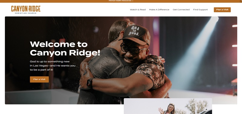
Next, I took a look at Canyon Ridge Church’s website.
Just like Declaration Church, Canyon Ridge also chose Squarespace for their website, and it shows in their polished and user-friendly design.
What’s on the Website
- Comprehensive Information: Canyon Ridge Church offers a wealth of information on their site, from service times and locations to details about various ministries and events.
- Engagement Opportunities: They’ve included plenty of opportunities for visitors to engage, including upcoming events, volunteer options, and small groups.
Design Features That Stand Out
- Visual Appeal: The use of engaging visuals and a cohesive color scheme immediately draws you in.
- Easy Navigation: The menus are clear and easy to navigate, ensuring visitors can find the information they’re looking for without any hassle.
- Interactive Elements: Features like event calendars and sign-up forms make the site interactive and user-friendly.
The Overall Experience
Canyon Ridge Church’s use of Squarespace has resulted in a website that’s not just about looking good, but also about providing a welcoming and informative experience for its visitors.
They’ve managed to create an online platform that mirrors the warmth and inclusivity of their physical church community.
Apostolic Church

When I explored the Apostolic Church’s website, my first thought was how crystal clear and straightforward it was.
They’re using Squarespace to build a platform that perfectly marries functionality with spiritual guidance.
What’s on the Website
- Welcoming Atmosphere: The website does a great job at making you feel welcomed. It’s clear they want everyone to feel at home.
- Easy to Find Information: They’ve organized their information so that you can easily find service times, location, and what they believe.
Design Features That Stand Out
- Clear Navigation: The navigation bar is really easy to use. You can find everything you need without any hassle.
- Engaging Visuals: The visuals on the site are inviting. They use pictures of their community, which makes the place feel more personal.
Bay Hope Church
Then, I took a look at Bay Hope Church’s website.
Just like the Apostolic Church, Bay Hope Church has harnessed the power of Squarespace to create an engaging and user-friendly website.
What’s on the Website
- Rich with Information: Right away, I noticed the website is packed with information. Whether you’re looking for service times, ways to get involved, or listen to sermons, it’s all there.
- Community Focus: They put a big emphasis on the community. There’s a whole section dedicated to ways you can dive in and be part of the church family.
Design Features That Stand Out
- Intuitive Design: The design of the website makes it super easy for anyone to navigate. Finding what you want takes practically no effort.
- Vibrant and Inviting Colors: The use of colors makes the website feel vibrant and full of life, which I think really reflects the spirit of the church.
The Overall Experience
Bay Hope Church’s website through Squarespace shows that they’re serious about reaching out and connecting with people.
Every aspect of the site is designed to welcome visitors and provide them with useful information. It’s clear they want to make a positive impact in their community.
Radiant Church
Radiant Church has a website that truly reflects its commitment to creating a vibrant community.
When I first visited their site, I noticed a few standout features:
Design and Layout
- Welcoming Atmosphere: The use of warm colors gives the site a welcoming feel. It’s as if they’re inviting you in for a comforting experience, just as one would expect from a church’s embrace.
- Easy Navigation: The streamlined menu makes finding information straightforward. You can jump to various sections like ‘Times & Locations’ or ‘Ministries’ without any hassle.
- Inspirational Content: The homepage showcases stories of hope and transformation which immediately draw you in and encourage you to learn more.
Functionality
- Event Information: Details about service times and locations are clearly listed, making it easy for newcomers to plan a visit.
- Sermon Access: They provide direct access to the latest sermons, which indicates that they value spreading their message to a broader audience.
- Engagement Options: There’s a clear path provided for those looking to take the next step in their faith or get involved with church activities.
Overall, I’d say Radiant Church utilizes its Squarespace platform effectively to not just inform but also inspire and connect with its audience.
Irresistible Church
As I explored the Irresistible Church website, I immediately sensed that its mission is to engage and welcome individuals looking for a spiritual home.
Let’s delve into what makes their Squarespace website stand out:
Design and Layout
- Modern Visuals: This site boasts contemporary design elements that create a sense of professionalism and progress.
- Inviting Photos: High-quality images pepper the site, offering a glimpse of the church’s vibrant community life.
- Organized Content: Each section flows seamlessly into the next, guiding you on a clear, informative journey through their mission and values.
Functionality
- Resource Availability: Whether it’s blog posts, podcasts, or videos, these resources are just a click away, displaying their dedication to accessibility.
- Community Focus: The focus on small groups and community involvement is prominent, showcasing how visitors can get involved.
- Clear Call-to-Action: Calls to action, like ‘Plan Your Visit’, are prominently displayed, making it simple for newcomers to take the next steps.
Westside Family Church
Visiting the Westside Family Church website, I felt greeted by a sense of community and warmth. Here’s what stood out to me:
What’s on the Website
- Community Feel: The website makes it clear this church values family and community. You can sense the fellowship they offer.
- Easy Navigation: Finding information is super easy. Whether you’re looking for service times or ways to get involved, it’s all just a click away.
Design Features That Stand Out
- Welcoming Design: The design is simple yet effective, making you feel welcome.
- Clear Messages: The church’s mission and values are communicated clearly, making it easy to understand what they stand for.
The Church RB
Next, I took a look at The Church RB’s website. Right off the bat, it’s clear that they’ve put a lot of thought into making their website helpful and engaging.
What’s on the Website
- Informative Content: The site is filled with useful information about church services, upcoming events, and how to get involved.
- Focus on Community: Just like Westside Family Church, The Church RB puts a strong emphasis on community building and outreach.
Design Features That Stand Out
- Vibrant Visuals: The use of bright and engaging visuals makes the website not just informative, but also pleasing to the eye.
- User-friendly Layout: The layout of the website is user-friendly, ensuring visitors can easily navigate through the different sections.
Engage Church
Finally, I visited the Engage Church website. This website stands out for its modern approach to connecting with its community online.
What’s on the Website
- Modern Approach: Engage Church takes a modern approach to its online presence, with a sleek design and current technology.
- Easy Engagement: The website makes it straightforward to engage with the church, whether through listening to sermons online or finding out about community groups.
Design Features That Stand Out
- Sleek Design: The design is modern and sleek, which likely appeals to a younger audience.
- Engagement Tools: The website offers various tools to engage visitors, from sermons you can listen to online to information about joining community groups.
Engage Church showcases how a church can use Squarespace to not only inform but also engage and attract a contemporary audience.
FAQ Section: Squarespace Church Websites
Why should my church consider using Squarespace for our website?
Squarespace offers a solution that is as straightforward as it is robust. It’s like your favorite pie recipe – simple ingredients, easy-to-follow steps, but the result is deeply satisfying and serves everyone just right. Plus, with Squarespace, you get design flexibility, intuitive editing tools, and excellent customer support. For churches, this can mean an inviting online presence that effectively connects your congregation and newcomers alike.
Will my Squarespace church website be mobile-friendly?
Absolutely! Squarespace ensures that your website will look great on any device – smartphone, tablet, you name it. It’s like having a website tailor-made to look good no matter what outfit (device) your visitor is wearing. This is important as more and more interactions are happening on mobile devices. By having a mobile-responsive site, you can be sure that anyone can connect with your church at any time, from anywhere.
Can I post my church’s sermons on our Squarespace website?
You bet! Posting sermons is a piece of cake with Squarespace. You can either upload audio files directly or embed video sermons from platforms like YouTube. Imagine your website as a digital pulpit, democratizing access to your teachings whenever and wherever it suits your audience. It enhances accessibility and ensures that your messages reach a wider audience, even beyond your regular Sunday congregation.
How about managing donations on my Squarespace church website?
Totally doable! Squarespace allows for simple integration with leading donation tools. It’s kind of like passing the offering plate during service, but in this case, the service is your website, and the offering plate is just a click away, 24/7. This makes giving more convenient for your congregation, helping to increase your church’s financial support.
What if we want to host events. Can Squarespace handle calendar integrations?
Yes, it can! Squarespace can integrate with an array of popular calendar tools, so keeping your congregation informed is as simple as marking a date. Think of your website as your church’s personal secretary, diligently announcing all upcoming events and even sending out reminders. This makes things a lot easier for your community as they’ll be able to stay updated about all church activities.


Leave a Reply