My content is reader-supported by awesome people like you. Which means I could earn a commission. Learn more here!
If you’re in the research phase of possibly building out a blog you’re in the right spot.
Most likely you’re searching for things like…
- Blog examples built on Squarespace
- Squarespace blog examples
I’m thinking…
These Squarespace blog examples should really give you some awesome design ideas and structuring of your blog.
Let’s get started check these out.
Meiwen See’s Journal
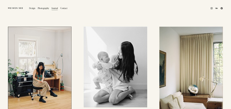
Meiwen See’s Journal is a beautiful blog by a photographer who loves to share her adventures, thoughts, and experiences through her lens.
As I looked around, I noticed a few things that made this website really captivating:
What the website shares
- Photos from around the world
- Personal stories
- Photography tips
Nice design features
- Big, gorgeous photos that catch your eye right away
- Clean layout, making it easy for you to read and explore
- Soft and welcoming colors that make you feel calm and happy
This blog does a fantastic job at showing off Meiwen’s photography skills and invites you into her world with every post.
Concept Kicks
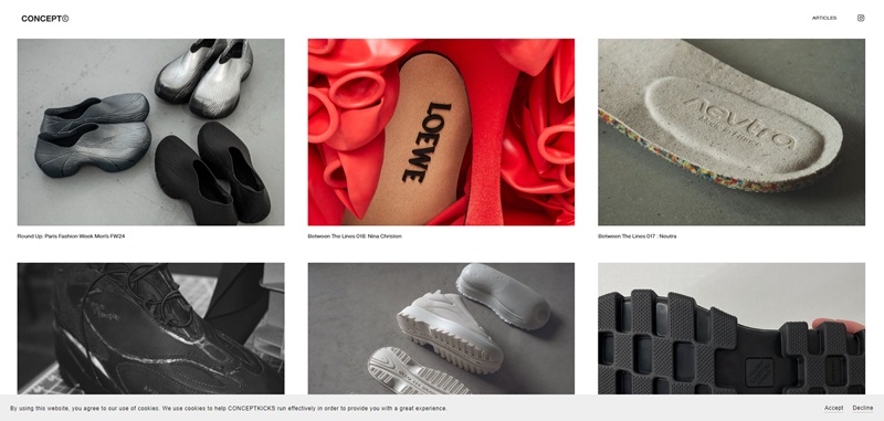
Concept Kicks is a super cool site centered around shoe design and innovation.
It’s not just any shoe blog;
it’s a treasure trove for anyone fascinated by the creativity behind footwear.
What the website covers
- Sneaker designs
- Interviews with designers
- Behind-the-scenes of shoe creation
Nice design features
- Minimalistic design that lets the shoes steal the show
- Easy navigation so you can find exactly what you’re looking for
- Cool contrasts that make the visuals pop
Olivia Bossert’s Blog
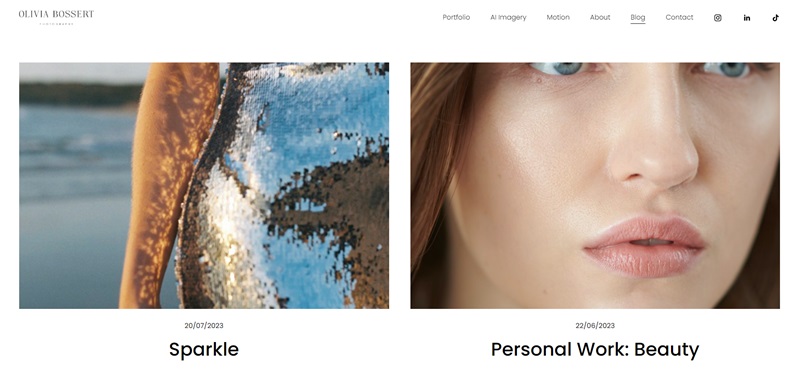
Olivia shares insights from her fashion shoots, advice for fellow photographers, and personal musings on her journey.
What the website includes
- Fashion photography tips
- Personal stories from shoots
- Advice for photographers
Nice design features
- Beautiful, high-quality images that captivate you
- A clean, elegant design that feels very high-end
- Helpful and straightforward categories to help you explore
Olivia’s blog is a wonderful resource for budding photographers and fashion lovers alike, offering a glimpse into the professional world of fashion photography.
A Fork & A Pencil
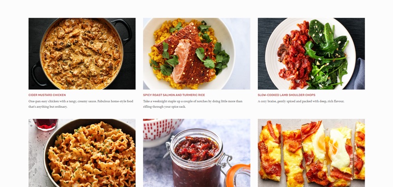
A Fork & A Pencil is where deliciousness lives on the internet.
Imagine a place filled with recipes that can transform your kitchen into the hottest restaurant in town.
I took a look, and here’s what I found:
What you’ll discover on the website:
- A variety of recipes like Cider Mustard Chicken and Coconut Saffron Mussels
- Suggestions for quick meals, such as Flatiron Steak and Bok Choy
- Potions for those who love to bake, featuring treats like Macadamia Cake and ANZAC biscuits
Features that make the design stand out:
- A simple, clean layout that makes finding recipes a breeze
- Amazing looking photos that will make your mouth water
- Neatly organized categories that let you pick the kind of recipe you need, fast
This blog knows a thing or two about making food shine, not just on your plate, but on your screen too!
Kendra For Now
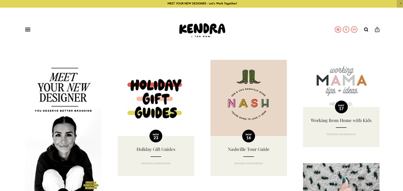
Kendra For Now is like stepping into a world of creativity and art that’s always fresh.
The blog is curated by an artist, and it feels like walking through a vibrant art gallery.
What Kendra shares with the world:
- Her journey as an artist
- Splendid artworks and projects she’s working on
- Personal insights and stories
Design elements I appreciate:
- A bold and artistic feel that reflects Kendra’s style
- Intuitive navigation that guides you through her art world
- A focus on visuals that showcases her work beautifully
Kendra’s space on the web is like a live gallery exhibit that’s accessible with just a click.
Ben Evans
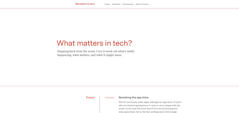
Ben Evans’ blog is like opening a book filled with images that tell stories.
He is a photographer, and his blog is a collection of moments captured through his lens.
Inside Ben’s photographic diary:
- Breath-taking snapshots from different corners of the globe
- Insights into his photography projects
- Lessons and tips for fellow photography enthusiasts
Why the design is photo-perfect:
- The pictures are front and center, so you see the world through Ben’s eyes
- It’s easy to wander from one photo to another, just like exploring a museum
- The site design is all about clean, uncluttered spaces that let the images speak
Ben creates a window to the world with his photos, and it’s a view you wouldn’t want to miss.
Kelsey O’Halloran’s Blog
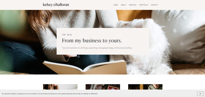
Kelsey O’Halloran’s Blog is like a warm, inviting place where stories come to life.
Kelsey shares tales from her own life, tips on how to tell your own story, and ways to feel happy and confident in your skin.
What you’ll find on this website:
- Personal stories from Kelsey’s life
- Advice on storytelling and writing
- Tips on personal development
The design features that stand out:
- A clean, inviting design that makes you want to read more
- Bright and cheerful photos that add a personal touch
- Easy navigation, so you can find what you’re interested in quickly
Kelsey’s blog feels like sitting down with a friend who has lots of wisdom and fun stories to share. Now, let’s move on to a blog that will make your stomach rumble with anticipation.
Binging with Babish
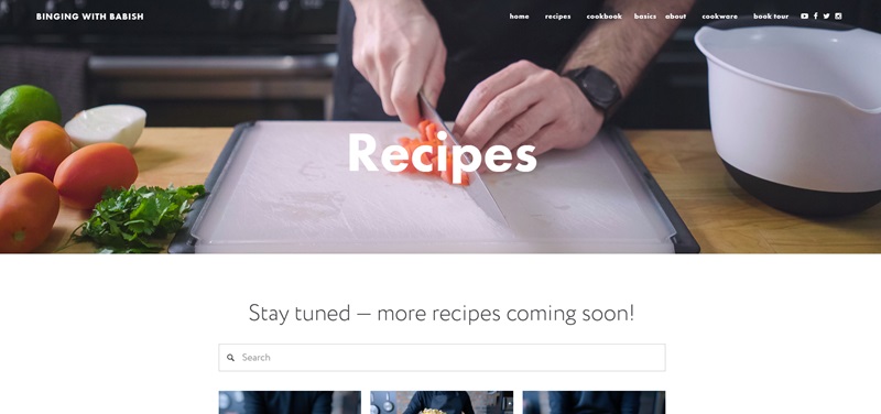
Binging with Babish is where food meets film, and it’s deliciously entertaining.
The blog is run by a guy who recreates meals from movies and TV shows.
So, if you’ve ever wondered what the Krabby Patty from SpongeBob SquarePants tastes like, this is the place to find out.
Here’s what’s cooking on this website:
- Recipes inspired by movies and TV shows
- Step-by-step cooking guides
- Videos that show you how to whip up these dishes
Website design features you’ll love:
- A clean layout that makes it easy to browse through recipes
- High-quality photos that’ll have you drooling
- Straightforward, easy-to-follow instructions for each recipe
Binging with Babish brings your favorite screen meals to your kitchen table, making cooking fun and a bit of an adventure.
Lee From America
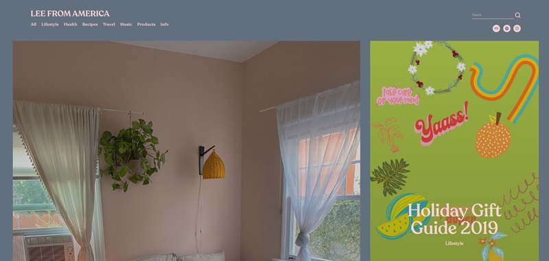
Immerse yourself in a wonderful realm of healthy living, lifestyle, and music with this strikingly designed website.
Simple to navigate yet visually compelling, it’s easy to get sucked into its wealth of engaging content.
Content
“Lee From America” talks candidly about personal and relatable topics.
Whether candidly discussing her journey with eating disorders or sharing her music playlists, the website manages to encapsulate an impressive blend of lifestyle and wellness advice.
There are also guides to destinations like Japan, recommendations on fiction books to read, and some mouth-watering food recipes – all of which look inviting enough to make your stomach rumble.
Design Features
The beauty of this website lies in its simple and clear design. The text is divided into separate blocks, making for easy reading.
I found that sometimes I didn’t even realize I was scrolling – it was that seamless.
Moreover, the site takes advantage of a soothing color scheme, which adds a sense of calm and tranquility as you explore its pages.
ConceptKicks – Design
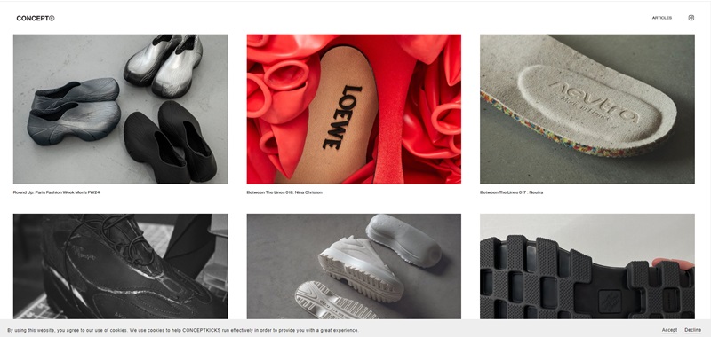
ConceptKicks is a digital platform that bends the usual rules with an eclectic array of content.
It’s mainly focused on shoe designs and features behind-the-scenes peeks into the world of shoe production.
Content
Think of ConceptKicks as a gateway to the world of shoe design.
It showcases smart and quirky shoe design concepts that would make any shoe lover sit up and take notice.
This site lets you in on highlights from famous fashion weeks, editorials of exclusive shoe releases, and names you should know in the shoe industry.
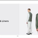
The blog posts like “Between The Lines” series provide insightful talks with the creatives behind the designs you love.
An exciting segment I found was “Starting Five:
Product Highlights” that captured shows you the new drops making waves.
Design Features
The website gives a chic and minimalist vibe. ConceptKicks uses monochrome aesthetics and visuals of shoe designs as the center stage to keep viewers hooked.
The text is neatly presented, making it easy to read and inviting you to explore more.
The website is smartly divided into several sections, making it a breeze to navigate.
The dark mode is a subtly nice touch that adds to the website’s sleek feel and goes easy on the eyes – a feature I find impressive.
Drawing both casual readers and sneaker enthusiasts, ConceptKicks serves as a trusted guide in the incredible world of shoe design.
Supernatural Kitchen – Recipes
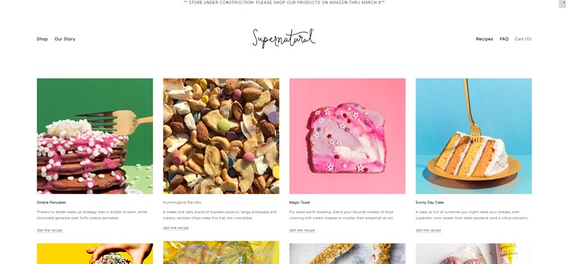
Welcome to a world where food is not just about taste; it’s about color, joy, and health rolled into one.
Supernatural Kitchen brings a vibrant twist to your everyday recipes.
Content
This blog serves up a feast for the eyes and the palate with its unique take on everyday recipes.
You’ll find a variety of treats, from ombre pancakes that brighten up any morning to healthier hot cocoa bombs that wrap warmth and sweetness into one delightful package.
Design Features
The design of Supernatural Kitchen is as delightful as its recipes.
- Colorful and bright, the website design reflects the joyful essence of the content it holds. The vivid pictures of food pop against the clean, white background, making everything look even more tempting.
- Easy navigation ensures that you can find your next favorite recipe without any hassle. Categories are laid out clearly, so whether you’re in the mood for a drink, a snack, or something sweet, you’re only a click away from diving into a recipe.
- Eye-catching fonts and layouts greet you as you scroll, making the process of exploring recipes as enjoyable as cooking them.
Traveling Mitch
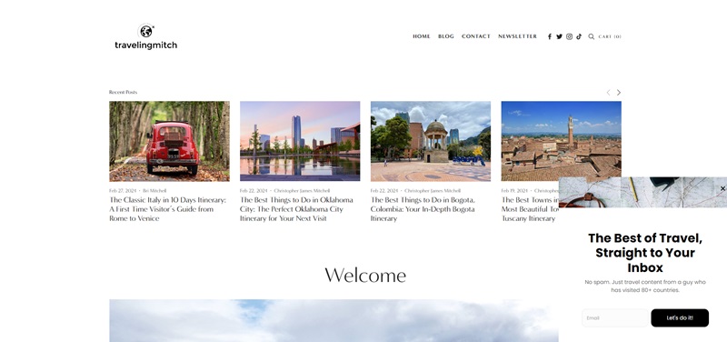
Traveling Mitch is your go-to online buddy for discovering the coolest spots around the globe.
From the romantic canals of Venice to the bustling streets of New York City, this blog has it all.
What’s Inside?
The website is filled with stories and guides that will make you want to pack your bags and explore:
- Exciting City Guides: Learn how to spend 10 amazing days in Italy or find the best things to do in places like Oklahoma City, Bogota, and many more.
- Winter Wonderland Adventures: If you love the snow, check out where to have fun in Quebec City during the winter or the top activities in Niagara Falls for couples.
- Cultural Experiences: Ever wanted to dance your way through Havana or eat your way across Eleuthera, Bahamas? There are guides for that too!
- Nature and Wildlife: From the peaceful gardens of Kyoto to the thrilling excursions in Skagway, Alaska, there’s something for the adventurer in you.
Why It’s Awesome:
- Easy-to-Read Posts: The articles are written in a way that feels like you’re hearing stories from a friend.
- Bright and Beautiful Photos: Every page is packed with photos that capture the beauty of each destination. It’s like a mini-getaway every time you click.
- Travel Tips Galore: You’ll find handy tips for taking ferries in Newfoundland and Labrador or how to make the most of your trip to the Florida Keys.
- Interactive Maps: Sometimes, seeing is believing. The maps included in some posts help you visualize where you’re headed next on your adventure.
I really like how Traveling Mitch takes you by the hand and leads you on an unforgettable journey through cities, cultures, and natural wonders.
This blog doesn’t just tell you about places; it shows you how to embrace every moment while you’re there.



Leave a Reply