My content is reader-supported by awesome people like you. Which means I could earn a commission. Learn more here!
Let’s be honest, capturing the essence of relaxation on a digital platform can be quite tough.
But, we’re here with some spa website examples, ready to inspire your journey.
Each example we will explore is a masterclass in aesthetic coherence, seamless functionality, and most importantly, customer experience.
So, sit back, breathe in the calming scent of inspiration, and prepare for a transformative deep dive.
Let’s get started!
Napa Valley Massage & Wellness
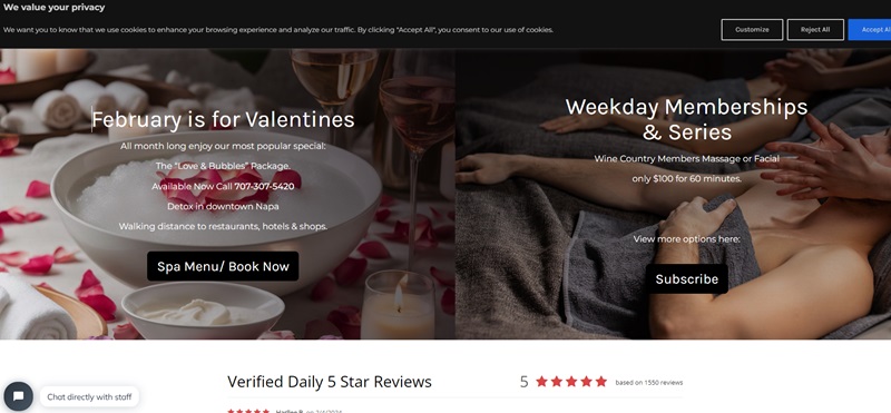
A haven for holistic health, Napa Valley Massage & Wellness offers a wide selection of spa treatments, including massages, facials, and yoga classes. Their website showcases a clean and serene aesthetic, with beautifully organized pages for easy navigation.
The use of engaging visuals, combined with soothing colors and modern web design, perfectly complements the brand’s overall philosophy of relaxation and rejuvenation.
Robert Joseph’s Salon
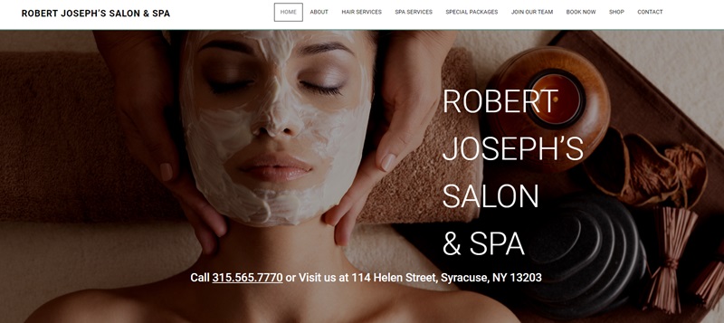
Robert Joseph’s Salon is a sophisticated hair and beauty salon promising a luxurious experience. The website employs an elegant design and color scheme that communicates the salon’s high-end service.
Detailed drop-down menus provide easy access to their services, team bios, and an engaging gallery, offering visitors insight into the salon’s operations and results.
Skin Care Paris
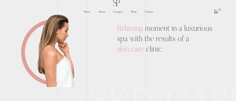
Skin Care Paris presents a skincare line underlining natural beauty and the power of simplicity. The webpage design is notably minimalistic, utilizing a monochromatic color palette that highlights the product photos and information.
Easy navigation and well-placed CTAs (Call to Action) make it effortless for visitors to learn about and purchase the products offered.
Willow Spa
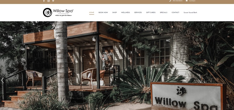
Willow Spa is a wellness spa offering unique restorative treatments inspired by global traditions. Their website is visibly calming, with a judicious use of imagery that evokes tranquility and healing.
The neatly arranged information on various services, along with straightforward online booking options, offers visitors an easy-to-use interface and an inviting virtual version of the serene physical space.
Posada Spa Las Golondrinas
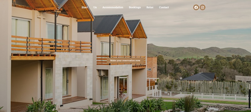
Posada Spa Las Golondrinas is a lavish resort coupled with a fully equipped spa in a dreamy, exotic location. The website effortlessly communicates a sense of escape and relaxation, thanks to its tropical color palette and rich imagery.
The full-width photo banners, inviting descriptions of the services, and user-friendly booking system elevate the website, providing visitors with a sneak peek into the tranquil getaway awaiting them.
La Belle Artistry
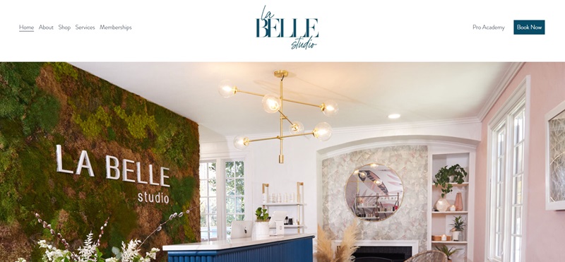
La Belle Artistry offers modern beauty treatments focusing on skincare, eyelashes, and eyebrows. Its website design is prominently clean and classy, showcasing its services and products neatly.
Beautiful images incorporated throughout instantly convey the quality of their offerings. The user-friendly layout and conveniently placed “Book Now” buttons enhance the overall user experience.
Shevet.me
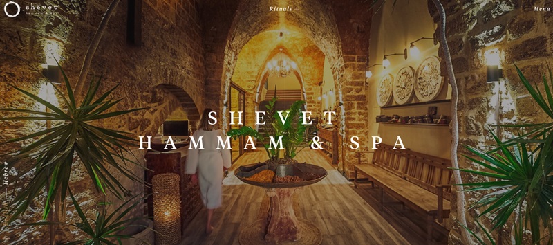
Shevet is a platform dedicated to career mentoring and coaching for individuals and organizations. The website boasts a minimalistic design, with easy-to-read typography and engaging colors.
Direct call-to-action buttons and clear descriptions of services facilitate effortless navigation, while client testimonials enhance credibility.
Ama The Salon
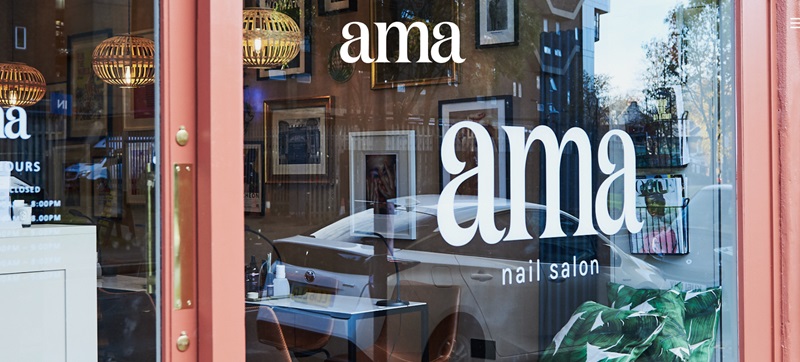
Ama The Salon is a hair salon that promises an inclusive and luxurious customer experience. Their website is visually striking, with a bold color scheme and large images.
It features a simple navigation bar, clear descriptions of the services on offer, and an efficient booking system — crafting an excellent user experience that mirrors the quality of the salon’s services.
Blooming Moon Spa
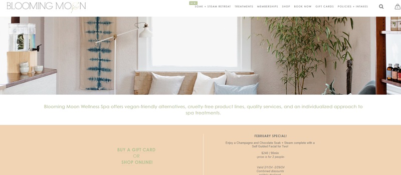
Blooming Moon Spa offers a tranquil wellness and spa experience. Its website echoes this relaxing theme with a subdued color palette, inviting images, and a soft, fluid design.
The site excels in displaying information about the treatments transparently and provides an uncomplicated scheduling feature, for a user-friendly browsing experience.
The Little Owl Spa
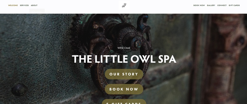
The Little Owl Spa specializes in fostering a serene and personal spa environment. Its website reflects the brand’s ethos through earthy tones, nature-inspired motifs, and elegant typography that exudes tranquility.
Service descriptions are detailed yet straightforward, and the online booking system simplifies the appointment process.
Hazel Salon
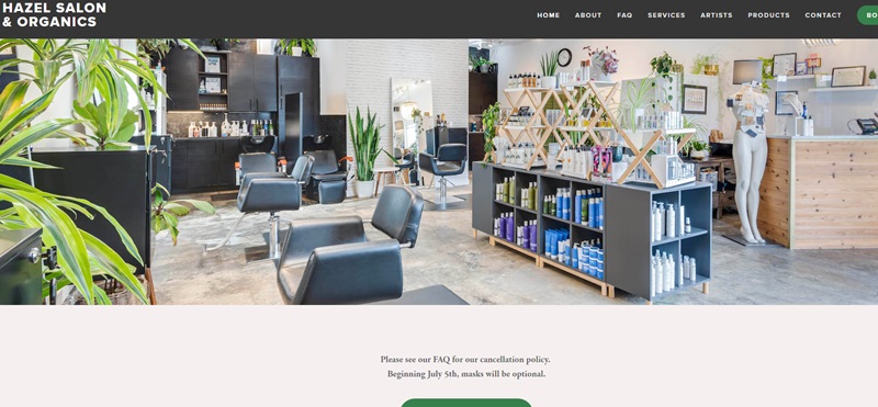
Hazel Salon is a hair and beauty salon in Seattle. The salon’s website, like its service, emphasizes originality and creativity. It features bold imagery, a vibrant eco-friendly color scheme, and a modern layout.
Detailed service descriptions, an online booking option, and an exclusive section dedicated to their team contribute to a browsing experience that’s as enriching as their service offerings.
FAQ On Spa Websites
1. What colors work best for a spa website’s design?
Let’s talk color palettes—it’s like picking the perfect nail polish for your toes! For spa websites, you want hues that whisper “relax, unwind, rejuvenate.” Think muted greens that mimic aloe vera plants, soft blues that remind you of a calming ocean, or subdued grays that bring to mind smooth pebbles lining a Zen garden. Pro tip: Avoid loud colors like neon pink that scream more party than pamper.
2. How important is mobile responsiveness for my spa website?
As essential as sunscreen on a beach day! Nowadays, everyone’s glued to their phones—even in the sauna! A mobile-responsive design ensures your spa’s website looks fabulous on any device, keeping the user experience as smooth as a hot stone massage. Google loves mobile-friendly sites too, so expect some SEO brownie points for getting this right!
3. Should my spa website include an online booking system?
Absolutely—because convenience is king (or queen)! An online booking system is like your digital receptionist, available 24/7. Think about your own habits; won’t you prefer to book that stress-releasing deep tissue massage with a click instead of calling in? Plus, it helps streamline your operations, and, let’s be honest, it’s a tiny bit fancier.
4. What type of content should I feature on my spa’s website?
Content on a spa website should be as enriching as the spa experience itself. Share sensuous descriptions of your services, introduce your therapists with warm bios, and definitely offer a menu of services that’s easy to peruse—think of it as your website’s skincare routine. Oh, and high-quality images? They’re the essential oil of website content, making everything better!
5. How important are customer testimonials on spa websites?
Testimonials are like trusted friends telling the world how great you are—they’ve got your back! Sharing glowing reviews on your website not only showcases customer satisfaction, but it also builds credibility. It’s like showing off your collection of ‘Best Spa of the Year’ awards—everyone wants in on that goodness!
6. Can a blog benefit my spa’s website SEO-wise?
Yes, a blog can work like yoga for your SEO—strengthening and expanding your website’s reach. Regular posts with helpful content, from wellness tips to the benefits of various spa treatments, can engage readers and keep them coming back for more. Plus, well-crafted blog content can help your website rank higher in search results, making sure your spa stands out like a shiny, well-oiled…seriously, a blog helps.
7. What’s the best way to showcase my spa’s amenities and services online?
Picture your website as a virtual tour of your spa. High-quality images are your best friend here—they give visitors a sneak peek into the sanctuary that awaits. Also, videos are like virtual test drives for potential guests; they allow people to experience your spa’s atmosphere before they book. And don’t forget snappy, descriptive service listings—make readers feel the relaxation leap off the screen!



Leave a Reply