My content is reader-supported by awesome people like you. Which means I could earn a commission. Learn more here!
Have you ever looked at your favorite coffee shop’s website and thought, “I wish my small business had a website like that!”?
It’s not just about looking snazzy, it’s also about making your business easy for folks to find and explore.
Welcome to our power-packed guide of small business website examples.
This ain’t your run-of-the-mill list.
Nope, we’re doubling down on real-life, kickstart-your-imagination types of examples that help small biz owners like you create an engaging online presence.
We won’t stuff you with tech jargon, just the good, clear stuff that you can use to amplify your brand.
Dive in as we unpack winning features, spill the secrets of what makes these sites stand out, and give you the low-down on the competition.
You’ll also get a peek into experiences from folks who’ve nailed the small business website game.
Think about this as your magic roadmap to small business website genius.
By the end, you’ll be filled to the brim with ideas and action steps to transform your online storefront into an irresistible spot for your customers.
Ok, let’s check them out!
One Choice Roofing
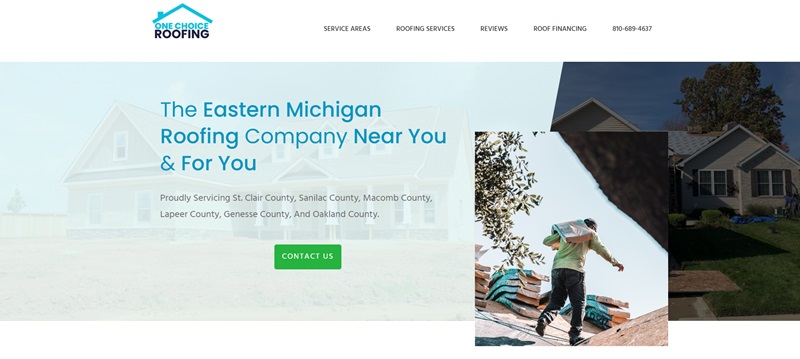
One Choice Roofing is a company focused on providing roofing services in the eastern Michigan region.
The website elegantly combines practicality with aesthetic appeal.
Description of the Website and its Features
- Focus on Services: The main purpose of the website is clearly shown. It’s about roofing services, and they’re all about helping you with your roof.
- Authority and Trust: The website helps to create trust with visitor reviews and blog posts available. These elements share experiences from previous customers and provide useful tips about roofing.
- Easy Navigation: With clear links to service areas, contact information, and a frequently asked questions section, users can find what they need quickly.
- Visually Clean and Direct: The design is minimalistic, with a cool color scheme. This allows the focus to remain on the content, making it easier to understand and flow from one part to the next.
Lions Share Digital Marketing
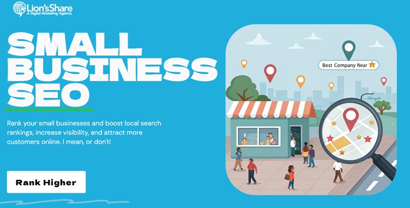
Lions Share Digital Marketing is a website designed to promote their small business SEO services and information.
This website is a showcase of the creative and technical skills offered by the company.
Description of the Website and its Features
- Informative: The website informs about their marketing services, expertise, and projects they have taken on. It’s like their digital portfolio.
- Engaging Visual Design: The use of colorful graphics and animations provides a visual feast and grabs visitor’s attention.
- Easy to Navigate: Important information is never more than a couple of clicks away, thanks to well-structured menus and links.
- Call to Action: The website makes it easy to get in touch with them. It’s clear, concise, and persuasive.
Bennett Tea
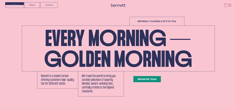
Bennett Tea is a website that caters to tea lovers everywhere, offering a selection of premium tea and related products.
It’s a digital tea shop that invites the visitor to explore.
Description of the Website and its Features
- Product Focused: Products are the star at Bennett Tea. High-quality images and detailed descriptions let visitors know exactly what they are buying.
- Easy Purchase Process: Clear pricing, an intuitive shopping cart, and secure payment options make the buying process a breeze.
- Engaging Design: The website engages with a warm, inviting color palette and fonts that read like a handwritten note, creating a cozy and inviting atmosphere.
La Petite Alice
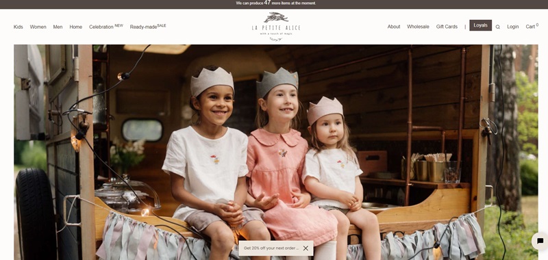
La Petite Alice is a unique online boutique offering handmade, eco-friendly kid’s clothing, and accessories.
It’s an online fairytale shop that meets an online clothing store.
Description of the Website and its Features
- Showcasing Products: The spotlight is squarely on the beautiful products, with high-resolution photos of handmade clothing and toys.
- Easy to Order: The website offers a simple, straightforward online shopping experience, with multiple payment options available.
- Engaging Storytelling Design: The site features a charming and whimsical design, perfect for their target market of children and parents. The fairy-tale theme helps create a sense of wonder and joy.
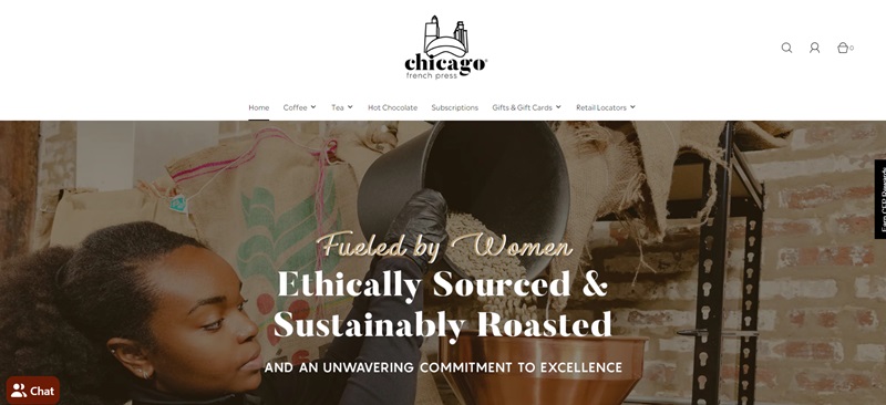
Chicago French Press
This website is all about coffee! It takes you deep into the world of caffeine-packed beverages and introduces you to the art of making coffee.
They sell tasty coffee, and delightful tea, and even have a hot chocolate selection.
They raise the bar even more by selling items like gift cards and merch.
Here’s what sets this website apart:
- User-friendly structure – The links to their different products (like coffee, tea, hot chocolate) are easily visible and accessible right from the homepage.
- Engaging visuals – Their photos are high quality, showing close-ups of their flavorful products.
- Interactiveness – Social media icons are on every page, allowing users to follow and interact with the brand on different platforms.
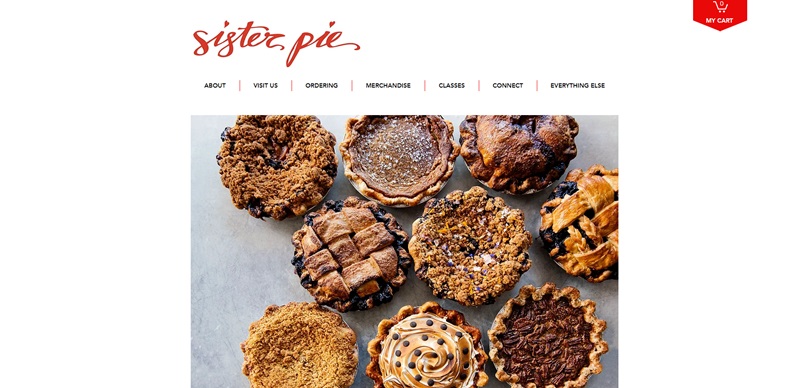
Sister Pie
Are you in the mood for a mouth-watering, crumbly, deliciously sweet pie?
Look no further, Sister Pie’s got you covered! T
hey offer a wide selection of baked goods that are hard to resist.
With their menu showcasing pies, cookies, and other treats, it’s a little slice of heaven for anyone with a sweet tooth.
What makes this website stand out:
- Stunning visuals – The high-resolution pictures show their baked goods in all their glory, tempting customers to take a bite.
- Simple design – The clean, uncomplicated design makes the site easy to navigate.
- Transparency – Sister Pie shares its story and values clearly, building a strong connection with users.
Little Karma Co.
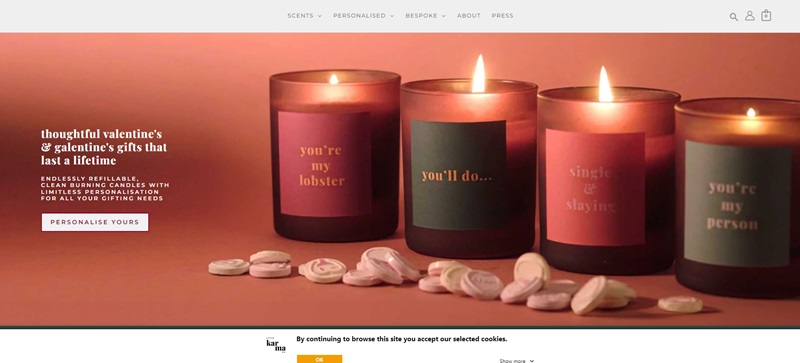
This unique site, the Little Karma Co., has a clear mission to spread positive vibes.
Their products include feel-good candles, thoughtful gift boxes, and postcards — dream items for anyone looking to boost their spirits or spread joy to others.
Website Design Features
What makes this site sparkle:
- Minimalist design – The simple layout makes it easier for customers to focus on the products.
- Warm, comforting colors – The website’s color scheme reflects the comforting nature of its products, giving a warm, inviting vibe.
- Easy navigation – The user-friendly setup makes finding and buying products a breeze.
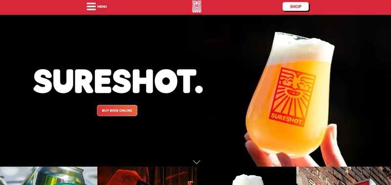
Sureshot Brewing
What is Sureshot Brewing About?
Do you love craft beer? If you do, Sureshot Brewing is like a dream come true for you.
They’re all about making tasty, high-quality beer.
And they want everyone to have fun while enjoying their brews.
They’ve got all these cool kinds of beer, like pale ale and porter, and they’re brewing them right in the heart of Manchester.
Let’s talk about the cool things you’ll see on their website:
- Happy Colors: When you visit their site, you find lots of bright, happy colors. It’s like walking into a party.
- Super Easy Menu: Finding your way around is a piece of cake. They have links to different pages, like “About” and “Shop,” that are big and clear.
- Fun to Shop: Shopping for beer online is really easy on this site. You click on “Shop,” and boom, there are all the beers, waiting for you.
- Stay in the Loop: They have a newsletter that tells you all the exciting news, like special discounts and new beer releases. And they promise not to flood your inbox.
Wildwood Bakery
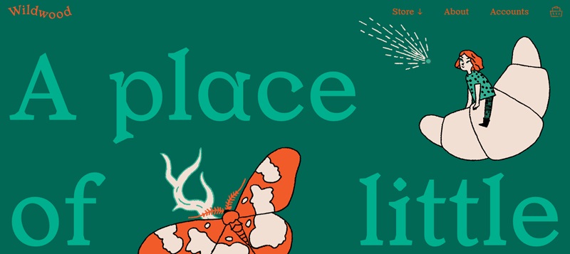
If you’re after delicious bread and sweets, Wildwood Bakery should be your next stop.
They whip up all kinds of baked goodies that you can almost smell through the screen.
Whether you’re a bread buff or a pastry fanatic, there’s something here for you.
Here’s what’s cool about their website:
- Delectable Imagery: The site usually would have photos of their baked creations that look so good you’ll want to reach through the screen.
- Crystal Clear Info: They make sure you can find everything you need to know, like how to order and where they are, without any trouble.
- Community Vibe: They often share stories or local events, which makes you feel like you’re part of the Wildwood family.
BDSM Architecture
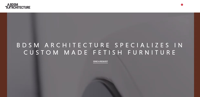
BDSM Architecture isn’t afraid to push the boundaries.
They focus on edgy and innovative building designs.
If you’re someone who thinks buildings should be anything but boring, their projects might just blow your mind.
Check out these sleek parts of their site:
- Fancy Project Portfolio: Their site would typically show off all the awesome buildings they’ve designed.
- Slick Professional Look: Expect a website that’s as polished and sharp as the designs they’re showcasing.
- Get in Touch: They make it super simple for you to reach out if you want to start a project or just have a question.
The Commons Detroit
What The Commons Detroit is All About
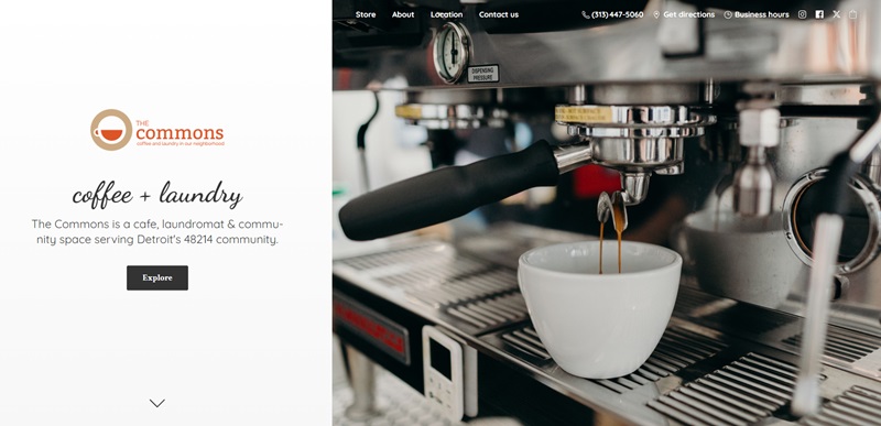
The Commons Detroit is a super cool spot where you can wash your clothes and chill with a cup of coffee at the same time.
They serve the 48214 community, and they’re all about bringing people together.
Whether you need to do laundry, grab a bite, or just hang out, they’ve got you covered.
Here’s what makes their website really stand out:
- It’s Simple: Navigating their website is really easy. You can find everything you need without any trouble.
- Inviting Colors: The website uses welcoming colors that make you feel right at home.
- Delicious Menu: They list all their tasty drinks and eats with prices, so you know exactly what temptations await.
- Tons of Info: They tell you their hours, location, and contact details so you can plan your visit without any guessing.
- Community Focus: The website shares how they love bringing neighbors together, which feels super nice.
- Shop on the Site: They’ve got an online store where you can buy cool stuff like mugs and gift cards.
Gatefoot Forge
What to Expect at Gatefoot Forge
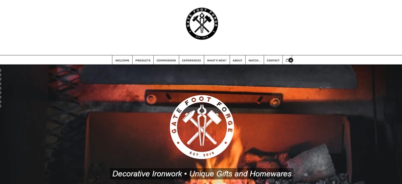
The owner, a blacksmith, turns iron into beautiful things, like gates and sculptures. They also offer classes for people who want to learn how to work with metal.
Cool Design Features You Might Find
- Pictures of Artwork: The website likely has photos of the metalwork, which is awesome to see.
- Details on Blacksmithing: It probably tells all about how they make things, which is interesting.
- Workshops and Learning: They might let you know how you can get your hands dirty and learn blacksmithing.
Eat Banza
Dive Into Eat Banza
Eat Banza is all about making food that’s both yummy and good for you. They make pasta, pizza, and rice out of chickpeas! So, if you’re trying to eat better or need gluten-free options, this could be a great choice.
Neat Parts of the Eat Banza Website
- Colorful and Fun: Their site is probably full of bright colors and fun shapes that make you happy just looking at it.
- Easy Recipes: They possibly show you how to make great meals with their products.
- Nutritional Info: If you care about what you eat, they sure give you all the health details on their food.
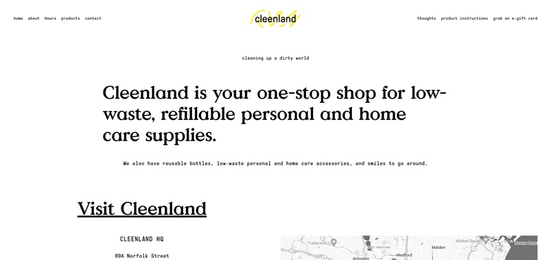
Cleenland
Cleenland is a super cool one-stop shop that’s committed to making our world a cleaner place. They specialize in low-waste and refillable supplies for you and your home. Want to do your bit for the planet while buying high-quality products? Cleenland’s got you covered! What’s more, they even have paperless e-gift cards for the eco-minded shopper. Not to mention, they’re always ready with a smile!
Here’s why their website stands out:
- Simplicity: Their site is incredibly easy to get around. You can find home supplies, personal care items, and gift cards with just a few clicks.
- Earth-Tone Aesthetics: They utilize muted, earthy colors, reflecting their eco-centric ethos.
- Informative: They keep their customers informed about their newest products through a newsletter.
- Mask Policy: Concerned about health and safety while shopping? They’ve included their current mask policy clearly on the site, along with any updates.
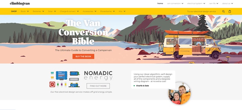
Climbing Van
Climbing Van is all about the love of – you guessed it – climbing and vans! Imagine a site where van enthusiasts and climbing lovers unite. They’d show you how to make a van your perfect mobile climbing partner, with the coolest modifications and gear.
Sweet Parts of the Climbing Van Website
- Pictures: Expect to see vans and climbing gear in action.
- Tips and Advice: They’d give you the low-down on converting your van and selecting the right climbing gear.
- Community Connect: They’d likely have forums or sections where van-lovers can exchange tales and tips.
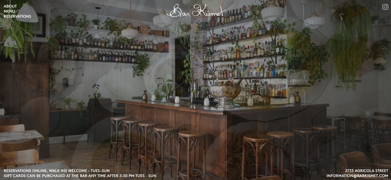
Barkismet
Dive Into Barkismet
Barkismet beckons to all art-lovers. Here, beauty meets creativity in a splendid showcase of art. An art boutique to delight your senses, this could be your source for the unique pieces that bring your space to life.
Cool Aspects of the Barkismet Website
- Art Showcase: Their site would include a beautifully curated gallery of artwork.
- Smooth Navigation: Ease of browsing is essential when you’re exploring art. Expect clear, simple menus.
- Information: You’d get the story behind each work of art, the inspiration, the emotion, and perhaps even glimpses into the artists’ minds.
Ladies Get Paid
What’s Ladies Get Paid All About?
Ladies Get Paid is all about helping women do awesome in their jobs and with their money. They give you the tools to grow your career, ask for the pay you deserve, find new jobs, and save up that cash. It’s cool because they’re supporting a lot of women — 45,000 of them — with this powerful info.
Cool Website Features
- Bright and Bold: The site uses colors that really stand out and grab your attention.
- Newsletter Signup: They have a newsletter that keeps you updated with all their latest tips and tricks.
- Community Feeling: As soon as you hop onto the site, you feel like joining a sisterhood that’s all about lifting each other up.
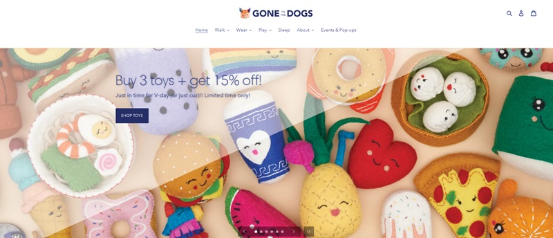
Gone to the Dogs
What You’ll Find at Gone to the Dogs
Gone to the Dogs is a special place for dog lovers. Imagine a website filled with stuff just for pups. They could offer treats, toys, or maybe even cool clothes for dogs. They probably also share happy stories about dogs and the joy they bring into lives.
Features That Make the Website Pawsome
- Puppy Pictures: They’d showcase adorable photos that’ll make you say “aww.”
- Easy to Shop: Finding what your dog loves should be quick and simple.
- Good Vibes: The site would radiate warmth and love for all things canine.
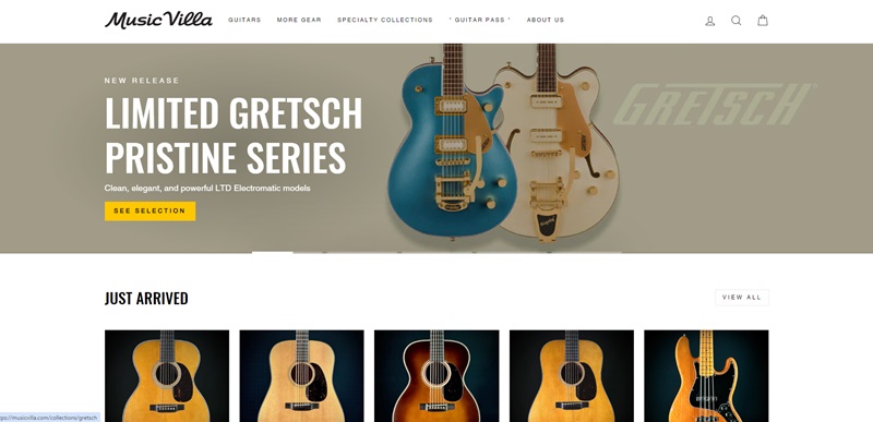
Music Villa
Tune into Music Villa
Music Villa rocks out with all the sweet gear you’d want if you play music. Expect guitars, drums, and maybe even keyboards. They’d be ready to help you choose your next instrument or find the perfect accessory for the one you already own.
Rhythmic Website Design Elements
- Hear the Music: The site likely has videos or sound clips so you can hear what the instruments sound like.
- Cool Deals: They probably have sales or special offers that make you happy about saving money on gear.
- Learn and Play: They might offer lessons or tips to improve your playing skills.
Small Business Website Design FAQ
What’s the best layout for small business websites?
When you’re whipping up a layout for a small business website, think about keeping it user-friendly and straightforward. You want your visitors to find what they need quick — like the menu at your favorite cafe. Place your contact info up top, have a clear navigation bar, and include call-to-action buttons that pop! Oh, and make sure your homepage tells your story at a glance.
How important is mobile responsiveness?
Look, practically everyone’s glued to their phones these days, so your site absolutely needs to look great on them. If your website is a bumpy ride on mobile devices, visitors are going to bounce. Make sure your design adjusts smoothly to all screen sizes.
What kind of photos should I use?
Real talk: use photos that tell your story like a comic book. Pictures of your actual team, your products, or your store in action are like gold. Stock photos? They can work in a pinch but think more about a homemade pie versus store-bought. Do you feel me? Authentic snaps connect with people way better.
How often should I update my website’s content?
Treat your website like a garden — it needs regular care. Keep your content fresh and up-to-date. Add new products, blog posts, or customer testimonials at least monthly. It keeps people coming back to see what’s new, just like a new episode of a hit show.
What features are must-haves for a small business website?
Must-haves? You’ve got to pack in an intuitive layout, captivating content, easy navigation, and swift load times. Throw in some customer reviews, and an FAQ section like this, and dang, you’ve got something going. Remember, online forms and a strong call-to-action are a nice touch..
Should I start a blog for my small business website?
Starting a blog is like opening a diary for your business. It’s a big yes! It’s your chance to share tips, news, and stories that make your business stand out. Plus, blogs are great for SEO — that’s like the compass that helps folks find you in the ocean of the internet.
How do I make my website show up in Google searches?
Getting your site to show up in Google is all about SEO, which stands for Search Engine Optimization. Use keywords that match what your customers are searching for, create engaging content, and make sure your site loads quickly. Oh, and get some reputable sites to link to you — it’s like having good references for a job interview.
Can I make a small business website myself?
Sure, you can totally DIY it. There are tools out there that are as helpful as a Swiss Army knife. But remember, sometimes you need a pro to get that polished look. It’s like the difference between a self-haircut and one from a stylist. If you’ve got the skills, go for it. If not, it might be worth investing in a professional designer.





Leave a Reply