My content is reader-supported by awesome people like you. Which means I could earn a commission. Learn more here!
I get it you want some simple and probably beginner-friendly website examples to help give you some ideas so you can start.
So:
You are searching for terms like:
- Simple website examples
- Simple websites for inspiration
- simple website design examples
Regardless you’re looking for some websites that are simple most likely to help build yours.
Let’s go ahead and check some out right now to help you out.
Want To Try Making One Similar? (Here Are A Few Options)
Maybe you don’t, but if you do here are some things I’d would do.
| Try the platform they are built on | This may be quite obvious but log in and check out the templates to see if one is similar. If you still aren’t seeing one contact them and show them the example. They might help you out. |
| Consider Wix AI | Wix has done a good job with their AI website builder method. So what you could do is go to the Wix AI builder and the first question will ask you your “design goals” I put in a prompt that stated “Build me a website similar to the design of (Whatever website URL example you like)” then it will generate some ideas. I felt my design wasn’t bad and it let me regenerate it if I didn’t like it. It let me do it for free too which is nice. |
| Try Hostinger | Another AI option is where you can input prompts such as the same I mentioned in Wix above. Seems great for simple and clean website ideas. |
Movement Lab
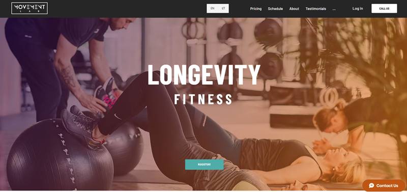
Let me guide you through what the Movement Lab website is focused on. Imagine if you combine personal training with the energy of a group workout.
That’s exactly what Movement Lab offers.
In Vilnius, they are known for creating a unique workout environment where you work out in small groups, which helps trainers give everyone the attention they deserve.
Fantastic Features of the Website:
- Simple Navigation:
- The website makes it easy to find what you need. You can learn about their prices, class schedules, and the team with just a few clicks.
- Everything is organized so that finding information is fast and easy.
- Inviting Design:
- The website’s design is welcoming. Soft colors and clear images show you what the gym looks like, so you can feel excited about visiting.
- Photos of happy people exercising give you a peek into the positive atmosphere they have.
- Clear Contact Information:
- You won’t get lost trying to find out how to reach them. The site gives you their email, phone, and address right at the bottom of the page.
- Real People, Real Stories:
- Testimonials from members share how much they love Movement Lab. When you read their stories, it helps you see that this place really cares about its community.
- Health and Happiness:
- Health is a big deal here. This place doesn’t just want you to look good; they want you to feel strong, confident, and full of energy.
- They’ve got special programs like semi-private training, where you get a blend of personal and group training benefits.
- Get to Know the Team:
- The coaches have their own section, where you get to know them a bit. It’s great to see who will be guiding you before you even start.
When you visit the site, it’s clear that Movement Lab prioritizes quality, health, and well-being.
The way they lay out their website reflects the thoughtful approach they take towards fitness.
It’s not just a gym;
it feels more like a community where each person really matters.
Melula
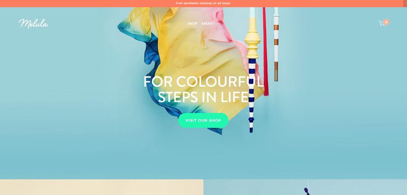
When you visit Melula’s website, the first thing you notice is how colorful and playful it is.
What the website is for:
- Melula is a brand based in Copenhagen.
- They make fashion for kids, and it’s really fun and bright.
- Their shoes are for everyone because they don’t pick colors just for girls or just for boys.
- Everything is designed in Denmark but made in Portugal.
Nice design features of the website:
- Colorful Background: Right away, the website shows lots of colors, which feels happy and full of life.
- Easy Navigation: It’s simple to look around with a clear menu to shop and learn more about Melula.
- Photos and Stories: There are pictures and stories that help you get to know them better.
- Free Shipping: A great thing is they’ll send your shoes anywhere in the world without extra cost.
It’s nice how Melula shares its story on the site, and they invite you to join them with updates if you share your email, but they promise to keep your email safe.
Plus, they make sure we know they’re thankful when you sign up. I
t’s refreshingly open and friendly!
Overall, the Melula website is very welcoming with its bright colors, and it makes shopping for kids’ shoes exciting.
Florian Matthias
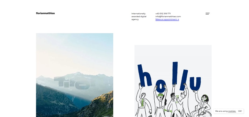
When I dive into the world of Florian Matthias, I step into a creative space where digital magic happens.
This is a place for those who want their brand to shine online, and it’s clear from the start that they’ve got the chops to make it happen.
What’s the site for?
- Pushing brands into the spotlight: They use a mix of strategy, design, and programming to help brands look their best on the web.
- Digital Relaunch and E-Commerce: They’re not just about looks – they help businesses sell stuff online too.
- Winning trophies for their work: They’re proud of their glittering awards cabinet, stuffed with international prizes.
Design Aspects That Catch Your Eye
- Bold statements: As you enter the site, you’re greeted with confident claims of their international acclaim – it sets the bar high.
- Clean and clear layout: Information is neatly organized – there are no wild goose chases to find what you need.
- Showcase galore: They let their projects do the talking with a gallery that displays their prowess.
- Ease of contact: Getting in touch with them is a breeze. A simple form or a direct email option is always just a click away.
Bedow
At first glance, Bedow’s website telegraphs that they are artisans of design.
From Stockholm, they spread creativity as a design studio focused on brand storytelling through design and packaging.
What’s the site for?
- Artful design storytelling: Bedow captures brand narratives and turns them into visual treats.
- Packaging with punch: They craft packaging that stands out on any shelf.
- A boutique of creative projects: Their portfolio showcases a caravan of brands they’ve worked with, each with its unique tale.
Design Features That Shine
- Minimalist elegance: Their website embodies the “less is more” philosophy, with a design so clean it sparkles.
- Engaging navigation: Exploring projects on the site feels like flipping through a designer’s sketchbook – intuitive and full of surprises.
- Vibrant visuals: They don’t stand still – with every scroll, you find bright, bold images that pop off the screen.
ETQ Amsterdam
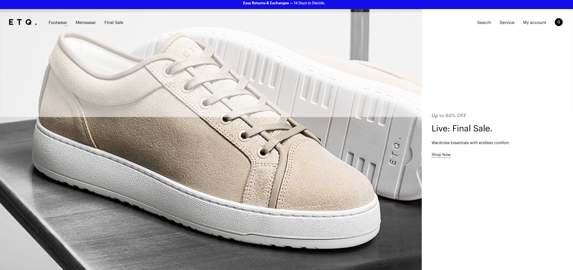
ETQ Amsterdam is a website that sells stylish shoes. They focus on creating high-quality footwear that blends style with comfort.
This brand is especially popular among people who appreciate a minimalist style.
They also emphasize sustainability, which means they care a lot about our environment.
What makes ETQ Amsterdam special?
- Fashionable and Clean Design: The shoes are not only chic but also made to stand up to everyday wear. Their designs are simple but stylish, making them perfect for many different outfits and occasions.
- Focus on Quality: ETQ Amsterdam promises that they use top materials for all their shoes, which helps them last a long time and feel great when you wear them.
Cool website features you might like
Sleek and Modern Look
- The website has a very modern style. It’s clean and straightforward, which makes surfing their site a breeze. You can find what you need quickly.
Excellent Product Displays
- The shoes are displayed clearly with high-quality images from different angles. This helps you see what you’re buying really well.
Easy Navigation
- Navigating the site is really easy. The menu is simple to understand, and you can find different categories like men’s shoes, women’s shoes, and accessories without any hassle.
Eco-Friendly Message
- The site clearly talks about the brand’s commitment to sustainability. This is great for customers who also care about the environment and want to make responsible choices.
Ollivere
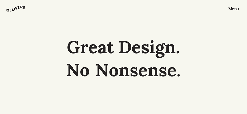
What makes Ollivere.co stand out?
- Simple and Creative Design: Martin loves designs that are easy on the eyes but also pack a punch. His work on the website is a perfect example of this, showcasing how simplicity and creativity can go hand in hand.
- Real Talk Quotes: When you land on the page, you don’t just hear Martin talking about his work. You see real quotes from people who’ve worked with him, praising his skill and reliability. This makes you feel pretty confident that he knows his stuff.
Nice website features that catch the eye
Clear and Straightforward Layout
- The website is super easy to navigate. You know exactly where to click to find out more about Martin and his projects. There’s no confusion or getting lost in too many pages.
Personal Touch
- Martin’s introduction is up front and personal. You quickly get a sense of who he is and what he values in his work.
Portfolio Right on the Home Page
- Right away, you see examples of Martin’s most recent work. This is great because it lets his work speak for itself without making you dig around for it.
Testimonials That Feel Real
- The testimonials on the site make you feel like real people trust Martin’s work. It’s not just about showing off; it’s about building trust.
Ali Two Times
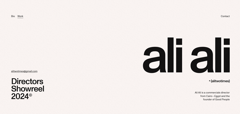
Ali Two Times’ website is a digital playground where artistry meets street-smart style.
This is Ali’s personal portfolio that doubles as a chronicle of his graphic design adventures.
What’s the site for?
- Designer diary: A portfolio that presents Ali’s design journey in vivid color.
- Street art spirit: The website pulses with the energy of graffiti and underground art scenes.
- A mural of multimedia: Ali doesn’t just show images; videos and animations bring his work to life.
Design Features That Turn Heads
- Personality-packed pages: Each page feels like a new mural on the street, bursting with life and defying the mundane.
- Dynamic displays: With animations and interactive elements, the site never lets your attention fade.
- Straight talking text: Ali’s no-nonsense commentary on his work makes you feel like you’re getting the inside scoop from a friend.
Shine
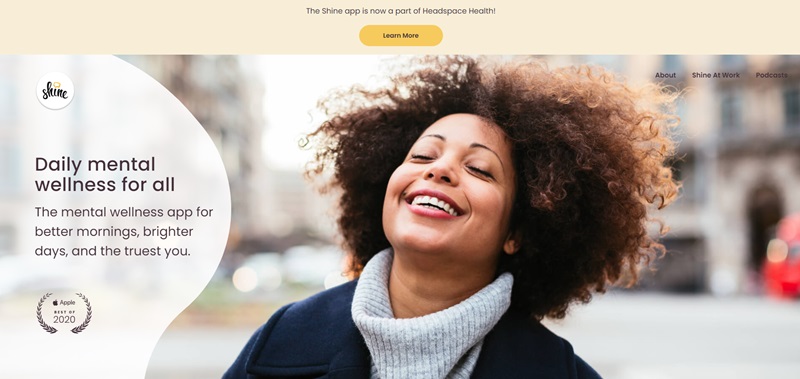
Shine is a special place on the internet where you can start taking better care of your mind.
Apple even said it was one of the best apps in a year!
What’s Shine all about?
- Learn every day: You get to listen and learn something new about taking care of yourself every weekday with the Daily Shine.
- Deep dive into big topics: There are courses that talk about things like how to deal with stress or how to set good boundaries. And guess what? Experts who really know their stuff teach these courses.
- Support just for you: Shine gives you suggestions from over 1,000 meditations. The cool part? These meditations are designed to include everyone.
The website has some neat features:
- Easy to find stuff: The website makes it super easy to find what you’re looking for, which is awesome because sometimes websites can be confusing.
- Looks good on your phone: Not only does the website look nice on a computer, but it also looks great on your phone. So you can check it out when you’re away from your computer.
Lars Tornøe
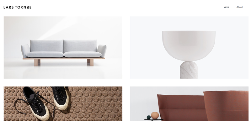
Lars Tornøe’s website is like walking into an art gallery, but for design!
Lars is super talented at creating furniture and lighting that looks amazing and is practical too.
His website shows off all the cool things he’s made.
What’s Lars’s site for?
- Show and tell: The website shows off all the beautiful designs that Lars has come up with. It’s like a digital portfolio.
- Learn about Lars: You can find out about Lars’s story—how he started and what he’s all about.
What’s nice about the website?
- Super stylish: The website has a clean look that makes Lars’s work the star of the show.
- Easy to look around: It’s really easy to find your way around the site and see all of Lars’s designs.
Gubrica
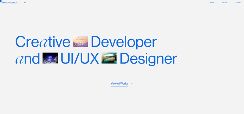
Gubrica’s website is like a digital playground for people who love technology and gadgets.
This site talks all about the latest tech trends and ideas.
If you’re into gadgets and the latest tech news, Gubrica is the place to be.
What does Gubrica offer?
- Tech news: They keep you up to date with what’s happening in the tech world.
- Gadget guides: If you’re thinking about buying a new gadget, Gubrica can help you decide.
Cool things about the website:
- Futuristic feel: The design of the website makes you feel like you’re in the future, which is perfect for a tech site.
- Easy to read: The articles and posts are easy to read, which means you can learn a lot without getting bored.
Convicts
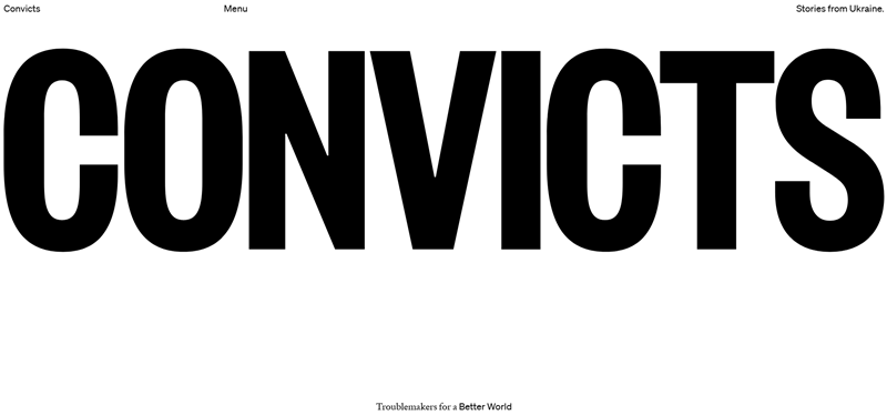
Let me tell you that Convicts is not your everyday website.
Imagine a friend who’s really good at telling stories that grip your heart and make you want to go out and change the world.
That’s Convicts for you. They’re a group of people who believe in making a big splash through the power of storytelling.
What you’ll find on Convicts:
- Purposeful storytelling: They share tales about people and ideas that are shaking up our world for the better.
- Creative muscle: They’re not just talkers; they use their creative skills to make sure these stories hit home.
What makes their website cool:
- Easy to get around: Finding your way through the website is a piece of cake. So young or a bit older, you’ll find what you’re looking for.
- Join the party: They’ve got something called ‘The Cure’, which sounds like a fun way to get a dose of optimism through email.
We Are Motto
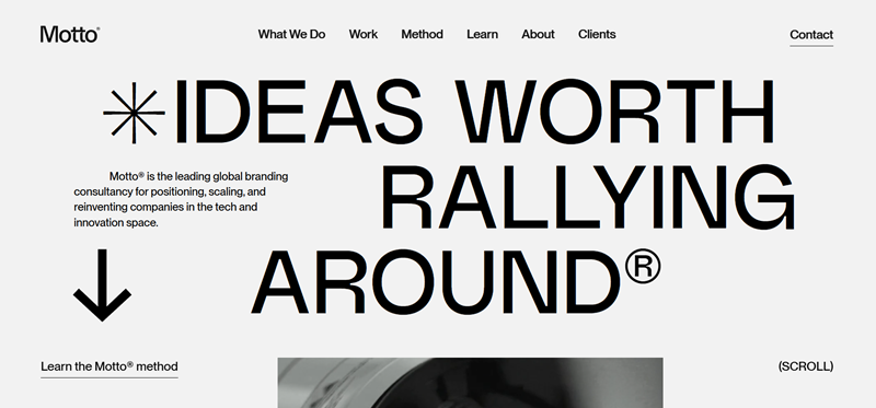
They know just how to help brands stand out and strut their stuff.
Plus, they understand that to make a brand sparkle, you need a super cool plan and design.
We Are Motto gives you:
- Brand transformation: If a brand needs a makeover, these are the go-to folks. They’re like the experts in brand coolness.
- Design secrets: From what I can tell, they have a secret sauce that makes brands look irresistible.
The website itself is pretty nifty because:
- It’s bold and brave: Just landing on their homepage tells you these people mean business with their daring colors and design.
- Tons of insight: They don’t hide their smarts. The website is full of tips and strategies to make a brand pop.
Netil Radio
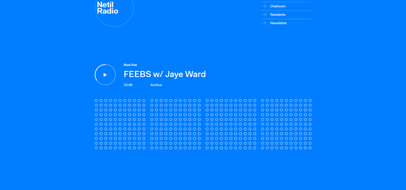
Netil Radio is a colorful website where music and community vibe together.
It’s like a secret club for cool sounds, but everyone’s invited!
Every visit feels like discovering a new favorite song.
What’s going on at Netil Radio?
- Shows Galore: With names like “3WD Festival Show” and “A Real Sisterhood,” you know there’s something for every mood.
- Music All Day: From groovy tunes with “Discofunk” to chill vibes in “Domingo,” there’s music playing no matter when you drop by.
Why the website rocks:
- Super Cool Layout: It’s easy to navigate. Finding a show feels like flipping through your favorite magazine.
- Visual Treats: Each show has its own colorful button, making the website a fun, visual playground.
AIAIAI Audio
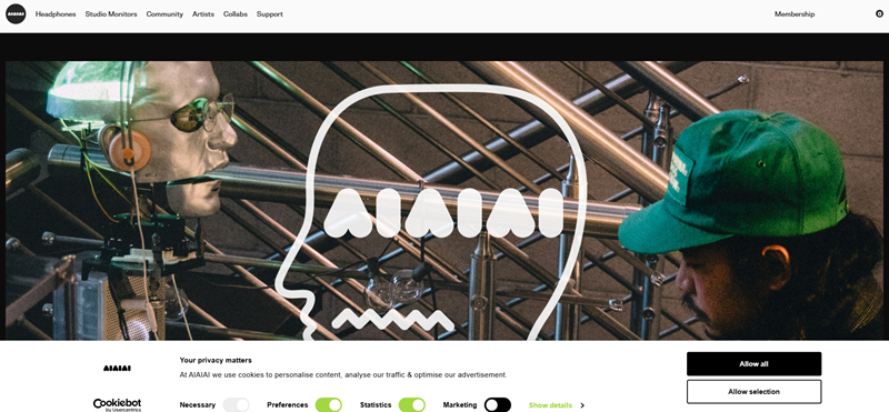
AIAIAI Audio’s website is where headphones meet high-tech wonder.
It’s basically a candy store for anyone who loves listening to music and wants to do it with style.
Dive into AIAIAI Audio:
- Headphones Galore: Whether you need something for the studio, DJing, or just enjoying tunes, they’ve got it.
- Customize Your Sound: You can mix and match parts to create your perfect pair of headphones.
The site’s standout features:
- Sleek Design: The site looks cool and futuristic, just like their products.
- Easy Navigation: Finding your dream headphones is a breeze, with simple menus and clear categories.
Frequently Asked Questions: Simple Website Examples
What makes a website simple?
A simple website keeps things easy and clear. Here's the secret sauce: Minimalistic design, intuitive navigation, and clear content. It doesn’t have unnecessary details. Being a simple website doesn't mean it's boring or plain. Oh no! Instead, it puts the focus on what truly counts— delivering quality content or spotlighting products/services without flashy distractions.
Can simple websites still be engaging?
Absolutely, yes! I’ve seen simple websites that are incredibly engaging. Text, images, layout— all these elements contribute to engagement. The trick? Make sure each element is designed to guide your visitor toward a specific action, whether it's reading a blog post, viewing a product, or filling out a contact form.
What are some examples of simple website designs?
Oh, there are so many examples I could share! For a clean, minimalistic design, check out Apple's website. Looking for something with a bit more visual pizzazz, but still simple? Try Etch. If you're after a website that's simple and has a fun, vibrant design, Bellroy serves up an eye-catching treat.
How to create a simple and effective website?
My best advice? Start by defining your website's purpose. Once you nail that, everything else follows. Keep the design minimal and clean. Use a clear, easy-to-read font. Use high-quality, relevant images. Your navigation should be easy to locate and use, so visitors can find what they want quickly. And always make sure your contact information is easy to find.
Why should I consider a simple website design?
Because simple designs are all about improving user experience. They make it quicker and easier for users to find what they are looking for. Plus, I've found simple designs often work better on mobile devices. And as the data suggests, a remarkable number of users will visit your website from a mobile device. Slaying the mobile game isn't just an option; it's crucial!
")


Leave a Reply