My content is reader-supported by awesome people like you. Which means I could earn a commission. Learn more here!
Searching for photography website examples to get ideas to build your website?
I get it!
Finding the right design for your photography website can be as crucial.
Here’s the deal:
a stunning online portfolio can turn viewers into clients faster than you can imagine.
In the bustling digital marketplace, it’s all about standing out with style and strategy.
I’ve scoured the web for top-shelf photography website examples that are not only visually delightful but are also SEO champs at playing the Google game.
We’ll snap into the features that make these sites click-worthy, the user experience that’s smoother than a gimbal’s glide, and how these examples stack up against the competition.
By the end of this, you’ll have the inspiration to craft a site that looks amazing.
Lorenzo Fanfani
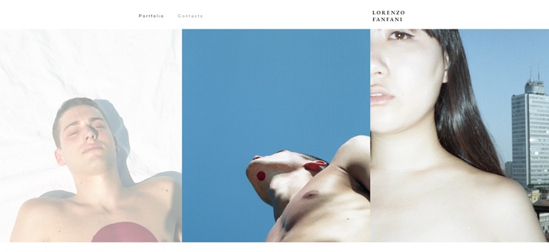
First, this site is a showcase, kind of like a gallery for Lorenzo’s cool work.
It’s a spot where you can see everything he’s made and reach out to him if you need to.
What’s the site about?
- Portfolio Showcase: It’s all about showing off Lorenzo’s creative projects. You can scroll through his work, kind of like flipping through a magazine, to see what he’s done.
- Contact Information: If you’re thinking, “Hey, I want to work with this Lorenzo guy,” you can easily find out how to buzz him on the “Contacts” page.
Neat Design Features:
- Simple Navigation: It’s a breeze to move around the site. Just use your keyboard’s tab key to jump through the menu stuff.
- Load More Button: If you’re hungry for more of Lorenzo’s work, just click the “Load More” to see additional stuff he’s done.
Photography by Logan
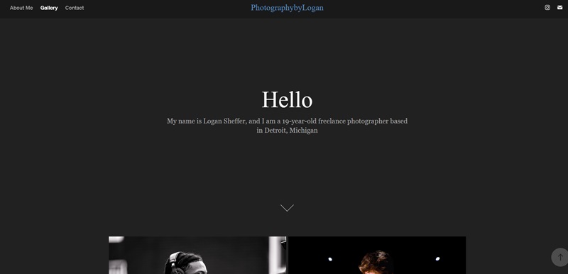
Next up, is Photography by Logan.
This website is like an online photo album chock-full of Logan’s picture-taking adventures.
What’s the site about?
- Photo Gallery: Logan’s got a bunch of his best snapshots here. From people to places, there’s a bunch to look at.
- Visual Stories: Each picture tells its own little story, just waiting for you to check it out.
Neat Design Features:
- Sleek Layout: The photos are the stars here, so the layout is clean, letting the pictures do all the talking.
- Easy Peasy Viewing: Clicking on a photo blows it up big so you can see all the nifty details.
Fish Luo
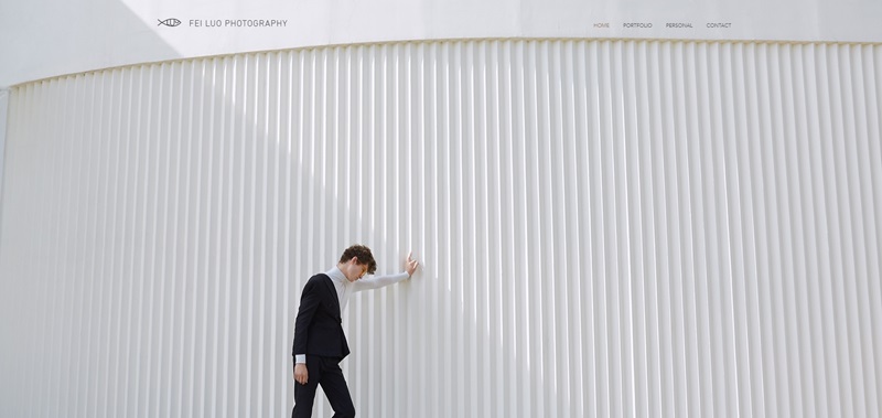
Fish Luo’s website is a digital dive into his artwork.
It’s like walking into an artist’s studio without having to leave your couch.
What’s the site about?
- Art Portfolio: Fish Luo’s website is filled with his artwork, each one a window to his imagination.
- Artist’s Journey: The site also shares Fish’s story and growth as an artist.
Neat Design Features:
- Vibrant Colors: The site pops with color, making it as fun to look at as his art.
- Smooth Scrolling: Glide through Fish’s world with a scroll wheel or a swipe on your tablet.
Julia and Gil
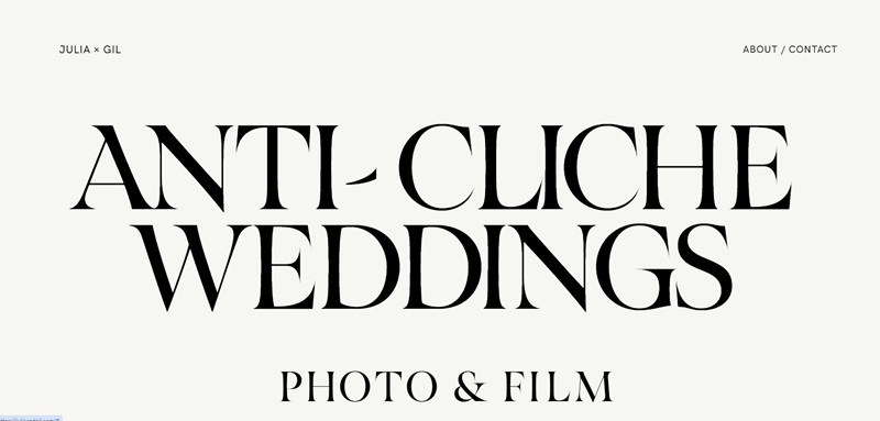
Over at Julia and Gil’s website, it’s all about love stories snapped into photographs.
What’s the site about?
- Wedding Photography: This duo specializes in catching those big-day smiles and tears.
- Love Story Central: The site not only shows their work but also tells the tales behind the faces and places.
Neat Design Features:
- Romantic Vibe: The design is super cozy, like a warm hug from an old friend.
- Stories Behind Photos: Instead of just looking at pictures, you get to read about what’s happening in them – it’s like a storybook with photos.
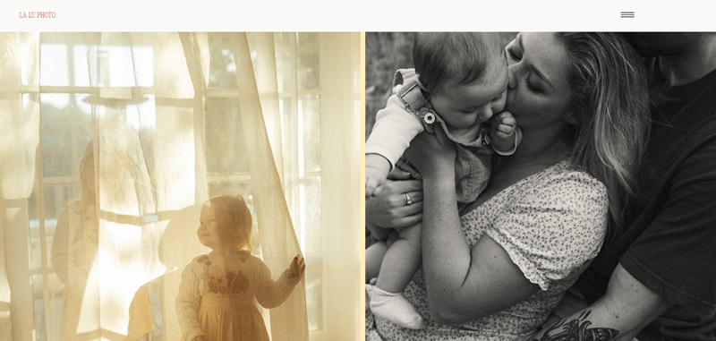
La Lu Photo
When you land here, it feels like you just stepped into a space where every moment is special, and real life is the main event.
What’s the site about?
- Personal Photography: This site is where you go to meet a photographer who can capture the real, unposed you. It’s all about honest snapshots of life.
- Unique Moments: Whether you’re into slow Sunday vibes or the wild tangles of toddler hair, the photos here tell those rich stories.
Neat Design Features:
- Warm Welcome: Right away, you know this place is bubbly and inviting, like a friend waving you over.
- Quick Contact: If you’re ready to book, there’s a spot to check for open dates—super easy.
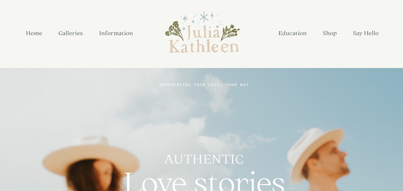
Julia Kathleen Photography
This site is like flipping through a treasured family album, but it’s filled with stories from many families, all captured by Julia’s lens.
What’s the site about?
- Life in Pictures: Julia’s craft is all about freezing those perfect little life moments in time.
- Family Focus: From newborn joy to family fun, the snaps here show real-life magic.
Neat Design Features:
- Clean Display: The site’s layout is straightforward, making it super simple to admire all the photos.
- Heartfelt Stories: Julia shares little bits about the photos, letting you peek inside the moments.
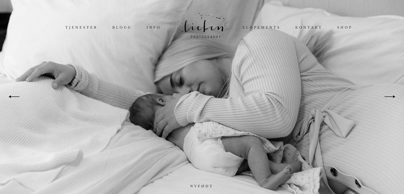
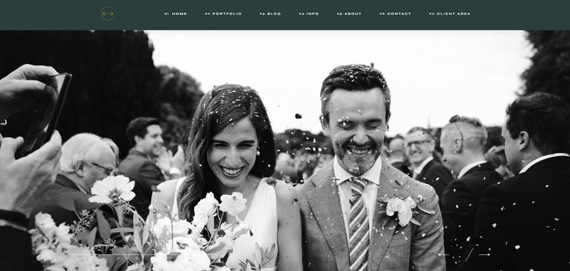
Lieben
Imagine finding a box filled with cozy, heartwarming letters—that’s what it’s like to explore this site, where the photos are as heartfelt as a handwritten note.
What’s the site about?
- Emotional Photography: Lieben is all about capturing the feels in every frame.
- Stunning Scenes: The pictures are wow-worthy, with a focus on couples and all kinds of love.
Neat Design Features:
- Dreamy Atmosphere: From the fonts to the layout, everything whispers “romance.”
- Easy Browsing: You can stroll through the photos without any fuss, like a walk in the park.
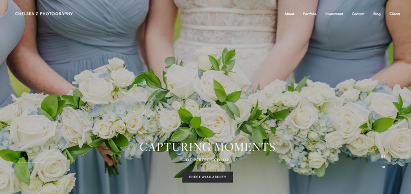
Chelsea Z Photography
Chelsea’s got a knack for nabbing those big scene-stealing moments and the quiet ones in between.
What’s the site about?
- Dramatic Shots: Chelsea’s all about that big-time splash in her photos, capturing your attention right off the bat.
- Variety of Services: Whether it’s a birthday bash or a casual day in the park, Chelsea’s your go-to.
Neat Design Features:
- Bold and Bright: The site hits you with vibrant colors and bold pictures that grab your eye.
- Stories We Share: With every photo, there’s a bit of the story shared, inviting you to feel part of it.
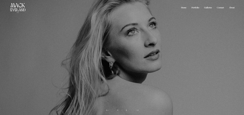
Mack Eveland
Jumping straight into Mack Eveland’s site, it becomes clear that this is a place brimming with spectacular photos.
What’s the site about?
- Professional Photography: The site serves as a vibrant showcase of Mack Eveland’s photography talent. It covers a wide range of categories, including Boudoir, Maternity, Family, and Fashion.
- Creative Direction: Alongside being a professional photographer, Mack Eveland also brings creativity to the helm with his role as a creative director.
Neat Design Features:
- Rotating Gallery: The homepage instantly engages you with a round-robin of captivating images.
- Easy Navigation: The straightforward site layout enables smooth movement across different categories of work.
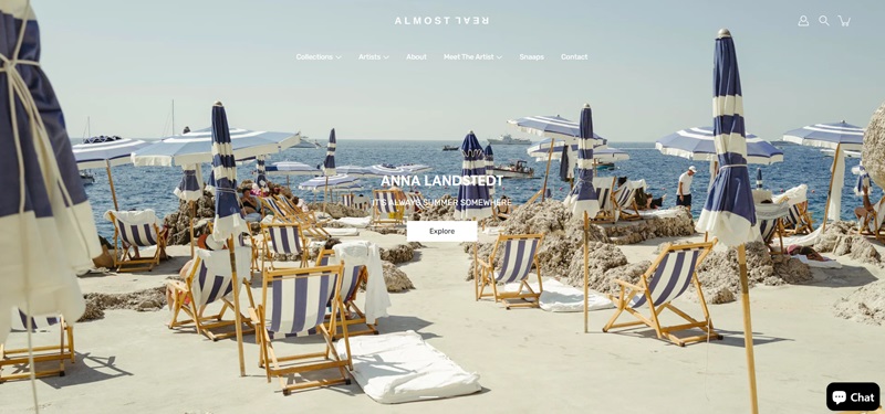
Almost Real
This site brings together the tangibility of physical presence and the vastness of digital space.
What’s the site about?
- Immersive Experiences: Almost Real works on creating deep, engaging experiences for users in the digital realm.
- Project Showcase: The website houses an eclectic mix of projects illustrating their expertise in creating digital environments.
Neat Design Features:
- Interactive elements: The incorporation of interactive elements on the site makes browsing an experience in itself.
- Minimalist Layout: The clean, simple design ensures that the focus remains on the projects without any distractions.
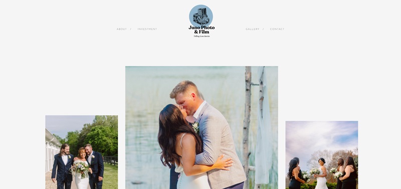
Juno Photo Film
Juno Photo Film’s website is all about capturing moments:
the big, the tiny, and everything in between.
What’s the site about?
- Emotive Photography & Film: The website spotlights Juno’s knack for capturing emotions in the form of photos and films.
- Diverse Portfolio: From weddings to films, one can witness a wide range of their work here.
Neat Design Features:
- Image-driven layout: Pictures take center stage on this site, letting Juno’s work speak for itself.
- Thoughtful descriptions: Each image is complemented by a thoughtful description, providing context and enhancing the browsing experience.
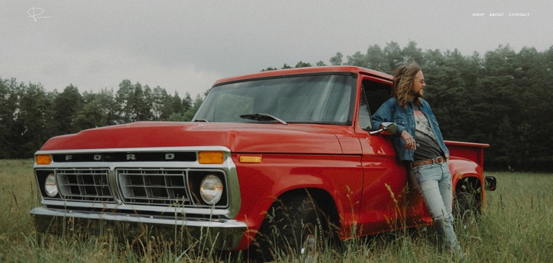
Peter McKinnon
This site stands as a testament to Peter’s journey, experiences, and work as a world-renowned photographer.
What’s the site about?
- Professional Photography: The site serves as a showcase for Peter’s photographic prowess.
- Personal Sharing: Through his blog, Peter shares insights into his passion for photography and his life experiences.
Neat Design Features:
- Catchy Visuals: The use of stunning imagery and vibrant colors on the site makes it visually appealing.
- Smooth browsing: Navigation is a breeze, helping users easily find their way around the site.
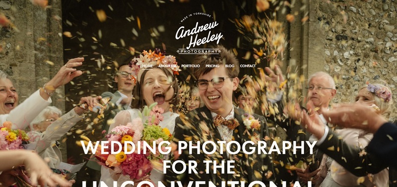
Andrew Heeley Weddings
When you land on Andrew Heeley’s website, it’s like walking into a gallery full of laughter and love.
His website is a colorful window into the world of unconventional wedding photography.
What’s the site about?
- Unconventional Wedding Photography: The site showcases Andrew’s talent in capturing natural, candid moments from weddings. It’s perfect for couples who want to remember their special day as it truly happened.
- Heartfelt Moments: Andrew specializes in relaxed photography without forced poses, which is great for couples who are shy in front of a camera but still want beautiful memories of their day.
Neat Design Features:
- Lively Testimonials: Happy couples share their experiences with phrases like “the pictures are nuts” and “the colours on the edit are so sick!” This makes it feel like you’re hearing from a friend.
- Clear Breakdown of Services: The site provides a clear breakdown of wedding packages and pricing. This is super helpful for couples trying to figure out their budget.
- Engaging Blog: There’s also a blog that dives into the world of alternative wedding photography, offering tips and showcasing real weddings to spark your own ideas.
What stands out is the joy and genuine emotion you can feel just from browsing the site.
And for anyone planning a wedding, it sure feels like Andrew Heeley would be a fun photographer to have around on your big day.
Claire Byrne Photography
It’s a wonderful space filled with magical moments that Claire has captured with her photography talent.
What’s the site about?
- Artistic Family Photography: Who said family photos can’t be works of art? Claire proves that’s not true with her creative shots of families and individuals.
- Inspiring workshops: Claire is not just a photography talent; she also shares her knowledge by offering workshops!
Neat Design Features:
- Sleek Portfolio Showcasing: Claire’s beautiful work shines through in every image displayed in her gallery.
- Easy Navigation: The simple interface lets you access info about sessions, pricing, and even Claire herself at a single click.
- Friendly Blog: Claire says hello through her blog where she shares not just photos, but stories – making it feel more personal.
Claire’s site clearly shows that she has a feel for the beautiful things in life.
Whether it’s a joyful baby laugh or a shared family moment, she captures it with elegance.
Through both her website and lens, Claire invites us into a world full of amazement and beauty.
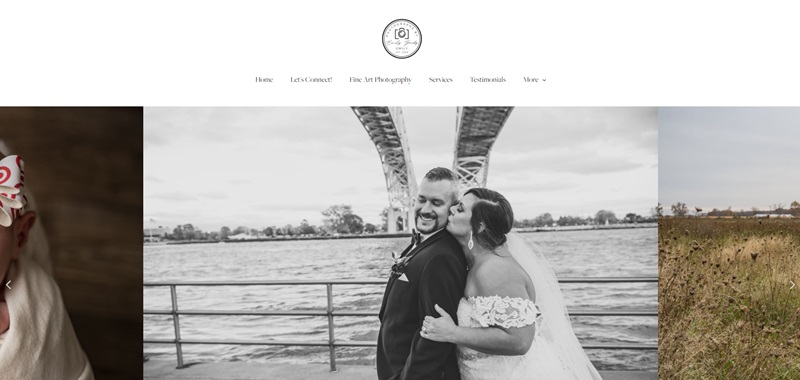
Photographs by Emily
Adventure on over to Emily’s photography website.
It’s clear that Emily isn’t just a photographer, she’s a storyteller.
What’s the site about?
- Diverse Photography Services: Everything from senior graduation sessions to joyous weddings to adorable newborn photoshoots is covered. There’s really something for everyone to remember their important milestones.
- Keepsakes of Life’s Adventures: More than just another photo album, Emily believes in capturing memories that your family will cherish for generations.
Neat Design Features:
- Gallery Showcase: Emily’s photos are displayed in a way that lets you quickly get a sense of her style.
- Biography Page: You can learn more about Emily on a warm and inviting “About Me” page that helps you get to know her before you book.
All told, Emily’s website serves as a snapshot of her passion for capturing moments in life that are worth remembering.
With a mix of her gift for photo-taking and a website that is easy to explore, it’s worth a visit if you need a photographer.
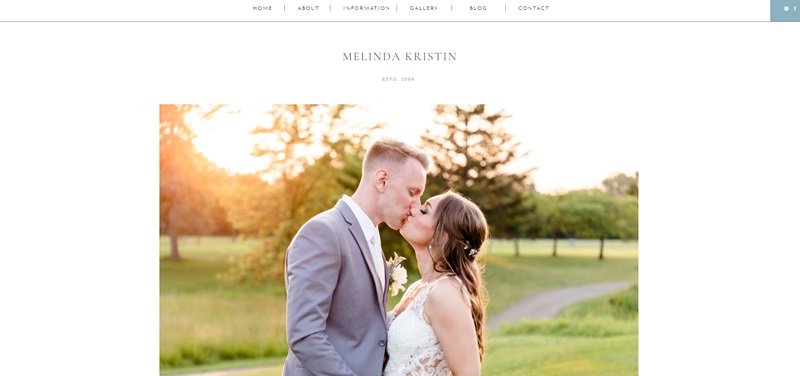
Melinda Kristin Photography
We’re now visiting Melinda Kristin’s world.
This website is a celebration of treasured and beautiful life moments.
What’s the site about?
- Wedding and Engagement Photography: Melinda puts her heart into capturing the magic at weddings and engagements.
- Passionate Photography: Whether it’s big celebrations or small, intimate moments, Melinda is passionate about telling your story through her pictures.
- Stress-free Experience: One thing’s for sure – Melinda is all about making your journey hassle-free and enjoyable.
Neat Design Features:
- Personalized Introductions: This website makes a charming first impression with warm and friendly introductions. It’s just like getting to know a friend!
- Detailed Descriptions: Whether it’s about weddings or portrait shots, the website provides clear details about what you can expect. That’s really handy to know!
- Featured Galleries: There’s a special space featuring wedding and engagement galleries. Now, this is cool – you can get a taste of Melinda’s work and style before you decide.
- Engaging Testimonials: To top it all off, you’ll see glowing testimonials from happy couples. It’s like hearing helpful advice from friends!
In essence, Melinda Kristin’s website is a charming treasure trove. It’s filled with beautiful images that echo tales of laughter, love, and life’s most precious moments. If you’re on the lookout for a photography service that’s a smooth and fun experience, this website is a must-visit.
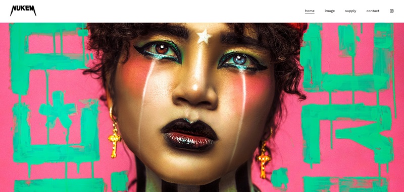
Haris Nukem
His website is like a secret door to his world of photography.
What’s the site about?
- Creative Photography: Haris Nukem uses his camera to tell stories. He’s not just taking pictures; he’s making art.
- Updates and New Stuff: The website has a cool feature where you can sign up for a newsletter. This way, you won’t miss out on what Haris is cooking up next.
Neat Design Features:
- Simple Navigation: The website has an easy-to-use menu. This makes it a breeze to explore Haris’s work.
- Sign-Up for News: You can quickly sign up to get updates right from the homepage. This is great for keeping up with Haris’s latest projects.
- Personal Touch: By inviting visitors to sign up for updates, Haris is building a community. It feels like joining a club for people who love awesome photos.
In conclusion, Haris Nukem’s website is a gateway to his extraordinary world of photography. Each photo tells a story, capturing moments that speak louder than words. Whether you’re there to browse or to sign up for cool updates, his website welcomes you into an inspiring space where creativity shines bright.
FAQ for Photography Websites
What’s the best platform for building a photography website?
If you’re looking to showcase your photography skills to the world, your platform should be as sharp as your images. Personally, I’m all in for platforms like Squarespace and Wix. Why? They offer sleek templates specifically designed for visual storytelling. It’s like having a glossy magazine spread, but you’re in control and can drag-and-drop until it looks just the way you envisioned. Plus, their built-in SEO tools are photo bombers you’ll actually want in the picture, helping your site rank better on Google.
Can I sell my photos directly from my website?
Absolutely, you can! This is a game-changer for photographers. For example, Shopify isn’t just a marketplace; it’s a powerful ally for creatives. With its endless customizations, you can set up your own digital shop window with ease. Not to mention platforms like WordPress with the WooCommerce plugin, which turn your website into a veritable cash register. Print-on-demand services? They integrate smoother than a buttery bokeh effect. So go on, make your site a one-stop shop!
How do I protect my photos from being stolen online?
Picture this: Your images are floating around the web without your permission. Not cool, right? Well, platforms like PhotoShelter and Format feel your pain. They offer right-click protection and watermarking features so that your images are harder to swipe than a triple-layer wedding cake. It’s not foolproof – let’s face it, if it’s on the screen, it can be captured – but it does make image theft less like a grab-n-go and more like a “hmm, maybe not.”
Do website builders support high-quality images?
High-quality images are your bread and butter, and squishing them into a pixelated mess is a no-go. That’s why most top-notch website builders support high-resolution photos. Not only do they make sure your images look crisp on any device, but they also ensure that loading times don’t take as long as waiting for golden-hour lighting. Remember though, balance is key. Huge files can slow down your site, and nobody waits for snails, no matter how fancy their shells are.
Can non-tech-savvy folks create a stunning website?
Listen, you don’t need to be a coding ninja to create an eye-catching website. These days, it’s like putting together LEGO blocks. Most website builders offer drag-and-drop interfaces – no cryptic lines of code in sight! Just pure, creative fun with instant visual feedback. And with tech support just a chat away, you’re never really flying solo.
What is SEO, and how do I optimize my photography website for it?
Search Engine Optimization (SEO) is the secret sauce that makes your website pop up on Google like a jack-in-the-box. It’s about using the right keywords so that when someone types “best wildlife photographer” or “wedding photos that make you cry” (in a good way), your website comes into view. Put those keywords in your page titles, descriptions, and photo tags. Also, regularly update your site with fresh content like blog posts about your latest shoots. Most builders will guide you through this, think of them as those helpful photo assistants, only for your website.




Leave a Reply