My content is reader-supported by awesome people like you. Which means I could earn a commission. Learn more here!
Let’s check out some One Product Shopify Stores to show you some examples to inspire you to build.
Will check out what they are doing right and what stands out.
I’ve personally found sometimes we just need some examples to get the ideas flowing for us.
Ready to check out some examples?
Death Wish Coffee
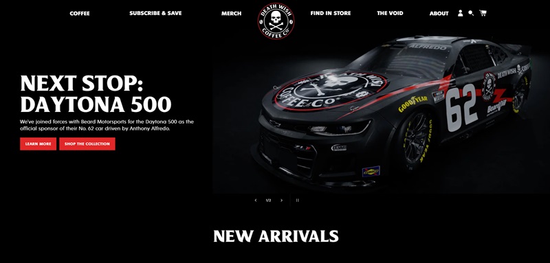
Death Wish Coffee is a website built with Shopify that offers super strong coffee.
They claim to have the world’s strongest coffee.
This website also shows that they sponsor a car in the Daytona 500 race, which is pretty cool for racing fans!
Now, let’s talk about what makes the design of their site really stand out.
Website Design Features
- Bold and Inviting Theme: The website grabs your attention right away with its bold colors and exciting themes. It’s all about making you feel the intensity of their coffee.
- Easy Navigation: Even someone using it for the first time can easily find what they’re looking for, thanks to the clear and straightforward layout.
- Interactive Elements: They have cool interactive bits, like animations that make the whole experience fun.
Besides being easy to use, these features really help make shopping on their site awesome.
Fybelle
Fybelle is an online store hosted on Shopify focused on fashionable clothing for women.
They offer a wide range of styles to make sure everyone finds something they love.
Website Design Features
- Elegant and Feminine Design: The design matches their products perfectly, with a soft and welcoming color scheme that makes shopping enjoyable.
- High-Quality Images: Each product is showcased with high-quality images, making it easy to see all the details.
- Simple Checkout: The site makes it super simple to buy what you want, which is great for shoppers.
Shopping on Fybelle feels more like flipping through a fashion magazine, thanks to its sophisticated design.
Cookie Chips
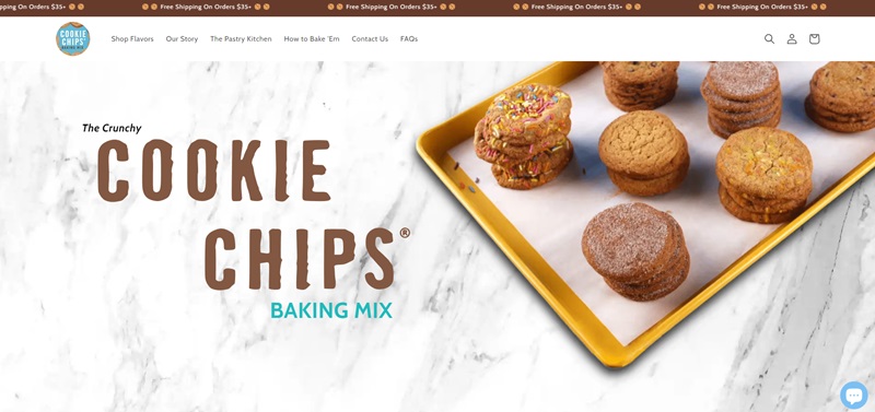
Cookie Chips is another awesome Shopify-based store.
Here, you can find deliciously unique cookie snacks that are unlike anything you’ve tried before.
Website Design Features
- Playful and Engaging Layout: The fun begins as soon as you land on the site, with bright colors and playful fonts that reflect the joy of snacking.
- Mouth-Watering Photography: Every cookie photo makes you want to reach through the screen and grab a bite.
- Easy to Use: The site layout makes it really easy to find whatever you need, from different flavors to ingredient lists.
Cookie Chips does a great job of making you feel hungry and excited to try their snacks, all thanks to their wonderful website design.
Seattle Cider Company
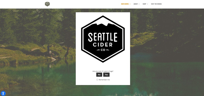
Seattle Cider Company makes cider, which is like a special kind of apple juice that adults enjoy.
Their Shopify site lets you explore all the different yummy flavors they create, like Basil Mint and Pumpkin Spice.
They use apples from Washington State to make their cider taste fresh and delicious.
Website Design Features
- Welcoming Start: Right when you visit the site, it asks if you’re old enough to explore, making sure only adults go through.
- Easy to Look Around: You can easily click and find different types of cider or learn new cocktail recipes.
- Fun and Informative: The site tells you about how they make their ciders with fresh apples, which is pretty interesting.
This Shopify store makes learning about cider exciting and simple.
Plus, it’s easy to find your way around and discover something new.
Kulala Land
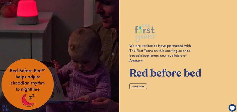
Kulala Land is a cute Shopify store where you can find lots of plush toys and cute accessories.
It’s like a treasure chest for anyone who loves things that are soft and cuddly.
Website Design Features
- Colorful and Fun: The site is full of colors and fun pictures, which makes shopping exciting.
- Super Clear Pictures: Each toy has a beautiful photo so you can see every detail before you choose your favorite.
- Easy Peasy Shopping: Finding the perfect plush toy is super easy, thanks to the clear categories and simple checkout process.
Kulala Land’s Shopify site makes shopping for plush toys a super happy and easy adventure.
State of Kind
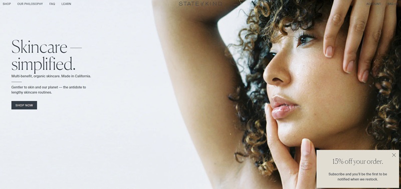
State of Kind is a Shopify store that’s more than just a clothing shop.
It mixes cool style with helping out, so you can look good and feel good about your purchases.
Website Design Features
- Clean and Simple: The site’s design is neat, making it super easy to read and find what you want.
- Inspiring Stories: They share the story behind their clothes and how they help people, which is really nice.
- Shop with Ease: Browsing their products and checking out is straightforward, so getting your new favorite shirt is a breeze.
State of Kind creates a calm space where shopping feels good, not just because you’re getting something new, but because you’re also helping out.
Fybelle
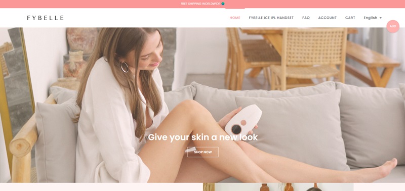
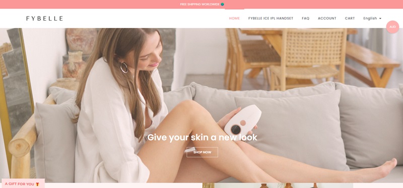
The Fybelle website focuses on helping people achieve beauty at home.
It offers a revolutionary product called Fybelle ICE IPL Handset for hair removal.
This product allows users to remove hair comfortably and effectively, eliminating the need for expensive and time-consuming beauty clinic visits.
Highlighting Fybelle’s Website Design Features
- Simplistic User Navigation
Fybelle’s site design is straightforward to navigate. Users can swiftly locate product details, FAQs, and shipping information, ensuring a hassle-free browsing experience.
- Engaging and Informative Imagery
The use of captivating and explanatory images helps customers understand the product and its usage with ease.
- Noteworthy Call To Action Buttons
Visible “Shop Now” and “Explore Now” buttons grab the users’ attention, guiding them smoothly through the buying process.
SNOOZ
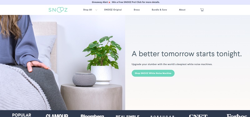
SNOOZ is a site designed to promote and sell a unique white noise machine.
The product helps people get better sleep by blocking out disturbing noise.
The company promises a peaceful night’s sleep with their gadget.
Website Design Features
- Easy-to-navigate layout. Info isn’t hard to find, and the site isn’t cluttered.
- The use of calm, soothing colors ties into the brand’s promise of a good night’s sleep.
- High-quality product images that provide a clear view of what the white noise machine looks like.
- The inclusion of real-user reviews. This builds trust with potential new customers.
- Use of cute, friendly icons that break up the text and make the site more engaging.
WaveBeam Pro
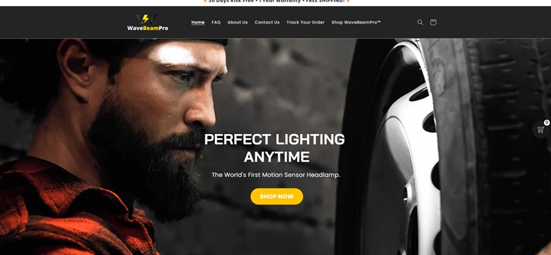
WaveBeam Pro is dedicated to selling a special kind of handheld massager.
Their product, the WaveBeam Pro, is designed to ease muscle aches, reduce tension, and promote overall wellness in the body.
Website Design Features
- Clear and concise tagline. It lets visitors know exactly what the product does right when they land on the page.
- Detailed product descriptions. They explain the benefits of the product and how it works.
- A strong call-to-action button. It stands out on the page, encouraging visitors to make a purchase.
- The use of videos demonstrating the product. This gives potential customers a better understanding of how it functions.
- Placement of a satisfaction guarantee seal. This reduces the perceived risk of making a purchase.
TRUFF
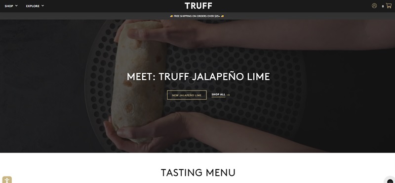
TRUFF is a website focused on selling truffle-infused hot sauce.
They offer a variety of hot sauces that blend the rich taste of truffles with the heat of peppers.
The tagline “You Can’t Get Enough TRUFF” suggests their products are not only unique but also highly delicious and addictive.
Website Design Features
- Bold and Appetizing Colors: The website uses a mix of black, white, and red colors which together, create an elegant and appetizing look.
- Easy Navigation: Finding your way around the site is simple. Buttons and menus are clear, so you know exactly where to click.
- Quality Product Images: The pictures of the hot sauce bottles are sharp and high-quality, making the products look irresistible.
- Reviews Section: The site includes reviews from customers. Reading positive feedback may convince new visitors to try the sauce.
BLK & BOLD
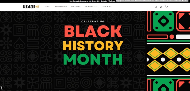
BLK & BOLD is dedicated to selling specialty coffee and tea.
The brand focuses not only on providing high-quality beverages but also on making a positive impact by supporting community causes.
Website Design Features
- Warm and Welcoming Design: The site uses warm colors that make you feel welcome. It’s like the cozy feeling you get from a good cup of coffee or tea.
- Clear Mission Statement: Right from the start, their purpose, and impact on communities are clearly stated, making you feel good about your purchases.
- Product Variety: The site displays a wide range of coffees and teas, complete with descriptions. It’s easy to find something you might love.
- Social Proof: They highlight their features in well-known publications, building trust through association.
NEOS SmartCam
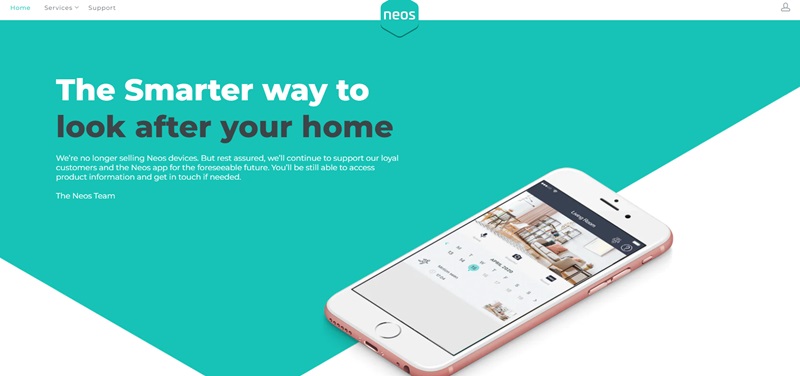
The NEOS SmartCam site sells smart home security cameras.
These cameras are designed to make home security simple and effective, offering peace of mind through their innovative technology.
Website Design Features
- Sleek and Modern Look: The design of the site matches the sleekness of modern technology, with a clean look and feel.
- Easy to Understand: The information about the SmartCam is presented in a way that’s easy to grasp. Even if you’re not tech-savvy, you’d understand the benefits.
- Customer Reviews: Like the others, this site also features reviews, highlighting customer satisfaction and product effectiveness.
- Product Demos: They include videos or animations showing how the SmartCam works, which can help visitors understand the product better and see it in action.
Bokksu
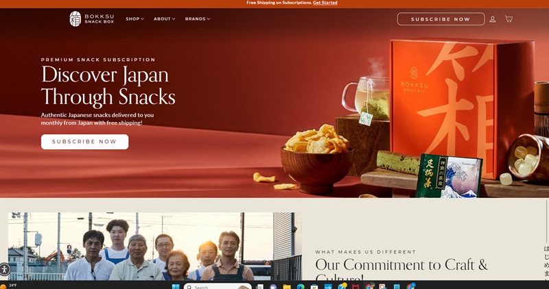
Bokksu sells a monthly subscription box filled with assorted Japanese snacks.
They work directly with snack makers in Japan, some of whom have been perfecting their craft for over 100 years!
When you subscribe, you get a box delivered to you every month that lets you taste and learn about different Japanese treats and cultures right from your home.
Website Design Features
- Vibrant and Engaging Colors: The site uses bright colors that are really inviting. It makes you want to explore more!
- Clear Photos and Descriptions: Every snack box and item has a clear, high-quality photo and a detailed description. You know exactly what you’re getting.
- Easy Navigation: The site’s menu is straightforward, so you can find what you’re looking for fast.
- Testimonials: There are reviews from people who’ve tried the boxes. It’s great to read their thoughts and see how much they enjoyed their snacks.
- Cultural Insights: The site isn’t just selling snacks; it’s offering a peek into Japanese culture. Each box comes with a guide that explains the origins, flavors, and even common allergens in your snacks.
LastObject
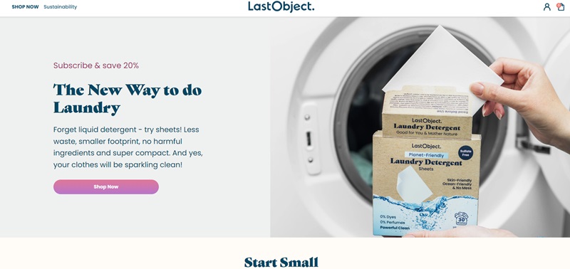
LastObject is on a mission to create sustainable alternatives to single-use items.
Their products include reusable cotton swabs, tissues, and paper towels, among other things.
The idea is to reduce waste and make the planet a cleaner place.
Purchasing from LastObject means you’re making an eco-friendly choice.
Website Design Features
- Clean and Simple Design: The website’s design is minimalistic, which reflects their sustainability mission.
- Product Benefits: Each product’s page clearly lists its benefits, showing you not just what the product is, but why it’s better for the environment.
- Educational Content: Besides selling products, the site educates visitors on the impact of single-use items on the planet.
- Easy to Navigate: Products are well-categorized, and it’s simple to find what you need.
Meow Meow Tweet
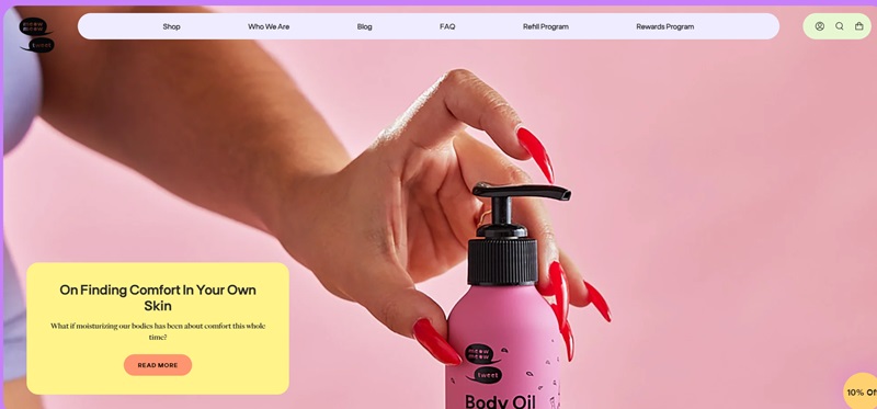
Meow Meow Tweet is a quirky, fun brand that sells vegan skincare products.
From soap to deodorant, all their items are cruelty-free and made with natural ingredients.
The brand is as dedicated to sustainability as it is to keeping your skin feeling smooth and fresh.
Website Design Features
- Fun and Friendly: The site uses fun illustrations and a friendly tone, making shopping a pleasant experience.
- Detailed Product Info: You get detailed descriptions of each item, including how to use them and their ingredients.
- Eco-Friendly Packaging: The brand emphasizes its commitment to sustainability by showcasing its eco-friendly packaging.
- Reviews: There are customer reviews for products, so you can see what other people thought.
Pillow Pug
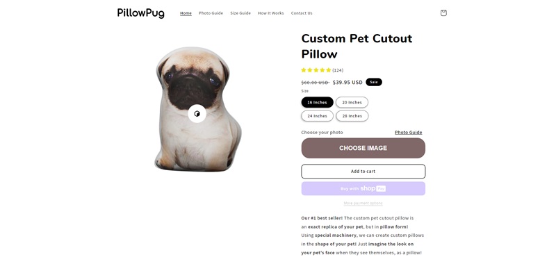
Pillow Pug is all about bringing comfort into your life with their range of pillows.
Website Design Features
- Bright and Welcoming Design: Websites like this often use bright, welcoming colors that make you feel cozy just by visiting.
- Detailed Product Descriptions: Online stores for pillows usually offer extensive details on materials, care instructions, and sizes to help you make the best choice for your needs.
- Customer Reviews: Likely features customer reviews and ratings for products to help build trust and guide shopping decisions.
- Clear Categories: It’s common for these websites to have clear product categories, making it easy to navigate to exactly what you’re looking for, whether it’s a neck pillow or a decorative throw pillow.
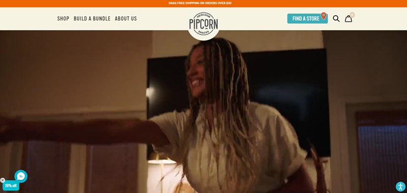
PipSnacks
PipSnacks offers a variety of gourmet popcorn made with unique, heirloom corn.
Their snacks come in different flavors, aimed at offering a healthier, tastier alternative to regular popcorn.
The heirloom corn kernels pop into lighter and crunchier popcorn, and with each purchase, you’re supporting a company focused on sustainable agriculture.
Website Design Features
- Bright and Fun Colors: The use of bright colors and fun layouts reflects the playful nature of the brand and its products.
- Easy-to-Find Flavor Profiles: You can quickly find detailed descriptions of each flavor, helping you decide which one you might enjoy the most.
- Subscription Options: For regular snackers, the site offers a subscription service, making it convenient to have your favorite snacks delivered on a schedule.
- Engaging Product Photography: High-quality images showcase the products in an appealing way, emphasizing the unique qualities of the heirloom popcorn.
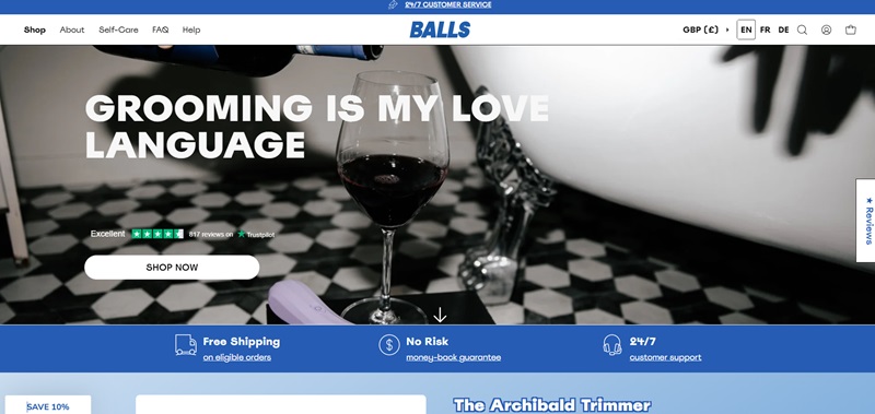
Balls.co
Balls.co is dedicated to men’s grooming, with a special focus on care for below-the-belt.
They offer the Archibald trimmer, which is popular online and comes in three colors.
Alongside, they sell all-natural elixirs that help with common grooming issues like ingrown hairs and clogged pores.
Their shop includes bundles for various grooming needs, endurance and cleansing wipes, a variety of condoms, and water-based lubricants.
Nice Features on the Website
- Clear and Fun Messaging: The website uses friendly language that makes the topic of men’s grooming approachable.
- Easy Shopping Experience: From the trimmer to the wipes, everything is easy to find and buy.
- Guarantees and Support: They offer free shipping on eligible orders, a money-back guarantee, and customer support around the clock.
- Product Variety: The site shows a variety of products with multiple options, like the trimmer that has different colors to choose from.
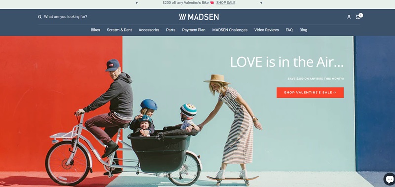
Madsen Cycles
Madsen Cycles offers a unique selection of cargo bikes that let you carry kids, pets, and all kinds of stuff in a bucket at the back of the bike.
These bikes are designed for families, adventurers, or anyone who wants to transport lots of things without using a car.
Nice Features on the Website
- Bright and Inspirational Photos: The site is full of beautiful photos of the bikes in action, which gets you excited about the possibilities.
- Detailed Bike Descriptions: Every bike has clear information on what it does and all the cool stuff about it.
- Testimonials: There are stories and pictures from happy bike owners, which helps you see how these bikes work in real life.
- Easy to Navigate: The site’s layout lets you quickly find specs, price, and color options.
FAQ For One Product Shopify Stores
Why would I want to sell just one product?
By selling one product, you streamline your marketing, simplify decision-making for customers, and fine-tune your branding. It's like spotlighting a superstar on stage—the audience knows exactly where to look.
Is running a One Product Shopify Store profitable?
Yes, but (and it's a big BUT), it all boils down to your product's appeal, your marketing strategy, and, honestly, a bit of good old-fashioned luck. Bear in mind, that scoring big in the eCommerce game is never a guarantee.
How do I market a One Product Shopify Store?
With just one product, you can create laser-focused marketing campaigns. From ad copies and email marketing to social media posts and SEO, be ready to give it your all to promote your store's rockstar!
Can I create a One Product Shopify Store if I'm new to Shopify?
Shopify is user-friendly, even if you're just dipping your toes into the e-commerce pool. Plus, concentrating on one product could make the learning curve less steep—like learning to cook using one spatula instead of a whole kitchen utensil set!
What if my one product doesn't sell well?
Maybe tweak your marketing strategy, adjust the pricing, or switch to a different product altogether.


Leave a Reply