My content is reader-supported by awesome people like you. Which means I could earn a commission. Learn more here!
Ever wondered how a stellar marketing portfolio website can fast-track your career?
In the bustling digital marketplace, a well-crafted portfolio is your personal brand’s front-runner.
Today, we’re diving deep into the essence of top-notch marketing portfolio sites, evaluating features that make them stand out, identifying benefits, and how they fare against peers.
Let’s check out unique insights, ensuring your portfolio not only showcases your prowess but also captures the right attention.
Hive Creative Group

The Hive Creative Group website is a digital front for their women-owned full-service marketing and design agency located in Charlottesville, VA.
The agency specializes in a range of services, including full-service marketing, branding, website design, social media marketing, package design, brochure design, and more. The origin story of the agency is compelling, beginning with a conversation between two friends at a book club in 2015, which evolved into a team of seven women working with over 60 clients.
A key element of the website design is the focus on usability and ease of access. The clear navigation menu enables visitors to dive into the agency’s portfolio effortlessly, get details on services via comprehensive packages, learn about the agency’s professionals or ‘the bees’, view client collaborations, and read their blog for insights.
The site’s design layouts follow a purposeful structure, whereby they promote the uniqueness of their website designs, and state that their builds are not only beautiful but also functional, mobile-friendly, and SEO-optimized.
The agency’s prowess in branding is also a highlight of the website, where they emphasize the importance of voice consistency and memorable interaction with the audience. For social media marketing, their value proposition is about offering strategy and content to elevate a business’s online presence.
Moreover, the website encourages visitor engagement by providing an option to sign up for a newsletter, integrating a subtle call to action. The contact information is displayed in an unobstructed manner at the bottom, ensuring transparency and easy communication.
Overall, the Hive Creative Group website fosters a balance between aesthetic appeal and functionality, mirrored through their choice of colors, typography, and high-resolution imagery, all contributing to an inviting user experience that aligns with the agency’s branding expertise.
Sylvia Ogweng
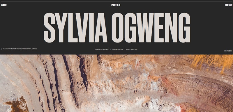
Sylvia Ogweng’s official website is a professional platform showcasing her expertise in digital marketing and copywriting. Operating worldwide from her base in Toronto, Sylvia offers full-stack inbound marketing services with a central focus on digital strategy, social media, content creation, and copywriting.
The website’s design showcases Sylvia’s proficiency in digital strategy and inbound marketing. The site has an organized layout with detailed sections for her services — emphasizing on holistic digital strategies, custom social media strategies, creativity-infused data-driven content, and SEO-focused copywriting.
A unique feature of the site is the portfolio section where Sylvia shares some of her projects. This, coupled with testimonials from previous clients, gives visitors a solid preview of Sylvia’s capabilities. The website also involves an interactive initiation for users to subscribe to ‘The Syllabus’ — a monthly review site for links, articles, and opinions in the realm of digital marketing, signaling an engaging visitor experience.
The website utilizes a clean and minimalist design that makes navigation intuitive and content easy to digest. With well-spaced typography, a harmonious color scheme, and high-quality visuals, the overall user experience is smooth and enjoyable, reflecting the high quality of Sylvia’s digital marketing expertise.
Jordyn Brenner
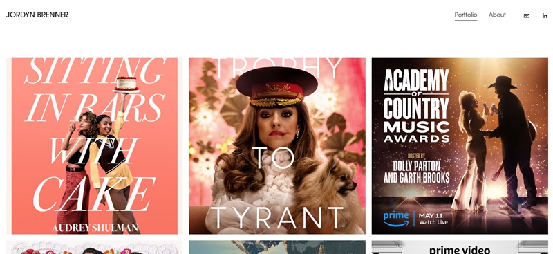
Jordyn Brenner’s professional website serves as an extensive portfolio showcasing her exceptional work in the creative design domain. Based out of Santa Monica, CA, Jordyn’s site provides a window to her contributions in various projects, imbued with creativity and multifaceted skills.
Her website design encompasses a broad range of projects reflecting her diverse skills, from traditional illustration and vector work to extensive multimedia campaigns like ‘The Marvelous Mrs. Maisel FYC campaign’. The titles of these creative projects provide clear insight into the diversity of her contributions, promoting enticing curiosity while encouraging visitors to delve into each section for more details.
Interestingly, the portfolio integrates not just one, but multiple facets of the FYC Campaign for ‘The Marvelous Mrs. Maisel,’ including the print and digital campaign, magazine cover takeover, pop-ups and events, and the awards mailer. This project-centric representation substantiates a comprehensive view of each piece’s thought process, execution, and impact, enriching the user interaction.
Other projects include different seasons of various shows such as ‘Outer Range,’ ‘Riches,’ ‘Panic,’ and more, while also shining a light on her contributions to different award experiences and mailer designs. One can note her versatile style and scrupulous design elements through these showcased works.
Quick and easy navigation is a highly commendable feature of the website, further enhanced by a dedicated ‘contact’ section featuring her email for effortless communication. The clean, crisp layout of the site, paired with its easy-to-understand structure and engaging content, makes the user experience gratifying and ensures that her creative caliber is well-articulated and appreciated by visitors.
Dayana Mayfield
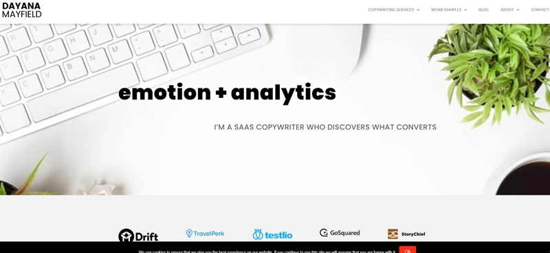
Dayana Mayfield’s official website is a dynamic online platform dedicated to her proficiency in SaaS copywriting. This site serves as an expressive representation of her signature approach of blending emotion with analytics to create transformative content.
Her services spotlight the perfect mixture of intuitive understanding, deep insights, and the tactical use of numbers to form powerful connections between businesses and their potential clientele. Dayana’s offerings range from creating SEO Web copy that drives site traffic, crafting outbound messages that elicit responses, to developing rich guide content that helps generate leads.
The website’s design is user-friendly, with a primary focus on clear messaging and intuitive navigation. Embodying a straightforward aesthetic, the website does away with confusing, elusive language and opts for a transparent and outcome-focused copy. Visitors to the site can effortlessly familiarize themselves with her various offerings and understand the value Dayana brings to their business.
Unique testimonials on her website offer meaningful insights from her past clients. These user experiences serve as persuasive evidence of her skillset and underscore the impact of her collaboration.
The contact section is transparent and approachable, encouraging visitors to get in touch with Dayana. This feature fosters effective communication and ease of engagement between potential clients and Dayana.
All in all, Dayana’s website stands out due to its clean design, and customer-centric narrative. It’s far from just telling about her services; it demonstrates precisely what to expect from Dayana’s operose work.
Droplet Marketing
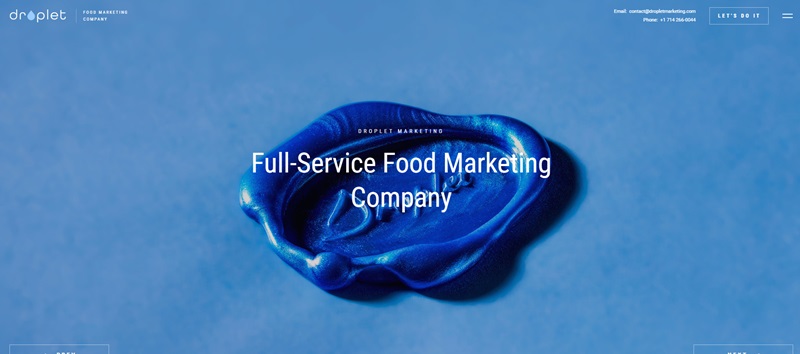
Droplet Marketing is a full-service food marketing company that specializes in providing comprehensive marketing solutions for the restaurant industry.
The company’s expertise spans various marketing avenues, including photography, design, video, digital marketing, and social media management. Droplet Marketing prides itself on being a one-stop shop that aims to maximize its clients’ marketing investments by devising a customized strategy tailored to their unique needs.
The website design is eye-catching and professional, featuring compelling imagery and relevant content that showcases the broad range of services available to clients.
The site focuses on highlighting the importance of integrating multiple marketing tools for optimal budget allocation and efficacy, setting itself apart from competitors that may promote singular strategies.
The services section effectively showcases the diverse offerings of the company through clear and concise messaging. Separating services into categories such as ‘Photo’, ‘Design’, ‘Video’, and ‘Digital Marketing’ enables visitors to get a comprehensive understanding of each specific element of their marketing assistance.
One of the website’s notable design features is the use of captivating metaphors and analogies to emphasize its mission, as illustrated by the impactful statement: “It only takes one droplet to break the tension of still water and ripple across the whole surface. Let us be that droplet for you.”
To top off the user’s experience, the use of a clean and elegant layout, combined with easy-to-use contact forms, provides an overall smooth journey for potential clients, effortlessly connecting them to the company and its services.
SnuggleMud
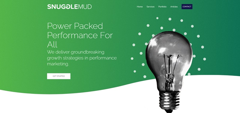
SnuggleMud is a distinct marketing agency focused on delivering innovative performance marketing strategies. Their collaborative effort maximizes the potential of your brand by giving it an impactful, efficient, and data-driven online presence.
The website’s services are clearly outlined—campaigns, branding, development, and content, each complete with links providing in-depth information.
SnuggleMud excels at nurturing brands, adopting data-driven approaches, crafting detailed designs, and leveraging strategic development to maximize conversion goals, alongside producing media paired with authoritative strategies for a positive ROI.
Founded by two creatively inclined brothers, SnuggleMud is a conscientiously assembled team offering specialized services in areas like SEM, SEO design, brand strategy, social media, email marketing, website development, and content creation.
The diverse portfolio of SnuggleMud includes partnerships with various clients including CPG brands, Fortune 500 companies, startups, non-profits, fashion and lifestyle brands, and local entrepreneurs.
The design of the website is user-centric and strategic, using an effective layout juxtaposing critical information and engaging visuals. The ‘Featured Clients’ and ‘Recent Work’ sections verify their industry credibility and display the effectiveness of their work firsthand, effectively showcasing their results-driven approach.
Valuable resources, such as articles and blogs, provide essential marketing insights and strategies, reinforcing SnuggleMud’s commitment to staying ahead of the curve. The ‘Let’s Chat’, ‘Contact’, and ‘Get Started’ CTA’s make it easy for potential clients to connect with them.
In conclusion, SnuggleMud’s website clearly communicates the company’s mission to deliver high-value marketing services without premium pricing, highlighting their ability to provide customized, innovative solutions.
Michelle L. Cheney
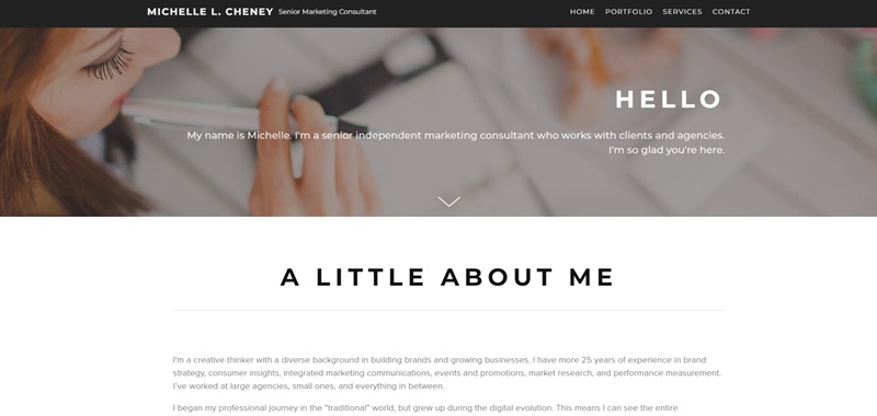
Michelle L. Cheney’s professional website showcases her credentials as a Senior Marketing Consultant. The landing page warmly introduces Michelle and quickly segues into her background, featuring over 25 years of brand strategy expertise and growth acumen for businesses. Her career has spanned from the traditional world of marketing to the digital evolution, equipping her with a comprehensive view of the communications landscape.
The website concisely outlines her areas of specialization such as Digital Marketing, Market Research, Event Marketing, Brand Strategy, and more. It emphasizes her ability to navigate both B2C and B2B marketing channels while showcasing a broad industry experience that includes Consumer Packaged Goods, Non-Profit, Retail, Technology, and Building Products.
Visitors to Michelle’s website can download her resume directly, a feature that facilitates professional connections. The site also mentions Hello Jolly Roger, a collective of freelancing professionals founded by Michelle for comprehensive project solutions beyond marketing and strategy.
The design of the website is clear and purposeful, with an introductory hero image that effectively grabs attention. The text is laid out in a manner that makes for an easy read, eliminating any unnecessary complexity that might distract from the content’s substance.
The website’s choice of a simple color palette and readable fonts emphasizes professionalism and reflects Michelle’s personal brand, which is straightforward and strategy-focused.
A broad quote about changing the world aligns with the motivational aspects of Michelle’s profile, resonating with visitors who are to be inspired and engaged. Practical contact information is presented in a direct manner and the straightforward design ensures users have a smooth experience when exploring the site.
In conclusion, Michelle L. Cheney’s website is a compelling online representation of her distinguished career as a marketing strategist, emphasizing clarity and accessibility so that potential clients and collaborators can connect with her effortlessly.
VN Medias
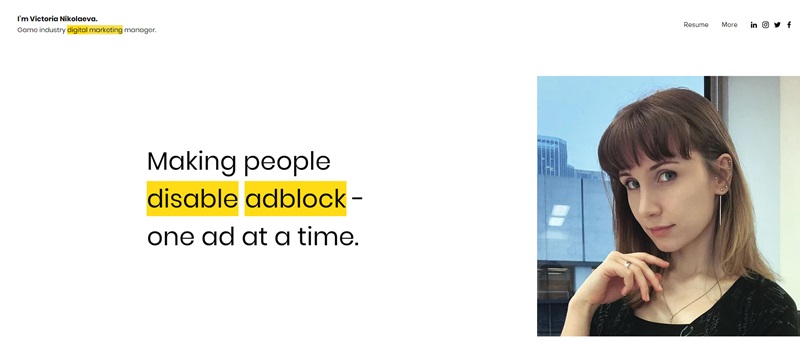
VN Medias is the professional platform of Victoria Nikolaeva, a digital marketing manager in the game industry with a robust profile in advertising and marketing.
The website serves as a window into Victoria’s experience, skillset, and past projects, highlighting her considerable expertise in areas such as Copywriting, Content Strategy, Campaign Management, Design, SEO, Branding, Social Media, Email Marketing, Research, Data Analysis, and Digital Marketing.
The site’s introductory content emphasizes Victoria’s diverse background. A statement reflecting her belief in the power of diversity as her work’s inspiration and her avid appreciation for art and color stands out, suggesting her creative approach. Victoria showcases her ability to marry creativity with data analytics to produce content that’s not only engaging but also strategically optimized and backed by data.
Design-wise, the website features a blend of compelling visuals and structured text, promoting ease of navigation for the viewer. The homepage introduces the essence of VN Medias—Victoria’s commitment to making a creative impact in the advertising space, with a humorous nod to disabling ad blockers.
There is a clear pathway to Victoria’s resume and portfolio, designed to provide a quick understanding of her qualifications and project accomplishments. Additionally, snippets of recent blog posts are featured, providing insights into her thoughts on content creation and optimization.
The design is reinforced with a quote by advertising titan David Ogilvy, encouraging a philosophy of continual testing and improvement that aligns with Victoria’s work ethos. Contacting Victoria is streamlined through an easily accessible ‘Get in Touch’ feature, facilitating potential collaborative endeavors.
In conclusion, VN Medias presents itself as a personal brand epitome, with a site design that reflects Victoria Nikolaeva’s varied talents and engaging content strategy. The website is as much a portfolio as it is a testament to her skill in creating digital narratives that are as analytically sound as they are artistically vibrant.
Perk Marketing Group
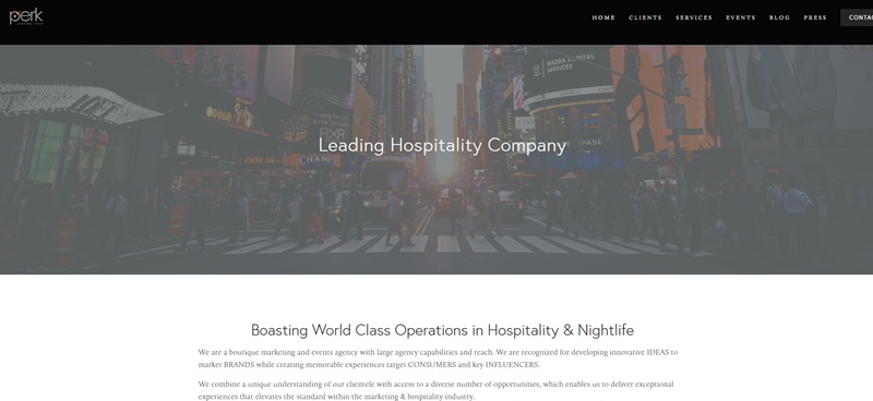
Perk Marketing Group operates as a boutique marketing and events agency offering a range of services akin to large agency capabilities.
The company positions itself as a leading player in the arena of hospitality and nightlife, distinguishing itself by developing innovative ideas to market brands and creating memorable experiences for target consumers and key influencers.
The firm asserts its unique understanding of its clientele and highlights the access it has to diverse opportunities. This combination positions them to deliver exceptional experiences, raising the standards within the marketing and hospitality industry.
One noticeable aspect of the website is their showcase of past global events, which reinforces their credentials in event planning and increases visitor confidence in their ability to deliver outstanding experiences.
Further emphasizing their industry prowess, Perk Marketing Group offers talent booking services, featuring a wide range of options from local entertainers to internationally acclaimed talent. In describing their service, they stress the importance of their experience, integrity, and a strong focus on client service on their talent booking page. They assert that the right entertainment is a game changer for any event, transforming it from bland to buzz-worthy.
The website design is clear and organized, making navigation a breeze for visitors.
The consistent display of various images from their past initiatives keeps visitors engaged further enhancing their browsing experience. The simplistic color scheme and typography provide a professional and uncluttered feel, allowing visitors to focus on the essential information.
Options to ‘Book Now’ and ‘Contact Us’ are positioned strategically to facilitate smooth user interactions for potential clients and collaborators.
This website, with its easy-to-use design and comprehensive showcase of the company’s capabilities, effectively underscores Perk Marketing Group’s expertise in the field of marketing and event planning.
Matthew Bullard
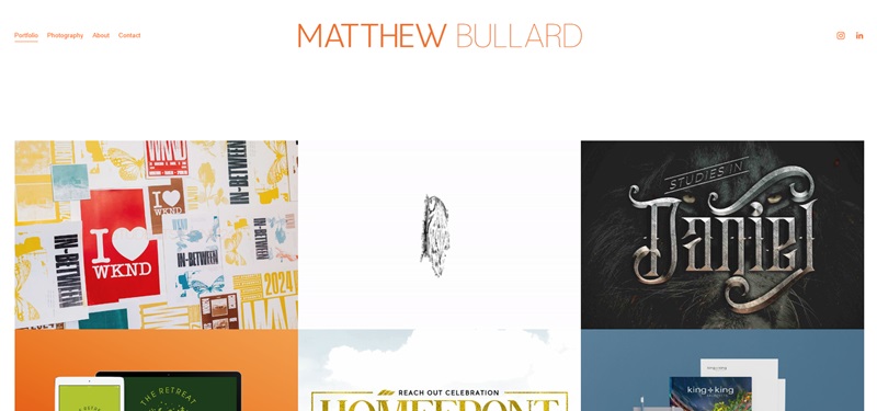
Matthew Bullard’s website works as the online platform for the eponymous marketing consultant specializing in digital marketing strategies. The site effectively establishes Matthew’s authority in the field by carefully outlining his services, experiences, and past projects. He accentuates his expertise in areas such as Digital Advertising, Social Media Marketing, SEO, and Email Marketing.
Navigating the website exposes the visitor to Matthew’s philosophy of marketing, highlighting his belief in the alignment of marketing goals with business objectives. Strategic thinking is at the core of his approach, promoting optimization within budget constraints, and striving to achieve the highest possible return on investment.
The design of the website is clean, with user experience prioritized. The homepage gives a quick overview of Matthew’s prowess, with links to section-specific landing pages for a more detailed perusal. The dominance of white space elegantly separates content and visual elements, ensuring a relaxing viewing experience. The color scheme is professional, leveraging tones that are calming and non-distracting, to keep attention focused on the content.
A distinct feature is the use of testimonials, creating credible trust signals for visitors. These testimonials vouch for the quality of Matthew’s work, amplifying his professional credibility. Potential clients can contact Matthew directly through a straightforward contact form, promoting simplicity and ease of use.
In conclusion, Matthew Bullard’s website is designed to present his wide range of expertise in digital marketing consultancy effectively. It maintains a professional look and feel whilst also being welcoming and approachable, all contributing to fulfilling the user’s informational needs.
FAQ On Marketing Portfolios Websites
What’s the main purpose of a marketing portfolio website?
A marketing portfolio website is essentially your professional highlight reel online. It’s where you showcase your best work, share your expertise, and essentially put your best foot forward to impress potential clients or employers. It’s like your digital business card, but way cooler because it’s interactive and packed with your professional achievements.
Can I include work-from-school projects in my marketing portfolio?
Absolutely, yes! If you’ve created some madly impressive campaigns or projects during your studies that demonstrate your skills, they deserve a spot on your platform. It doesn’t matter if they weren’t for actual clients—what counts is the skill, creativity, and effort you put into them.
How often should I update my marketing portfolio?
Keep it fresh! Regular updates show you’re active and always improving. A good rule of thumb is to add new content every few months, or whenever you have a new, stellar project to brag about. It’s like tidying up your room before you have guests—you want it to look its absolute best.
How detailed should project descriptions be on my portfolio?
Goldilocks has the answer: Just right. Not too long that it becomes the next “War and Peace,” and not too brief that it leaves more questions than answers. Provide context, your role, the results, and, importantly, what you learned. It’s storytelling with a point.
Should I include analytics or metrics on my portfolio?
If numbers are a big part of your achievements, show them off! Nothing says ‘success’ like cold, hard data. Did you boost engagement by 50%? Say it loud and proud! But remember, if you’re sharing client-sensitive info, get permission first.
How important is the design of my marketing portfolio website?
Design is king and content is queen. Your site should look as professional and polished as you want to be perceived. Good design helps users navigate your site and find what they’re looking for easily. Think of it as dressing to impress—it matters!
What if I don’t have a lot of professional experience yet?
Shine the spotlight on your potential. Focus on your education, certificates, internships, and relevant skills. You can also create hypothetical marketing campaigns or offer your services to non-profits or local businesses to build up your portfolio.
Should I include testimonials on my portfolio website?
If someone’s singing your praises, include it! Testimonials are like trusty sidekicks that help validate your awesomeness. They provide social proof that you don’t just talk the talk, you walk the walk.
Is it worth having a blog on my marketing portfolio website?
If you’ve got the gift of gab about industry topics, then yes. A blog can position you as a thought leader, keeping visitors returning for more and improving your site’s SEO. Just make sure you’re up for the commitment—consistency is key.
What about SEO for my portfolio website—should I optimize it?
You betcha! SEO is your stealthy partner in getting your site seen by the right people. Use keywords related to your skills and projects, optimize your images, and make sure your site’s structure is search engine friendly. It’s like a treasure map for clients, leading them right to your treasures—your work!
By addressing these frequently asked questions, you’re arming yourself with the knowledge to build a marketing portfolio website that not only looks amazing but also is purposeful, drawing the right attention and showcasing your abilities in the best light. Go ahead, create that digital masterpiece that screams “hire me” in the classiest way possible!



Leave a Reply