My content is reader-supported by awesome people like you. Which means I could earn a commission. Learn more here!
If you’re looking for landscaping websites to give you some inspiration for you to get started.
You’re in the right spot for brainstorming ideas.
Let’s go ahead and get started on these landscaping website examples
Brewers Pool & Landscaping
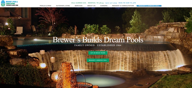
Brewers Pool & Landscaping is a design and build firm that specializes in creating custom pools and maintaining them since 1964.
The website offers an intuitive layout, with clear sections detailing their pool construction services, outdoor living solutions, and a gallery of their past work.
The ‘Why Choose Brewers’ section highlights their customized approach to designing pools that complement a home’s architecture and cater to a family’s unique needs.
Professional and easy to navigate, the website reflects the company’s extensive experience and commitment to customer satisfaction.
Laniel Paysage
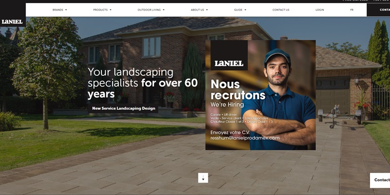
Laniel Paysage is a French-Canadian landscaping company offering a variety of services, including landscaping design, construction, and maintenance.
The website showcases their work with an interactive gallery featuring images that reveal key project details when clicked.
The site’s design is clean and modern, effectively highlighting Laniel Paysage’s commitment to quality craftsmanship.
The user-friendly structure of the website, combined with a well-designed quote request form, encourages potential clients to engage with the company.
JT’s Landscaping
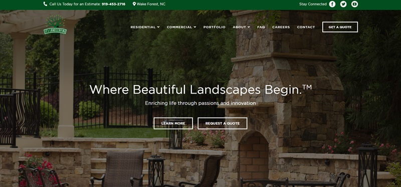
JT’s Landscaping is a professional landscaping service provider offering high-quality, unique solutions for projects of all sizes.
The website boasts a clean and attractive design with eye-catching imagery.
The site features a great balance of informative content and visuals, with sections dedicated to their landscaping services, retail components, and a gallery filled with stunning examples of their work.
The website’s blog section and testimonial page are ideal for showcasing expertise and customer satisfaction to potential clients.
Hunter Green
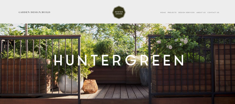
Hunter Green is a New York-based landscaping company offering services related to landscape design, garden installations, and seasonal garden maintenance.
The website possesses the appearance of both sophistication and eco-friendliness with a visually engaging green color scheme.
Featuring a simple yet elegant layout, the website provides detailed information about their services and processes, accompanied by a contact form for clients to reach out with ease.
Mark Tessier Landscape Architecture
Mark Tessier Landscape Architecture is a design firm specializing in contemporary landscape architecture that infuses elements of art and sustainability.
The website provides strong visual appeal with a full-screen, auto-play slideshow featuring engaging images of their completed projects.
Its minimalistic and modern design offers a clean and elegant visual experience.
The projects section employs an interactive grid layout that expands to reveal additional details about each design.
Green Options
Green Options is an Australian landscaping company specializing in providing sustainable, high-quality landscaping services.
The website uses an appealing combination of green and white color schemes complemented by high-quality images.
The site is designed to be user-friendly, with sections detailing their services, environmental commitments, a portfolio of projects, and client testimonials.
The impressive project gallery and blog section add an extra layer of engagement and expertise, contributing to the overall website’s effectiveness.
Lawngevity Landscapes
Lawngevity Landscapes is a full-service landscape company based in Jackson, Wyoming.
They offer a range of services which includes landscaping installation, turf management, tree and shrub work, snow removal, holiday lighting, and forestry services.
Their clients span the residential, commercial, retail, and hospitality sectors.
The website’s design features a well-structured layout, allowing visitors to easily navigate through their services. The inclusion of an ‘Our Process’ section displays transparency in how they operate.
One particularly notable design feature of the website is the ‘Meet Our Owner’ section, which adds a personal touch by detailing owner Adam Fletcher’s background.
This segment helps build trust by sharing his journey spanning from wildland firefighting to establishing the business.
The website also benefits from a home gallery that visually showcases their past work, reinforcing their expertise in the field.
The website promotes ease of access with clearly presented contact information and business hours, aimed at facilitating customer engagement.
The design’s simplicity paired with professional aesthetics creates a user-friendly experience while reflecting the business’s focus on quality and passion for the outdoors.
Earthbound Designs
Earthbound Designs is a landscaping company based in Ireland, helmed by designer Valerie Deering.
The business specializes in creating landscapes that are not only inspired by but also blend seamlessly with nature.
Their services reflect the intricate fusion of fine art and nature, emphasizing the creation of spaces such as herbaceous borders, woodland walks, kitchen gardens, courtyards, box parterres, rose gardens, and turf mazes.
The website design has simplicity and elegance, placing a strong focus on the artistry of landscaping.
One distinguishing feature of the website is the emphasis on the restoration projects they’ve embarked on, such as the historic restoration in Co. Kildare, where they revived overgrown gardens to their former glory.
Another is the mention of an English-style cottage garden project, which features gathering spaces and enchanting lighting that accentuates the garden’s beauty at night.
Key highlights from the website include:
- A portfolio section, ‘Browse Our Landscaping Work,’ which likely showcases their most notable projects.
- A personal touch through ‘Meet Valerie,’ where clients can learn more about Valerie Deering’s creative inspiration and approach to design.
- The website encourages interaction by offering a ‘Book a Consultation’ feature, complete with an easy-to-use contact form.
- The footer suggests personal service and attention to detail, listing contact information and inviting visitors to follow their projects, blog, and social media for updates.
- Photography credits at the bottom of the page indicate high-quality imagery is likely used throughout the site to draw visitors into the beauty of their work.
The website’s interface is designed to provide a visually appealing, informative, and engaging experience to potential clients.
The inclusion of stunning photography by John Channing likely gives visitors a vivid look into Earthbound Design’s capabilities and the transformative power of their landscaping work.
LawnMore
LawnMore is a landscaping organization based in Gainesville, Florida that prides itself on delivering high-quality landscaping and lawn maintenance services.
The company offers a range of services for both residential and commercial landscapes, including design consultations, holistic design, landscaping architecture, plant installation, mulch installation, hardscaping, outdoor lighting, and irrigation services.
LawnMore’s website conveys a strong emphasis on client collaboration and attention to environmental detail, leading to the creation of stunning landscapes that are both visually pleasing and long-lasting.
The website itself is carefully crafted, with concise sections showcasing their services, a photo gallery of their projects, and an ‘About Us’ section.
One of the striking features of the website is the customer testimonials, which provide invaluable social proof to website visitors and potential clients.
It also answers FAQs to address clients’ main concerns.
Furthermore, the website has a ‘Blog’ section, which assists in enhancing the company’s SEO and provides valuable insights to visitors, positioning LawnMore as an authority in their industry.
LawnMore’s website design is streamlined and easy to navigate, with well-structured sections that make information-seeking effortless for visitors.
The call-to-action buttons placed strategically across the site make it simple for visitors to request a quote or inquire further about services.
Transparent communication is clearly prioritized, making the website an effective lead-generation tool.
Easy accessibility is reflected in the prominent placement of the company’s contact information and operating hours.
Overall, LawnMore’s website combines professionalism and user-friendliness effectively, offering a comprehensive insight into their services and professionalism.
Brauss Lawn Service
Brauss Lawn Service is a company that provides comprehensive lawn care services.
The business is based in Mount Juliet, Tennessee, and extends its services to the Greater Nashville Area and Lebanon.
They offer solutions for busy homeowners who find it challenging to find the time to maintain their lawns, emphasizing that the lawn’s proper mowing, edging, and debris removal will be taken care of.
The website of Brauss Lawn Service is simple yet tasteful, focusing on delivering clear and direct information to its visitors.
It presents significant proposals like the promise of detailed attention to each project and the guarantee of customer satisfaction as the company’s top priority.
One attractive feature that stands out on the website is the highlight of ‘Free Quote.’
This calls to action is a strategic prompt to entice potential customers to reach out and discover the services offered by the company.
Another key feature of the website is the client gallery, where visitors can likely view the quality of Brauss Lawn Service’s work, providing visual proof of their expertise.
The business hours and contact information, including a phone number and email address, are clearly displayed, making it easy for potential customers to reach out.
Coupled with its promises of timely completion of tasks with detail, precision, and affordable pricing, the website effectively communicates the viability of the company as a reliable partner for lawn care services.
Overall, Brauss Lawn Service’s website has a clean, clear design that successfully portrays the company’s dedication and commitment to providing quality lawn care services.
Hess Landscape Architects
Hess Landscape Architects is a professional firm specializing in landscape architecture.
Their website is structured to provide an introduction to the firm, showcase their projects, offer information about the company, and provide ways to contact them.
Website Description and Design Features:
- Sleek and Professional: The site opens with a warm welcome, inviting users to explore its content.
- Navigation: The menu is clear and straightforward, likely allowing for easy movement between sections such as Welcome, Projects, Firm, and Contact.
- Featured Projects: The site’s main attraction appears to be a curated selection of featured projects, including titles such as “Chestnut Hill Estate,” “Birch Knoll Revival,” “Center Mill,” “River House,” “The Golf House,” and “Seaside Retreat.”
- Awards Showcase: Highlighting the firm’s credibility, the site mentions an “APLD Gold Award Winner” accolade, positioning them as leaders in their field.
- Privacy and Transparency: They have included a Privacy Policy that underscores their commitment to user privacy.
- User Engagement: The “Join Our Team” link suggests they are welcoming new talent, which could engage professionals interested in careers in landscape architecture.
The website for Hess Landscape Architects is thoughtfully designed, emphasizing both the visual showcase of their work and the functionality necessary for potential clients and partners to learn about and contact the firm.
Smith Lawn and Landscape
Smith Lawn and Landscape is a landscaping service provider based in Madison Lake, Minnesota.
They offer full-service landscape design, hardscape installation, and commercial snow removal in the Greater Mankato Area.
The company is dedicated to transforming outdoor spaces whether remodeling an existing landscape or building a new one.
The website design of Smith Lawn and Landscape is user-friendly and informative.
Upon entering, visitors are greeted with a clear overview of the services offered including landscaping maintenance and snow removal.
Details about the nature of these services, targeted towards both home and facilities, are made available in an easily understandable manner.
The business’s commitment to offering high-quality service is expressed through easy-to-find ‘Learn More’ buttons accompanying each service description.
Prominently displaying positive client testimonials serves to enhance credibility and provide social proof of the company’s high-quality work.
These testimonials highlight the company’s dedication to meeting customer’s expectations, offering great recommendations, cleanliness, attention to detail, and prompt communication as well as their vision of incorporating unique features like fire pits and footings for future pergolas.
The website also features a ‘Project Gallery’ where customers can likely view completed projects, allowing them to understand the scope and quality of Smith Lawn and Landscape’s work.
Also, the ‘Get a Quote’ feature is easily accessible, encouraging potential clients to get in touch and further explore their offerings.
Their contact information is readily available for visitors who may have inquiries or are interested in their services, enhancing the user experience.
The website design is neatly structured, and professional, and focuses on communicating the expertise and credibility of the company effectively to potential clients.
Smith Lawn and Landscape’s online presence reflects their dedication to serving customers with high-quality landscape solutions, making the website an effective tool for providing information and attracting business prospects.
FAQ On These Landscaping Website Examples
What are the key features I should look for in a landscaping website?
A top-notch landscaping website should offer a clean and intuitive design, a comprehensive display of services such as design, installation, maintenance, and hardscaping, as well as a gallery showcasing past projects. Testimonials, clear contact information, and calls-to-action like ‘Get a Quote’ buttons also enhance the site’s usability and foster trust with prospective clients.
How can a landscaping website help me choose the right service?
A well-organized website will outline detailed service descriptions, offer educational content about various landscaping projects, and provide advice on maintenance and care. Through these resources, you can gain a better understanding of your needs and what services will meet them before contacting the company directly.
What makes a landscaping website visually appealing?
The visual appeal comes from high-quality images of landscapes, a color scheme that reflects the vibrancy of nature, and a layout that mimics the serenity and organization you would want in your green space. The aesthetic should be such that it complements the beauty of the landscaping work being presented.
Can I find out the cost of landscaping services on a website?
While most landscaping websites may not list detailed pricing due to the personalized nature of the work, many offer a ‘Get a Quote’ feature. This allows you to provide details about your project so they can return to you with a customized estimate.
What information should a landscaping company’s “About” page include?
An ‘About’ page should reflect the company’s history, team expertise, core values, and a mission statement that communicates their dedication to customer satisfaction and quality workmanship. It should give you a sense of the company’s professional identity and why they stand out in their field.
How do I know if a landscaping website is up-to-date with the latest trends?
A website that features a blog or a news section with recent posts can be a good indicator that they stay current with industry trends. You may find articles on sustainable practices, innovative design ideas, or new plant varieties, reflecting the company’s ongoing commitment to modern landscaping trends.
What kind of maintenance tips should a good landscaping website provide?
Search for educational content on seasonal care, irrigation techniques, pest prevention, and plant health. Guidance on DIY maintenance or when to call a professional can also be particularly useful for ensuring the longevity and beauty of your landscaped space.
How important are customer testimonials on a landscaping website?
Customer testimonials are crucial as they lend credibility and offer real-life examples of a company’s work ethic. They also serve as a reliable indicator of customer satisfaction and often highlight the company’s strengths, such as timeliness, communication, and the overall quality of the completed projects.



Leave a Reply