My content is reader-supported by awesome people like you. Which means I could earn a commission. Learn more here!
If you are starting in the field of interior design, you may be thinking of creating a website.
A website is always the first step to a successful business since it will build your online presence.
However, you will need to make sure your website is spot on when it comes to interior design.
People will be coming to you for design purposes, so you will need to show off your skills even through your website.
If your website does not look good, they probably won’t hire you.
For this reason, we will be looking at 11 examples of interior design websites.
Through these examples, you can find out what kind of websites are successful in the interior design field.
Let’s get started.
Ver Designs – verdesigns.com
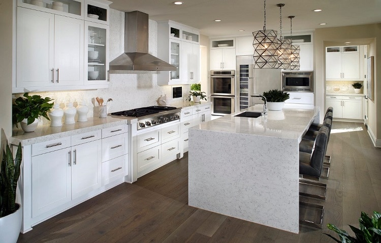
Ver Designs is a company based in the United States.
The company focuses on very modern and sleek designs, incorporating a lot of light tones such as white, grey, and blue.
The homepage of their website features two photos of their work next to boxes of text describing what they do and who they are.
The two photos they display are of a bedroom and a kitchen.
The main bedroom and kitchen are two of the most important rooms of the house, so these pictures will pique future clients’ interests.
Furthermore, the website features a black and white color theme and reinforces the companies style.
The site is very sleek and clean-looking and is not too cramped with information.
There are also pictures of the designers at the bottom of the homepage.
This feature will help clients instantly connect with the designers as well as their designs.
Not only does the color theme and layout of the website reflect their style, but the font does as well.
The stylists have chosen a simple, easy-to-read sans serif font that looks equally modern for both the titles and descriptions.
Overall, the website for Ver Designs is very easy to navigate and read.
The site is simple but has just enough of the designer’s style to draw people in.
Hart Howerton – harthowerton.com
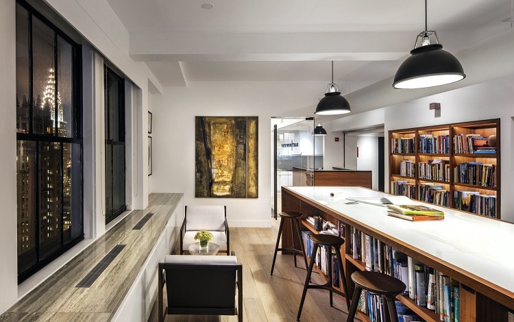
Hart Howerton has one of the best interior design websites.
The website’s homepage features a slideshow of wide-angle photos that showcase some of the designer’s best and biggest projects.
The website feels a bit more unique and personal since it uses three different fonts; two serif fonts and one sans serif.
Some of the titles are also written in italics, which adds to the glamourous feel of the site.
If you scroll down a bit, you will see more photos. You can then click on a specific project to read more about it.
While the website’s design is not anything to write home about, it is a great example of how to use your portfolio photos as the main feature of your design website.
Avery Cox Designs – averycoxdesigns.com
Avery Cox Designs is based in Austen, Texas.
The designer focuses on creating overall modern looks with influences of vintage style and bold colors.
When you first visit the URL, you do not see the homepage of the website.
Instead, you are directed to a simple page with a button reading “enter site.”
The company’s name is right above the button, and the designer’s location is at the very top of the page.
The background is a modern abstract painting and features green, blue, and light peach colors.
This cover page helps the website to feel more professional.
It also gives the impression that this site is more of a portfolio than a regular website.
When you enter the website, the first thing you see is a wide-angle photo of a colorful and stylish living room accented with green, white, and pink.
Underneath the design is a quote from the designer explaining what exactly she does:
“Let’s work together to design a joyful, cohesive, inspiring space….”
Right below this section is a short yet detailed list of services she offers.
The title font is a serif font that looks very stylish and feminine, while the body font is a basic and easy-to-read sans serif font.
Right below her services is some photos from her portfolio.
This feature allows clients to view her work right away instead of visiting another page of the website.
The website is very simple yet elegant and acts as the perfect base to let her photos shine.
Laurel & Wolf – laurelandwolf.com
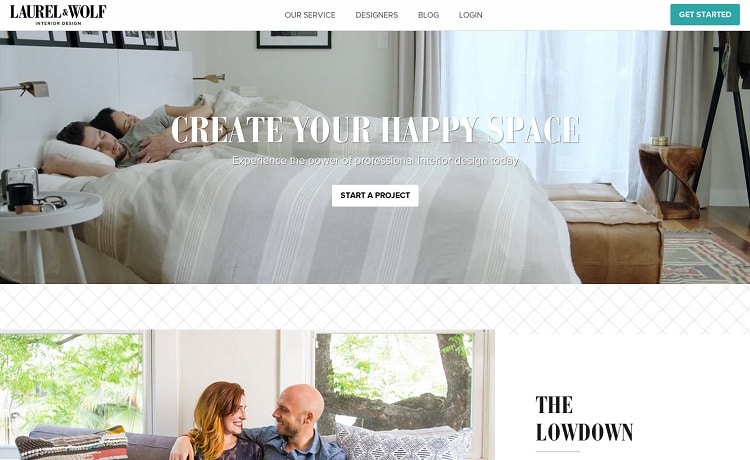
While this isn’t one of the most creative interior design websites, it is a great example of simplicity.
The homepage features a light and feminine design with purple tones and geometric shapes.
As you scroll down, you will see a few buttons that clients can click on to get more information.
Each button also has a photo beside it, so clients can see a few design examples right away.
All of the other pages on the website include forms for the client to fill out and other things such as testimonials.
If you want to build a simple yet effective site, this is a great one to check out.
Andrey Sokruta – Sokruta.com.ua/en
Andrey Sokruta has been an interior designer since 2008.
When you first visit the site, all you see are photos from the designer’s portfolio.
There are about three photos that the homepage flips through as a slide show.
The website has a very innovative and contemporary design and functionality.
You can navigate the entire website by simply scrolling with your mouse; you won’t have to click anything if you don’t want to.
This unique design reflects the designer’s philosophy very well.
The color scheme of the website is black and white.
The title font is bold sans serif style that is easy to read.
The body font is also sans serif and matches the modern feel of the title font.
After the customer views a few images of Andrey’s work, they also read five reasons why they should hire the designer.
Each reason takes up an entire page, which gives it a very minimalist feel.
The first few pages of the website are very simple.
Customers can also click on the side menu to learn more about the business.
Karim Rashid – karimrashid.com
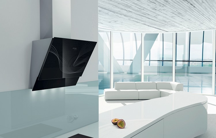
Karim Rashid has one of the boldest interior design websites out there.
The title font is a very thick, serif font that is typically the focal point of each webpage.
Each page also features a bold color that blends well with the picture in the foreground.
If you want to create each webpage to be a design in itself, this will be a good website to study.
While other websites simply rely on their work to speak for themselves, Karim Rashid approached his own website as a separate design project.
Each page looks like a fun, modern piece of art.
One of the main things you can take from this website is how you can match the color scheme of each webpage to the photo you are showcasing.
Not every page has to look the same;
play around with the colors and have some fun with it.
Overall, the website is full of bold colors and fonts that jump out at you.
Jova – jovaconstruction.com
Jova construction is a company based in Quebec, Canada.
Their website is one of the most innovative interior design websites you will visit.
The homepage features a large, full-screen image of their work in the background with a business card-like box in the center.
You can click on a few buttons that will bring you to the other pages on the website from this box.
The entire website is full of portfolio images.
However, the modern functionality of the site also adds to the designer’s credibility and adaptability.
Not only does each page feel like a work of art, but each graphic element moves onto the page in fluid motions when the page first loads.
As you go through the site, it feels like a very interactive experience.
Emily Henderson – stylebyemilyhenderson.com
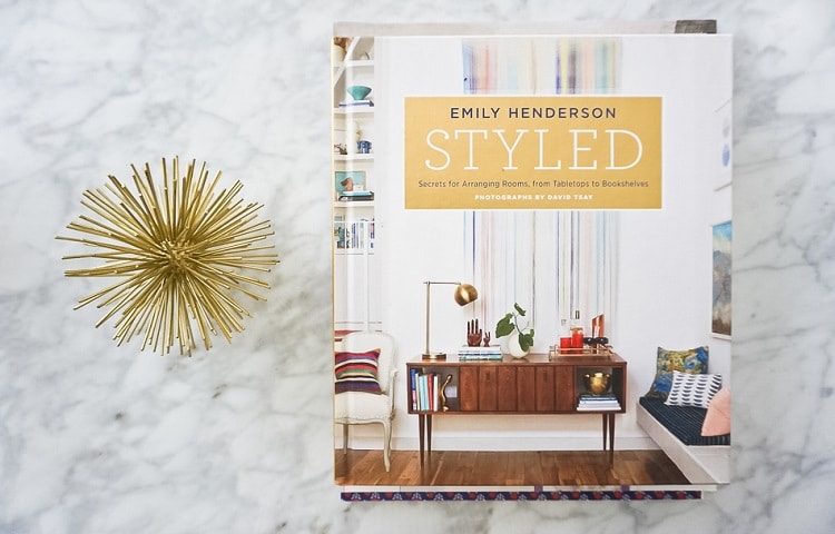
If you intend to run a blog on your interior design website, stylebyemilyhenderson.com will be a good site to look into. Emily Henderson, an interior designer, started this design blog about ten years ago in 2010.
The website has a stylish banner on the top of each page.
The banner features an elegant flower drawing with vibrant colors of pink, green, and purple.
The designer’s name is written in a modern sans serif font.
Just above Emily’s name is her logo.
The menu runs along the top of the website. People can then click what page they want to visit.
There are about ten pages on this website.
As you will see, the website is very photo-heavy.
The background is plain white, but the site can get away with it since beautiful photos of Emily’s designs cover the whole page.
Amber Interiors – amberinteriorsdesign.com
Amber Interiors Design Studio is based in Los Angeles, California.
While the designer embraces contemporary influences, she also incorporates each client’s personality into each style.
Amber Interiors has one of the most beautiful and elegant interior design websites.
The website has a simple cover page that simply reads “Amber Interiors Design Studio.”
Behind the sans serif text is a slideshow of Amber’s portfolio.
To enter the site, you can click on the menu button. If clients want to see more of her work, they can visit the projects page.
From there, they can click on different client projects and see an entire gallery of the designer’s work.
The site is not overwhelming in the sense that there are not too many pages.
The color scheme is very modern and includes white, black, and green/grey.
All of the fonts are also sans serif, which adds to the contemporary feel.
LauraU Design Collective – laurauinteriordesign.com
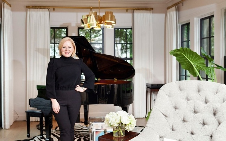
While many other interior design websites have more modern themes, LaruaU Design has a classy and elegant theme.
The home page has a wide-angle picture of one of the companies projects.
As you scroll down, you will see the faces behind the company and a few more portfolio photos.
There are also a few links to the portfolio page and the services page.
This website is another great simplistic example.
The site is easy to navigate and has a clean color scheme (white and beige).
Portfolio pictures are the focal point of every page, which helps the client get a feel of the firm’s style.
Amanda Hamilton – amandahamiltondesign.com
If you are looking for a more trendy interior design website to look at, this will be a good one to check out.
The homepage immediately catches your eye; there is a video playing in the background.
The short video shows Amanda, the main designer, in action.
This video gives clients the chance to connect with the designer even before meeting her.
When you scroll down a bit, there are three options you can click on.
You can either learn more about the main designer or check out the residential and commercial portfolios.
One thing that stands out about this website is the color scheme.
The site is white, light pink, and black.
While the site still looks professional, the little splash of color makes it feel a bit more friendly.
Conclusion
We hope this guide has helped you get a few more ideas for your new interior design website.
There are a few things to keep in mind when creating a site for your interior design business.
First of all, having some portfolio photos on the home page of your site is always a good idea.
To convince a potential customer to continue looking through your site, you need to show them that you are a good designer from the get-go.
Furthermore, your site should be easy to navigate.
A potential customer should not have any difficulty visiting the different pages of your site; if they have trouble, they will most likely search for another designer.
While you can fully rely on your portfolio photos to do the work, you should also design each page of your website to be a work of art on its own.
Show off your design skills and create a beautiful website.
Most importantly, make sure your website represents your style.



Leave a Reply