My content is reader-supported by awesome people like you. Which means I could earn a commission. Learn more here!
Let’s check out some Hubspot website examples utilizing the free CMS Hubspot tool.
Will see some key designs and websites utilizing it some or all.
There is added functionality in premium editions of CMS Hub too!
Let’s get started and check some out to get the inspiration you need to start yours.
The Spicy Shark
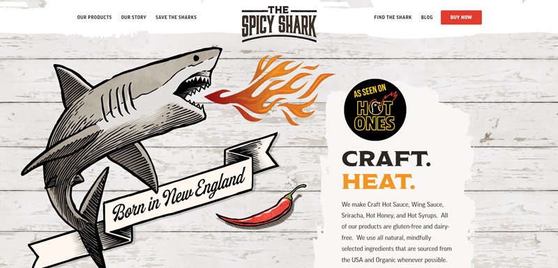
When I checked out The Spicy Shark website, I could tell right away it’s a place where you can buy hot sauce and other spicy treats.
This site is not just a store; it’s a whole experience!
Let me tell you what makes it really cool and easy to use:
- Easy on the Eyes: The colors are bright and grab my attention. The site uses reds and oranges, which make me think of spiciness and heat. I want to explore more just because it looks fun.
- Simple to Navigate: Everything I want to find is just a click away. They have clear menus for products, their story, and even how they help sharks! This makes it easy for someone like me to find my way around without getting lost.
- Yummy Photos: Pictures of their products, like hot sauces and syrups, are everywhere. They look so delicious that I can almost taste them through the screen.
- Great for the Earth: They don’t just sell hot sauce. They care about the ocean and sharks, and they share how they help. That makes me feel good about buying from them.
What’s Hot About Their Sauces
- All-Natural Ingredients: They’re serious about what goes into their sauces. They choose everything carefully, so it’s healthy and doesn’t have any fake stuff. This is important for keeping our bodies happy.
- Heat Levels for Everyone: No matter if you like a little tingle or a big, bold fire in your food, they have a sauce for you. They even have a ‘6 Fin Series’ for the bravest spice lovers!
Cool Extras
- Their Story: I love hearing how people start their businesses, and The Spicy Shark has a special section where they share their family’s love for hot sauce and their mission to protect the oceans.
- Interactive Elements: They have a “Find the Shark” game! How often do you see that on a food website?
To Wrap It Up
The Spicy Shark has a website that’s not only about shopping; it’s a place where you learn, have a bit of fun, and even do some good by supporting ocean life.
It makes me want to try all the sauces and be a part of their story!
Raison Home
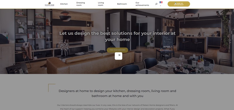
I took a good look at the Raison Home website, and it’s a fantastic place online that shows you how to make your house look great.
They focus on custom-designed kitchens, storage, and bathrooms.
Let me tell you more about what makes this website stand out.
What Raison Home is All About
- Custom Kitchen Designs: They offer a bunch of styles for kitchens where you can find the one that fits you best, like modern, rustic, or industrial.
- Personalized Storage Solutions: If you’ve ever wanted a closet made just for you, they’ve got tips and tools to help design the perfect space for all your clothes and stuff.
- Bathroom Perfection: Bathrooms are not just bathrooms here; they turn them into relaxing spaces where you can really chill out after a long day.
Nice Features of The Website
- Easy to Explore: When I clicked around, everything was super easy to find. They’ve set it up so you can hop from the kitchen info right to the dressing or living room ideas without any trouble.
- Cool 3D Planner: There’s this awesome tool where you can design your own kitchen or closet in 3D. It’s like playing a game where you get to create a part of your house!
- Real Examples: They show a bunch of pictures of what they’ve made before, which I think is super helpful when you want to see what’s possible.
- Helpful Advice: The website is packed with tips and tricks, all written down so you can read them anytime you want some ideas for your own space.
- Language Options: I noticed that you can choose different languages to read the site in, which is great for all sorts of people from different places.
Overall, Raison Home’s website is really cool if you’re trying to shake things up at home and need some fresh, custom ideas.
And with all these features, it makes planning fun and a whole lot easier!
The Influence Room
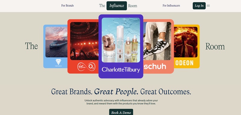
I dove into The Influence Room’s website, and let me share what I found.
This website is a cool spot where brands and influencers can come together.
If you’re a brand, you get to meet influencers who already love what you do.
And if you’re an influencer, you get to find brands you’re passionate about and work with them.
Let’s break it down a bit more.
What The Influence Room Does
- For Brands: Brands can find and work with influencers. This place helps brands to easily pick influencers who already like their products. It’s like making friends who already think you’re cool!
- For Influencers: If you’re an influencer, this website helps you find brands that fit what you like talking about. You can choose who you want to work with and create fun content for them.
Cool Website Features
- Easy Navigation: First off, finding your way around the site is a breeze. You can quickly jump to the info you need, whether you’re a brand or an influencer.
- 3D Design Tools: They have these neat tools that let brands and influencers picture how they can work together. It’s almost like playing a video game where you plan cool partnerships.
- Real Success Stories: The site shows real examples of brands and influencers who’ve made awesome things happen together. It’s inspiring to see what others have achieved.
- Guides and Resources: They’ve packed the site with helpful tips, guides, and ebooks. It feels like they’re really there to help you succeed, no matter which side you’re on.
- User-friendly Interface: The website has a clean look and is super simple to use. It’s easy on the eyes and makes finding what you need hassle-free.
Coke Northeast
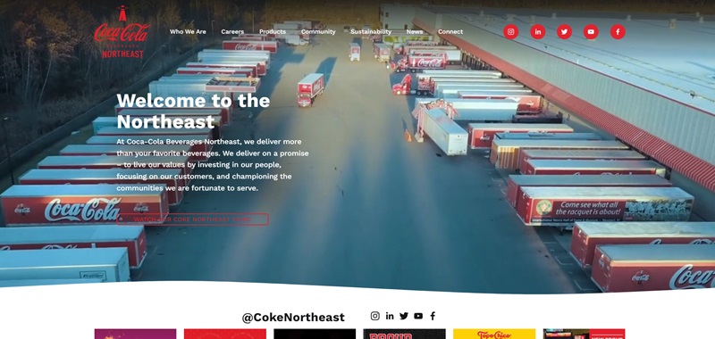
Next up, Coke Northeast’s website caught my attention.
This site is all about showcasing Coca-Cola products and initiatives in the Northeast region.
They’ve got everything from the classic Coke we all love to new, exciting drinks.
Plus, they dive into community efforts and ways they’re trying to make a difference.
Here’s more on that.
What Coke Northeast is Sharing
- Cool Products: They spotlight all the Coca-Cola goodies, from your favorite sodas to new beverages you might not have tried yet.
- Community Engagement: This site isn’t just about selling soda; it’s also about how Coke gives back to local communities. They talk a lot about being good neighbors and helping out where they can.
- Environmental Efforts: Coke Northeast is serious about taking care of our planet. They share info about how they’re working to reduce waste and use resources wisely.
Website Design Highlights
- Bright and Friendly: The site welcomes you with warm colors and happy images. It feels like walking into a friend’s house where everyone is glad to see you.
- Easy to Read: They’ve made sure you can find the info you want quickly, and it’s all written in a way that’s easy to understand. No headache-inducing fine print here.
- Interactive Maps: There are cool maps that show you where Coke Northeast is making a difference in the community. It’s a fun way to see the impact they’re having.
- Community Stories: They share stories from real people in the Northeast about what Coke means to them. It feels like a community bulletin board filled with happy notes.
- Eco-Friendly Focus: The site does a great job of explaining how Coke Northeast is trying to be better for the environment. It’s clean, green, and all about being eco-friendly.
Foundation IT
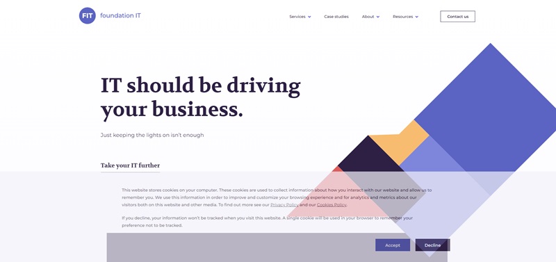
I took a thorough look at Foundation IT’s website.
This site is all about offering top-notch managed infrastructure services.
They provide various services from standard managed services to tailor-made cloud desktops.
Let’s see what makes this site so engaging.
What Foundation IT Offers
- Managed Services: They offer maintenance, optimization, and rapid incident response for your IT infrastructure. This means your system keeps running smoothly, and you can focus on your business.
- Azure Virtual Desktop and FIT Cloud Desktop DaaS: These services give your team the power to work from anywhere while keeping your data secure. They are perfect for businesses that have remote teammates and need a flexible solution.
Cool Website Features
- Straightforward Navigation: I had no trouble finding my way around this site. The information is organized in a simple way that makes sense.
- Real Success Stories: The site shares real-life examples of businesses that have worked with Foundation IT. This is really helpful if you want to see their services in action.
- Detailed Service Information: They have broken down each service to help you understand what you’re getting. It’s all written in a really simple, sixth-grade reading level so that no one has a headache trying to understand it.
- Contact Info: If you need more information or want to reach out to them, their contact info is easily accessible right on the homepage.
In short, Foundation IT’s website is a great example of how to showcase your services effectively.
Simplicity and clarity are key here, and it means finding the info you need is a smooth process.
Their website certainly reflects the quality of the services they provide.
Guest Suite
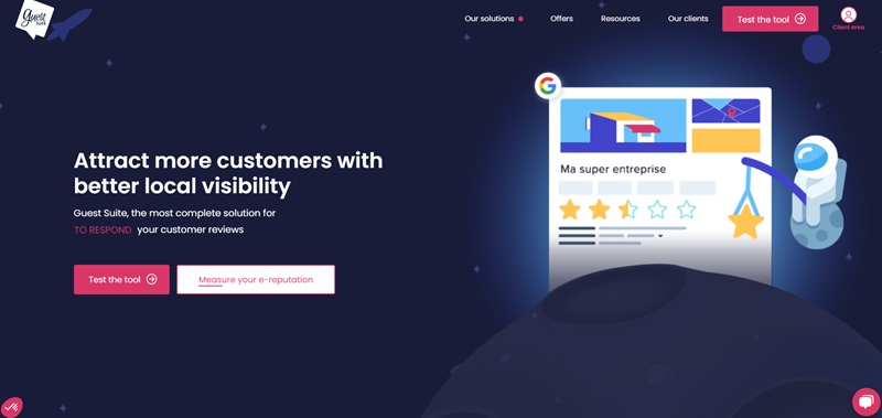
I dove into the Guest Suite website and discovered that it’s a specialized tool for managing local visibility online.
Guest Suite helps businesses collect, analyze, and share customer reviews.
They put a lot of work into helping businesses shine online.
What Is Guest Suite All About?
- Collecting Reviews: They help you gather feedback from your customers which can help other people decide to use your business.
- Analyzing Feedback: The website provides tools to look closely at what customers are saying so you can understand and improve your services.
- Sharing Success: It makes sure the good things customers say are seen on websites and social media platforms.
Design Features That Stand Out
- Eye-Catching Visuals: I noticed that the website uses bright and inviting colors. This grabs your attention and guides you on where to look next.
- Clear Layout: They’ve laid out sections cleanly, so you know just where to click for more details or how to get started.
- Helpful Examples: Guest Suite shows how other companies use their service. You see real achievements from businesses that have gotten more stars online.
- Easy to Connect: If you need to talk to Guest Suite, it’s easy because their contact info is right there on the page. No hunting around is needed!
In conclusion, the Guest Suite website makes its mission clear.
It offers a straightforward path for businesses to improve their online presence through customer reviews.
The site design is practical and user-friendly, helping visitors quickly learn how they can benefit from the service.
Care New England
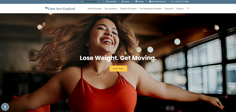
When I visited the Care New England website, I found it is a helpful place that talks about health services in Rhode Island.
They offer a lot of different healthcare options and provide support for almost two decades.
Care New England also has tons of info about working in their hospitals and clinics.
What Care New England Offers
- Wide Range of Services: They give many types of health services, like helping women give birth and taking care of people’s hearts.
- Easy Access to Health Records: You can see your health records right through their website.
Highlights of the Website Design
- Bright and Inviting Colors: The website uses colors that make you feel welcome and calm.
- Simple Menus: Everything you need is easy to find thanks to the way they organize the menus.
- Success Stories: I saw stories about people they’ve helped, which shows they really care.
- Educational Blogs: They write blogs that teach you about health and how to take better care of yourself.
So the Care New England website is a great tool for people looking for health care.
It helps people learn about their health, and I can tell it’s a place that wants to make sure people feel cared for and informed.
Hillbrush
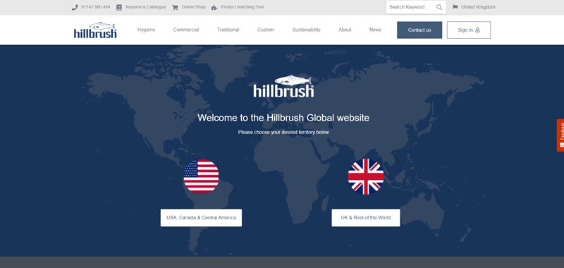
I explored the Hillbrush website, and I want to share what it’s focused on and some cool parts of its design.
Hillbrush is a company that makes brushes and hygiene cleaning tools.
They have a lot of products for keeping places clean, like buckets, brooms, and special brushes that make sure no dirt is left behind.
What Hillbrush Is Offering
- Variety of Cleaning Tools: They have everything you might need to clean, from simple hand brushes to more complex cleaning systems.
- Custom-Made Brushes: If you can’t find the brush you’re looking for, Hillbrush can make one just for your needs. This is super useful for businesses with specific cleaning challenges.
Awesome Website Design Features
- Colorful and Clear Sections: The website uses bright colors that draw your attention to the important parts. This makes it really easy to look at and understand.
- Easy Navigation: I could find my way around the website effortlessly. They have a simple menu that takes you exactly where you want to go.
- Success Stories and Case Studies: Hillbrush shows off how their tools have helped other businesses. Reading these stories gives you a good feeling about what the tools can do.
- Information on Sustainability: They talk about how they make their products in a way that’s good for the planet. I think it’s important and cool that they share this.
In summary, the Hillbrush website does a fantastic job of showing off their cleaning tools and how they can help keep your space clean.
The design of the website makes it super easy and enjoyable to find all the information you need.
Caithness Construction
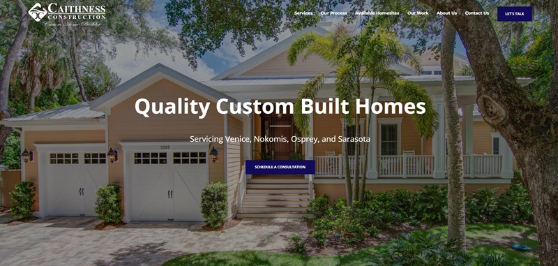
I checked out the Caithness Construction website, and I’m excited to tell you what they do and why their site is so nice.
Caithness Construction is a top-notch home builder in Sarasota, Florida.
They focus on creating custom homes for people in the Venice, Nokomis, Osprey, and Sarasota areas.
Whether you want a house by the water or somewhere else cool, they can build it.
What Caithness Construction Offers
- Custom Homes: They build special homes that match exactly what you dream of.
- Remodels and Renovations: If you already have a home but want to change things up, they can do that too.
- Attention to Every Detail: They promise that your house will have the best of everything because they pay attention to even the smallest things.
Cool Website Design Features
- Bright and Welcoming: The website uses colors and pictures that make you feel excited about building a home.
- Super Clear Information: It’s really easy to find out about their services, like building and remodeling.
- Stories of Happy Homes: The website shows pictures and stories of homes they have built, which makes you think, “I want a house like that!”
- Local Pride: They talk about using local people to build their homes. It feels good to know they support the community.
In short, the Caithness Construction website does an amazing job of showing off what they do best: building beautiful custom homes.
The site is easy to navigate, and it makes you excited about the possibility of creating your dream home with them.
Frequently Asked Questions
What are examples of websites using Hubspot?
If you're curious about who's using Hubspot, you're in the right place. Countless businesses, both small and large, use Hubspot's range of services. From construction companies like Caithness Construction using it to showcase their stunning custom homes, to health services like Care New England that makes patient information easily accessible. Another example is the manufacturer Hillbrush who hooks visitors with its colourful, interactive website.
How do these Hubspot website examples stand out?
I can't stress enough how important the design and functionality of a website can be. The great thing about these Hubspot websites is how they make information easily digestible while still catching your eye with unique designs. For instance, Care New England uses clear, simple menus, while Hillbrush dazzles visitors with bright, clean sections for a smooth navigation experience. Our pal, Caithness Construction, showcases their offerings with bold imagery.
Why are these Hubspot website examples user-friendly?
These websites hit a home run when it comes to user experience. The easy-to-understand information, combined with the simple navigation, are unique features found in these Hubspot website examples. They've been so clever with the way they've structured their sites, you never feel lost or confused.
What can I learn from these Hubspot website examples?
Ah, my favorite question! These websites can teach you a lot about creating a great online experience for your visitors. From Care New England's educational blogs to Hillbrush's use of success stories and sustainability info, these websites know how to engage their audience. They promote their products and services in vivid, relatable ways.



Leave a Reply