My content is reader-supported by awesome people like you. Which means I could earn a commission. Learn more here!
https://creatingawebsitetoday.com/how-to-make-a-website-to-sell-clothes/Have you ever caught yourself daydreaming about starting your own eCommerce website after stumbling across a particularly cool one?
Well, buckle up,
because we’re about to turn that daydream into reality.
This article is chock-full of e-commerce website examples to kickstart your creativity and get you ready for launch.
From innovative design and mighty SEO tactics to remarkable user experience, our handpicked examples cover all bases.
No, we’re not stopping at just showcasing these sites.
I’m also going to dissect what makes each one shine in today’s competitive eCommerce world.
And trust me,
you’ll want to keep reading because applying these insights could transform your eCommerce dream into the next digital sensation.
Are you ready to check out some awesome eCommerce websites?
Let’s go!
Supernatural Kitchen
Website Description
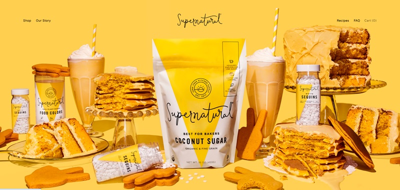
Supernatural Kitchen is all about making your baking experience sweeter and healthier.
They produce food coloring, sprinkles, baking chips, and frosting mixes that are colorful and plant-based.
To boost the joy of baking, they’ve ditched the usual food colors that contain harmful chemicals and instead, utilize colors derived from plants.
Website Design Features
- Bright colors and appetizing images instantly grab your attention.
- Simple navigation at the top of the page makes it easy to explore.
- Clear product descriptions with a call to action, encouraging visitors to shop.
- Inclusion of social proof in the form of “Instagram Sprinkle Grams,” enhancing trust.
- The footer includes links to important information such as contact options and terms of service.
The Sus Outdoors
Website Description
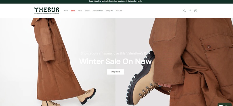
An outdoor adventurer’s paradise: The Sus Outdoors beckons those who thrive in Mother Nature’s playground.
They have every piece of outdoor gear you can think about, from tents and hammocks to camping cookware and hiking backpacks.
Website Design Features
- Striking, high-quality images showcase the beauty of the outdoors and their products.
- Clean layout makes information easily accessible.
- Search bar adds functionality and makes it easy to find specific items.
- Footer includes links to social media profiles, increasing engagement opportunities.
Send Potion
Website Description
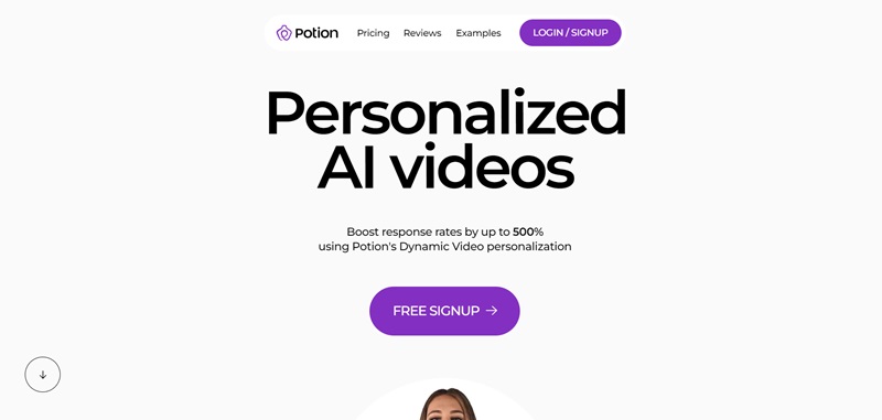
Send Potion is about making social media marketing easier.
By helping automate Twitter activity, they help grow their customers’ online following. Now you can easily share your content and attract new followers!
Website Design Features
- Minimalist, clean design makes navigation effortless.
- A step-by-step explanation of the service on the homepage is helpful for new visitors.
- Trust-building elements such as press mentions and testimonials are highlighted.
- Highlights clear pricing plans directly on the homepage.
Roofing Direct
Website Description
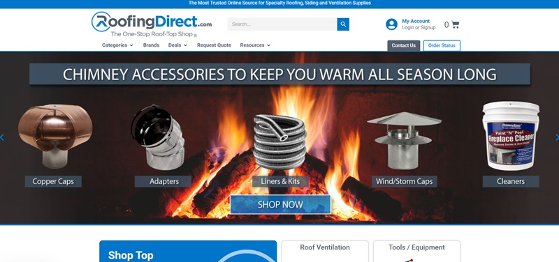
Roofing Direct is a one-stop shop for all your roofing needs.
The website offers a great assortment of roofing products, catering to both professionals and homeowners.
You can find everything – from roof coatings and shingle cutters to mobile fall protection carts and skylights.
Website Design Features
- The Roofing Direct website makes sure no visitor feels lost in the sea of roofing supplies. Everything is categorized neatly, making it super simple for you to find your perfect roofing product.
- They offer free shipping on many items, which is definitely a treat! Not only do you score your necessary roofing materials, but you also get them shipped to your doorstep for free.
- An interesting feature is their product rating and review system. You can check product reviews directly on the site, a nifty way to know if a product will meet your expectations.
- Contacting the Roofing Direct team is a piece of cake as well; they’ve made sure you can reach out with just one click!
In a nutshell, Roofing Direct is a user-friendly site where you can buy various roofing supplies without any fuss.
The ease with which you can navigate and shop makes Roofing Direct a top-notch online marketplace.
Feastables
Website Description
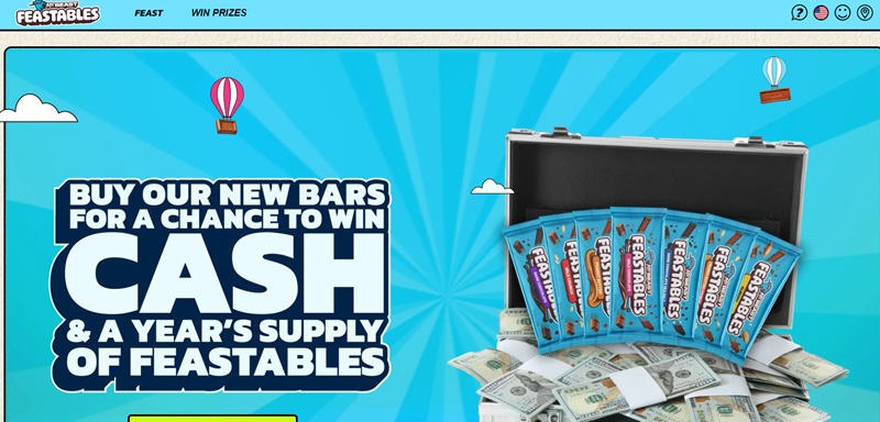
Feastables is the spot where making meals becomes easy and fun.
This website offers a variety of readymade meals.
Now, you can easily keep your fridge stocked up with delicious, wholesome dishes.
Website Design Features
- Engaging large images of mouthwatering meals creates a visual feast.
- The design is clean and easy to navigate.
- High emphasis on food quality and variety in their homepage.
- A pop-up box for subscription on the homepage.
- The footer provides quick links to important information like FAQs and Shipping Policy.
Kohl’s
Website Description
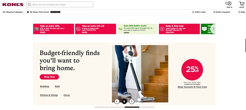
If you’re in need of one-stop shopping, Kohl’s is your place.
It’s a popular department store.
Here, you can find everything from clothing and accessories for your family to home decor and more.
Website Design Features
- Eye-catching sales and deal sections on the homepage.
- User-friendly top bar navigation, segmented by popular categories.
- Numerous filters are available to make shopping for specific items easier.
- The interactive cart that immediately shows added items.
Decibullz
Website Description
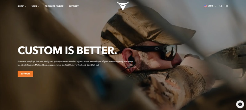
Decibullz is a unique website for music lovers who value comfort and quality.
They offer custom-fit earphones that give excellent sound quality without sacrificing comfort.
Website Design Features
- They engage the visitor immediately with an impressive video.
- Simple navigation options reside at the top of the website.
- Products are well-showcased with images and descriptions.
- Mobile responsive design ensures smooth browsing on any device.
Kroger
Website Description
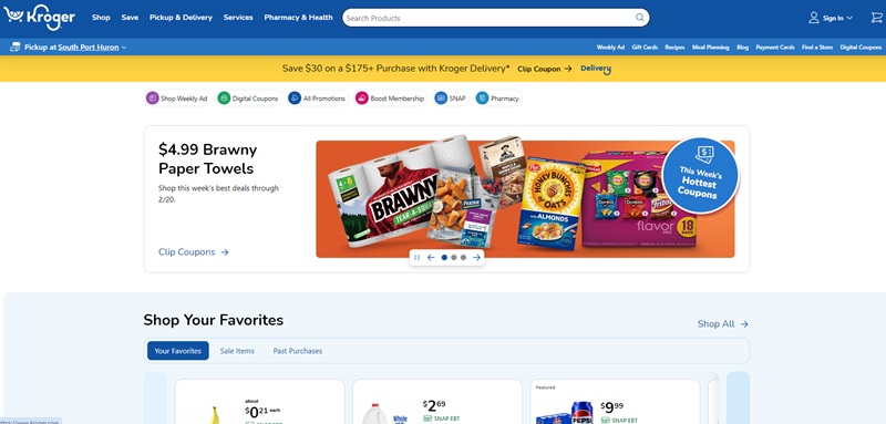
Shopping for groceries is now a click away with Kroger.
It’s an online grocery store.
You can shop for all your household needs, right from the comfort of your home.
Website Design Features
- It is a neat and simple design for easy navigation.
- Comprehensive search bar for specific searches.
- Store locator for those preferring an offline shopping experience.
- Explicit sections for offers and deals.
Azteca Soccer
Website Description
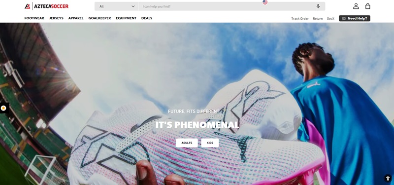
Azteca Soccer is all about the beautiful game – soccer!
This place is a soccer player’s dream.
They sell everything a soccer enthusiast needs, from shoes and jerseys to soccer balls and equipment.
Website Design Features
- Bright and colorful images immediately grab your attention.
- The design is lively, mimicking the energy of soccer.
- Menus are clear and let you find what you need fast – like cleats or your favorite team’s gear.
- On the homepage, there’s a section for deals and featured products.
- They’ve got a customer support chat, too, right on the site if you need help.
Bite Toothpaste Bits
Website Description
Bite Toothpaste Bits is shaking up the way we brush our teeth!
Their website sells tiny toothpaste bits that make sure your smile is healthy and your breath is fresh.
Website Design Features
- The homepage gets straight to the point with a video showing how the bits work.
- Big, bold text explains the steps – they make it simple.
- Their design is clean and fresh, just like their product!
- They have reviews on their homepage too, so you can trust what they’re selling even more.
Bliss
Website Description
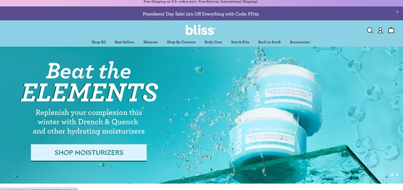
This is a blissful place for all things skincare.
Bliss features a range of spa-quality products, and they’re all about making your skin glow.
Website Design Features
- Super fun and inviting colors greet you when you visit.
- The layout is simple – it guides you right through all the good stuff, like face masks and moisturizers.
- They’ve got a cool thing where you can chat for skincare advice.
- All over the place, you see their promise: 100% cruelty-free.
Black Star Pastry
Website Description
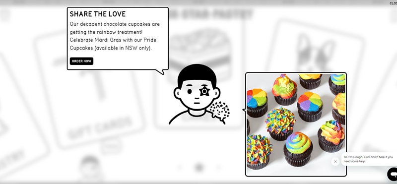
They are famous for this amazing cake covered in flowers – it’s like a garden you can eat!
Website Design Features
- First thing: delicious photos of their pastries that make your tummy rumble.
- You can easily click around to find their locations or order those tasty treats.
- They show off their Instagram right on the homepage, so you see all the yumminess people are enjoying.
- And there are easy buttons to press if you want to get those goodies for your next party.
Crossrope
Website Description
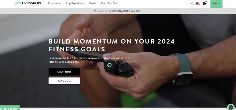
Crossrope brings the fun and challenge of jumping rope to a new level.
Whether you want to get fit or just have a good time, they have you covered with ropes for all ages and fitness levels.
Website Design Features
- As soon as you hop onto the site, you’re welcomed with action-packed images.
- They keep it simple and clear, helping you find the right rope.
- They feature a neat quiz that helps you pick a jump rope that’s just right for you.
- Reviews from other jumpers are there for you to see how much people enjoy their products.
The Home Depot
Website Description
Get ready to tackle your home projects with The Home Depot.
If you want tools, building materials, or just a new plant for your garden, this is where you’ll find it.
Website Design Features
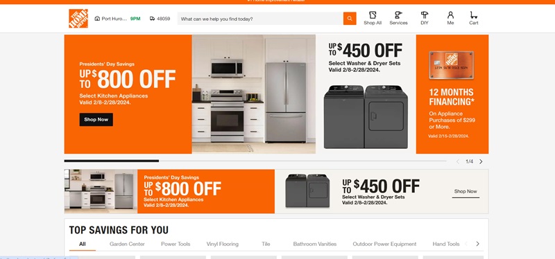
- The bright orange theme catches your eye the second the page loads.
- They make it super easy to search for everything you need.
- With clear categories and deals featured right up front, you won’t miss out on the best buys.
- For more help, they have a chat box ready to provide you with advice on your projects.
Zeuss
Website Description
Zeuss powers up your portable charging game.
For anyone who’s on the go and needs their devices ready and full of juice, Zeuss has the gear you need.
Website Design Features
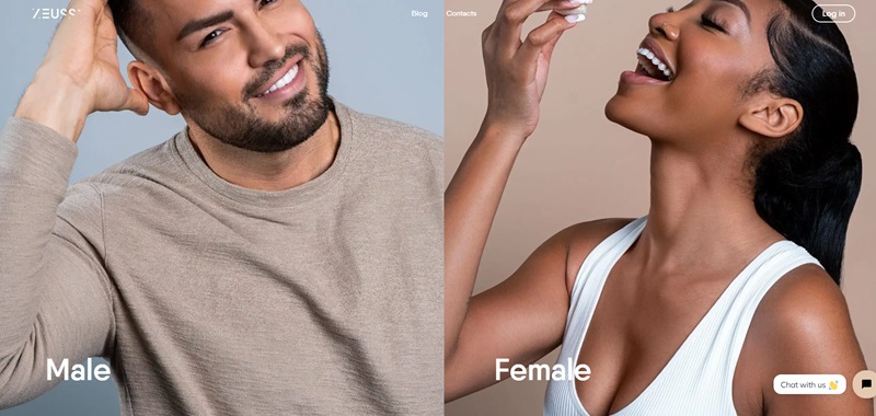
- You’re right away met with bold images of their products that are hard to miss.
- They lay it all out clearly – their chargers will make sure your devices never die.
- Testimonials are easy to find, so you can read why their customers think Zeuss rocks.
- Plus, ordering is a breeze with the big “Buy Now” button.
Cruisemaster
Website Description
Cruisemaster is for those who love to hit the road and explore Australia.
They have all the gear you need for caravans and off-roading, making every journey smooth and fun.
Website Design Features
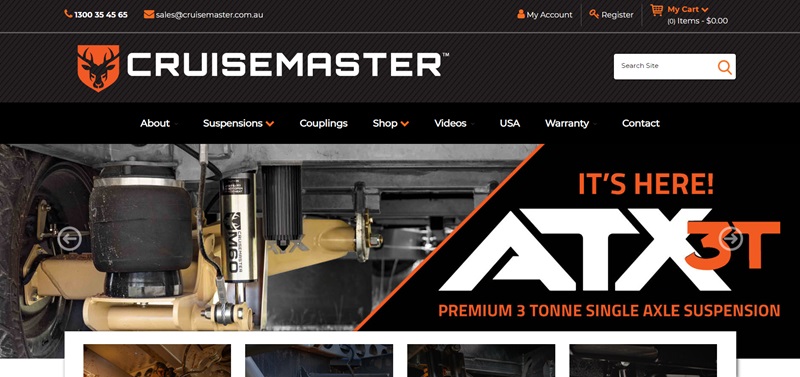
- The website uses cool photos of Aussie adventures to show you the potential of your travels.
- Navigation is no fuss, leading you exactly where you need to go.
- You can easily find support if you’re stuck with large ‘Contact Us’ buttons.
- Getting info on each product is easy with detailed pages and specs.
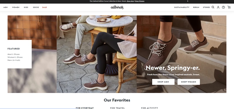
Allbirds
Website Description
Allbirds shoes are all about putting comfort on your feet and caring for our planet.
If you want sneakers or flats that feel great and are eco-friendly, Allbirds is where you should be.
Website Design Features
- Their website is fresh, clean, and super easy to walk through.
- Big, clear images show off the shoes, so you know just what you’re getting.
- You’ll find sections about their commitment to the environment as you scroll.
- Checking out their many styles is easy, and you can shop by collection or by the type of shoe you want.
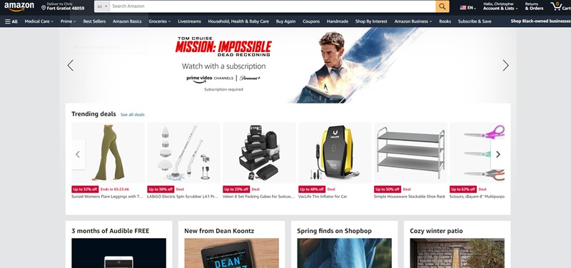
Amazon
Website Description
Amazon is a shopper’s dream, home to millions of items guests can buy. From books and clothes to electronics and household goods, you can find almost anything you need.
Website Design Features
- Landing on Amazon, you’re met with a simple search bar – it’s so quick and easy to start finding what you need.
- They have a variety of departments that are clearly marked, helping guide your shopping experience.
- Right on their homepage, they highlight their best deals to make sure you don’t miss out!
- With a personalized account, you can also view recommended items based on your browsing history.
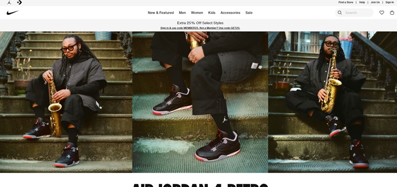
Nike
Website Description
Nike is all about meeting your athletic needs. Known for their sportswear and gear, they’re dedicated to helping you stay at the top of your game.
Website Design Features
- Their sleek design mirrors the quality of their products.
- Large, rotating images showcase their newest and most popular items.
- The product categories are easy to navigate – you can smoothly sail between shoes, clothing, and accessories.
- Plus, they have a special feature where you can even customize your own Nike shoes!
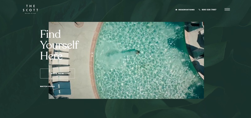
The Scott Resort
Website Description
The Scott Resort brings luxury and relaxation to your vacation! They provide beautiful accommodations for travelers looking to unwind in Scottsdale, Arizona.
Website Design Features
- The website’s design captures the resort’s luxury, with gorgeous images setting the mood.
- The navigation is very straightforward, guiding guests around the site seamlessly.
- There’s a clear and helpful section where guests can explore accommodations, dining options, and resort services.
- They feature guest reviews too, so you can see what others thought of their stay.
uMake
Website Description
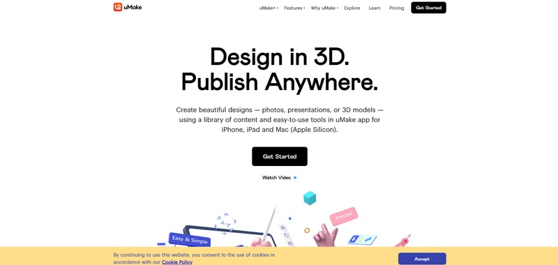
They offer a 3D sketch platform that can turn your ideas into reality.
Website Design Features
- The website is crisp and clean, just like the designs you can create with uMake.
- On the homepage, a looping video showcases how uMake works in real time.
- The product’s features are clearly laid out, so you can easily understand how it can benefit your design process.
- There’s a section for testimonials, where customers share their experiences using uMake.
Walmart.com
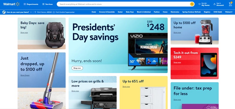
Delving into the world of Walmart.com, one finds themselves amidst a plethora of diverse products and services.
This globally recognized online marketplace primarily caters to customers by providing a vast range of goods like clothing, household items, electronic gadgets, and much more.
Walmart.com truly grabs your attention with its remarkable website design features. The platform is user-friendly, which makes shopping a breeze. People love the setup of this site because:
Clear and Uncomplicated Navigation
The website enjoys a straightforward, intuitive design. All the categories are well organized. Whether you’re in search of the perfect grill or hunting for a good deal, everything is just a click away on Walmart.com.
Availability of Discounts and Offers
Everyone loves a good discount, and the website body indicates that Walmart.com certainly delivers in this regard. With discounts reaching up to 65% off, it’s evident shoppers can land some incredible bargains here.
Walmart+ Membership
The website offers an attractive perk – the Walmart+ Membership.
Shoppers who sign up for this get to enjoy free same-day delivery, which adds to the overall shopping convenience.
On top of that, Walmart+ members can get everyday low prices on a wide variety of items.
Overall, the synergy between the website’s simplicity and functionality, coupled with the vast product range and fantastic deals, makes Walmart.com a must-visit online shopping destination.
Frank Body
Website Description
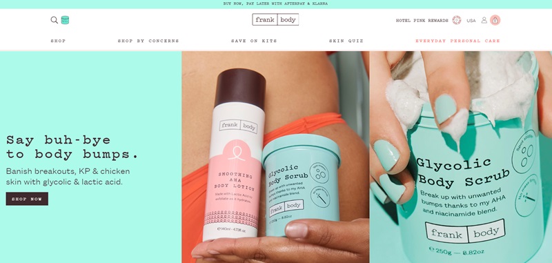
This website is about skincare that’s not just clean but also cruelty-free. Their range of products promises to brighten, hydrate, and exfoliate your skin.
Website Design Features
- The website greets you with a lively vibe that matches the cheeriness of the brand.
- Their products are well-categorized, making it easy to find what you’re looking for.
- Awesome images of their products in action let you see the result of using Frank Body.
- They have a shopping feature that makes your experience even better, you can buy now and pay later!
- Imagine getting a 10% discount on your first order. That’s sure to make anyone’s day! By signing up for their newsletter, you get this deal.
- They also feature reviews right on their homepage. It’s super easy to read about why real people love Frank Body.
Shopping on Frank Body is as smooth as the skin they promise you’ll get from their products. From browsing, and adding products to your cart, to checking out, it’s all a crystal-clear process. If you love your skin and want products that love it as much as you do, Frank Body is your go-to website.
Fresh Fronks
Website Description
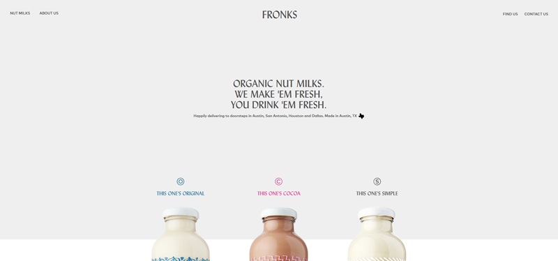
This webstore is a go-to spot for anyone looking for healthier, natural, and fresh alternatives to traditional dairy products.
Website Design Features
- Fresh Fronks keeps things brief yet impactful. When you land on their website, you’ll understand what they’re about straight away.
- The site’s clean layout and simple aesthetics make your browsing experience calm and easy.
- Also, the direct “Find Us” feature ensures customers know where to get their products from, without any fuss.
- To top it all, customers can contact the Fresh Fronks team with a single click! So, if you have any questions or just want to chat about nut milk, they’re ready for you.
In a nutshell, Fresh Fronks offers a pleasing user experience. The design of the website is simple and elegant, just like the brand itself. If you’re looking for exceptional nut milks, Fresh Fronks is definitely worth checking out.
FAQ On eCommerce Website Examples
What are the top features of a killer e-commerce website?
You want a slick design, user-friendly navigation (because who likes getting lost?), fast load times (I’m looking at you, spinning wheel of doom), mobile-friendliness (since smartphones are practically glued to our hands), and tight security (because no one’s excited to see their credit card flying around the internet). Think Amazon; they’ve got the formula down to a science.
Do I need a massive budget to set up an eCommerce site?
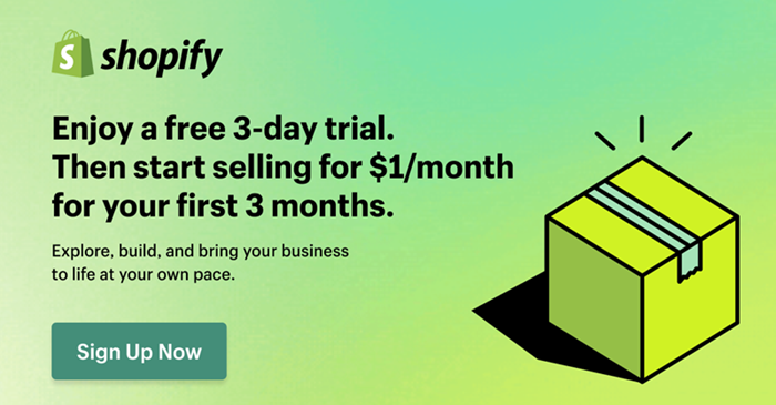
Platforms like Shopify or WooCommerce give you the oven mitts to start baking without the five-star chef price tag. Sure, if you want custom designs and features, the price tag might go up, but to start? You don’t need to empty your piggy bank.
How does mobile optimization impact online sales?
Let me lay it out for you: more people are shopping on their phones than ever before. If your site stutters on mobile, it’s like showing up to a party with stale chips – a definite no-go. A smooth mobile experience means customers stay, browse, and more importantly, buy. Don’t skimp on this; it’s the express lane to Salesville.
Why should I care about SEO for my eCommerce site?
Use the right keywords, optimize your images, and make Google love you. Get this right, and you’ll be the talk of the town – or at least the talk of the SERP (Search Engine Results Page).
What’s the key to keeping visitors on my eCommerce site longer?
The secret ingredient? Engaging content. That could be vivid product descriptions, alluring images, helpful reviews or tutorials, even a blog to educate and entertain. It’s about creating an experience, not just a webpage. Treat visitors like guests at your dinner party; give them great conversation (content) and they’ll stick around for dessert.
How often should I update my eCommerce site?
Keep it fresh! Regular updates mean you’re always bringing something new to the party. It’s like having a wardrobe; you’re not wearing the same outfit from 2010, are you? Updating shows your customers that you’re on the ball – plus, Google loves fresh content, which can help with those rankings.
Are customer reviews really that important for eCommerce?
Reviews are the internet’s word-of-mouth. They’re like friends telling friends, “Hey, this is good stuff!” Positive reviews build trust and can help fence-sitters make that leap into buyers. Just make sure you’re getting the real deal – authenticity is key, nobody likes a ringer.
What sets an average eCommerce site apart from an exceptional one?
It’s all about exceeding expectations. Does your site load faster than expected, is the design cleaner, and is the checkout simpler? These things make shopping not just a task, but an experience.
How do I turn first-time visitors into loyal customers?
First impressions matter – make your site welcoming and easy to use. Personalize the experience where you can, be transparent with shipping and returns, and show that you value their business. Think of it like a first date – show up looking good, be charming, and they’ll want to see you again.



Leave a Reply