My content is reader-supported by awesome people like you. Which means I could earn a commission. Learn more here!
Have you ever asked yourself, “How can my site both look snazzy and work like a charm?”
Enter Duda—an innovative website builder that successfully marries aesthetics and usability.
This article delves into real-world Duda website examples, outlining their key features and standout design elements, all while offering practical tips you can adapt.
By the end, not only will you appreciate the versatile creativity Duda enables, but you’ll be chomping at the bit to implement these inspirations in your next project.
Because who said style and substance can’t coexist happily in web design?
Let’s check them out!
Archbishop Chapelle High School
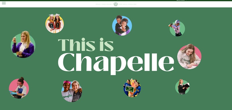
Archbishop Chapelle High School creates a nurturing environment dedicated to educating young Catholic women.
At this school, each student receives attention to help her grow academically and spiritually.
Let’s walk through what the website highlights and the design elements that stand out.
Website’s Purpose:
- The website presents a Catholic high school focused on guiding young women through their educational journey.
- It emphasizes personal growth inside and outside of the classroom, ensuring students become confident and capable women.
Design Features:
- The website uses a bright and welcoming color scheme that reflects the school’s spirit.
- Navigation is smooth and user-friendly, making it easy for visitors to find information about admissions, academics, and student life.
- It hosts a calendar feature to keep students and parents informed about upcoming events.
- The photo gallery offers a glimpse into school life, celebrating student achievements and community involvement.
Nai Arabia
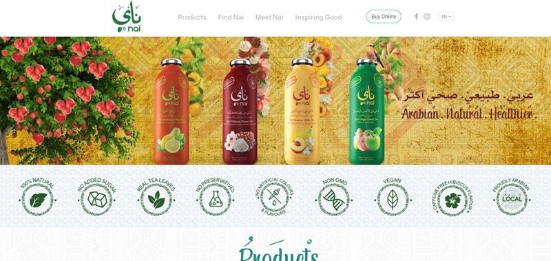
Nai Arabia takes you on a journey through a world of flavored iced tea.
Their website is an invitation to wellness through a variety of tea blends.
Website’s Purpose:
- The site introduces a brand that offers a unique blend of natural iced teas.
- It aims to attract customers who want to enjoy healthy and refreshing beverages.
Design Features:
- The website boasts a crisp, clean look, with lots of whitespaces that highlight the vibrant tea packaging.
- Easy-to-use menus lead you through the different tea flavors, ingredients, and health benefits.
- Beautiful images of the tea and ingredients capture the essence of the brand’s natural and health-focused values.
- It has quick links to its social media to connect and engage with tea lovers.
Thriving Mind Marketing
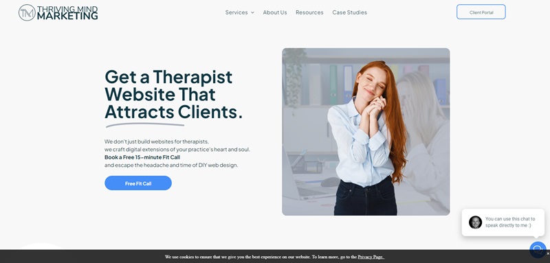
Thriving Mind Marketing is a website that offers web design and SEO (Search Engine Optimization) services, specially tailored for therapists.
Their goal is to help therapists build an online presence that not only looks great but also connects with the right clients.
What the Website Does
- It introduces a service that creates websites for therapists, aiming to capture the heart and soul of their practice.
- The site offers a free 15-minute call to therapists to discuss their needs and how Thriving Mind Marketing can help.
Design Features That Stand Out
- Bright Call-to-Action Buttons: The website has bright buttons that are easy to find, encouraging visitors to take the next step, whether that’s booking a call or learning more about their services.
- Simple and Organized: Visitors can navigate the site easily with clear menus and organized sections, which means finding information is a breeze.
- Professional Testimonials:
- There are testimonials from happy clients, making it easy for visitors to see the impact of the service.
- Each story is proof of how much they care and the quality they deliver.
Transitioning into the specifics, the website boasts features that are both functional and stylish, making sure that the user experience is just as great as the visual appeal. Let’s dive deeper.
Special Elements of Thriving Mind Marketing’s Website Design
- Responsive Design: The website adjusts well to any device, making sure it looks good whether you are on a phone, tablet, or computer.
- Intuitive Navigation: They’ve made sure you don’t get lost or frustrated when looking for information. Everything is where you expect it to be.
- Clear Calls to Action: You can’t miss the instructions on what to do next, whether it’s booking that introductory call or viewing more details on services.
Fire Wings
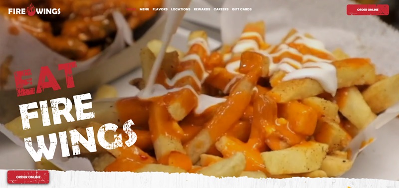
Fire Wings is a restaurant that knows how to make your taste buds dance with joy.
They offer a wide selection of chicken wing flavors that would make anyone eager to try them all.
Here’s a breakdown of what makes the Fire Wings website standout:
What Fire Wings is:
- A place where chicken wings and beer come together to create a perfect dining experience.
- With over 20 wing flavors, they ensure every visit can be a new taste adventure.
- They also cater to online orders, making it super convenient to enjoy their offerings.
Cool Website Design Features:
- Vibrant Photographs: The website uses mouth-watering pictures of their wings that almost make you feel you can taste them by just looking.
- Easy Navigation: It’s really easy to find what you need. Whether you’re looking for the menu, wanting to know more about their flavors, or finding a location near you, it’s all just a click away.
- Clear Call to Action: Right from the home page, you know how to order pick-up or delivery. This makes the process smooth and encourages you to order.
Study Like A Boss
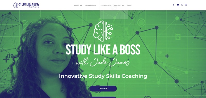
“Study Like A Boss” is a website that helps students get better at studying.
They offer online tutoring and study skills training.
Here’s what you will find on their website:
What the Website Offers:
- Study skills coaching to help students learn more effectively.
- An innovative 16-part video course on studying techniques.
- Access to monthly online coaching calls and study groups on WhatsApp and Facebook.
Cool Design Features of the Website:
- Clear Layout: The website is easy to move around. You can find everything you need without any trouble.
- Engaging Colors and Text: The colors and text on the site grab your attention. They make you want to explore more.
- Success Stories: There are testimonials from parents and students. These stories show how much the website has helped them.
- Contacts Easy to Find: If you want to reach out, finding their contact info is a breeze.
Kireys Pet Salon and Hotel
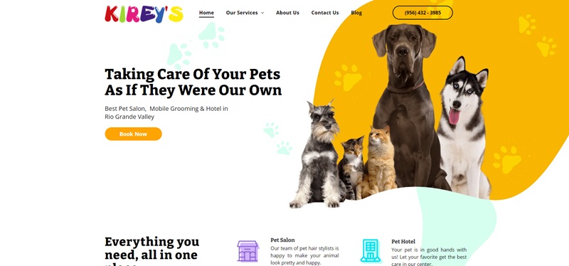
The Kireys Pet Salon and Hotel website is a one-stop hub for pet care services.
It provides a virtual gateway to a broad variety of services that cater to pet’s needs.
What It’s About
- Pet Salon and Hotel: Kireys is a renowned pet care center providing well-loved services like styling and grooming for pets. It’s a haven for your pets where they receive expert care in a comfortable setting.
- Mobile Grooming: What makes Kireys stand out is their convenient mobile grooming service. The friendly staff pulls up in a fully equipped van and provides pet grooming in the comfort of your own home.
- Pet Taxi: If you’re too busy, Kireys Pet Taxi is a handy solution. Book a day in advance, and they can help with grooming your furry friend.
- Trash Cleaning Service: Also, to keep your surroundings clean, they even offer a trash cleaning service.
Website Design Features
The Kireys Pet Salon and Hotel website has several attractive design features:
- Clear and Concise Description: The website uses uncomplicated language making it super easy to understand what they offer. It’s also organized neatly, so you know exactly where to find information.
- Full of Images and Videos: The mixture of colorful images and videos create a friendly ambiance.
- Testimonials: Real-life testimonials paint a positive image of their services. Authentic feedback from happy pet owners enhances the trust factor.
- Contact Information: The website makes it an easy task to reach out. They’ve ensured their phone number, address, and email are clearly visible.
- Appealing Visual Design: It’s visually pleasing with neat layouts, pleasing color scheme, and stylish fonts, making navigation a fun process.
Sunday Market Flowers
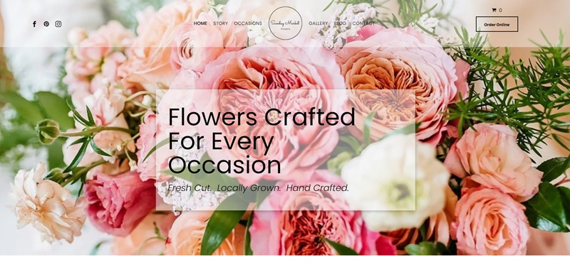
Sunday Market Flowers tells the story of a dedicated family that grows beautiful flowers on their farm in Sonoma County.
They take pride in not only growing vibrant flowers but also in building strong bonds with their customers.
Features of The Website
- Locally Sourced Florals: The flowers come straight from the family’s own farm or nearby gardens, assuring fresh and locally grown blooms for your home.
- Family Business: It’s more than just selling flowers — it’s a cherished family venture. They put their hearts into growing the business and treasure the connections they make with people.
- Community-focused: They emphasize the importance of the community, fostering relationships that extend beyond a simple buyer and seller dynamic.
Design Elements That Stand Out
The website has some aspects that make browsing enjoyable:
- Easy to Read: The text is clear, which means you won’t have trouble figuring out what they are saying or offering.
- Inviting Photos: Expect to see vibrant images of flowers, which are likely to invite you in and make you want to see more.
- Simple Navigation: With helpful buttons and streamlined menus, finding your way around the website is a breeze.
In essence, the Sunday Market Flowers website captures the essence of a warm, family-oriented flower business.
With a dash of community spirit and a focus on fresh, local flowers, the site welcomes you to explore and connect.
Coupled with user-friendly design features, it truly reflects the loving care this family puts into their blooms.
Advantage Lancaster
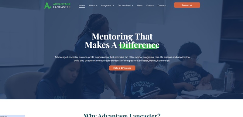
Advantage Lancaster focuses on helping the youth of Lancaster, Pennsylvania.
This non-profit organization offers amazing after-school programs, real-life lessons, and academic mentoring.
They strive to make a big difference in children’s lives by guiding them towards a bright future.
Key Features of Advantage Lancaster
- Mentoring Programs: Advantage Lancaster gives kids a boost in life with mentoring that genuinely cares about their success.
- Variety of Activities: Whether kids love sports, are into the arts, or are fascinated by technology, there’s something for everyone. This makes sure that all kids find something that excites them.
- Community Engagement: Building strong connections within the community is a big deal here. It’s not just about the individual but about how everyone can grow together.
Niceties of the Website Design
The website for Advantage Lancaster packs some really cool design elements:
- Clear Information Layout: Finding out what Advantage Lancaster does is easy because the information is laid out clearly. This helps parents, guardians, and kids understand their programs quickly.
- Inspiring Success Stories: Reading stories from former students who’ve done well in life after participating in their programs can motivate and inspire. It shows that the program truly makes a difference.
- Vibrant Visuals: The use of vivid pictures and videos across the website keeps it engaging. It’s not just a bunch of text but a colorful window into what they do.
- Year-Round Programs: The site details various programs throughout the year, from summer semesters to fall/spring activities, ensuring kids have opportunities to learn and grow no matter the season.
To Wrap It Up
Advantage Lancaster’s website does a fantastic job of showing how they support and uplift the youth in Lancaster.
With engaging programs and meaningful mentoring, they equip kids with the skills needed for success.
Plus, their website is a joy to explore, with its captivating design and heartwarming success stories.
Zero Wasted UK
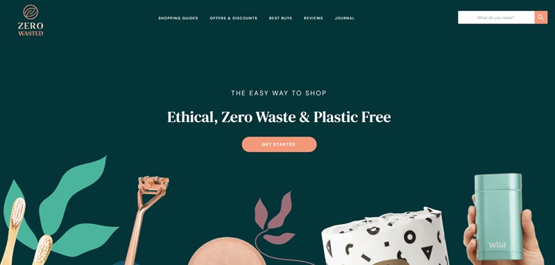
Zero Wasted UK is a cool website filled with information on how to shop in an eco-friendly way.
It helps people in the UK find products that are good for the environment, save money, and don’t harm animals.
This website is a treasure chest full of shopping guides, reviews, discounts, and tips on living without waste.
Highlights of Zero Wasted UK
- Sustainable Shopping Guides: They offer guides that make it easy to shop for products that don’t hurt the planet.
- Reviews and Best Buys: If you’re looking for the best eco-friendly products, their reviews and “best buys” sections are gold mines.
- Discounts and Offers: Everyone loves a good deal, and they provide plenty of discounts and offers on sustainable goods.
Cool Website Features
The design of the website has some awesome features:
- Easy-to-Follow Layout: The website is super easy to navigate. You can find the information you need without any hassle.
- Bright and Cheerful Design: The use of bright colors and cheerful images makes browsing the website a pleasant experience.
- Helpful Content: From how-tos on living a zero-waste life to product comparisons, the website has loads of helpful info.
- Frequent Updates: The website keeps things fresh with the latest guides and reviews on sustainable products.
Wrapping It Up
All in all, the Zero Wasted UK website is your go-to place for everything you need to know about eco-friendly shopping in the UK.
With its helpful guides, honest reviews, and awesome discounts, it makes living a sustainable lifestyle much easier.
Plus, the website is fun and simple to use, which is always a bonus!
Legacy Homes
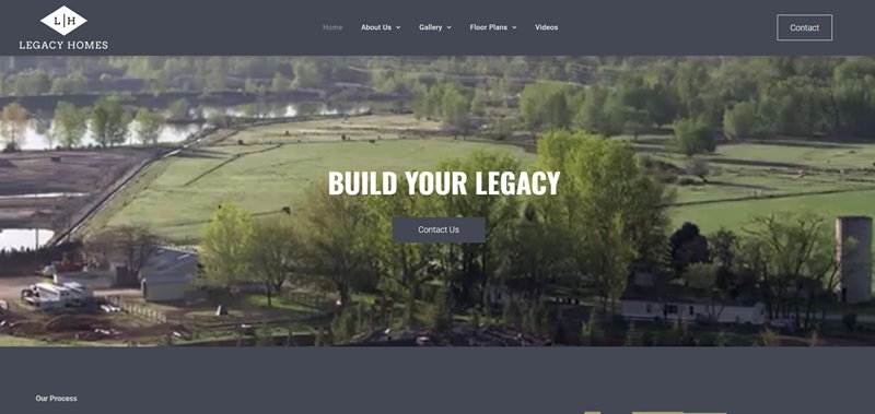
Legacy Homes is a website that shows you how a group of skilled builders and designers come together to create beautiful custom homes.
This company, based in Idaho, specializes in working closely with clients to bring their dream homes to life.
From initial design ideas to the final touches, Legacy Homes guides people through every step.
What Makes Legacy Homes Special
- Custom Home Building: They focus on designing and building custom homes. This means you get a home that fits what you want and need.
- Experienced Team: The team at Legacy Homes brings over 20 years of building and designing experience to the table. This experience helps to make sure homes are well-made and beautiful.
- Personal Touch: The goal is to build not just houses, but homes. They strive to understand what each client dreams of and make that a reality.
Cool Features of the Website
Legacy Homes’ website has some great features that make looking through it fun and easy:
- Gallery of Homes: There’s a section full of photos of homes they’ve built. It’s like getting a tour without having to leave your house.
- Detailed Process Guide: The website clearly outlines the steps involved in building a custom home with them. It makes the whole process seem less daunting.
- Meet the Team: You can learn about the people who will be helping to build your home, which is pretty neat because it adds a personal connection.
Two Gloves Professional Gardening Services
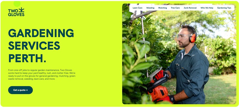
Two Gloves is a gardening service website from Perth, Australia.
It’s for people who need help with their gardens, like mowing lawns, pulling weeds, spreading mulch, or getting rid of unwanted stuff.
The site tells you what they do, how to get a free quote, and shares some gardening tips!
Design Features
- Clear Services List:
- The site lists out services like lawn care, weeding, mulching, and junk removal, which makes it easy to find what you’re looking for.
- Easy to Contact:
- There’s a phone number and email right there on the page, so you can quickly ask questions or set up a service.
- Free Quote:
- They offer a chance to get a quote for free, which is great because you know what you’ll pay upfront.
- Helpful Links:
- With links to different services and gardening tips, you can easily jump to the information you want to read.
New Haven Painters LLC
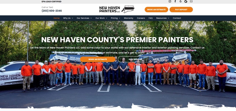
New Haven Painters LLC is all about helping you paint your place.
If you’re in New Haven and want to give your home or office a new look, this website is where you can learn about their painting services, see some of their past work, and find out how to start your own painting project with them.
Design Features
- Photo Gallery:
- Pictures of their painting jobs are on display, giving you a real sense of the quality they offer.
- Service Breakdown:
- The list of what they do – inside painting, outside painting, and commercial jobs – is neatly explained for easy reading.
- Get an Estimate:
- You can fill out a form right away to get a cost estimate for your painting project, which is super convenient.
- Customer Feedback:
- There are testimonials from previous customers, so you get to hear what others thought of their painting work.
Repli360
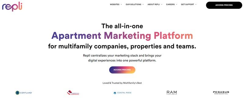
Repli360 provides digital marketing services specifically for apartments and multifamily housing companies.
It aims to make it simple for these companies to advertise their offerings to potential clients or renters.
Apart from listing their services, it gives you an option to check their pricing and success stories as well.
Nice Design Features
- Wide Range of Services:
- You can learn about a broad scope of services like SEO, web design, social media management, and digital advertising from their site.
- Easy to Navigate:
- Repli360’s website layout lets you find what you need quickly with well-organized menu categories like ‘Websites’, ‘Services’, and ‘About Us’.
- Success Stories:
- They share happy customers’ experiences. It gives you an idea of how they may benefit your own company.
- Access to Pricing:
- The ability to view their pricing helps in planning and budgeting.
- Work Opportunities:
- If you’re searching for a job, there’s a section showing open positions and how to apply!
The Sticky Bun Factory
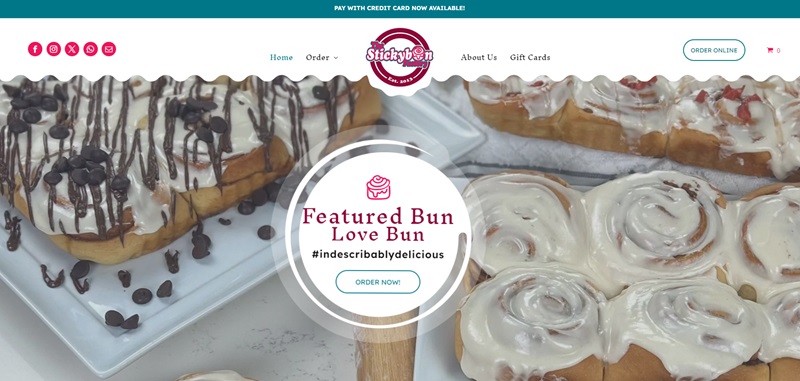
The Sticky Bun Factory is a digital bakery, but not like your usual kind.
It’s a place where you find sweet and savory buns of all kinds. Moreover, they have bread and special seasonal bun options as well.
You can order all these yummy treats from the comfort of your home and even get them for special occasions through their catering service.
Nice Design Features
- Simple Ordering Method:
- Want some delicious buns? All you need to do is click on the “Order Online” button, and you’re good to go.
- Diverse Menu:
- Explore different categories like ‘Sweet Buns’, ‘Savory Buns’, ‘Seasonal Buns’ and ‘Bread’. Choices, choices!
- Special Event Features:
- The site shares upcoming events where you can get their treats on the spot.
- Informative Product Descriptions:
- The ‘BUNS OF THE MONTH’ section provides an in-depth look at the bun options available for the month with mouth-watering descriptions.
In conclusion, The Sticky Bun Factory website showcases their passion for making your taste buds dance! It’s a user-friendly, cheerful site full of delectable bun choices to impress any bakery lover.
Kozyra Construction
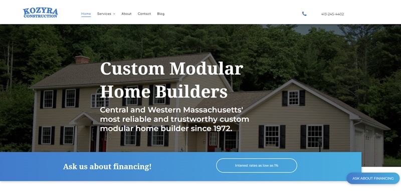
Kozyra Construction is a family-owned company based in Central and Western Massachusetts that offers comprehensive construction services.
They have been building custom modular homes, performing excavation tasks, and providing septic services since 1972.
This website guides you through what they offer, shows off their past projects, and provides a quick and easy way to contact them for your construction needs.
Nice Design Features
- Detailed Service Descriptions:
- Information about each service, such as modular homes, excavation, and septic services, are available. This helps you to learn more about what you might need.
- Project Showcase:
- The website features a selection of their past projects, allowing you to see the quality of their work.
- Easy Contact Form:
- Quickly reach the experts at Kozyra Construction using the contact form provided on the site.
- Testimonials:
- The testimonials from satisfied customers give you an insight into their work ethic and dedication to customer satisfaction.
- Finance Information:
- The website also mentions financing options for their services, which is beneficial if you’re budgeting for a large project.
In conclusion, Kozyra Construction’s website does an excellent job of showcasing their skills, dedication, and love for the work they do.
With easy navigation, a wide array of services, and numerous customer testimonials, it is sure to make the process of starting a construction project much smoother.
FAQ For Duda Website Examples
What types of websites can I build with Duda?
You’re in luck because Duda’s versatility is pretty impressive. Whether you’re looking to craft a sleek online store, launch an eye-catching portfolio, or roll out a professional business site, Duda’s got your back. With a wide array of templates and design elements, it supports a broad range of industries, from restaurants and photography to consulting services. Plus, its intuitive design tools make customization a breeze, so you can make any site unmistakably yours.
Can I see examples of websites made with Duda?
Absolutely! Duda boasts a rich collection of real-world website examples on its platform. These showcases are not just a feast for the eyes; they’re a huge bucket of inspiration. Whether you need a touch of creativity for a personal project or want to analyze the latest design trends for e-commerce, Duda’s example gallery is the place to be. It’s a handy way to visualize what’s possible and pick up some pro tips along the way.
How user-friendly is Duda for beginners?
Here's the skinny: Duda scores high marks on the user-friendly scale. If you're new to the web design game, Duda extends a warm welcome with its drag-and-drop interface, which means you can place elements exactly where you want them without touching a line of code. Besides, it throws in fun tutorials and a supportive help center into the mix. So, if you're starting from scratch or looking to level up your design skills with minimal fuss, Duda's got your back.
Are Duda websites mobile-responsive?
In today’s mobile-first world, Duda doesn’t drop the ball. Every site built with Duda is designed to look great and work smoothly across all devices—desktops, tablets, and smartphones. This isn't just about scaling down aesthetics; it's about ensuring your site is intuitively navigable and aesthetically pleasing on any screen size. Considering that Google loves mobile-friendly sites, this feature is a big win for your SEO endeavors, too.
What SEO features does Duda offer?
Duda is pretty savvy when it comes to SEO. It offers a suite of built-in SEO tools that guide you through optimizing your site for search engines—think meta tags, custom page titles, and descriptions, plus easy Google Analytics integration for tracking your site's performance. Duda understands that good SEO isn’t just about ticking boxes; it’s about enhancing the overall user experience. And with its focus on mobile responsiveness and lightning-fast loading times, it helps give your site a leg up in those search rankings.
Can I customize my Duda site without coding?
Yes, and here’s how that’s a game-changer: Duda’s platform is built with the non-coder in mind. It offers an extensive range of widgets and design elements, allowing you to tweak layouts, fonts, color schemes, and more with just a few clicks. Want to add a blog or plug in an online store? No problem. The drag-and-drop interface makes these additions straightforward. For those who love a little more control, you also have the option to dive into the code. But it’s totally not required to build a stunning, professional-looking site.
How does Duda support e-commerce sites?
Duda doesn’t just support e-commerce; it empowers it. With flexible e-commerce solutions that cater to various business sizes, you can manage products, accept payments, and even handle shipping directly through your Duda website. It’s equipped with product galleries, shopping cart functionalities, and more, all designed to provide a smooth online shopping experience. Plus, Duda’s e-commerce tools are built with global sales in mind, so you can reach customers near and far.


Leave a Reply