My content is reader-supported by awesome people like you. Which means I could earn a commission. Learn more here!
Check out some nice website examples of some contractor websites.
If you’re a contractor having a website can really benefit you and after seeing these examples you will get some much-needed inspiration.
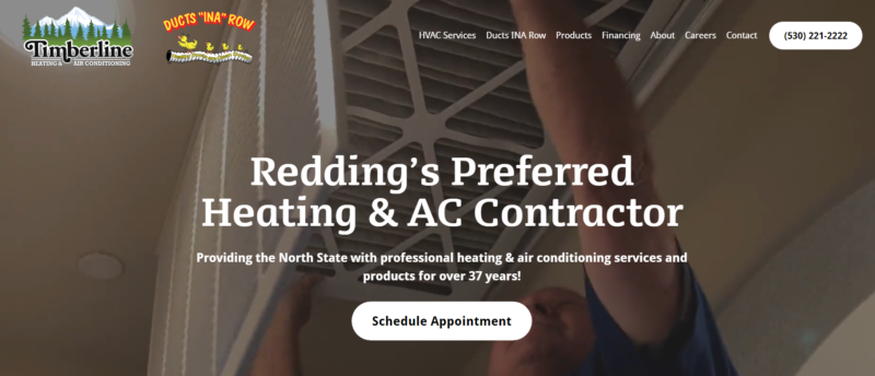
Timberline Heating & Air Conditioning

Timberline Heating & Air Conditioning is a website dedicated to providing professional heating and air conditioning services in Redding, California.
With over 37 years of experience, they offer a wide range of HVAC services including installation, repair, maintenance, duct cleaning, attic insulation, and indoor air quality solutions.
The website design is clean and easy to navigate, with a simple menu and clear headings for each service.
The color scheme is professional, with shades of blue and white giving a sense of trustworthiness.
The homepage features a prominent call-to-action button to schedule an appointment, making it easy for visitors to take action.
Overall, the website design reflects the company’s expertise and professionalism in the HVAC industry.
Apex Green Roofs
Apex Green Roofs is a website dedicated to promoting and providing green roof solutions.
The website design is modern and visually appealing, with vibrant images showcasing green roofs in different settings.
The layout is organized and user-friendly, with clear sections explaining the benefits of green roofs, the installation process, and the company’s portfolio.
The use of green and earthy tones in the color scheme reinforces the eco-friendly aspect of the business.
Apex Green Roofs’ website design effectively showcases their expertise and commitment to sustainable roofing solutions.
TCB Painters
TCB Painters’ website is all about their professional painting services. The website design is straightforward and emphasizes the quality of their work.
The color scheme is clean and minimalistic, with shades of white and blue creating a sense of trust and reliability.
The homepage features a rotating banner showcasing some of their past projects, along with testimonials from satisfied clients.
The navigation menu is concise, making it easy for visitors to find information about their services and contact details.
TCB Painters’ website design effectively highlights their expertise in the painting industry.
D&L Roofing
D&L Roofing’s website focuses on providing high-quality roofing services.
The design is simple and professional, with a clear color scheme of blue and gray, reflecting the reliability and durability of their work.
The homepage features a slideshow of beautiful roofing projects they have completed, showcasing their expertise.
The navigation menu is easy to follow, allowing visitors to explore their different services, testimonials, and contact information.
D&L Roofing’s website design effectively conveys their commitment to excellence in the roofing industry.
Ravenwood Flooring
Ravenwood Flooring specializes in providing flooring solutions.
The website design is elegant and visually appealing, reflecting the beauty of their products.
The color scheme is warm and inviting, with shades of brown and cream.
The homepage displays images of different types of flooring they offer, along with detailed descriptions and specifications.
The navigation menu is well-organized, making it easy for visitors to browse different flooring options and request a quote.
Ravenwood Flooring’s website design effectively showcases its wide range of flooring products and their expertise in the industry.
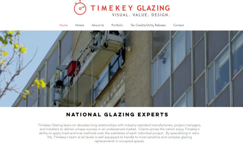
Timekey Enterprise
Timekey Enterprise offers a range of services, including HVAC, electrical, and plumbing solutions.
The website design is clean and professional, with a blue and white color scheme that conveys trust and reliability.
The homepage features a slider showcasing their different services, along with testimonials from satisfied clients.
The navigation menu is clear and concise, allowing visitors to easily find information about the services they offer and contact details.
Time key Enterprise’s website design effectively presents its diverse range of services and its commitment to quality workmanship.
The Home Team Northwest
The Home Team Northwest is a website dedicated to providing real estate services in the Pacific Northwest region.
The website design is clean and modern, with a professional color scheme of blue and white.
The homepage features a search function where visitors can look for properties in their desired location.
The navigation menu is intuitive, allowing users to explore different sections of the website, such as buying and selling guides, and contact information.
The Home Team Northwest’s website design effectively caters to the needs of those looking to buy or sell properties in the Pacific Northwest.
Tanner Flanagan
Tanner Flanagan is a personal website that showcases the portfolio of Tanner Flanagan, a graphic designer and web developer.
The website design is sleek and modern, with a black-and-white color scheme that puts emphasis on the work showcased.
The homepage features a grid layout displaying various design projects, along with descriptions and links to more details.
The navigation menu is simple and unobtrusive, allowing visitors to focus on the portfolio.
Tanner Flanagan’s website design effectively presents his skills and creativity in the field of graphic design and web development.
Apex Window Werks
Apex Window Werks specializes in window repair and replacement. The website design is clean and professional, with a white background and blue accent colors.
The homepage features a slideshow of different window repair projects they have completed, showcasing their expertise.
The navigation menu is clear, allowing visitors to easily find information about their services, testimonials, and contact information.
Apex Window Werks’ website design effectively highlights their specialization in window repair and replacement.
Kitchen Cabinet Guys
Kitchen Cabinet Guys’ website focuses on providing kitchen cabinet installation and remodeling services.
The website design is simple and informative, with a clean color scheme of white and light gray.
The homepage features images of different kitchen cabinet designs, along with descriptions and testimonials from satisfied clients.
The navigation menu is clear and concise, making it easy for visitors to explore different cabinet options, services offered, and contact information.
Kitchen Cabinet Guys’ website design effectively showcases their expertise in kitchen cabinet installation and remodeling.
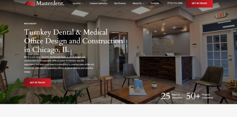
Master Dent Group
Master Dent Group specializes in paintless dent repair for cars.
The website design is sleek and modern, with a black and red color scheme that reflects their focus on automotive services.
The homepage features before-and-after images of cars they have repaired, emphasizing their skills in paintless dent removal.
The navigation menu is intuitive, allowing visitors to easily find information about their services, location, and contact details.
Master Dent Group’s website design effectively showcases their expertise in automotive dent repair.
Yura’s Roofing
Yura’s Roofing offers residential and commercial roofing services. The website design is clean and professional, with a simple color scheme of blue and white.
The homepage features a slideshow displaying images of different roofing projects they have completed.
The navigation menu is easy to follow, allowing visitors to explore different roofing services, testimonials, and contact information.
Yura’s Roofing’s website design effectively conveys their expertise and capabilities in the roofing industry.
A&P Remodeling
A&P Remodeling specializes in home remodeling services.
The website design is sleek and modern, with a white background and green accents.
The homepage features a slideshow showcasing different remodeling projects they have
FAQ On Contractor Website Examples
Why are contractor website examples important for my business?
Contractor website examples are crucial for showcasing your work and building credibility. They provide potential clients with a visual representation of your expertise, helping them make informed decisions. Additionally, a well-designed website can attract more leads and improve your online presence.
How can I choose the right contractor website example for my business?
When selecting a contractor website example, consider your business’s unique needs and target audience. Look for a design that aligns with your brand identity and showcases your services effectively. It’s also important to ensure the website is mobile-friendly, user-friendly, and optimized for search engines.
Can I customize a contractor website example to match my branding?
Yes, most contractor website examples can be customized to reflect your branding. You can personalize the color scheme, add your logo, and incorporate your unique content and images. Customization allows you to create a website that is unique to your business and stands out from the competition.
What should be included in the portfolio section of my contractor website?
Your portfolio section should include high-quality images or videos of your completed projects. Showcase a variety of work to highlight your expertise in different areas. Include project descriptions, client testimonials, and any awards or certifications you have received. This helps potential clients see the quality of your work and the range of services you offer.
How do I optimize my contractor website for search engines?
To optimize your contractor website for search engines, focus on incorporating relevant keywords throughout your content, meta tags, and headings. Ensure your website has a clean structure, fast loading times, and mobile responsiveness. Consistently create valuable and informative content that addresses your target audience’s needs. Acquiring backlinks from reputable sources can also improve your search engine rankings.
Should I include pricing information on my contractor’s website?
The decision to include pricing information on your website depends on your business model and preferences. Some contractors prefer to provide pricing estimates after assessing specific project requirements. However, you can consider mentioning starting price ranges or indicating the factors that affect pricing. This approach can help potential clients determine if your services align with their budget.
How can I encourage visitors to contact me through my contractor website?
To encourage visitors to contact you, ensure your contact information is prominently displayed on your website, including a phone number, email address, and a contact form. Add a call-to-action button on each page, prompting visitors to get in touch for more information or a free quote. Additionally, providing a quick response to inquiries and offering a friendly and helpful customer experience can significantly increase conversions.
Can I integrate customer reviews and testimonials on my contractor website?
Absolutely! Integrating customer reviews and testimonials is a great way to build trust and credibility. Consider adding a dedicated section or a testimonial carousel on your website that highlights positive feedback from previous clients. Make sure to request reviews from satisfied customers and respond graciously to any negative feedback to demonstrate your commitment to customer satisfaction.


Leave a Reply