My content is reader-supported by awesome people like you. Which means I could earn a commission. Learn more here!
The internet has opened up so many possibilities for coaches to reach more people than ever before.
A well-designed website is essential for establishing your expertise, attracting new clients, and growing your coaching business.
The goal of this article is to provide examples of great coaching websites to serve as inspiration if you’re looking to create or revamp your own coaching site.
Whether you’re just starting out or are an experienced coach looking to upgrade your online presence, you’ll find plenty of website design ideas here.
Why Have a Coaching Website?
In today’s digital age, having an online presence is crucial for establishing credibility and professionalism as a coach.
A coaching website allows you to showcase your services, attract clients, build authority, and grow your business.
Some key reasons to create a website for your coaching practice:
-
Establish Credibility and Professionalism – A professional website demonstrates you are a legitimate business and expert in your field. It builds trust with potential clients showing you are credible and established.
-
Showcase Your Services – Your website is the ideal place to highlight your coaching offerings, experience, methodologies, and areas of specialty. This helps attract clients who are a good fit.
-
Share Your Story & Personality – The website can introduce who you are as a coach and display your unique philosophy, voice, and style. This connection makes visitors more inclined to work with you.
-
Generate Leads & Sales – A website with lead generation tools like contact forms or discovery calls helps capture leads and convert them to paying clients.
-
Build Your Brand – Blogging, resources, and other site content focused on your niche helps build authority and visibility. This strengthens your brand in your industry.
-
Access Metrics & Analytics – Understand your audience and improve your strategies using website analytics on traffic, conversions, popular content, and more.
In summary, a professional coaching website is essential for credibility, lead generation, brand building, and business growth.
Investing in a website repays itself many times over.
Elements of a Great Coaching Website
A coaching website needs to clearly communicate who you are, what you offer, and why someone should work with you.
Some elements that the best coaching websites tend to have in common include:
-
Clean, simple design – Avoid clutter and confusion. Use white space effectively and make sure your website is easy to navigate. The focus should be on your services, benefits, and credibility.
-
Explain your coaching methodology – Discuss your philosophy, approach, and what makes your coaching unique. Help potential clients understand what working with you would look like.
-
Share client success stories – Social proof is powerful. Feature testimonials and case studies from happy clients to build trust and credibility.
-
Strong calls to action – Make it crystal clear how visitors can get started working with you. Use CTAs like “Schedule a Consultation” and include contact info prominently.
-
Professional headshot – Feature a high-quality photo of yourself so visitors can put a face to your name. It makes you seem friendly and approachable.
-
Blog or articles section – This shows off your expertise and gives visitors valuable free content. It also improves SEO and gives people a reason to come back to your site.
Keeping the design clean while nailing these elements gives coaching websites a polished yet approachable feel.
It shows you’re a pro and immediately communicates the value you provide.
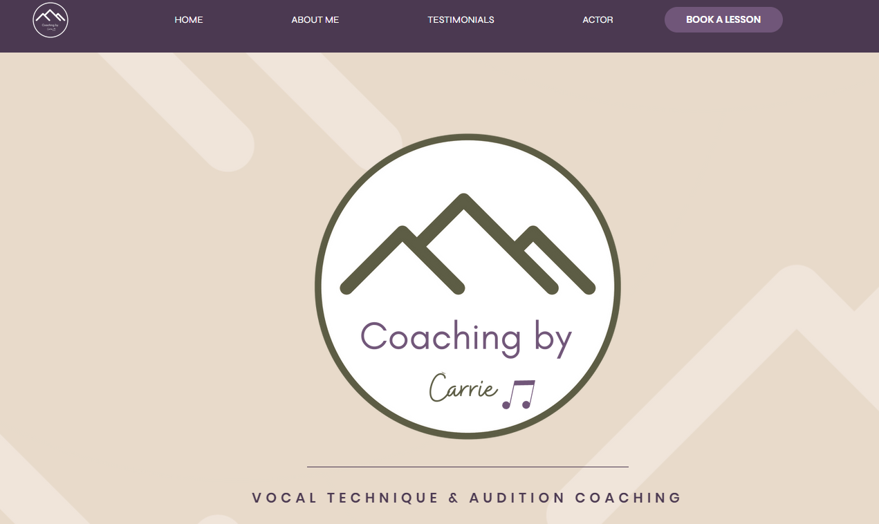
Coaching By Carrie
Coaching by Carrie focuses on helping singers grow.
Carrie thinks good singing includes both solid technique and the power to show feelings.
She offers vocal lessons and audition coaching, and now, all of her lessons are online.
Website Description
- Homey and Welcoming: When you jump onto the website, you feel welcomed right away. Carrie believes in pushing students to do their best while giving them a comfortable place to learn and improve.
- Student-Focused: Her website talks about how her students get better at singing fast. There’s a feeling of excitement and progress when you read the testimonials from her students who have seen a lot of growth in their singing.
Website Design Features
- Easy Navigation: Using tabs on the website makes finding your way around super simple. It’s quick and easy to find what you’re looking for, like booking a lesson or learning more about Carrie.
- Positive Testimonials: There are great comments from students that make you feel like Carrie can really help you get better at singing.
- Stay Connected: She’s got a spot on her website where you can follow her on Instagram. This is a smart way to keep in touch and see what she’s up to.
Carrie’s website is friendly and straightforward. It’s clear that she loves what she does and she’s great at helping singers get better.
The website’s clean look, combined with happy reviews from students, and the fact you can book lessons easily, makes you feel right at home.
It’s like Carrie’s saying, “Let’s work together to make your voice shine,” and her website shows that really well.
Jillian Turecki
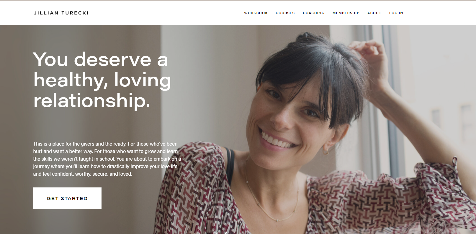
Jillian Turecki’s life coaching website immediately draws you in with the large background image and powerful testimonials front and center.
As you scroll down, an “About Me” section tells Jillian’s story and background in a personable and engaging way.
She shares just enough to establish credibility and help you relate to her, without oversharing.
The site makes it easy to get in touch, with a contact form prominently placed. You’re left feeling like Jillian is both an expert coach and someone approachable.
The thoughtful design touches like handwritten-looking fonts give the site a warm, human vibe.
Overall, Jillian’s site is inviting yet professional – a great example for any coach looking to connect with clients online.
The strategic use of visuals and smart content makes this site really shine.
Marie Forleo

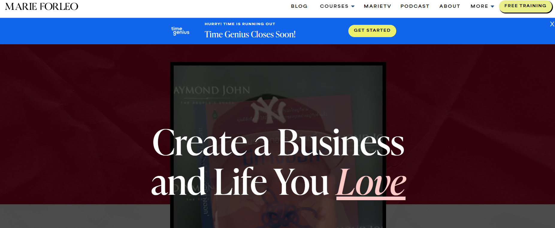
Marie Forleo’s coaching website immediately grabs your attention with its bold colors and fun, conversational tone.
Forleo is a business and life coach who helps creative entrepreneurs get “unstuck” and take their life and work to the next level.
One of the best features of Marie Forleo’s website is her extensive library of free videos and other downloadable resources.
She offers free weekly training videos that provide actionable tips on marketing, mindset, productivity, and more.
The videos are high quality, entertaining to watch, and packed with value.
This is a great way to give prospective clients a taste of Forleo’s coaching style and expertise.
The website design is bold and high-contrast, with bright pops of color like orange, green, and pink.
This creates an energetic first impression that matches Forleo’s lively personality.
The content is written in a casual, conversational voice, so clients feel like they’re learning from a friend versus a business coach.
Overall, Marie Forleo’s website does a phenomenal job reflecting her unique brand.
It’s fun, helpful, and overflowing with free value – three essential ingredients for a coaching website that converts visitors into clients.
Ramit Sethi
The website of personal finance guru Ramit Sethi is a fantastic example for coaches looking to sell online courses and build a community.
Ramit’s site prominently features his premium courses like Earnable and Dream Job.
The course pages use emotive, benefit-focused copy to clearly explain the tangible outcomes students will achieve.
Testimonials create social proof.
The site also contains a blog with free advice articles, acting as a gateway to the paid programs.
The articles position Ramit as an approachable expert.
Ramit also offers a podcast called I Will Teach You To Be Rich, strengthening his authority. Listeners can access volumes of his advice for free.
Additionally, the site fosters community with features like forums.
Engaged students can interact with each other and Ramit’s team.
This community element increases customer lifetime value.
In summary, Ramit’s site incorporates online courses, free content like a podcast and blog, and community features to create an enticing offer for his target coaching audience.
Coaches should study his model.
Brendon Burchard
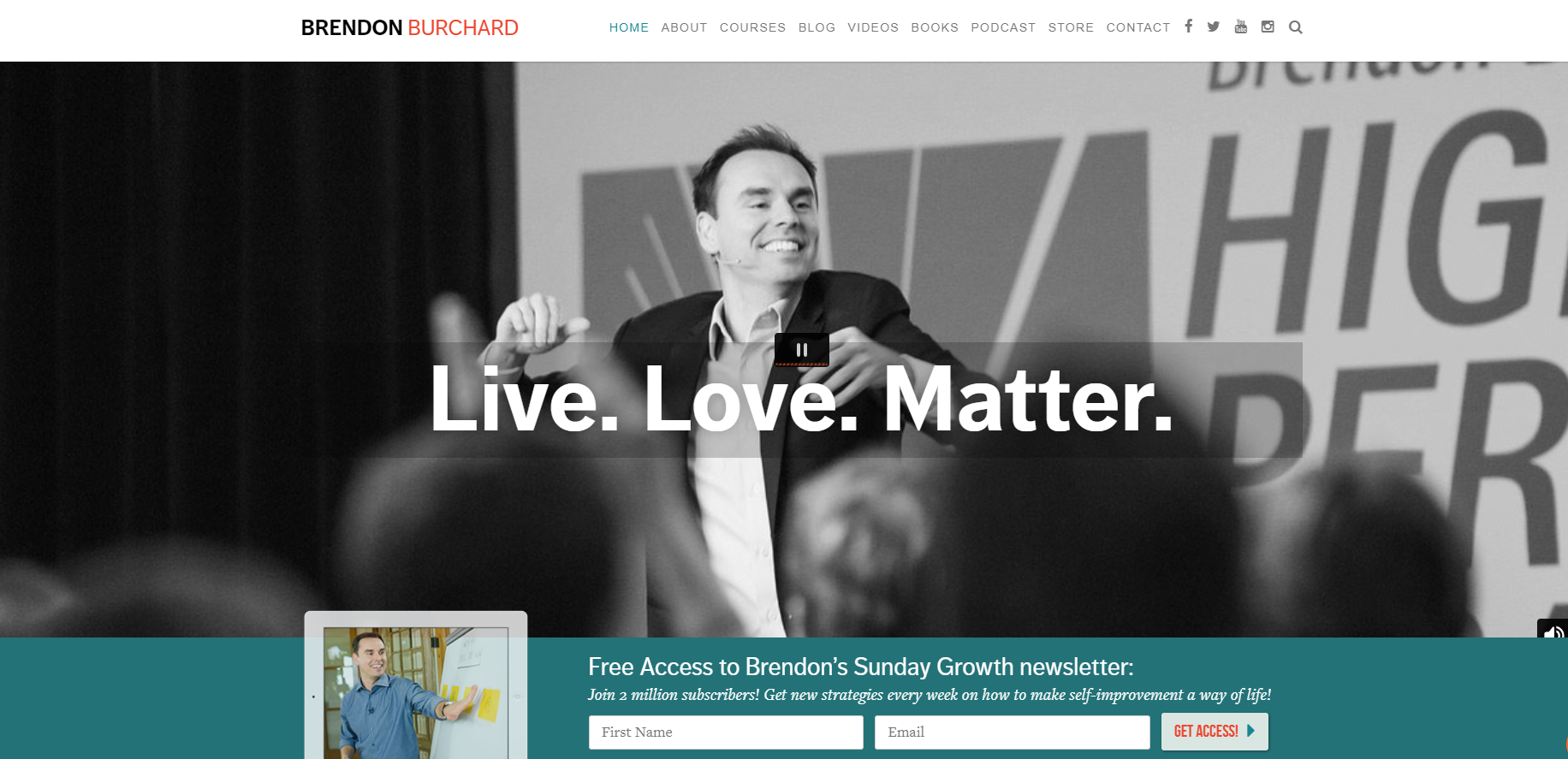
Brendon Burchard is a high-performance coach who leverages his website to establish his expertise and promote his programs, books, and speaking engagements.
His clean, modern website immediately highlights his #1 New York Times bestseller titles and media appearances.
The home page focuses all attention on Brendon himself – featuring his headshot and biography prominently.
This effectively builds a connection between his face/brand and the high-value content he provides.
His “About” page goes in-depth on his credentials, sharing his extensive background in coaching executives and high performers.
This highlights how he has walked the walk, providing credible expertise.
He offers numerous online courses, training programs, seminars, and other paid offerings.
These are prominently featured but interspersed with free content samples like blogs and videos to draw visitors in.
Finally, Brendon features his availability for corporate training, keynote speeches, and personal coaching.
His rates and requirements are listed upfront, along with testimonials from past clients like Amazon and Accenture.
This presents him as a premier coaching resource for high-level clients.
Overall, Brendon’s website exudes his experience and premium positioning in the coaching industry.
It balances promotional elements with value-driven content, clearly presenting the breadth of his capabilities.
This is an impactful blueprint for coaches seeking to highlight their knowledge online.
Key Takeaways
-
Coaching websites should focus on solving clients’ problems and showing how the coach can help. Key messaging and calls to action should be prominent.
-
Great coaching sites use simple, clean designs that are easy to navigate. They also have a consistent visual brand and color scheme.
-
Coaches should share their credentials, qualifications, client reviews/testimonials and successes to build authority and trust.
-
Useful free content like blogs, videos, downloads, and newsletters help attract and retain website visitors.
-
Clear pricing and program details help visitors understand the coaching offerings and packages.
-
Coaching websites should have responsive mobile designs and be optimized for search to maximize reach and conversions.
-
Social proof elements like client logos, testimonials, and reviews reassure visitors that the coaching delivers results.
-
Coaching sites should aim to educate, inspire, and motivate visitors to take action and sign up for coaching.
-
Successful coaching websites focus on serving the client and providing a great user experience from start to finish.
Gabby Bernstein
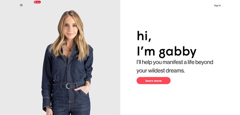
Gabby Bernstein’s website is a vibrant space that invites visitors to explore her many programs, books, and personal coaching tools.
Gabby, a New York Times bestselling author and speaker, focuses on empowering individuals through spiritual growth and self-improvement.
The website is packed with resources aimed at helping individuals manifest a more fulfilling life.
What the Website Offers
- Coaching App: Gabby offers an app called “Gabby Coaching” that provides anytime access to personal growth lessons, guided meditations, and challenges.
- Books and Podcasts: You can check out her books and listen to her podcasts directly from the site. These feature a variety of topics designed to uplift and heal.
- Articles and Events: The site also lists upcoming events and insightful articles on topics like connecting with spiritual guides and overcoming trauma.
Design Features that Stand Out
- User-Friendly Layout: Navigation is a breeze, which makes finding what you need simple and fast.
- Engaging Visuals: The design incorporates welcoming colors and inspiring images that reflect Gabby’s positive energy.
- Interactive Elements: These include video introductions and clickable links to various resources, enhancing the interactive experience.
With a clear mission to unlock the highest potential in everyone, this site surely commits to delivering content that can transform lives, backed by a design that’s as spirited as Gabby herself.
Dominique Ara
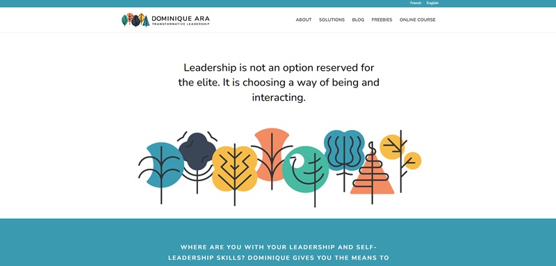
Dominique Ara’s personal portfolio website is a masterpiece of minimalism, showcasing her skills in visual design and branding.
Dominique, an accomplished graphic designer, uses her website to highlight her past projects and the unique aesthetic she brings to her work.
What the Website Offers
- Portfolio Display: Visitors can view a curated collection of Dominique’s best work, which shows off her versatility and expertise in graphic design.
- Services Overview: There’s a neat section outlining the different services she offers, from complete visual identities to web design.
- About and Contact Information: There’s also an easy-to-find about section and a contact form for potential clients or collaborators to get in touch with her.
Design Features that Stand Out
- Minimalist Layout: The website sticks to a minimalist theme, which not only makes it elegant but also allows her work to take the center stage.
- Smooth Navigation: Even with the simple design, the site includes smooth transitions and clear, easy-to-read type that guides you naturally through her works.
- Responsive Design: The site performs beautifully on both desktops and mobile devices, which shows Dominique’s attention to detail and user experience.
Dominique Ara’s website is a perfect mirror of her professional style – clear, straightforward, and beautifully organized.
Matthew Kimberley
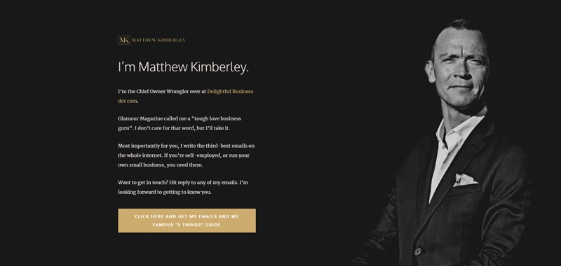
Matthew Kimberley’s website serves as a central hub for his work as a sales mentor.
Through his site, Matthew offers coaching services, books, and free resources designed to help businesses achieve remarkable sales success.
What the Website Offers
- Sales Coaching: Matthew promotes his personal coaching designed to boost sales skills.
- Book Sales: His site offers his books for sale, which promise to teach readers valuable sales tactics.
- Free Resources: There are numerous free resources, such as podcasts and downloadable guides, which visitors can use to enhance their understanding of effective sales strategies.
Design Features that Stand Out
- Professional Tone: The design is slick and professional, which perfectly suits the professional tone of the content.
- Clear Call-to-Actions: Throughout the site, the calls-to-action are bold and clear, making it easy for visitors to know how to proceed if they’re interested in his services.
- Testimonials Section: Showing off client testimonials effectively boosts credibility and trust, which is crucial in the sales consulting field.
Matthew Kimberley’s website does a fantastic job of presenting him not just as a coach but as a leader in the sales industry, designed to communicate directly and effectively with aspiring sales professionals.
FAQ On Coaching Websites
What are the must-have features for a coaching website?
Your coaching website should be as dynamic and engaging as you are! I always say, start with the basics: a clear homepage, about section, services, testimonials, and a contact page. Nail these, and you're setting yourself up for a great start!
How can I make my coaching website stand out?
Add your personality - sprinkle in your unique style, use vibrant colors that reflect your brand, and throw in interactive elements like videos and quizzes. Remember, your vibe attracts your tribe!
What's the best way to showcase my coaching services online?
Highlight the benefits and outcomes of your services. Real-life success stories? They’re gold. Use engaging descriptions, package your services neatly, and be clear about what clients will gain.
Can I integrate booking software into my coaching website?
Absolutely, and you totally should! Many platforms out there make it super easy to sync up with your calendar. It's a game-changer for taking appointments and growing your business.
What strategies can drive traffic to my new coaching website?
Roll up your sleeves – it's SEO time! Use relevant keywords, create killer content, and leverage social media. Email marketing and guest blogging can also work wonders.
How important are testimonials on a coaching website?
Testimonials are the bread and butter of your reputation. They're like having a hype-person saying, “This coach is the real deal!” Gather those rave reviews and showcase them proudly.
Should I start a blog on my coaching website?
For sure, if you have the time and insights to share. A blog can be a fantastic tool to share your wisdom, build authority, and keep your website fresh. Google loves that new content buzz.
Is it worth having a newsletter for my coaching business?
A newsletter keeps you connected with your clients and followers. Share updates, tips, and special offers – it’s like saying “Hey, just checking in!” in email form.
How often should I update my coaching website?
Keep it fresh! Regular updates keep your site relevant and interesting. Once a month is a solid target to aim for, whether it’s tweaking content, posting a new testimonial, or adding a blog post. Keep the digital dust away!
Conclusion
A great coaching website is an invaluable tool for building your coaching business and connecting with potential clients.
As we’ve seen in the examples above, an effective coaching website clearly communicates what you do, why you do it, who you help, and how you can help them transform their lives.
It establishes you as an authority in your field while also highlighting your unique personality, philosophy, and approach.
The website is often the first touchpoint for people discovering you as a coach, so it needs to immediately gain their interest and trust.
A clean, professional design with engaging copy and a simple user experience helps accomplish that. At the same time, it should feel authentic to you.
Your website is also a platform to deliver value to your audience with free resources like blogs, videos, podcasts and more.
This is how you nurture relationships over time and convert visitors into leads and clients.
In summary, investing time, thought and care into your coaching website pays huge dividends.
It is well worth the effort to create a site that represents you and your services, communicates effectively, and helps you build your business.
With the abundance of options for design, copy, hosting and more, you can craft a powerful web presence tailored to your unique needs and brand.




Leave a Reply