My content is reader-supported by awesome people like you. Which means I could earn a commission. Learn more here!
Let’s go ahead and check out some Cartoonist Website Portfolios to help get you inspired.
Pay attention to what they do and what you like.
This way!
When you start building your cartoonist website these examples should help you structure it.
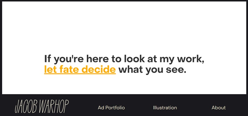
Jacob Warhop
Jacob Warhop’s website showcases the artist’s stunning and imaginative work across various mediums like painting, drawing, and sculpture.
Here are some nice design features on this site:
- Visually engaging: The site begins with a captivating homepage featuring a carousel of Warhop’s gorgeous artwork.
- Simple navigation: With concise menus, it’s effortless to explore different art categories and learn more about the artist.
- Well-organized artwork presentation: The work is divided into categories and displayed in user-friendly galleries, making it easy to browse through.
Rose Blake
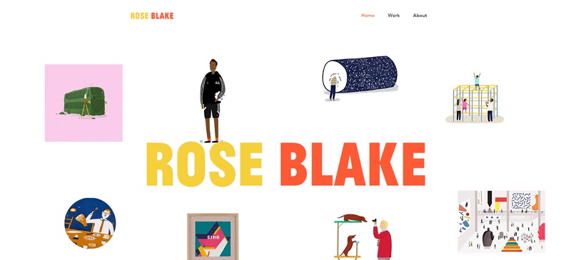
Rose Blake’s website is a colorful and inviting portal into her artistic world.
Lovely design features include:
- Bold color palette: The vibrant colors instantly draw you in, offering a delightful browsing experience.
- Mosaic layout: The eye-catching mosaic layout beautifully organizes her artwork, creating an appealing visual arrangement.
- Smooth-loading animations: As you scroll through, smooth-loading animations add to the engaging nature of the site.
Pro Cartoonists Portfolios
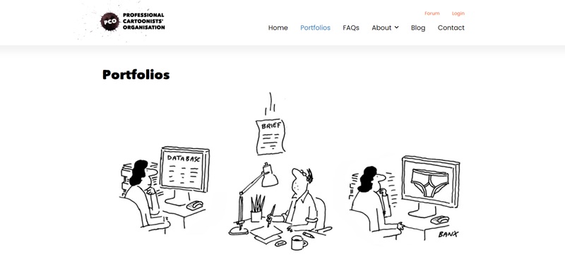
The Pro Cartoonists Portfolios website introduces you to an incredible collection of professional cartoonists and their work.
Check out what makes this site engaging:
- Clean design: The minimalist approach allows the artwork to take center stage, without any distractions.
- Easy navigation: The dropdown menu makes accessing the various cartoonists’ portfolios simple and straightforward.
- Effective categorization: Each artist has a dedicated profile page, enabling visitors to view individual portfolios and discover more details about the cartoonists.
Carbonmade: Comics
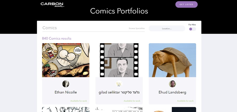
First up, let’s dive into the fabulous world of comic art on Carbonmade.
This webpage is all about sharing awesome cartoon artwork from various artists.
What makes this website cool? Well, let’s see:
Design Features:
- Colorful and inviting: The homepage immediately pulls you into a world of vibrant colors and fun creations.
- Easy scrolling: An intuitive scroll-down navigation makes it super simple to browse through a wealth of comics.
- Captivating bios: Each artist has a small bio with a link to their full portfolio, making it easy to learn more about your faves.
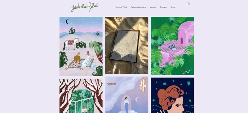
Isabelle Feliu
Next, take some time and travel into the charming universe created by Isabelle Feliu.
This personal website houses her beautiful portfolio of illustrations.
Design Features:
- Inviting Overview: The landing page welcomes you with elegant artwork, creating the perfect first impression.
- Smooth Navigation: The simple, easy-to-use menu lets you browse through the website without any trouble.
- Interactive click-through galleries: Click on an art piece and it opens an interactive slide show, allowing you to enjoy each artwork in detail.
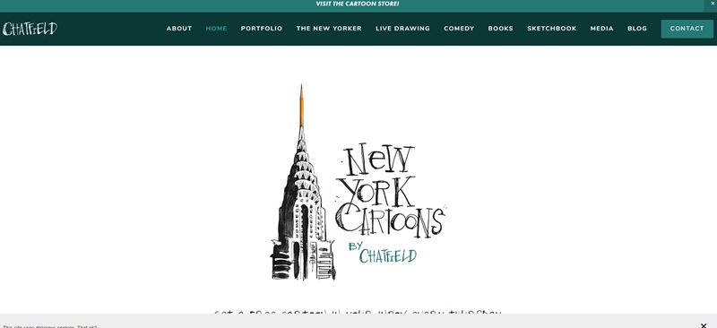
Jason Chatfield
Finally, let’s check out Jason Chatfield’s website.
Jason is a cartoonist and comedian, and his website showcases his diverse talents.
Design Features:
- Personalized touch: Jason’s fun bio, written in a conversational tone, gives the site a personal feel.
- Clean Layout: The crisp, white background and clear menus make it easy for visitors to find information.
- Integrated Social Media: Social media links are included, enabling visitors to connect with Jason across different platforms.
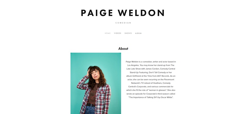
Paige Weldon
Take a fun-filled tour of Paige Weldon’s humor-filled platform.
Paige, a comedian, writer, and actor in Los Angeles, showcases her roles and performances here.
Design Features:
- Personalized touch: Paige’s website is all about her, giving it a personal feel.
- Easy Navigation: It’s easy to find your way with the clear menus.
- Embedded Videos: For a hearty laugh, there are various videos available right on the site.
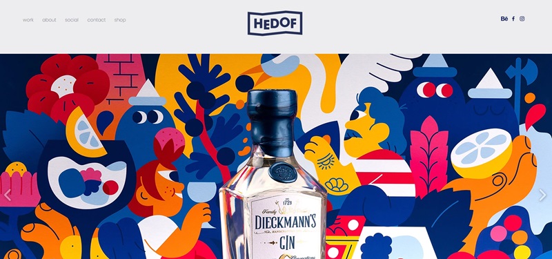
Hedof
Take a refreshing journey into the world of vibrant and eye-catching illustrations by Hedof, an artist with a unique flair for colors and design.
Design Features:
- Bright and Colorful: The site is overflowing with bold, colorful illustrations, making every visit enjoyable.
- Grid Layout: The designs are well organized in an easy-to-navigate grid layout.
- Single Page Design: Everything is present on one scrollable page, which keeps it clean and easy.
Jeremy Wins Life
Meet Jeremy, a self-proclaimed adventurer, writer, and “monkey mind tamer”, through his life-affirming website.
Design Features:
- Inspiring Content: The site’s content is motivational and uplifting.
- Unique Animations: Unique animations, such as clickable drag-and-drop crystals, give an interactive feel.
- Thought-provoking blog: The blog offers readers a deeper dive into Jeremy’s perspective on life.
Sofia Warren
Welcome to the colorful, creative world of Sofia Warren!
She’s an artist and what you’ll find on her website is a window into her artwork and projects.
What’s on the website:
- Cool comics: Sofia shares her comic art, which tells stories and presents ideas in a way that’s fun to read.
- Smart layout: The website has a clear layout so you can easily see all her work and find out more about her.
- Personal blog: There’s also a blog where Sofia shares her thoughts and stories, which is really interesting to read.
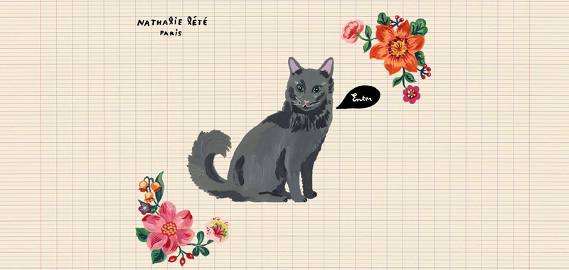
Nathalie Lété
Step into Nathalie Lété’s magical place online!
She is an artist who makes beautiful, whimsical art that kind of feels like a fairy tale.
Cool stuff on her site:
- Artsy pictures: The homepage shows off Nathalie’s awesome artwork right away.
- Neat categories: You can click on different sections to see all sorts of art pieces, like paintings and ceramics.
- Gallery vibes: It’s like walking through an art gallery but on the computer.
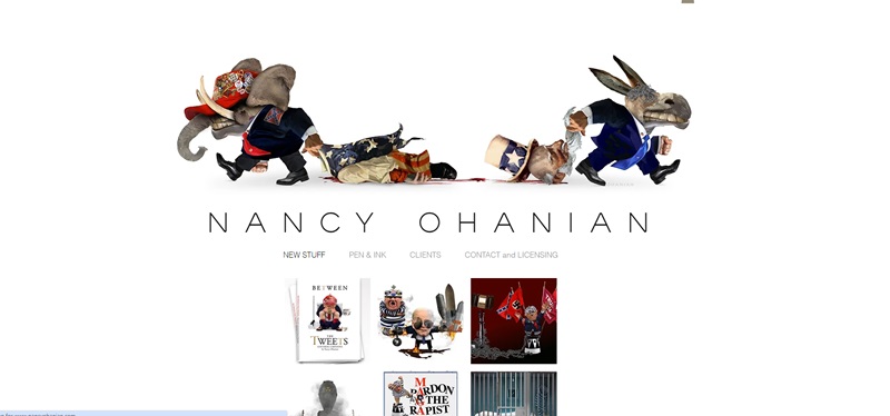
Nancy Ohanian
Get ready to explore the thought-provoking world of Nancy Ohanian!
Nancy is an editorial illustrator, and her website is packed with her powerful drawings that make you think.
Features of Nancy’s website:
- Eye-opening images: Right from the start, you’ll see a bunch of Nancy’s illustrations that are inspired by current events and important issues.
- Discover more: You can click around to find out lots of information about Nancy and her illustrations.
- Educational and fun: Her website doesn’t just show her art; it also explains the stories behind them, which is super educational.
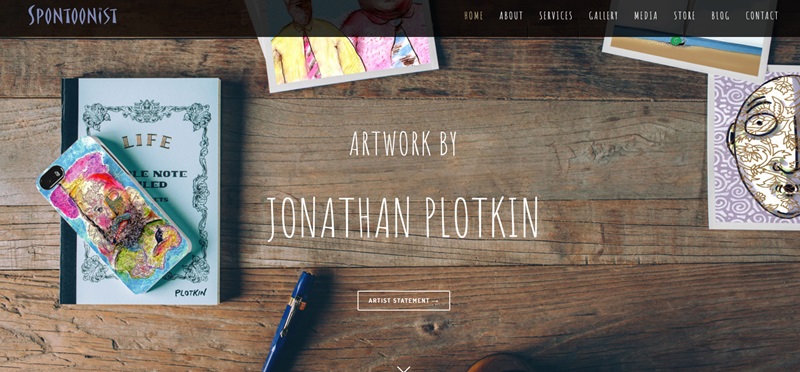
Spontoonist
Welcome to the creative universe of Spontoonist!
This eye-catching website is filled with artistic treasures.
What’s inside:
- Interesting Art and Stories: The site offers unique imagery glittered with imaginative tales that are sure to impress anyone with a love for art and storytelling.
- Organized Design: Information and artwork are well laid out, making it quick and easy to dig into what interests you.
- Inviting Visuals: Artwork and artist descriptions invite visitors to explore in more detail, creating an engaging experience.
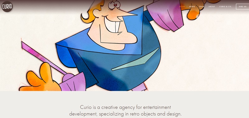
CurioCorp
Next on the list is CurioCorp. It’s a fascinating platform that takes you into an interactive world of discovery.
What it boasts:
- Immersive Experience: The site draws you into a world where curiosity reigns, making page browsing a rewarding journey.
- Clear Navigation: It’s simple to use effective menus and explore the wealth of information CurioCorp has to offer.
- Interactive Features: The website has loads of interactive content that’s fun to engage with.
FAQ: Cartoonist Website Portfolio Design Inspiration
What are some eye-catching features I should include in my cartoonist website portfolio?
Let's jazz your website up with some cool features! You'll want to have a clean and simple layout that's easy to navigate—your visitors should be able to find what they're looking for with no trouble at all. Pair that with some high-quality images of your work, perhaps in a slideshow or a gallery, to really showcase your stuff. Don't forget to tell your visitors about yourself too, like your background, your inspirations, or any awards you've won. People love a good story!
How can I make my cartooning portfolio really pop?
Visuals are your best bet! Use large, vivid images to display your work, which will grab your visitors' attention right away! You might consider incorporating some animation for a whimsical feel, maybe an animated version of you drawing! Also, you might want to try using some contrasting colors—you know, those that are across from each other on the color wheel, like red and green, or blue and orange.
What else can I include in my website besides my portfolio?
Consider adding a blog or a news section to your site where you share updates or thoughts with your visitors. This can create a deeper connection with your audience making them feel like a part of your creative journey. If you sell prints, original works, or merchandise, add an online shop! Plus, contact info is a must—let folks know how to reach you.
How can I keep my cartoonist website fresh and interesting?
Keep yourself in the picture! Update the site regularly with new work, blog posts, news about any events, or showcases you'll be participating in. Visitors are more likely to come back if they know there's new and interesting material.
I want to make my website interactive. Any suggestions?
Absolutely, interactivity can increase user engagement. You could add an area where guests can try coloring one of your black-and-white sketches or perhaps a simple game related to your work. You might also have a monthly poll or contest—people love to participate in things and it keeps them coming back for more! Remember, every bit of your website is an extension of you and your art. So why not make it as fun, visually appealing, and engaging as the great work you do?




Leave a Reply