My content is reader-supported by awesome people like you. Which means I could earn a commission. Learn more here!
Ever felt stuck staring at a blank screen, wondering how to make your website pop without breaking the bank?
I’ve been there.
Trust me, nothing’s worse than watching potential customers click away because your site looks like it was made in 1999.
But what if I told you the solution might already be in your design toolkit?
Canva: Yep, the same tool you use for social media graphics can now create stunning websites that look professionally designed.
And I’m not talking about basic pages that scream “template.”
I mean amazing sites that make visitors think you hired a fancy design agency.
Don’t believe me?
I’ve gathered some amazing Canva website examples that’ll make you rethink everything you thought you knew about DIY web design.
These sites show what’s possible when creativity meets simplicity no coding required.
Ready to see how your new website could look by this time tomorrow?
Band
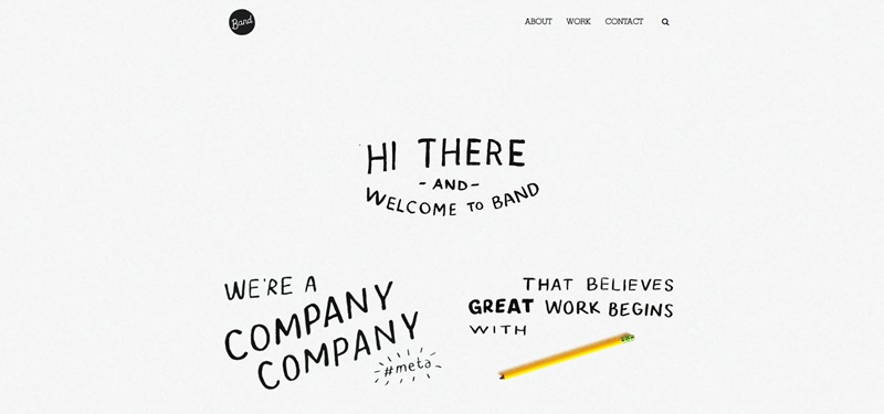
Band is a creative studio that focuses on developing beautiful and artistic ideas.
Their website has a unique design that makes it very pleasing and interesting to look at.
Description of Website Info
At the heart of Band, there’s a drive to craft beautiful and purposeful things.
These are evident when we look through their menu items such as ‘About’, ‘Work’, and ‘Contact’. This tells us Band is interested in meeting new people and producing quality work.
Cool Design Features
- Band’s website has a cool feature called ‘search for exit’, which lets the user navigate easily.
- The website uses a mix of colorful images and plain black-and-white designs. This contrast gives a visually pleasing experience to visitors.
- It’s also mobile-responsive, which means you can view the website on your phone too without losing any of its cool features!
Mac Beauty Co
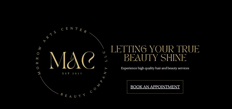
Mac Beauty Co is all the beauty inspiration you’d ever need in one place.
The website is absolutely fun to browse through and very easy to use.
Description of Website Info
Mac Beauty Co website is a treasure trove of beauty inspiration.
They have a mix of beauty products, tips, and tricks.
All of these come together to give users a one-stop shop for all their beauty needs!
Cool Design Features
- The first thing you’d notice on the Mac Beauty Co site is the easy-to-use menu. The menu categories are clean, simple, and to the point making it easy for users to find what they’re looking for.
- The website uses beautiful images of the products. This makes it super easy for visitors to see what they’re buying
- They show social proof, which means they have reviews from folks who have used their products before. This is good as it can help you decide if a product is good for you.
- Like Band, Mac Beauty Co’s website is also mobile-responsive. This means you’ll have just as much fun browsing it on your phone as you would on a computer!
Jessica Brookman
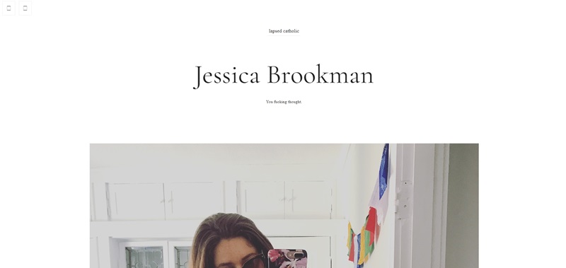
Jessica Brookman’s website acts as a visual and textual representation of her work and ideas. I
t’s easy to navigate and offers a sleek and simple design.
Description of Website Info
Jessica Brookman’s site serves as her personal platform.
She shares her thoughts, ideas, and work with anyone interested.
The site gives off an air of creativity which makes it clear she’s a great thinker.
Cool Design Features
- The website has a clean, uncluttered design which makes it super easy to find information or just simply read through her thoughts.
- The background image is dark and stands out nicely against the white text.
- The text is in a clear, easy-to-read font which makes it very easy to read, even for long durations.
Anna Gratia Interiors
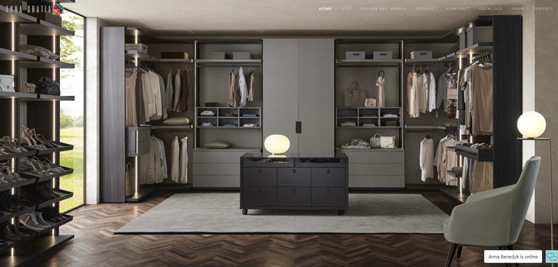
Anna Gratia Interiors’ website showcases their interior design work beautifully.
The design of the website itself complements the work they do.
Description of Website Info
Anna Gratia Interiors.com is a beautiful showcase of the company’s interior design work.
Through the website, they demonstrate they can transform spaces into luxurious homes.
Cool Design Features
- The site uses a beautiful blend of photos and text to tell their story.
- Photos of their work takes up the full screen, letting visitors get a detailed look at their work.
- The text is overlaid on the photos, and it’s usually a short and sweet blurb about the project.
- Navigation is simple, made of easy-to-understand and straight-to-the-point menu items. This makes browsing through the site a breeze.
- The site is mobile-responsive so anyone can have a good experience whether they’re using a computer or a phone.
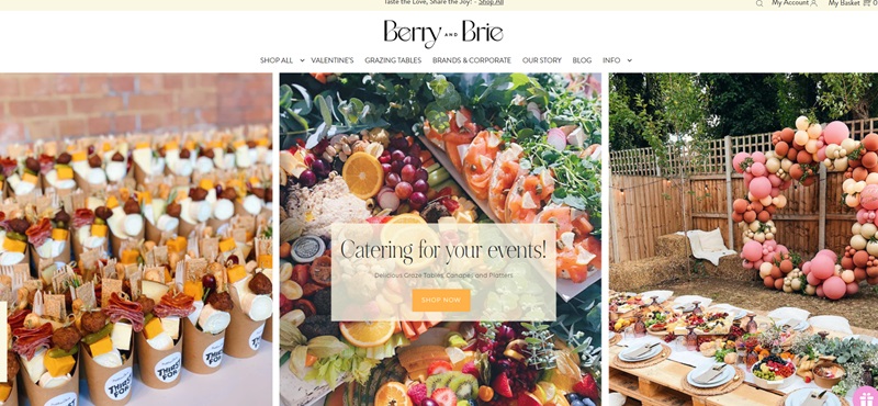
Berry and Brie
Berry and Brie lights up London’s catering scene with delicious and delightful grazing tables and cheese platters.
Its unique website shines a spotlight on its impressive offerings, making food look like a love language.
Description of Website Info
As we browse through Berry and Brie’s website, we find out they are all about tasteful, opulent spreads.
They offer everything from vibrant grazing platters to cheese boxes perfect for a fancy night at home.
They cater both small intimate events and major functions.
Cool Design Features
- The website employs high-quality, full-screen images of their mouthwatering spread, making visitors drool.
- The texts, in a standard sans serif font, overlay these pictures, giving visitors an easy read.
- It’s simplistically designed with easy navigation in mind; key information just a click away on the header.
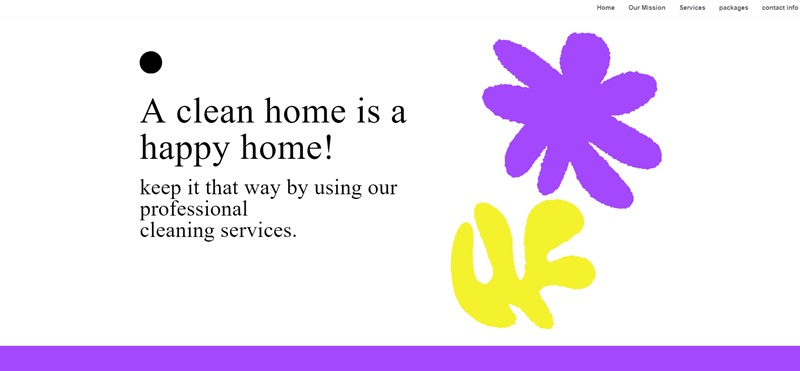
Cleaned Wright LLC
Cleaned Wright LLC presents itself as the perfect solution to all cleaning needs.
Their website design is functional, easy on the eye, and quite user-friendly.
Description of Website Info
Cleaned Wright LLC’s website shows us that they provide top-notch cleaning services.
Their priority is making things shine, and they have the expertise and the equipment to do so.
Cool Design Features
- The color palette used on the website aligns with their business – clean, fresh, and calming.
- The site has a crisp, clear layout, making it easy for visitors to navigate and find the cleaning service they need.
- It’s mobile-responsive which means you can check out the services on your mobile devices whenever you need to.
- High-quality images are used to complement their services, giving a glimpse of their exceptional workmanship.
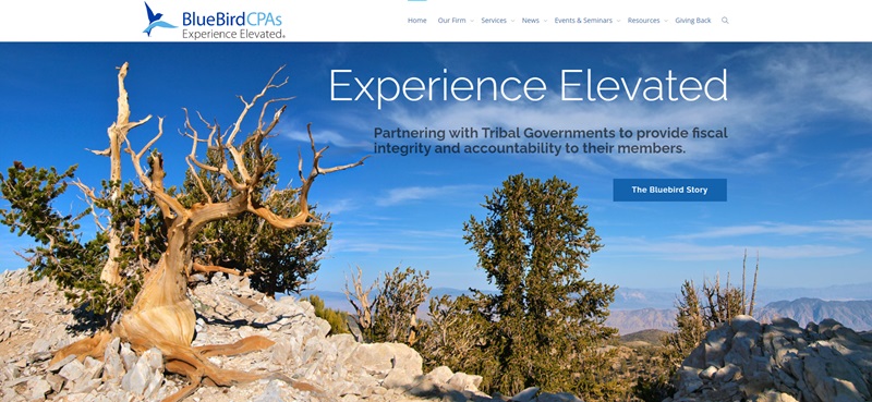
BlueBird CPAs
BlueBird CPAs is a Nevada-based CPA firm, specializing in auditing, consulting, and training services for Native American tribes and casinos across the nation.
They hold true to their values of providing fiscal integrity and accountability.
Description of Website Info
Upon visiting BlueBird CPAs’ website, we learn that they are dedicated to helping Native American tribes and casinos maintain strong fiscal responsibility.
Their services include casino audits, tribal audits, internal audits, forensic audits, education seminars, and consulting.
Cool Design Features
- The website uses a clean layout with a modern design that is visually appealing and easy to navigate.
- High-quality images representing their services capture visitors’ attention and convey a sense of professionalism.
- The website’s color scheme aligns with the BlueBird CPAs brand, creating a consistent look and feel throughout the site.
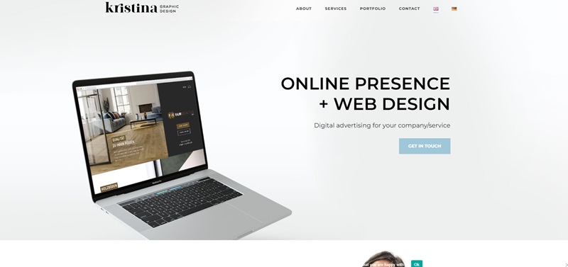
Kristina Graphic Design
Kristina Graphic Design is an online portfolio showcasing the graphic design work of a talented artist named Kristina.
The website displays her creative skills and design expertise, which are sure to impress visitors.
Description of Website Info
Kristina Graphic Design is a well-structured portfolio, organized by project type, spotlighting Kristina’s work and presenting her unique design approach.
Cool Design Features
- The website has a visually pleasing design with a minimalist focus, which highlights the artist’s graphic design projects.
- Vibrant, high-quality images showcase Kristina’s work effectively, engaging and capturing the interest of the visitors.
- A straightforward menu ensures easy navigation, helping users explore different sections and projects throughout the website.
Canva Website Design FAQ
What types of designs can I create with Canva?
Canva is an all-around amazing design tool that lets you create a wide range of designs like:
- Social media graphics
- Presentations
- Posters
- Flyers
- Business cards
- Websites
- Invitations
You can choose from numerous templates and customize them as much or as little as you want, giving your designs a personal touch. Plus, Canva is user-friendly, so everybody, from beginners to experts, can create fantastic designs.
How do I start my own website design on Canva?
You’ll love how simple it is to design a website on Canva. Just follow these easy steps:
- Sign up for a free Canva account or log in if you’ve already registered.
- Click on “Create a design” and select “Website” from the dropdown menu.
- Browse through the available templates, and choose one that catches your eye.
- Customize your website design with colors, fonts, images, and other elements. The fun part is you can move things around and make it your own.
- Save and download your design, and it’s all set to be used on your website.
Is it expensive to use Canva for designing a website?
Nope! Canva offers a free plan that has plenty of features to get you started. With free access to thousands of templates and a wide variety of design elements, you can bring your creative ideas to life without spending a dime.
They also offer a Canva Pro plan which, for a small monthly or annual fee, gives you access to even more design options and features. It’s the perfect choice if you’re looking to step up your design game. The great thing is Canva is super affordable for what it offers, so it won’t burn a hole in your pocket!
Can I collaborate with others on my Canva website design?
Absolutely! Canva allows you to work together with your friends, teammates, or clients on your website designs. Collaboration is super simple:
-
- Open your website design in the Canva editor.
- In the top-right corner, click on the “Share” button.
- Type in the email addresses of those you want to collaborate with, or send them a link.
- Decide if they can view or edit the design, and let the teamwork magic begin!



Leave a Reply