My content is reader-supported by awesome people like you. Which means I could earn a commission. Learn more here!
Planning to build a beauty website and need a spark of inspiration?
Well then, let’s start by checking out some beauty websites.
We’ll stroll through some websites with standout features that make them shine.
But wait!
Let’s break down some things each website offers to give you some help.
This is not just about acing website design, but also about offering real value to your audience – the recipe to winning customer hearts.
Now, who’s ready for a deep dive into captivating designs and inspiring ideas?!
Let’s get started right now!
Wholy Dose
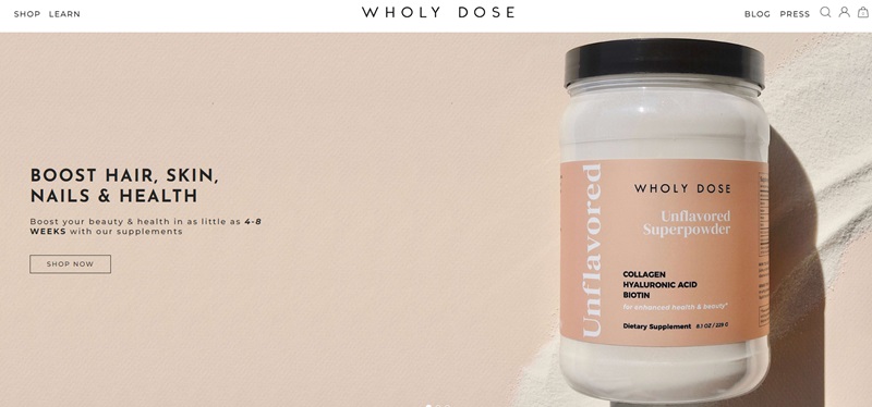
Get ready to feel amazing from head to toe with Wholy Dose!
This website offers all-in-one health supplements that pump up your beauty and boost your health.
Moreover, the website is all about providing solutions for beauty, health, and more.
The creators behind Wholy Dose truly went all out in developing a product that not only cares for skin and hair, but also includes benefits for your metabolism, immunity, digestion, joint health, and energy levels.
Website Design Features
- Moving on, let’s talk about the enjoyable user experience. The website design is clean and soothing, which helps reassure you about the quality of their products.
- Navigation is straightforward. You’ll easily locate links to shopping, learning about the products, or with any queries you might have.
- Product images are clear and large, leaving no room for imagination about what you’re buying.
- Perhaps one of the niftiest features is their “See the Difference” section where they proudly display before and after photos from real users.
100% Pure
Site Description
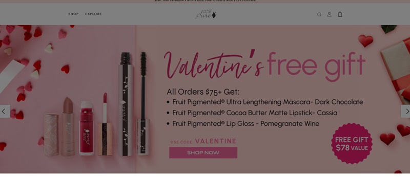
Next up is the wonders that are 100% Pure! As the name implies, this site is home to pure, organic, and healthful beauty products.
The focus is placed on natural solutions to enhance your beauty from every angle.
Website Design Features
- The site’s design is just as pure as its products. A white backdrop serves as a canvas for their colorful and enticing product pictures.
- It’s a breeze to navigate around the site, with clearly marked categories and filters.
- The home page greets you with stunning and inspiring images. And what’s more, they’re often accompanied by juicy deals and offers!
Kylie Cosmetics
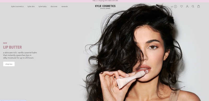
Kylie Cosmetics is a website that’s all about making your lips look great and feel even better.
They just released a new lip balm called “Lip Butter.”
It’s packed with goodies for your lips, like stuff that helps keep them moisturized and soft.
Plus, it smells like vanilla caramel, which sounds pretty amazing!
Website Design Features
- Clear, Attractive Photos: The website shows big, clear pictures of the Lip Butter, so you know exactly what you’re getting.
- Easy to Read: They talk about the Lip Butter in simple words, making it easy to know why it’s so awesome for your lips.
- Cool Style: The site has a really cool layout that’s not just pretty to look at but also makes shopping fun and easy.
Jeffree Star Cosmetics
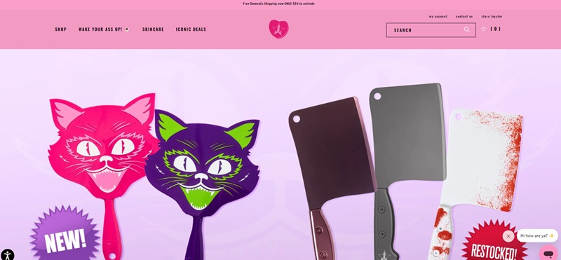
Jeffree Star Cosmetics is the place to find bold, one-of-a-kind makeup.
If you love standing out with your makeup, this is your paradise.
Website Design Features
- Bright and Bold: The site uses super bright and eye-catching colors that match the personality of the brand.
- Easy to Navigate: Everything is sorted into categories so you can find what you’re looking for without any stress.
- Engaging: The site makes you want to click around because each page is just as exciting as the next.
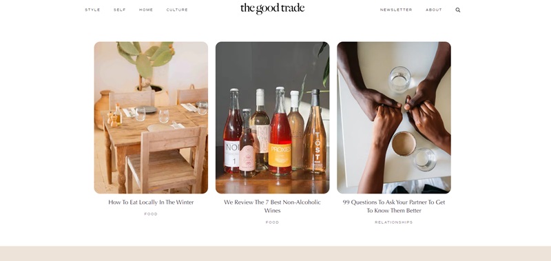
The Good Trade
The Good Trade is a cool website for people who want to make the world a better place.
They share information about ethical fashion, beauty, and lots of other things that are good for the planet.
Website Design Features
- Clean and Green: The design is super clean and has a natural feel, just like their focus on being kind to the earth.
- Informative Articles: They have lots of articles that are easy to understand, and they’re super helpful if you want to live a more eco-friendly life.
- Organized Layout: Finding what you need is a breeze because everything’s organized so well.
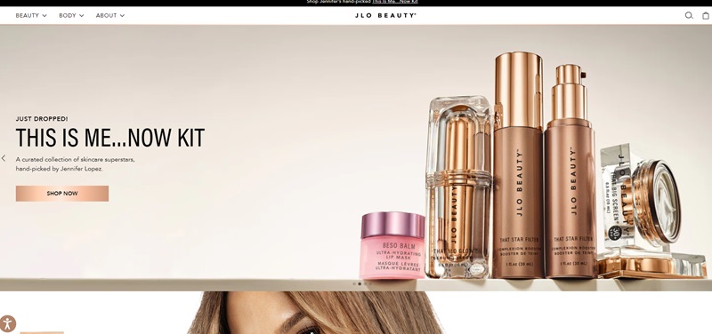
JLo Beauty
First off, JLo Beauty is like a secret code to unlock that famous JLo glow.
The website sells skincare products that promise to make your skin as radiant as Jennifer Lopez herself.
They’ve skipped the makeup and dove right into nourishing skincare stuff.
Website Design Features That Stand Out
- Captivating Testimonials: As soon as you land on the site, you see what people are saying about how the products get them one step closer to looking like JLo.
- Famous Magazine Mentions: The site makes sure you know their products are talked about – you see names like Glamour and Vogue super often.
- Clear, Beautiful Imagery: They show off their products with images that make you feel like you’re stepping into a glamorous world.
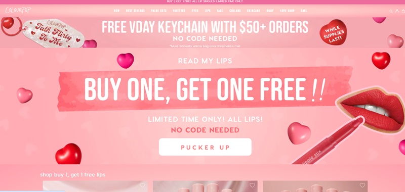
ColourPop
Alright, moving on to ColourPop!
This one’s all about giving you makeup that’s as fun and vibrant as you are.
They’ve got a rainbow of colors to choose from whether you want eyeshadow, lipstick, or something else to brighten your day.
Why The Website Rocks
- Super Fun Colors Everywhere: The moment you see the website, it’s like a party for your eyes with all the colors they use.
- Awesome Deals Front and Center: They show off their best deals right away, so you feel like you’re getting a special treat.
- Easy Peasy To Find Things: You won’t get lost looking for stuff – it’s all set up to help you find exactly what you need.
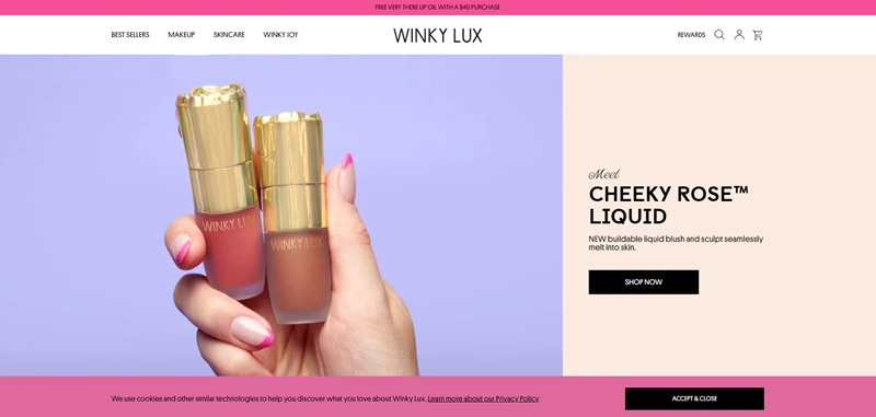
Winky Lux
Winky Lux is a super fun makeup website where you can find cool and unique cosmetics.
They’ve got everything from lip gloss that changes color to moods, to flower-shaped blushes and beyond!
Website Design Features Making It Nice
- Fresh & Playful: The site design is full of bright colors and fun patterns, making it cheerful and appealing.
- Easy Navigation: Finding what you’re looking for is a breeze, thanks to the clear and organized menu.
- Visual Fun: They use catchy product images and engaging animations to showcase their items.
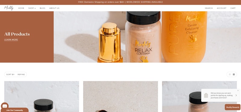
Muddy Body
Muddy Body is a skincare haven where you can find products made from natural ingredients.
They focus on keeping your skin looking and feeling its best, all while being gentle and kind to the earth.
Cool Stuff About The Site’s Design
- Clean & Earthy: The design is fresh and clean, with a touch of nature-inspired elements that make you feel connected to the outdoors.
- Organized Layout: Shopping is easy with the site’s user-friendly design, allowing you to browse and find what you want quickly.
- Inviting Imagery: They use lovely images to show how the products can enhance your self-care rituals, making them irresistible.
Cloud 10 Beauty
Cloud 10 Beauty is a one-stop shop for beauty products from iconic brands and exciting new discoveries.
They’ve got makeup, skincare, body care, and more, all in one place for your convenience.
Why The Website Shines
- Vibrant & Contemporary: The site uses lively colors and a modern design, engaging you from the moment you arrive.
- Helpful Recommendations: They showcase popular products and staff picks, making it super easy to find the best items for you.
- Smooth Navigation: You’ll have no trouble finding your way around the site, thanks to the well-organized layout.
Ella+Mila
Ella+Mila is a fabulous site that helps you take care of your nails.
They offer vegan and cruelty-free nail polish in a wide variety of colors, as well as treatments to keep your nails healthy and strong.
Website Design Features Making It Nice
- Chic & Lovely: The site has a stylish design, with soft colors and minimalist touches that make it inviting.
- Color Wonderland: They showcase their nail polish array with colorful images that catch your eye and make you want to try them all.
- Smooth Shopping: Navigating the site is super easy, making it a breeze to find what you’re looking for and enjoy the shopping experience.
Doe Lashes
Doe Lashes is all about giving you the most gorgeous fluttery lashes. The site offers high-quality, natural-looking false lashes made to comfortably amp up your eye game.
Cool Stuff About The Site’s Design
- Soft & Dreamy: The site design is delicate, using pastel colors and gentle images to create a soothing atmosphere.
- Clear Display: It’s easy to see the different lash styles, with close-up images that help you choose the perfect pair.
- Helpful Hints: The site offers tips on lash application and care, making sure you’re confident and ready to rock your new look.
Frequently Asked Questions
What are some features I should include in my beauty website?
Well, my friend, designing a beauty website is like curating an art exhibition – each element should harmoniously reflect the aesthetic of your brand. Key features to consider are high-quality images (we all love those crystal-clear skincare close-ups, right?), engaging and easy-to-read product descriptions, customer reviews, and a simple, secure checkout process.
How can I make navigation easier on my beauty website?
The easier your site is to navigate, the happier your customers will be. Simple menus, clear categories like ‘Skincare’, ‘Makeup’, and ‘Hair care’, and an efficiently working search function are a must-have. Visual breadcrumbs (like those little arrows guiding you back home) also give users a clear path to go back to or continue shopping.
What’s the advantage of having a blog on my beauty website?
It adds, like, a ton of value! A blog is not just a space for you to showcase your products. It’s a platform where you can share your unique story, ethos, and, most importantly, your expertise in beauty in a more casual, yet informative manner. Also, it’s a fantastic SEO booster! Google loves fresh, keyword-rich content, and a regularly updated blog is perfect for that.
Should I include product videos on my beauty website?
Yes, yes, a thousand times yes! Videos help customers understand your products more clearly than static images or plain text. For instance, you could demonstrate how to use a product, or show a before-and-after clip. People tend to buy what they understand, and videos can help you achieve just that.
I keep hearing about SEO. How can it help my beauty website?
This is the key to making your website ‘discoverable’. SEO, or Search Engine Optimization, niftily allows search engines like Google to find your site more easily. By including relevant keywords (like “organic skincare” if that’s what you’re selling) in your website content, you are telling Google, “Hey, I’m here! Show me to people looking for organic skincare.” And voila! Higher visibility, more potential customers.
How can social media integration benefit my beauty website?
Social media is more than just a place for cute dog videos. It’s a powerful tool to drive traffic to your website. Integrating social media buttons on your site (like those little icons for Instagram, Facebook, and Twitter) encourages users to share deals, purchases, or posts about your brand. It gets people talking about you, and word-of-mouth marketing, trust me, is gold.
Are customer reviews important for my beauty website?
Absolutely! When you shop online, don’t you check reviews before buying a product? Most people do. Reviews provide honest feedback from those who’ve used your products. They engender trust and transparency, which are key to building long-term customer relationships. So, embrace those stars and let your customers’ voices shine!


Leave a Reply