My content is reader-supported by awesome people like you. Which means I could earn a commission. Learn more here!
Ever wondered why some barbershop websites just pop up and stay with you?
It’s all in the style of the website design and elements!
Today, we are checking out some of the best of the best in Barbershop Website examples.
These digital storefronts aren’t just about flashy graphics;
they’re the cornerstone of customer interaction and the perfect fade into the digital realm.
We’ll comb over features, benefits, how they stack up to the competition, and the unique charm they bring—setting the trend for others to follow.
Get ready, because these sites are a cut above the rest, shaping an experience that’s just as memorable as that fresh trim feeling.
Scissors & Scotch
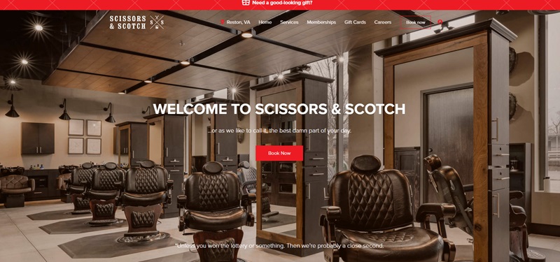
Scissors & Scotch is an all-in-one men’s barbershop, grooming center, and hangout location, which is revolutionizing the traditional barber experience.
The Experience
Traditional barbering and modern spa services are effortlessly blended at Scissors & Scotch, truly delivering what they imply as “the grooming experience every man deserves”.
Indeed, the amenities provided are created with the intent to ensure that every visit is the best part of the customer’s day.
As you may anticipate, transitioning from a haircut or shave to a relaxing beverage, Scissors & Scotch indeed feels like a favorite watering hole rather than a typical grooming station.
They offer a wide range of grooming services which includes haircuts, shaving, trimming, waxing, and much more along with a fully-stocked bar.
Design Features
The website design can be summed up as clean, user-friendly, and effectively resonates with the brand’s image.
From the navigation menu to the booking system, every feature is displayed reliably.
The website also boasts an elegant blend of imagery and typography, using professional photos of its services and facilities as its main visual element.
This provides a glimpse into the experience awaiting each customer, reinforcing their message of an elevated grooming experience.
Contrasting colors and large, bold typography are used effectively to draw attention to key areas of the site.
A good balance of text and images is maintained throughout, ensuring information is presented clearly and attractively.
Customer Friendly Features
What makes Scissors & Scotch’s website stand out is its consumer-centric design, leading with a swift booking system perked up at the header of the website, an insightfully organized account login section, and an intriguing review section showcasing positive customer testimonials.
These elements inspire user trust and encourage interaction.
Overall, Scissors & Scotch’s website does a fantastic job of capturing the brand’s unique concept and personality, inviting users in for an unforgettable experience.
Through its design and messaging, it clearly communicates its goal – to make the grooming process more enjoyable and rewarding for the modern man.
Fort Worth Barber Shop
Fort Worth Barber Shop is a classic barbershop based in Fort Worth, Texas, which offers traditional men’s grooming services.
They pride themselves on their skilled and experienced barbers, quality grooming products, and cozy environment.
The Offering
Specializing in classic cuts, beard trims, hot towel shaves, and high-quality grooming products, Fort Worth Barber Shop aims to help each client look their best.
Their team of professional barbers employs traditional techniques while adding a touch of modern flair.
The barbershop has created a laid-back atmosphere that encourages great music, thoughtful conversation, and strong relationships within the community.
Website Design
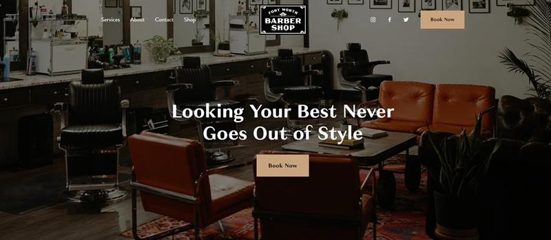
The Fort Worth Barber Shop website is designed with simplicity and functionality in mind.
It features a clean interface that showcases the barbershop’s unique selling points and provides an effortless booking experience.
With clear navigation menus and visible calls-to-action, users can seamlessly access services, about, contact information, and shop sections.
Engaging Visuals
The website employs refined typography and visual elements to pique user interest.
The top fold of the homepage presents a large hero image reflecting the ambiance of the barbershop.
Meanwhile, other attractive visuals enhance the overall design, successfully conveying the vibe of the shop to the target audience.
User-Oriented Information
Showcasing the offered services, the site provides easy-to-read descriptions of each one.
This menu includes everything from traditional cuts, long layers, beard trims, buzz cuts, and specialty styles, to transformations and shaves.
Moreover, the website offers comprehensive information on the barbershop’s location, hours, and contact details.
In summary, Fort Worth Barber Shop’s well-designed website effectively combines simplicity and functionality while reflecting the barbershop’s personality, making it a delightful user experience.
Southern Gentlemans Barbering Co
Southern Gentlemans Barbering Co is a unique online portal that proudly presents the services of a premier family-owned men’s barber shop.
This website incorporates three convenient locations across the Midlands into its design, catering to clients from Five Points, Lexington, and Chapin SC.
Friendly Introduction
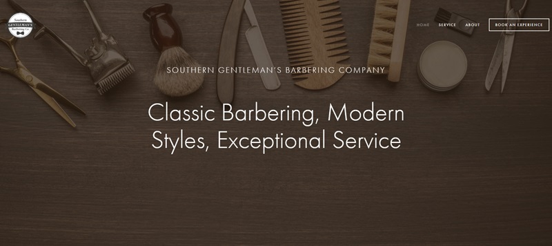
Right off the bat, the website welcomes you with a warm introduction to its world of classic barbering, with a promise of modern styles and exceptional service.
This bold statement stands out prominently, providing an indication of the company’s passionate commitment to quality grooming services.
User-friendly Navigation
At the top of the home page, there is a clear and simplified menu that guides users effortlessly to their desired sections.
Whether it’s checking out Services, learning more of the barbering team, or scheduling an appointment, navigating the site is as smooth as a hot shave.
Distinct Features
- Attractive Service Menu: A detailed guide to all their services is provided, each explained vividly. From classic haircuts to gentleman’s shaves and senior haircuts, the detailed listings give an understanding of what to expect.
- Meet the Team: An introduction to the highly skilled barbering team, each showcased with their names and respective roles. This adds a personal touch, amplifying trust and boosting connection between clients and barbers.
- Booking System: For the ease of clients, the website offers an interactive booking system. This feature is a great convenience, providing one-click booking at the location of choice.
- Feedback System: The platform encourages customer feedback. Clients can give their thoughts on services received at any of the locations. This indicates the trust the company places in its services, and a willingness to improve and adapt.
Eye-catching Design
The Southern Gentlemans Barbering Co website uses a variety of visual strategies to appeal to customers. The design is clean and crisp, with sharp images reflecting the quality of their service. The contrasts between the dark and light textures in the background enhance the aesthetics, giving the website an elegant, yet modern feel.
Transitioning from one section to another is smooth, just like their customer service. Color coordination between different sections adds visual appeal, and the overall design of the website celebrates the blend of traditional and modern practices.
No doubt, Southern Gentlemans Barbering Co’s website offers a polished platform that mirrors the high caliber of their services and their devotion to ensuring every client feels and looks their absolute best.
Tweed Barbers of Boston
Tweed Barbers of Boston is a distinguished establishment that has been providing iconic men’s haircuts and quality hot lather shaves to discerning clients since 2006.
Passionate about their craft, the barbershop takes pride in perpetuating the fine art of classic barbering.
Service Offered
With an emphasis on attention to detail, Tweed Barbers ensures a cut that is well tapered, even sideburns, and a straight neckline.
They listen attentively to their clients, displaying their commitment to delivering an exceptional grooming experience.
Not just renowned for their precision in haircuts, Tweed Barbers present a welcoming vibe, making it a preferred choice for many in Boston.
Website Design
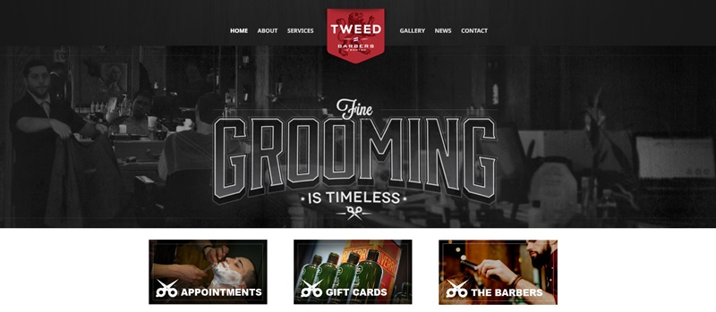
Their rudimentary web design features an easy-to-navigate menu bar that directs users to the key areas—Home, About, Services, Gallery, News, Contact, and Appointment Booking.
This uncluttered design allows users to effortlessly journey through the site, retrieving the desired information without fuss.
Visual Appeal
Tweed Barbers’ website tastefully integrates a vintage aesthetic, with throwback photos adding a touch of nostalgia, reflecting the heritage of classic gentleman’s grooming.
These pictures paired with descriptions provide insights into the experience at the shop.
Ease of Accessibility
The inclusion of operating hours and contact information on the homepage is a significant feature that bolsters customer convenience.
Furthermore, a direct Appointment Booking system enhances the website’s functionality, presenting an end-to-end solution for customers.
In essence, the Tweed Barbers of Boston website encapsulates the barbershop’s ethos and services seamlessly, offering a smooth user experience mediated by a timeless design language.
Rob’s Chop Shop
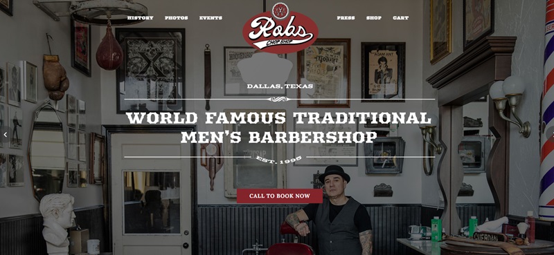
Rob’s Chop Shop is a full-service traditional men’s barbershop located in Dallas, Texas.
With a history stretching over 25 years, the barbershop specializes in classic tailored haircuts and offers men’s grooming services modeled after trends from the past.
Grooming Services
Adopting a straightforward approach, Rob’s Chop Shop delivers an array of grooming options spanning classic haircuts to specific services unique to men.
With every haircare service rendered, the shop has managed to uphold and further the tradition of men’s grooming since its inception in 1995.
Website Features
The website exudes a traditional and rustic vibe mirroring the shop’s interior, immersing visitors in the authentic barbershop experience.
One principal feature of the site is its simplicity, characterized by an uncluttered layout and clearly defined sections.
Engaging Aesthetics
The aesthetic appeal of the website is enhanced by the use of monochrome photography and minimalistic graphics, imparting a timeless feel.
Images of hair grooming in action add dynamism to the site and provide visitors with a glimpse into the meticulous craft practiced at the shop.
User Accessibility
Understanding the significance of easy navigation, the tabs for History, Photos, Events, Press, Shop, and Cart are thoughtfully arranged.
A built-in booking system enables users to ‘Call to Book Now’ with one simple click, making it convenient for customers to secure an appointment.
Added Touches
The Shop also keeps its customers engaged through an Instagram feed, displayed as part of the website layout.
This ensures clients are always updated about the shop’s activities and services.
In summary, Rob’s Chop Shop’s website reflects the classic and timeless nature of the services provided, complete with a simple-to-use layout.
A testament to its belief is in not just offering a barber service, but delivering a lifestyle.
Natural Barber Co.
Natural Barber Co. is an eco-conscious haircare brand that focuses on offering innovative, all-natural grooming products for men.
Their primary mission is to pioneer change in the men’s grooming market by making environmentally friendly choices every day, effortlessly, and accessible for their customers.
Product Offering
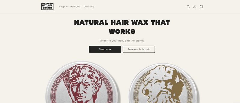
Their signature product, an all-natural hair wax, is designed to nourish, condition, and protect hair without harming the planet.
By choosing Natural Barber Co.’s products, customers can embrace healthier hair while reducing their environmental impact.
Design Features
The Natural Barber Co. website is well-designed, boasting a clean and easy-to-navigate layout.
The use of whitespace and high-quality images allows products to be showcased in an engaging and visually appealing manner.
The site provides an enjoyable browsing experience, allowing users to understand the brand’s values at a glance.
Inspirational Messaging
One of the striking aspects of the website is the inclusion of inspirational messages such as “Venture on” and “We believe that anything’s possible when you look and feel your best.”
This inspiring tone aims to motivate customers to not only choose eco-friendly products but also strive for their personal best.
Social Media Integration
The website seamlessly integrates a social media feed that keeps customers informed about new product releases, helpful hair care tips, and brand updates via Instagram.
This is an excellent feature as it encourages visitors to follow the brand and join the community of like-minded individuals who care about sustainable haircare solutions.
In a nutshell, the Natural Barber Co. website effectively represents the brand’s commitment to offering eco-friendly, high-quality men’s grooming products.
Through a visually appealing design and inspiring messaging, the site leaves a lasting impression on visitors and entices them to explore and support natural solutions for hair care.
Pankhurst London
Pankhurst London stands as a premier barbershop and grooming brand conveniently located in the heart of London.
Known for its exceptional services and wide array of luxury grooming products, it manifests a unique blend of traditional craftsmanship and contemporary aesthetics.
High-End Barbering Services
Pankhurst London is widely recognized for providing distinguished barbering services.
From simple trims to thorough shaves, its craftspeople uphold the highest standards of quality.
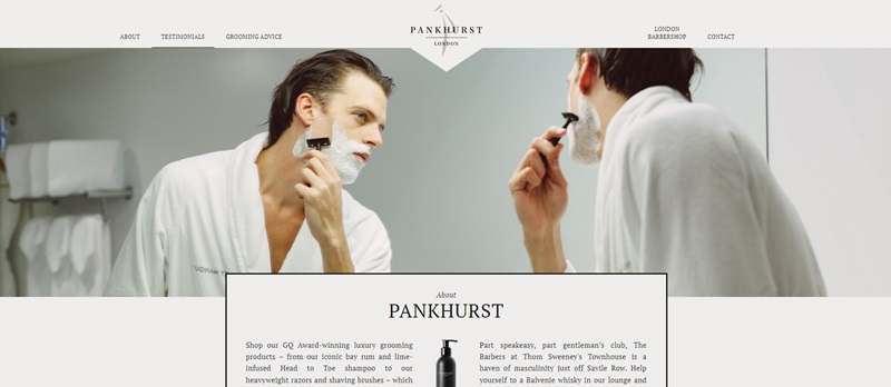
The experience doesn’t stop there; customers can relish a complimentary Balvenie whisky in the lounge area before their service, reinforcing the brand’s commitment to creating an extraordinary grooming experience.
Superior Grooming Products
Alongside its bricks-and-mortar operations, the brand boasts an impressive lineup of GQ-award-winning grooming products.
Their iconic, bay rum and lime-infused shampoo are among the luxury offerings, setting the brand apart in the ultra-competitive grooming market.
The site’s “Shop” section perfectly showcases these products, supported by mentions in the prestigious Vanity Fair, Esquire, and GQ.
Sophisticated Website Design
The website design does justice to the brand’s elegant persona.
A harmonious marriage of a monochrome background with vivid graphics offers a visually pleasing contrast.
User-friendly design faceted with an easy-to-navigate menu makes the website an enjoyable experience for all its visitors.
Engaging Multimedia Content
The Pankhurst London website engages its visitors with a rich collection of multimedia content.
“Pankhurst Films” offer a peek into the stylish world surrounding a Pankhurst man, and the “How To” section offers handy tips on using their award-winning products.
In conclusion, Pankhurst London’s artistic blend of service offerings coupled with quality grooming products and a stunning website, truly sets a high precedent in the industry.
The website successfully communicates the brand’s essence, offering a magnificent user experience enhanced with exemplary content and intuitive design.
Abels on Queen Barbershop
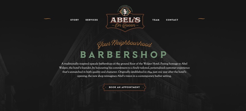
Abels on Queen Barbershop is an upscale, traditionally-inspired establishment located at the base of the historic Walper Hotel.
It pays tribute to the hotel’s founder, Abel Walper, by continuing his legacy of a finely tailored, personalized customer experience, one that is unmatched in both its richness and character.
Having been originally established in 1893, the shop now brings Abels’ vision into the present age, redefining the classic barbering experience.
Exquisite Grooming Services
Patrons of Abels on Queen can indulge in an array of grooming services.
From precision haircuts to hot towel shaves, the shop upholds a tradition of excellence.
The service menu clearly articulates an unfaltering commitment to quality, ensuring every visit is met with utmost craftsmanship.
Design & User Experience
The barbershop’s website reflects the same attention to detail with a sophisticated online presence.
Distinctive sections for the shop’s story, services, team, and contact information allow for effortless navigation.
Furthermore, each service is described with clarity, and the invitation to book an appointment is prominently displayed, inviting action from site visitors.
Team Introduction
A unique touch is the introduction of the barbers, fostering a sense of familiarity and trust even before a customer walks through the door.
Users are encouraged to ‘Book with Mitch’, ‘Book with Eric’, or ‘Book with JP’, personalizing the experience right from the start.
Engaging Visual Elements
Moreover, the website’s visual elements capture the essence of the shop’s nostalgic yet modern vibe.
The consistent branding and photography echo the physical space’s elegance, creating a coherent narrative between the online and in-store experience.
In conclusion, Abels on Queen Barbershop’s website artfully conveys its rich heritage and modern sophistication, providing potential customers with all the necessary information to begin their grooming journey with ease and assurance.
Karin and Company Salon
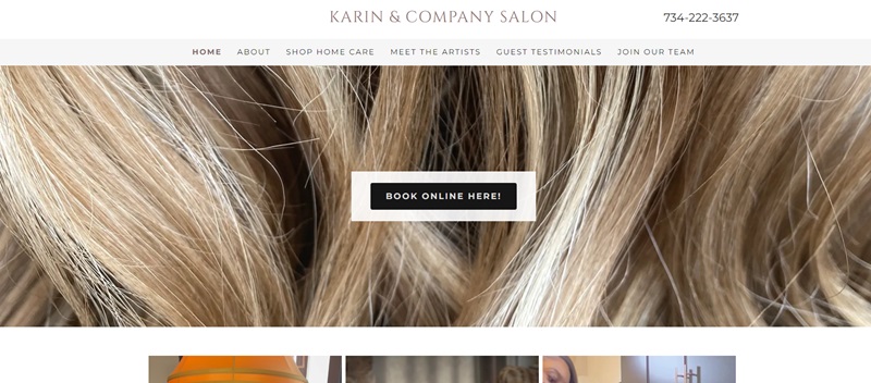
Karin and Company Salon is an upscale hair salon located in Ann Arbor, Michigan, dedicated to providing top-tier hair care and styling services.
By pairing experienced stylists with a warm and welcoming environment, they ensure that every guest can enjoy a premium salon experience.
Renowned Hair Services
At the core of the salon’s offerings are its high-quality hair services.
The website ensures that booking these services is convenient by prominently featuring a ‘Book Online Here!’ option.
Additionally, it includes a comprehensive section where potential customers can ‘Meet The Artists,’ connecting guests with the skilled professionals behind the salon’s reputation.
Customer-Centric Approach
Moreover, the salon spotlights authentic ‘Guest Testimonials,’ lending credibility and giving voice to their customer base.
This feature serves as an assurance for new visitors, showcasing the satisfaction of those who have experienced the salon’s services firsthand.
Easy Navigation
Navigational ease is well-achieved by a cleanly structured menu—providing clear pathways to essential information about the salon, how to shop for home care products, and openings in their team for potential applicants.
Social Media Integration
Engagement is maintained beyond the visit through the website’s social media links, which act as a portal to the salon’s latest updates and customer interactions.
This encourages a continuous and dynamic connection with clients.
Lucky’s Barbershops
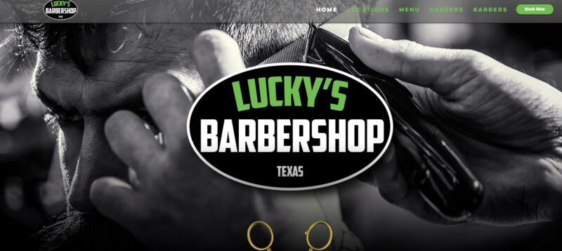
Lucky’s Barbershops stands out as an award-winning men’s grooming institution with multiple locations in the Dallas, Richardson, and Allen areas.
This establishment is founded on the principles of precision and style, delivering an array of barbering services designed to meet contemporary grooming needs.
Comprehensive Grooming Services
The website clearly outlines the extent of Lucky’s services, including expert fades, shaves, and trims.
These offerings are detailed in sections that clients can easily learn more about, presenting the craftsmanship and personalized care taken in each service.
Easy Online Booking System
Regarding accessibility, the site features a straightforward ‘Book Now’ option that guides visitors smoothly through the process of making appointments.
Consequently, the convenience factor is significantly enhanced, catering to guests on tight schedules.
Client Education
Each of the descriptive sections serves to educate clients on what they can anticipate from their visit.
This thorough understanding upfront fosters a sense of trust and aligns expectations, contributing to a higher rate of customer satisfaction, as evidenced by their reported numbers.
Intuitive Navigation
Furthermore, the website features a user-friendly layout, making it a breeze for customers to navigate through the various menu items, find locations, view services, and access career opportunities.
It also provides direct links to the mobile app for added convenience.
Community and Team Engagement
The site takes pride in its team of expert barbers and displays a commitment to growth by inviting passionate professionals to join the team.
With a simplified application process highlighted on the site, Lucky’s extends an invitation to like-minded individuals who share an ardor for barbering.
In summary, Lucky’s Barbershops’ website exhibits the blend of class and convenience that patrons can expect from their services.
With a design that facilitates engagement and conveys a wealth of information, the site effectively reflects the barbershop’s ethos of blending traditional service with modern style.
Swanky Stylez
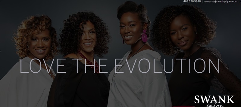
Swanky Stylez is an exclusive hair salon specializing in natural hairstyles.
The salon, led by Verness, a premier natural hairstylist, offers an immersive and relaxing experience for its clients, fused with top-tier hairstyling services.
Exceptional Hair Services
Swanky Stylez provides a comprehensive range of hair services, each cleverly titled to reflect the salon’s vibrant and creative character.
From ‘Straighten Me’ and ‘Define Me’ to ‘Curl Me’ and ‘Color Me,’ the salon ensures all hair needs and preferences are catered to.
By categorizing the services clearly on the website, customers can easily identify and select the best options according to their hair goals.
Inviting Atmosphere
The salon atmosphere, as indicated on the site, aims to be a hub of tranquility and relaxation.
Clients can immerse themselves in various music genres and experience the calming effects of diffused essential oils, contributing to a holistic beauty experience beyond the hair treatments.
Bookings and Contact Information
The website promotes easy interaction and book planning with a dedicated ‘Contact Me’ section that makes it effortless to reach out for appointments or inquiries.
The salon’s appointment-only policy ensures each client receives undivided attention and personalized care.
The Lady Clipper Barber Shop
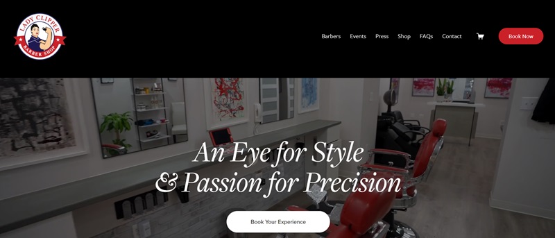
The Lady Clipper Barber Shop is a distinguished black woman-owned salon based in Washington, D.C.
The salon, nestled in the epicenter of the Historic U Street Corridor, strives to exceed expectations with precision cuts in an inclusive environment, creating an amiable space where everyone feels welcome.
Artistic Services and Skilled Professionals
The salon provides tailored barbering services to accommodate diverse styling needs.
Furthermore, the website features a ‘Meet the Barbers’ section, providing a brief introduction to each barber.
The range of expertise in the team, including barbers and hairstylists, highlights the salon’s dedication to catering to various hair styling and care requirements.
Simplified Booking Experience
With a view to improving customer convenience, the website includes a prominent ‘Book Your Experience’ button at multiple points.
This simplifies the booking process, offering clients an efficient way to secure their preferred service and timing.
Community Engagement
In addition, the site incorporates a section dedicated to ‘Events’ and ‘Press,’ helping visitors stay informed about the salon’s community involvement, milestones, and recognition.
This active engagement with the broader community underscores the salon’s connection to its clients and the area it serves.
Online Store
The website’s ‘Shop’ section enables users to purchase exclusive products, demonstrating the salon’s commitment to providing high-end grooming essentials.
This not only adds an extra layer of convenience for customers but also extends the salon’s care beyond the confines of the shop.
Finally, the contact details and a simple way to get in touch feed into the overall emphasis on customer convenience and accessibility.
In conclusion, The Lady Clipper’s website builds on the salon’s ethos of skilled craftsmanship and warm connection, presenting an elegant online reflection of its physical counterpart.
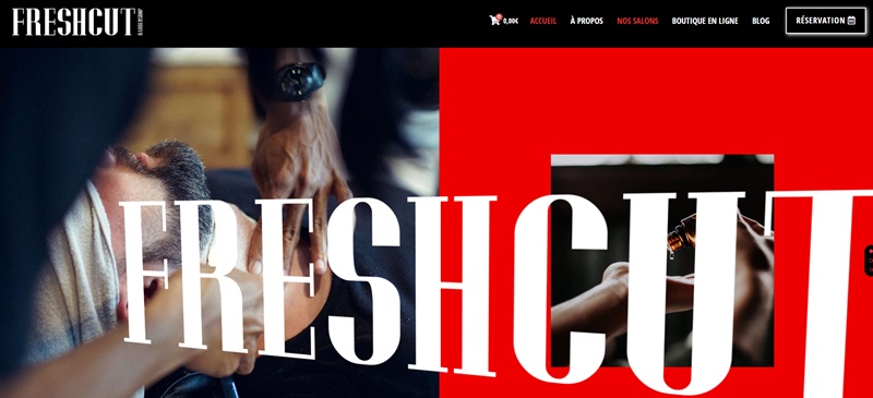
FreshCut BarberShop
FreshCut BarberShop is a modern barbershop that has been offering contemporary hairstyles since 2014.
With locations in Epinay, Fleury-Mérogis, and Nantes, the shop is known for its American-style ambiance, originality, and avant-garde haircuts.
Exceptional Hair Services
The website highlights the shop’s specialization in classic haircuts and barbering services.
FreshCut BarberShop’s reputation is built on the quality of products used, and the expertise of its hairstylists, making it a popular choice for customers in the region.
Online Store
The website showcases an online shop, which features a premier selection of products, such as hair wax, beard balm, hairstyling powder, and more.
Customers can add items to their cart and make purchases directly from the website, offering a convenient shopping experience.
FAQ For Barbershop Websites
What’s the big deal about having a website for my barbershop?
A good website is like the front door to your barbershop — it’s the first impression you give! Potential customers will check your website for information such as services, prices, your location, and more. Having a well-designed, user-friendly website can help you attract new clients, showcase your work, and let people book appointments easily. It’s a win-win, if you ask me!
What are some standout features of a successful barbershop website?
Great question! Have you ever visited a website and within seconds you knew where to find what you were looking for? That’s the kind of intuitive, user-friendly design that your barbershop website should aim for. Make sure the site is easy to navigate, mobile-responsive, and quick to load.
Also, high-quality images of your shop and team, as well as customer testimonials, can really enhance your brand and appeal. Lastly, an online appointment scheduling feature would be super handy for your customers.
What should I include in my ‘Services’ section?
Your ‘Services’ section is the meat and potatoes of your site. It should comprehensively list all services you offer. Each service should have a short but detailed description and pricing. If you offer unique services, like beard trims or hot towel shaves, highlight them. A great ‘Services’ section can help potential customers understand exactly what they’re getting for their money.
How can I make my website easy to navigate?
Keep it simple, my friend. Have a clear, concise menu that leads your visitors to the information they need. Ensure that your contact information and ‘Book Appointment’ button are easily visible. Remember, a lost customer on your website could mean a lost customer in real life.
How can I show off my skills and services on my website?
You know how they say a picture is worth a thousand words? Well, they weren’t lying! Adding a gallery of before-and-after shots of your haircuts or styling services can be a powerful tool. It allows potential customers to see your skills in action.
Also, including customer testimonials or reviews on your website adds that extra layer of trust. People love seeing what other customers have to say about your services.
How important is SEO for my barbershop website?
Super important! SEO (Search Engine Optimization) helps your website appear in search results when potential customers are looking for barbershops in your area. Include keywords in your website copy that people might use to search for your services. For your barbershop, it might be words like “best barbershop near me,” “fade haircut,” or “beard trim.”
Should I include a blog on my barbershop website?
If you have the time and inclination, a blog can be a fantastic addition! It is an excellent way for you to share your thoughts on trends, offer grooming tips, and highlight your expertise. Plus, regular blog posts can help improve your SEO.



Leave a Reply