My content is reader-supported by awesome people like you. Which means I could earn a commission. Learn more here!
Ever wondered how some artists seem to glow digitally, snagging eyes and gigs effortlessly?
It all starts with their art portfolio websites.
In a sea of endless online galleries, we’ve found the crème de la crème, and we’re here to unfold the magic behind their designs and features.
From sleek user interfaces to vivid displays of color and form, this review reveals why these sites capture attention and how they might just be the launchpad your artwork needs.
Get ready as we dive into the bright world of art portfolio website examples, where your art’s potential knows no bounds.
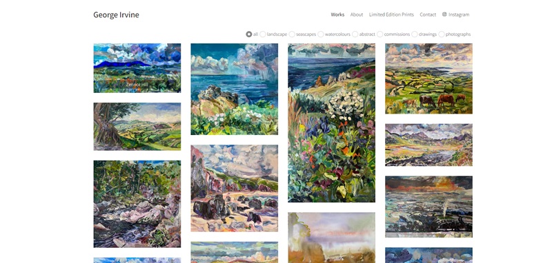
George Irvine Fine Art
George Irvine Fine Art is a colorful playground for art lovers.
Back to front, up and down, it’s filled with bright and beautiful artwork.
Mr. Irvine’s work includes landscapes, seascapes, abstracts, and even some crafty photography.
If you’re into art, you’re going to love it here.
Dazzling Design Features
- Beautiful portfolio: George’s work is front and center. From landscapes to abstracts, there’s a lot to see.
- Clear navigation: The website is well-organized, it’s really easy to find your way around.
- Contact info: There’s clear information on how to get in touch with George. Perfect for those looking to commission a piece!
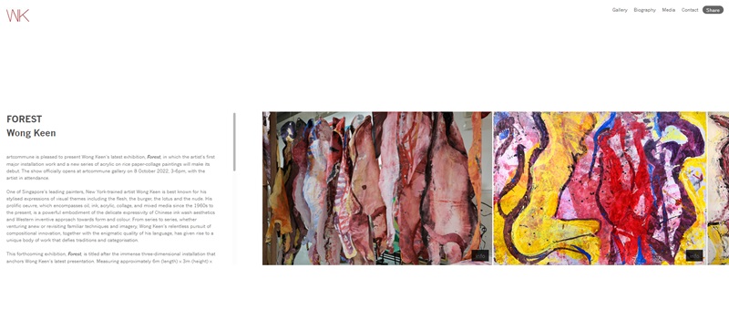
Wong Keen
Meet Wong Keen. Just like George Irvine, Wong Keen’s website is a banquet of breathtaking art pieces.
You’ll find a delightful variety of work from ink on rice paper to oil on canvas.
There’s more to see than you can imagine.
Outstanding Design Features
- Exciting portfolio: Wong Keen’s work will take you through an adventure of different art styles. You won’t want to stop scrolling.
- Distinctive pages: The website has individual pages for each art style, making it easy to find your favorites.
- Contact info: Need to chat with Wong Keen? There’s a super easy way to reach out right on the website.
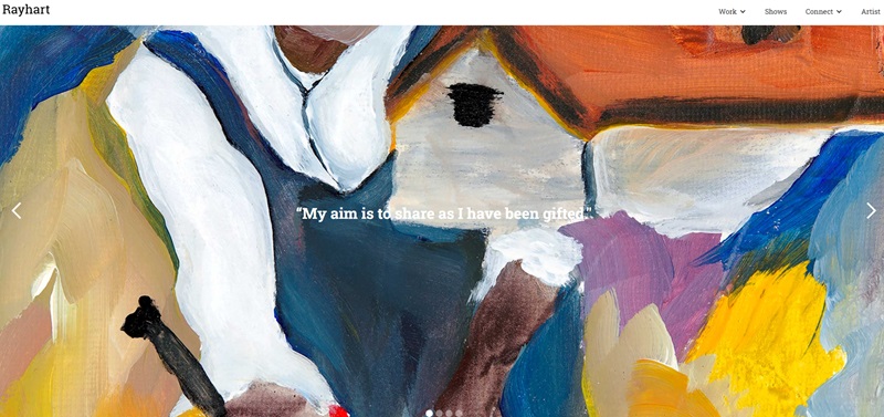
Ray Hart
Ray Hart’s website is a beautiful collection of this artist’s work.
Paintings that leave you speechless take center stage here!
Mr. Hart’s website is about his impressive journey as an artist and showcases his entire portfolio.
Outstanding features of the website:
- The minimalist design makes it easy and straightforward to navigate.
- On the home page, you will witness some impressive art pieces that immediately grab your attention.
- The simplicity of the color scheme allows users to focus entirely on the artwork.
- The ‘About’ section introduces Ray Hart, his mission, and his passion as an artist.
- The interactive ‘Contact’ feature offers a simple and efficient way to communicate with him.
In essence, the website design is clean, and easy to navigate, with high-quality images of the artworks, making it a visual treat.
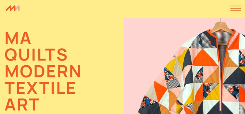
MA Quilts
MA Quilts showcases an amazing world of quilting artistry.
The beautiful handmade quilts on display will leave you in awe.
The website offers insight into quilting, the story behind MA Quilts, and a gallery of quilt collections.
Distinguishing features of the website:
- The home page immediately welcomes users with warm, vibrant colors from quilt images.
- Simple and clear headers guide you through the website’s different sections easily.
- The ‘Gallery’ section boasts intricate quilt designs that let users appreciate the craftsmanship.
- The website provides a deep understanding of the artist’s journey in the ‘About’ section.
- The ‘Contact’ option enables users to connect with the artist directly.
All in all, the website is an inviting space, user-friendly, and displays a clear passion for quilting art.
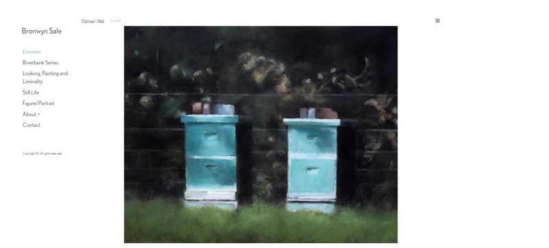
Bronwyn Sale
This is the website of artist Bronwyn Sale.
Here, a world brimming with stunning artwork awaits each visitor.
The site serves as a space where Bronwyn can share her breathtaking paintings with the world.
Key features of the website:
- Simple and clear design, making it super easy to roam around.
- Glorious paintings are displayed right on the homepage, capturing instant attention.
- Clean and concise menus guide you through different artwork collections.
- The ‘About’ section reveals more about Bronwyn, and her approach to art and painting.
- The ‘Contact’ option is convenient if you wish to get in touch with the artist.
In conclusion, Bronwyn’s website is both user-friendly and artistic, offering an amazing walkthrough of her portfolio.
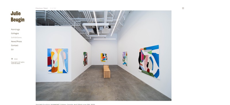
Julie Beugin
Julie Beugin’s website showcases her beautiful artwork, with paintings and collages on display.
This website provides an opportunity for art enthusiasts to explore her previous exhibitions and learn about upcoming events.
Notable features of the website:
- A clean and visually appealing layout ensures that the focus remains on Julie’s artwork.
- The home page showcases stunning images of her paintings, instantly capturing the attention of visitors.
- Navigating through the various sections of the website is simple and hassle-free.
- The ‘Exhibitions’ section provides an insight into her past events and upcoming shows.
- Users can easily get in touch with the artist using the ‘Contact’ feature.
Overall, this website is user-friendly, visually captivating, and offers an excellent experience for art lovers.
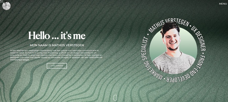
Mathijs Verstegen
Mathijs Verstegen’s website highlights his experience as a graphic designer and front-end developer.
The website serves as a platform for Mathijs to provide information about his services, projects, and skills.
Distinctive features of the website:
- The homepage offers a straightforward and minimalistic design, inviting users to explore further.
- The site ensures easy navigation through different sections, making the user experience smooth.
- The ‘Portfolio’ section showcases Mathijs’s design and development projects with engaging visuals and descriptions.
- Users can get a sense of Mathijs’s expertise in the ‘Skills’ section, which lists his abilities in various technologies and tools.
- The ‘Contact’ feature makes it simple for potential clients to reach out to Mathijs for job opportunities or inquiries.
In conclusion, Mathijs Verstegen’s website is clean, easy to navigate, and effectively communicates his skills and projects to the audience.
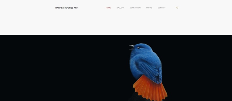
Darren Hughes Art
Darren Hughes Art is a stunning website that features the work of talented artist Darren Hughes.
The website showcases his incredible artwork, provides information on how to commission a piece, and offers prints for sale.
Engaging features of the website:
- The homepage presents a splendid display of Darren’s artwork, capturing the attention of visitors right away.
- Straightforward menus make it easy for users to locate the different sections, such as the gallery and commission information.
- Art lovers can appreciate the wide range of art pieces in the ‘Gallery’ section, which has been meticulously organized.
- Visitors who desire a unique piece of art can find all the necessary information in the ‘Commission’ area.
- For those who want to take a little piece of the magic home, the ‘Prints’ section offers just that, with a variety of prints for purchase.
- Lastly, keeping in touch is made effortless through the ‘Contact’ feature.
Overall, Darren Hughes Art is a visually impressive and user-friendly website that allows art fans to delve into the artist’s world with ease.
The site truly serves as a wonderful platform to showcase Darren Hughes’ talent and share it with the world.
Francesco Pirini
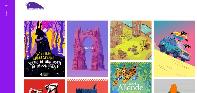
Francesco Pirini’s website is a captivating showcase of his work as an illustrator.
It allows people to be amazed by his visual art which ranges from series related to Shakespeare to animal-themed pieces.
Striking features of the website:
- As soon as you reach the home page, an array of artwork grabs your attention.
- The layout is clean and straightforward, making it effortless to explore the website.
- Each art series is displayed in a visually pleasing manner in the ‘Works’ section.
- Users can learn more about Francesco and his artistic journey in the ‘About’ section.
- Visitors can take home a piece of Francesco’s work through the ‘Shop’ section.
- If they want to reach out to Francesco, they can do so through the available ‘Contact’ feature.
In summary, Francesco Pirini’s website is a visual feast for art enthusiasts.
Its user-friendly design and visually exciting display of artwork make it a delightful platform for exploring Francesco’s work.
Frequently Asked Questions about Art Portfolio Website Design
What are the essential features of an art portfolio website?
An art portfolio website should, first and foremost, showcase your art in a beautiful and visually striking way. But let’s not forget about the tiny details that make a site really shine:
- High-quality images: Your art is the star, let it shine in all its glory with crisp, clear images.
- Uncluttered layout: A clean design gives your artwork the space it needs to captivate audiences.
- Easy navigation: No one likes walking in circles. Make it easy for visitors to explore your art and find information.
- About the artist section: Let people get to know the creative genius behind the art!
- Contact details or form: You never know who would love to buy your art or hire you for a project!
How can I make my art portfolio website visually appealing?
Your site is like a digital art gallery, so give it a design that enhances your art, not overshadows it.
- Use a clean and minimalistic design: Allow your artwork to be the main focus. No need for fancy web design tricks.
- Quality over quantity: Showcase only your best pieces, this is your chance to wow the visitors!
- Tell a story: Arrange your works in a way that tells the progression of your artistic journey.
How should I organize my art portfolio website?
The organization is key for a smooth and enjoyable user experience. Here are a few pointers:
- Create different sections for different art types: Paintings in one section, sketches in another, and so on. This helps visitors quickly find the type of art they’re interested in.
- Have a separate section for your biography and artist’s statement: This helps potential buyers or employers understand your artistic approach and motivations.
- Include a sales or commission section: If you sell prints or take on commissioned work, make sure this is clearly outlined on your site.
How can I optimize my art portfolio website for search engines?
You want your stunning artworks to reach as many people as possible, right? Good news, with some good SEO practices, they can!
- Use descriptive titles and captions: Rather than “Image 1”, try something like “Sunset Landscape Acrylic Painting”. Sounds way more engaging, doesn’t it?
- Optimize your images: Compress your images for faster loading times, but remember to keep the quality high. No one enjoys pixelated art.
- Include metadata for your images: This is SEO speak for ‘describe your pictures’. It immensely improves your site’s visibility on search engines.




Leave a Reply