My content is reader-supported by awesome people like you. Which means I could earn a commission. Learn more here!
Ever wondered how architectural masterpieces happen?
They start with brilliant design on amazing Architecture Websites!
This walkthrough will guide you through the innovative spaces where creativity takes shape.
Expect to uncover features, benefits, and awe-inspiring designs that make these sites stand out from the crowd.
So, are you ready to explore where architecture and cutting-edge web design intersect?
Then:
Let’s dive right in and discover why these sites are building the future of architecture in cyberspace!
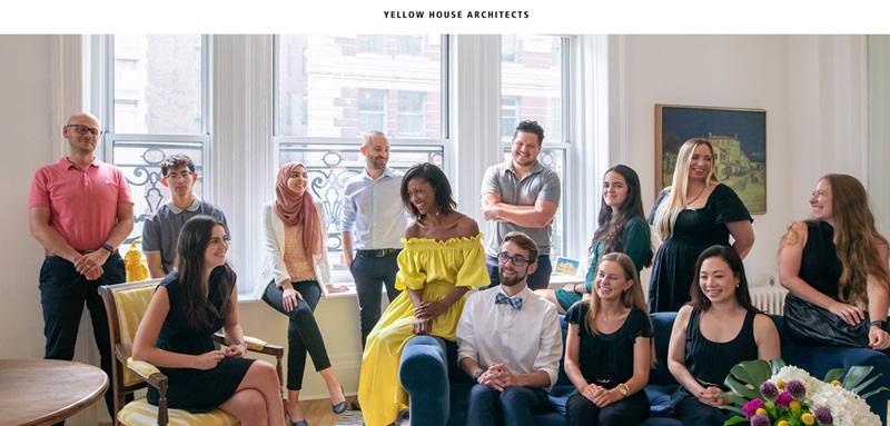
Yellow House Architects
Yellow House Architects is all about designing cool buildings and interiors.
They’re like a group of friends who love making new and exciting places where people can live, work, or just hang out.
The website shows off their big ideas and their projects.
What’s the Website About?
- Yellow House Architects is a creative team. They make awesome designs for buildings and inside spaces.
- They show their work online for you to see—they call this their “Portfolio”.
- They want to talk with you if you like their work—you can contact them through the website.
Design Features
- The website is super clear and easy to use. You won’t get lost looking for stuff.
- It’s got big, beautiful pictures that show off their work. It makes you want to see more.
- They keep things simple—there are just a few pages like “Home,” “About,” “Portfolio,” and “Contact” so you can find everything you need fast.
User Experience
- Easy Navigation: Just a few clicks and you can see all their projects.
- Photos and Media: Big pictures grab your attention and show you what they can do.
- Contact Information: It’s a snap to reach out and get in touch with them.
Everything on the website is put together to show off how skilled Yellow House Architects are and to make it super easy for you to understand what they do and how they can help you.
If you’re thinking about building something awesome, their website is a great place to start!
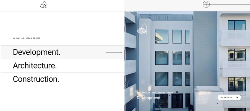
Vertically Built
Vertically Built is a treasure trove for people interested in urban design and building.
They blend development, architecture, and construction to create state-of-the-art structures in Nashville.
They help imagine, plan, and build cool and modern buildings.
What’s the Website About?
- The website tells you all about Vertically Built, a business that takes care of everything from designing to building projects.
- They have a portfolio where you can look at the projects they have completed.
- Handy contact information on the website is available in case you have questions or a job for them.
Design Features
- The website design is as modern as the buildings they create, with a clean and easy-to-use layout.
- It showcases large, beautiful pictures of their projects—these are so good, that they make you feel like you’re standing right there.
- Navigating through different pages such as “Home,” “About Us,” “Projects,” and “Contact” is a walk in the park, keeping your visit hassle-free.
User Experience
- Convenience: Finding your way around the website is a breeze, with just a few simple clicks.
- Visual Appeal: Engaging images pull you into the world of Vertically Built, giving you a glimpse of their amazing work.
- Easy Contact: To ensure a smooth interaction, all contact details are provided in an easy-to-find manner.
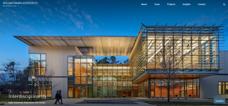
Rawn Architects
Rawn Architects is a place where buildings and art meet.
They believe in designing structures that energize and excite people.
Their website serves as a canvas to showcase their spectacular and awe-inspiring architectural designs.
What’s the Website About?
- It introduces the visitors to Rawn Architects, a team that excels in planning and constructing beautiful structures.
- A portfolio page lets you admire their incredible and unique designs.
- There’s a contact page for any questions or collaborations you might be thinking about.
Design Features
- The website has a sleek and modern design, complementing the architectural brilliance of Rawn Architects.
- It uses dramatic pictures to display their work, driving home their exceptional skills.
- Its user-friendly interface includes pages like “Work,” “Studio,” “Culture,” and “Contact.”
User Experience
- Effortless Navigation: One click, and you’re where you need to be.
- Inspiring Media: Mesmerizing project images give you a real feel of Rawn Architects’ aesthetic and design philosophy.
- Accessible Contact Info: Well-placed contact details ensure no effort is wasted in trying to reach out to them.
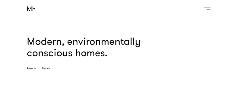
MAFCOhouse
MAFCOhouse is a company that creates modern homes that are friendly to our planet.
They work closely with people to design buildings that meet each person’s needs.
What’s the Website About?
- MAFCOhouse is all about making homes that look good and help the Earth.
- They show a bunch of different projects they’ve done to give you cool ideas.
- The website also has a place where you can learn about how they make these homes called the “Process”.
Design Features
- The website has a simple, clean style that makes it super easy to look at and use.
- There’s a section called “Notebook” that seems like a blog, which is probably where they share fun stuff and news.
- Big, bright pictures of the homes give you a sneak peek into the kind of work they do.
User Experience
- Simple Layout: The website makes it easy to find things, which is great when you’re trying to learn about them.
- Photo Galleries: The images tell a story of the quality and style of MAFCOhouse better than words alone.
- Contact Details: They’ve put their phone numbers and emails right on the website, so getting in touch is no problem at all.
MAFCOhouse’s website mixes sleek design with user-friendly features.
It’s like a virtual open house where you can peek into what they build and how they do it!
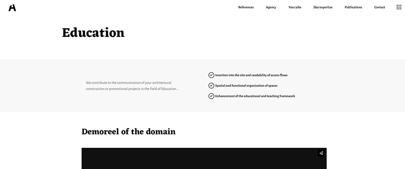
Archi Graphi
Archi Graphi is like an online art gallery but for architecture.
This website shows off their talent for making buildings and spaces that are both beautiful and useful.
What’s the Website About?
- Archi Graphi tells you all about how they design architecture that is both practical and pretty.
- They have a page where you can see cool pictures of the work they’re proud of.
- The website can be read in English even though it starts in French, which is handy for more people to understand.
Design Features
- The design is artistic and matches the creative work they do.
- The website is also in English, making it accessible to a wider audience.
- They’ve got a sleek gallery that flows smoothly as you scroll, showcasing their projects in a way that feels alive.
User Experience
- Bilingual Options: Changing languages is a snap, which is perfect for users from around the world.
- Smooth Navigation: Moving around the website feels natural and is easy to do.
- Contact Info: Just like MAFCOhouse, Archi Graphi makes it super simple to find a way to get in touch, making sure friends and clients can reach out whenever they need.
Archi Graphi’s website stands out due to its elegant design that nicely mirrors the architectural wonders they create, ensuring a visit to its site is as enjoyable as it is informative.
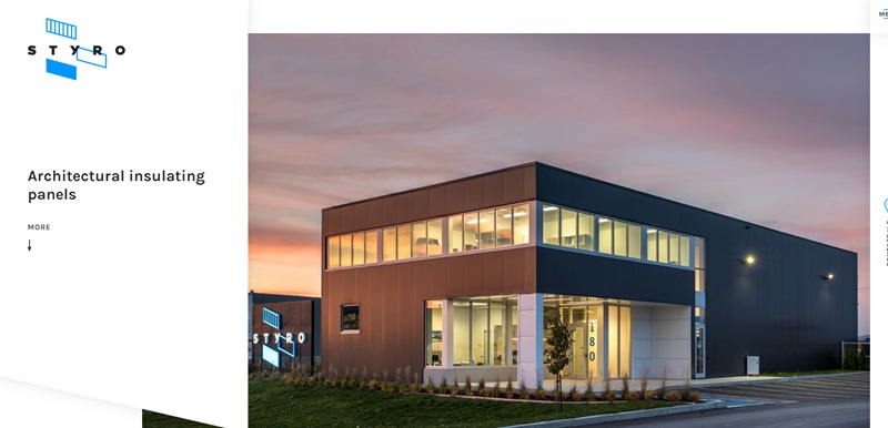
Styro
Styro is a company that specializes in architectural insulation panels for all sorts of buildings.
Whether you’re putting up a commercial space, or need something for an industrial project or a food-related building, they’ve got it all.
What’s the Website About?
- At Styro, they offer insulated panels that help make buildings safe and keep temperatures just right.
- They’re really into working with businesses and give you lasting and quick solutions for your construction projects.
- This website also shows off what they’ve done before, so you can see how great their work looks.
Design Features
- The site uses a clear menu, so you find what you need fast.
- They have a cool section called “Realizations” where you can see pictures of their projects.
- On the website, there’s a part where you can reach out and ask questions or get help.
User Experience
- Easy Navigation: Finding your way through the website is a breeze, which is super helpful.
- Quality Visuals: The images on the site do a great job of showing what the company can do.
- Information Access: They make sure you know all about their products and services without any trouble.
Styro’s website is packed with helpful info and shows you exactly how they can help with your building needs.
Plus, it’s put together in a way that’s friendly to use, making your visit to their site not just easy but pretty enjoyable too!
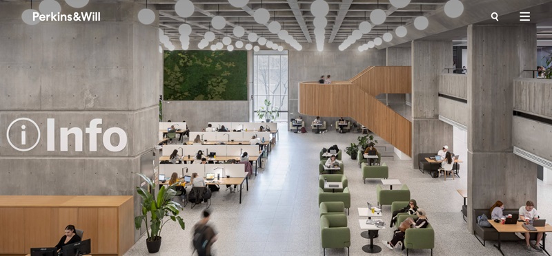
Perkins & Will
Perkins & Will is a team of visionaries who dedicate their ideas and hard work to designing buildings all around the world.
They craft creative spaces for us to learn, relax, work, and explore, with designs that always have people and the planet in mind.
What’s the Website About?
- The main idea behind Perkins & Will is to use design to improve the world and make people’s lives better.
- You’ll navigate through various sections showcasing the company’s work, team, and approach to designing.
- They’re involved in lots of different project types like workplaces, health facilities, education buildings, and more.
- Besides the main work, they also share meaningful insights and news about their latest works and recognitions.
Amazing Design Features
- A nice big menu that’s a cinch to follow lets you explore the site.
- Photos of completed projects are truly stunning, enabling you to feel the power of design.
- The site hosts a section where you can dive deep into the brains of the creators and understand their thoughts and processes.
User Experience Highlights
- Simplified Navigation: The layout and structure make finding what you need a walk in the park.
- Inspirational Visuals: The images and designs shared on this site are a visual treat.
- Knowledge Access: The ‘Insights’ section provides a deeper understanding of the work they do, and why it’s essential.
In conclusion, Perkins & Will’s website doesn’t just tell you what they offer but also allows you to immerse yourself in their world of design.
The combination of visuals, information, and the easy-to-navigate environment provides a fantastic online experience!
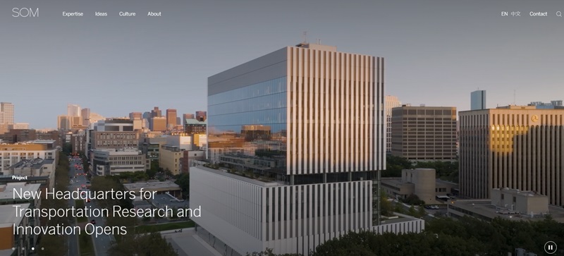
SOM
SOM is a team full of experts in architecture, design, engineering, and planning.
They work hard to make our future better by creating impressive buildings and designs.
What’s the Website About?
- SOM is all about building a better future using their expertise in various fields.
- One of their ambitious jobs was designing Rivian’s $5-billion EV Manufacturing Plant.
- They have a unique approach to sustainability, considering the whole life of carbon emissions from the start of a project.
- They are open to collaboration and innovation, always looking for ways to reduce environmental impact.
Cool Design Features
- The site uses a simple menu, which makes it easy to explore the whole website.
- They share amazing pictures that show off the projects they’ve completed.
- You can sign up to stay updated with their latest work.
User Experience Goodies
- Simple Navigation: Getting around the site is super easy.
- Great Pictures: The images do a good job of showcasing their amazing works.
- Stay Updated: The option to sign up means you won’t miss out on any exciting updates.
Next time you think of architecture and design, SOM should definitely come to mind. Their website is nicely designed and user-friendly, making your journey through their work a joy.
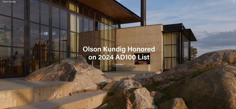
Olson Kundig
This is your go-to place if you want to explore how art can meet architecture in the most elegant ways!
What’s the Website About?
- From residences, and commercial spaces, to multi-story office buildings, Olson Kundig does it all.
- Their team believes in pushing the boundaries of design with each project.
- Showcasing the spiritual side of architecture, they make spaces where people and their experiences take center stage.
Design Features That Make Us Say Wow
- Clear, simple tabs guide you through their interesting world of architecture.
- The Projects section is a mini architecture tour you can enjoy from your screen.
- Stay in the loop with the News & Stories section that celebrates their achievements and more.
User Experience Highlights
- Straightforward Navigation: Their simple yet effective tabs keep things uncomplicated.
- Artistic Project Displays: The high-quality images on the Projects page are like viewing a virtual art gallery.
- Stay Connected: Regularly updated with articles and news, the website keeps you around the creative buzz.
Olson Kundig’s website supports their creative philosophy perfectly. The artistic quality, ease of use, and thought-provoking content make it a valuable experience for anyone interested in progressive architecture.
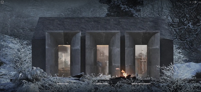
Makhno Studio
Welcome to Makhno Studio’s world, where art and architecture merge seamlessly to create living spaces beyond imagination.
What’s the Website About?
- The studio’s work includes residences, commercial spaces, and architectural lighting.
- It’s a place where they aren’t afraid to play with forms, textures, and colors.
- Their unique and extraordinary design philosophy might just spark your own creativity.
Awestruck by Design Features
- Quick and effortless navigation with detailed sections on different aspects of their work.
- The Portfolio section is like a design dreamland – a space to get lost and soak in their creativity.
- The Blog section shares interesting bits about their designs, processes, and creative thoughts.
User Experience Top Points
- Uncomplicated Navigation: No frills, no rush, the website is easy and relaxing to explore.
- Immersion in Artistry: Each image is like a story waiting to be unraveled.
- Insights Galore: Their blog provides an intimate peek into their creative minds.
Makhno Studio’s website captures the spirit of their work beautifully.
Visual delights accompany informative content making it a pleasure to browse, whether you are a design lover or just enjoy exploring the creative side of architecture.
Frequently Asked Questions (FAQs) On Architecture Websites
What is an architecture website?
An architecture website is the online face of an architectural firm, displaying info about the designers, and showcasing their works. Think of it as a portfolio that’s open 24/7 for anyone who wants to check out some intelligent design.
Why should architects have a website?
Sure, you’ve got building blueprints, but having an architecture website is like a blueprint for success! It’s a great place to showcase past projects and share ideas about design. It’s also open all the time for potential clients to explore and get in touch.
What should be on an architecture website?
A good architecture website puts the firm’s best foot forward. It’ll usually have information about the team, the philosophy behind their design, and past projects. It’s all about attracting new clients, but also showing a broader audience what good design can do.
How can I make my architecture website stand out?
Personality, my buddy! Showing off your unique design style and philosophy is key. And let’s not forget about great quality photos of your projects. They are like the stars that make your website the night sky!
Can I design an architecture website without coding knowledge?
Absolutely! There are platforms like Wix, Squarespace, and WordPress that offer drag-and-drop website builders. It’s a bit like assembling a model, but instead of tiny trees and cars, you’re working with pictures and text boxes. Pretty cool, right?




Leave a Reply