My content is reader-supported by awesome people like you. Which means I could earn a commission. Learn more here!
Struggling to design an agency website that actually converts?
You’re not alone.
Many agency owners and freelancers hit a wall when it comes to building a site that looks professional and drives results.
It’s easy to get stuck in a loop of overthinking layouts, copy, and branding—only to end up with a site that falls flat.
Worse, a bad website can quietly lose you clients before they even reach out.
But here’s the good news:
you don’t have to start from scratch or guess what works.
In this post, you’ll find a curated list of high-performing agency website examples—plus tips and tools to help you build your own with confidence.
Whether you’re starting fresh or revamping an outdated site, you’ll walk away with real inspiration, practical steps, and the clarity to move forward.
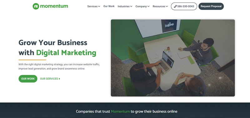
Momentum
Momentum is a digital marketing and web design company.
They are experts in making businesses shine online.
Let’s talk about what their website tells us and the cool features that make it extra nice.
What is the website about?
- Digital Marketing and Web Design: Momentum is all about helping businesses grow online.
- Diverse Services: From Search Engine Optimization (SEO) and Pay-Per-Click Advertising (PPC) to Photography and Copywriting, they have a broad array of skills.
- Valuable Resources: They not only share their work but also provide blog posts and case studies to educate visitors about digital marketing.
Website Design Features
- Modern Design: The website has a modern and clean design, which creates a professional and inviting vibe.
- Easy Navigation: It’s easy to find different sections, like Services or Industries. This gives users a hassle-free experience.
- Interactive Elements: With cool hover effects and smooth transitions, the website feels alive and interactive.
Visiting Momentum’s website is an informative and pleasing journey.
You’ll find detailed explanations of their services, see their past work, and even get tips and tricks from their blog.
The engaging design keeps you interested and makes you want to explore more.
Just like they make their clients’ businesses stand out online, their website proves that they know how to attract attention and share important information effectively.
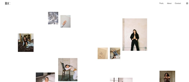
Ryu Creative
Ryu Creative is a digital marketing agency.
They understand the digital world and use that knowledge to help businesses grow.
What makes it stand out?
- The website has a dark design that feels different and exciting.
- Photographs and illustrations are used beautifully throughout the site to tell their story.
- Their services are displayed neatly, making it super simple to understand what they offer.
- You’ll really enjoy the testimonials section. Real-life stories always win!
- Last but not least, their site works well on all devices too.
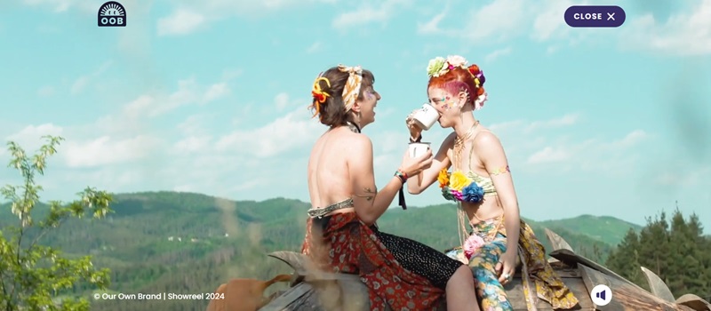
Our Own Brand
Our Own Brand is a creative marketing agency based in London.
They make bold brands stand out and get heard.
Why is it cool?
- The website has a minimalistic and modern design. The colors pop out, and the images are thrilling.
- The navigation menu is simple and clear. You can effortlessly find your way around the site without feeling lost.
- The visuals and animations on the website are top-notch! They keep you glued to the screen.
- And hey, their blogs are easy and fun to read! You’ll love them.
- One more thing: Their website is responsive. That means you can view it on any device and it will look just as nice.
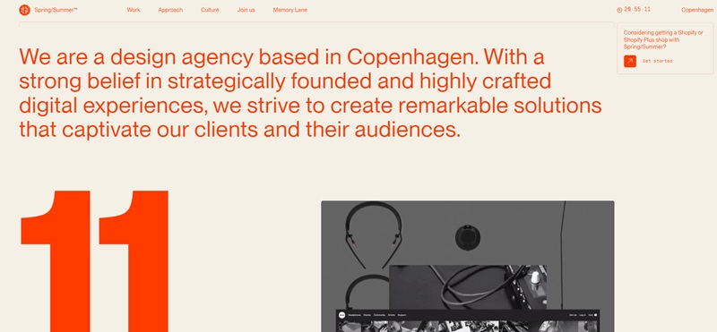
SpringSummer
SpringSummer is a design agency located in Copenhagen.
They focus on creating digital experiences with a neat and artsy touch.
They craft online shops, corporate websites, and brand identities.
First, let’s talk about what the website allows people to learn and the cool features that make the site stand out.
What is the website about?
- Design Agency with a Scandinavian touch: SpringSummer excels in showcasing sleek designs that mix functionality and beauty.
- E-Commerce and Branding Experts: They build online stores and create branding that tells a story and connects with audiences.
- Work Diversity: The agency demonstrates a vast experience across multiple industries, from fashion and beauty to furniture and even music.
Website Design Features
- Clean Layout: The website has a very clean layout, which makes it easy to navigate.
- Portfolio Display: There’s a smart way they show their projects, which invites visitors to explore their past work.
- Engaging User Experience: The website uses smooth animations and interactive elements that catch your eye and make you want to keep clicking.
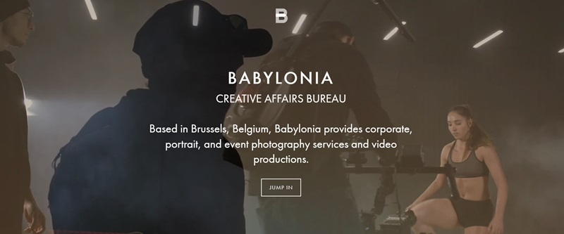
Babylonia Brussels
Babylonia Brussels is a creative affairs bureau based in Belgium.
They offer professional photography and video production services.
Let’s dive into what their website tells us and the fantastic features that make it enjoyable.
What is the website about?
- Photo and Video Agency: Babylonia Brussels specializes in capturing stunning images and creating captivating videos for various needs.
- Expert Services: The company provides services like corporate portrait, event photography, and impressive video productions.
- Client-Focused Approach: They ensure great experiences by working closely with clients to deliver tailored solutions.
Website Design Features
- Visually Pleasing: The website showcases a visually engaging design that highlights their creative approach.
- Smooth Navigation: Users can effortlessly move through different sections and find information with ease.
- Effective Use of Imagery: Babylonia Brussels does an excellent job of using high-quality images to show off its work and expertise.
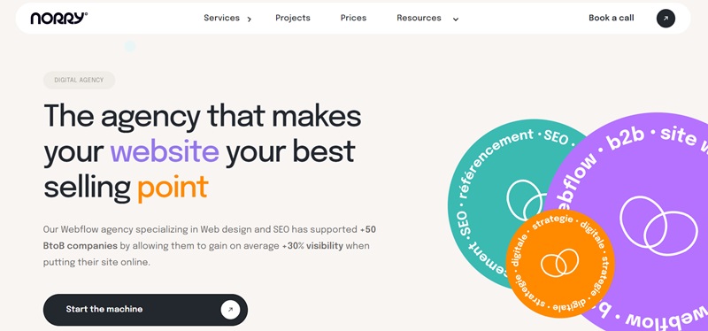
Agence Norry
Agence Norry is a digital communication agency with a focus on providing tailored solutions to help businesses succeed online.
Let’s explore their website and uncover the design features that make it delightful to visit.
What is the website about?
- Digital Communication Agency: Agence Norry helps businesses enhance their online presence and reach their target audience.
- Custom Solutions: They offer a range of digital services, from web design and development to branding and social media.
- Results-Driven Approach: The agency prioritizes client satisfaction and fosters a strong long-term partnership.
Website Design Features
- Modern Look: The website has a clean and contemporary design that reflects their expertise in all things digital.
- User-Friendly Interface: Agence Norry’s website is intuitive, making it simple for visitors to find what they need.
- Interactive Elements: The site incorporates engaging animations and interesting hover effects that capture users’ attention.
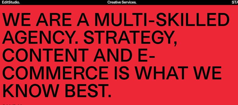
EditStudio Agency
EditStudio Agency is a multi-disciplinary creative house specializing in fashion, beauty, and lifestyle industries.
Let’s take a look at what the website offers and the attractive design features that make it enjoyable to visit.
What is the website about?
- Multi-Disciplinary Creative Services: EditStudio Agency excels in providing a variety of design solutions tailored to fashion, beauty, and lifestyle brands.
- Measurable Business Goals: Their approach combines integrated strategy, creativity, and technology to help clients achieve data-driven results.
- Impressive Portfolio: EditStudio showcases diverse projects with clients such as Diesel, Gas Jeans, and Dan John.
Website Design Features
- Clean and Modern Layout: The website presents an organized visual flow that is both easy to navigate and aesthetically pleasing.
- High-Quality Media: EditStudio demonstrates their creative talents through eye-catching images and videos highlighting their work.
- Efficient Information Display: Users can quickly find essential information, such as the company’s core team members, completed projects, and produced content.
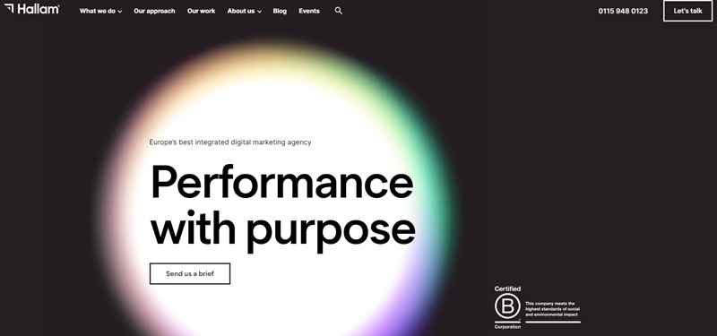
Hallam
Hallam is an award-winning digital marketing agency that helps businesses thrive online.
Let’s explore their website and uncover its appealing design features.
What is the website about?
- Digital Marketing Services: Hallam provides a comprehensive range of services that extend from web development and design to search engine optimization, public relations, and social media marketing.
- Proven Expertise: Hallam’s team of specialists ensures excellent results for clients in various industries.
- Award-Winning Agency: Hallam has received multiple recognitions and accolades for their exceptional digital marketing services.
Website Design Features
- Simple and Professional Design: The website uses a minimalist and professional layout that makes it easy to read and explore.
- Dynamic Content: Hallam’s site effectively employs engaging animations and interactive elements, capturing users’ interest.
- Information-Rich Resources: The website includes informative resources, such as blogs, guides, and case studies, to educate users on digital marketing topics.
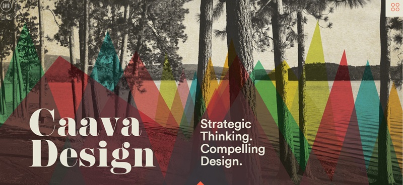
Caava Design
Caava Design is an Idaho-based branding agency.
They focus on developing brand identities, interactive experiences, and packaging designs.
Their work aims to build strong relationships between brands and their customers.
What is the website about?
- Branding and Design: They offer services in brand development, packaging, and digital design.
- Creative Portfolio: Caava has a gallery of past projects that include a variety of clients, showing their flexibility and creativity.
- Client Success Stories: Testimonials from clients share how Caava Design has helped their businesses grow.
Website Design Features
- Engaging Visuals: The website uses attractive images and videos to show off their projects.
- Clear Navigation: It’s easy for visitors to find their way around the site.
- Interactive Contact Form: The site includes a simple form for potential clients to get in touch, which makes starting a project with them straightforward.
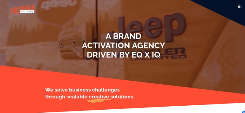
Inspira Marketing
Inspira Marketing is a marketing company that seems excited about creating experiential marketing campaigns that inspire action.
They stress the importance of experiences that connect brands with the people.
What is the website about?
- Experiential Marketing Services: They provide services that help brands interact with their audiences.
- Insights and Strategies: Inspira focuses on using research to create powerful marketing strategies.
- Case Studies: They showcase previous campaigns that have successfully connected brands with their audiences.
Website Design Features
- Vibrant and Lively Design: The website uses bright colors and dynamic images that grab your attention.
- Informative Case Studies: By sharing detailed case studies, visitors can understand their successful strategies.
- User-Friendly Layout: The website is organized in a way that makes information accessible and digestible.
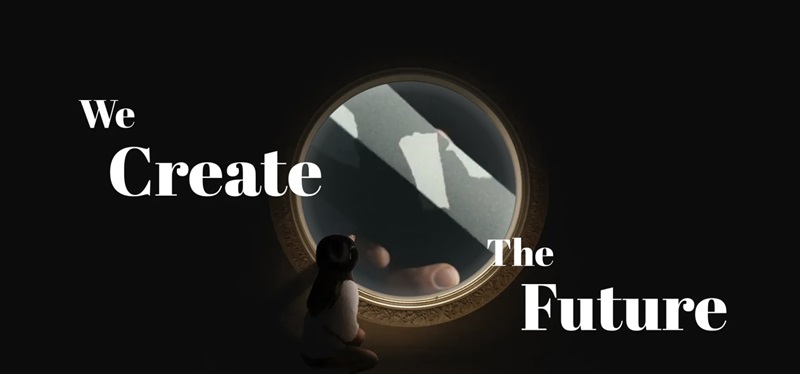
Designers Agency
Designers Agency is an organization dedicated to supporting creative professionals in the field of design.
They offer help to designers to grow their careers and improve their skills.
What is the website about?
- Support for Designers: The agency provides resources and assistance for designers to succeed.
- Educational Resources: They offer learning tools for designers to expand their knowledge and skills.
- Community Engagement: There’s a strong focus on building a community where designers can connect and share ideas.
Website Design Features
- User-Friendly Interface: The site is easy to use, which makes finding information a breeze.
- Clean and Organized Layout: They use a clear layout so you can find the stuff you need without much effort.
- Interactive Elements: There are parts of the site that respond and change when you click or hover over them, making the experience fun.
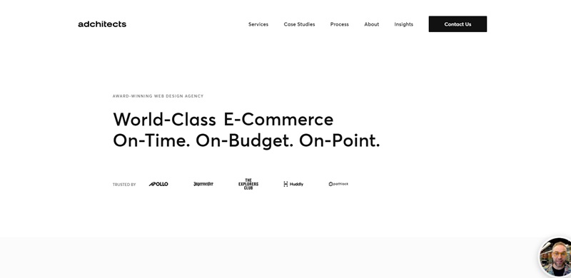
Adchitects
Adchitects is a web design and development company that specializes in crafting delightful digital experiences.
They focus on creating websites and products that are not only functional but also visually appealing.
What is the website about?
- Web Design Excellence: They make websites that are beautiful and work well.
- Custom Development: Adchitects can build special features for websites that need something extra.
- Branding and Strategy: They help companies figure out how to present themselves online in the best way.
Website Design Features
- Creative and Modern Design: The website looks fresh and has cool graphics and layouts.
- Smooth Animations: As you move around the site, you’ll see smooth movements that make it feel alive.
Portfolio Showcase: They show off their best work with examples you can look through, showing what they can do.
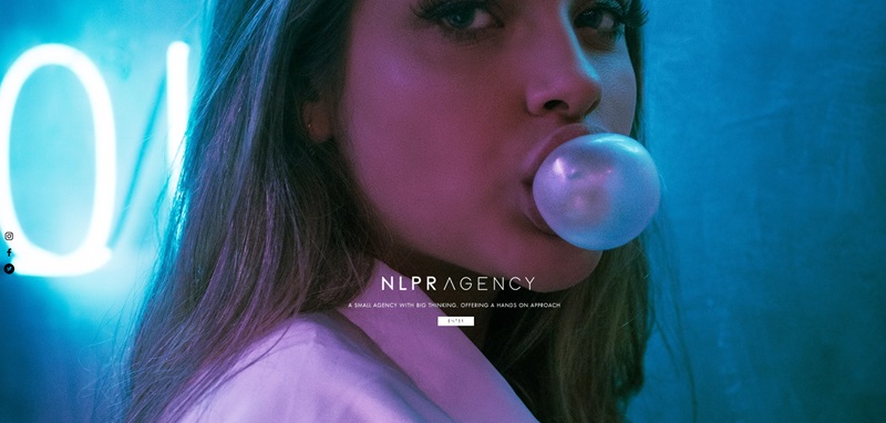
NLPR
This agency prides itself on big ideas and hands-on approaches.
Now, let’s jump into what makes the design of this site stand out.
What the Website Is About
First off, NLPR’s website serves as the face of the company on the internet.
It offers a peek into who they are, what services they offer, and who their creative partners are.
In addition, it gives visitors a chance to book a studio for their needs and provides a way to contact them for services or inquiries.
A Few Standout Web Design Features
- Simplicity: NLPR relies on a clean, easy-to-navigate design. It’s not confusing or cluttered, which makes it user-friendly even for those who aren’t tech-savvy.
- Readability: One of the things you first notice is the contrast between the calm background color and the crisp text. This makes everything easy to read, without you having to strain your eyes.
- Navigation Bar: Right at the top, there’s a handy navigation bar. This helps guide visitors to the pages they need, such as services offered, who the creative partners are, or how to contact them.
- Inviting Entry Button: There’s an ‘Enter’ button right on the homepage. This adds personality and warmth to the user experience.
FAQ On Agency Websites
What should I consider while choosing an agency website example for my business?
Picking the right agency website example is crucial for your online presence. Keep these factors in mind:
- Your target audience: Choose a design that caters to your potential clients’ tastes and preferences.
- Functionality: Make sure it has all the necessary features to run your business efficiently, such as easy navigation and contact forms.
- Branding: Your website should reflect your brand identity with the right colors, images, and tone.
- Responsive design: It’s essential that your site looks and works great on all devices, from smartphones to desktops.
How can I make my agency website stand out from the competition?
To create a memorable website:
- Use high-quality visuals: Professional photos and impactful graphics elevate your site.
- Tell a story: Your website should convey your agency’s unique selling points and convey your mission.
- Offer value: Share valuable content like blog posts, case studies, and testimonials that build trust and showcase your expertise.
- Focus on user experience: Optimize site load time, navigation, readability, and responsiveness.
What pages should I include in my agency website?
Consider these essential pages:
- Home
- About Us
- Services or Products
- Portfolio or Case Studies
- Blog or Resources
- Testimonials
- Contact Information
How can I improve my agency website’s SEO?
Boost SEO by:
- Utilizing relevant keywords in content, titles, and meta tags
- Crafting high-quality, engaging, and shareable content
- Ensuring your site loads fast and works seamlessly on all devices
- Building high-quality backlinks through guest posting and partnerships
How often should I update my agency website?
To stay competitive, make a habit of:
- Regularly reviewing content: Refresh outdated content, add new services or products, and update case studies and testimonials.
- Posting fresh blog articles: Aim for at least one post per month to showcase your expertise and engage your audience.
- Testing user experience: Identify and fix any issues related to load time, navigation, and responsiveness.
How can I measure the success of my agency website?
Monitor your performance through:
- Analytics: Tools like Google Analytics show key metrics like traffic, bounce rate, and user behavior.
- Conversions: Track the number of leads or sales generated, contact form submissions, and newsletter signups.
- Engagement: Monitor shares, likes, and comments on your website content.
What budget should I allocate for my agency website?
The cost of your website can vary depending on factors like complexity, design, and functionality. Analyze your needs and decide on a budget that allows you to create a professional, high-performing site that achieves your objectives.


Leave a Reply