My content is reader-supported by awesome people like you. Which means I could earn a commission. Learn more here!
Ever wondered how the pros make numbers look easy?
Great accountant websites turn the headache of balancing books into a breeze!
We’re digging into how top-notch accountant sites keep the cash flow clear and the taxman happy.
In our lineup, we’ll explore neat features, the perks that can make your tax time less taxing, and just how they stack up against the competition.
Stay tuned as we unfold the standout qualities that make these websites a must-visit for numbers novices and ledger legends alike!
Hungerford Nichols
Hungerford Nichols is a CPA firm in West Michigan focused on providing tax, accounting, and financial services for local businesses and families.
The website is designed for both current and potential clients to easily access information about the company and its wide range of services.
Easy navigation features:
- Dropdown menus make it simple to find specific areas of expertise or service categories
- The informative homepage gives a concise overview of the company and its offerings
- The easy-to-use search function helps visitors find the information they need fast
Engaging and informative design:
- Clean, professional visuals with eye-catching images make the website attractive
- Clearly outlined sections allow visitors to quickly understand the company’s mission and values
- Effective use of subheadings and bullet points makes the text easy to read
Useful resources for visitors:
- Blog updates present industry news and events, keeping clients and visitors informed
- Accessible online tax guides, financial calculators, and other resources provide additional assistance
- Integration of social media links and video content on the website creates interactive and engaging experiences for users
In summary, Hungerford Nichols’ website showcases a well-designed, user-friendly layout for visitors to access valuable information about the firm’s services and expertise.
The visually appealing design and easy navigation make it a great resource for clients and potential clients alike.
Pulver CPA
Pulver CPA is a professional website offering accounting services for various needs including taxes, estates, not-for-profit organizations, businesses, and more.
User-friendly menu bar:
- Easy-to-locate and understand options guide you effortlessly through the website.
- A neatly organized navigation bar allows a quick overview of the services offered
Visually appealing design:
- A smooth and clean look gives off a professional vibe, perfect for a business in the financial sector
- The use of contrasting colors makes different sections stand out
Engaging content and resources:
- Pertinent information and updates are provided regularly about tax laws, accounting news, and other relevant topics
- A resource section packed with helpful tools like financial calculators and tax forms for easy access.
All in all, Pulver CPA’s website has a crisp and professional design, easy-to-read content, and beneficial resources targeted at helping their clients with all aspects of their accounting needs.
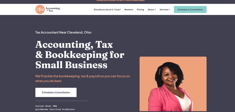
CBW Accounting
CBW Accounting is a one-stop hub located near Cleveland, Ohio, that provides services tailored to your tax, bookkeeping, and accounting needs.
Their dedication to guiding their clients year-round sets them apart from typical tax firms.
Clear and streamlined navigation:
- A well-arranged menu bar that directs users efficiently through the site
- An easy-to-find appointment scheduler for a consultation
Professional and clean design:
- The color contrast in website design emphasizes key points
- Equipped with engaging content about the firm’s mission, services, pricing, and contact details, making it easy for you to access important information
Resources to keep you informed:
- Provides a digital book providing valuable tax reduction strategies for businesses
- Embedded client testimonials validate their professional claims
- A comprehensive blog keeps you updated on business finance-related topics.
In short, the CBW Accounting website is convenient, insightful, and visually attractive, making it a great platform for clients who want easy-to-understand tax, bookkeeping, and accountant services.
Kanani Chartered Professional Accountant
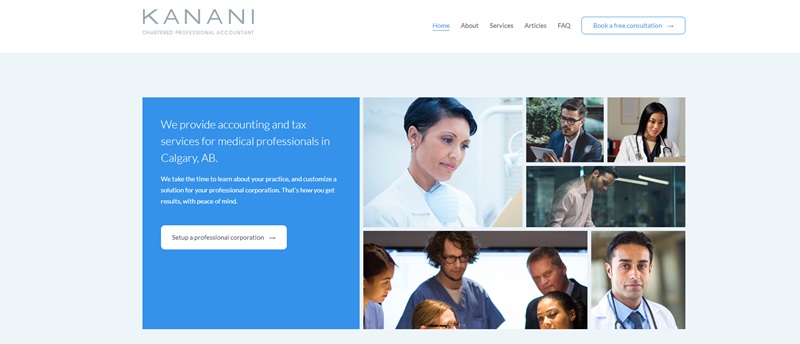
Kanani Chartered Professional Accountant offers accounting and tax services specifically for medical professionals in Calgary, Alberta.
The website demonstrates a focus on understanding each client’s individual needs and designing tailored accounting solutions.
User-friendly layout for easy navigation
- An uncomplicated menu bar guides users throughout the site, making it quick and easy to dive into the different types of services offered.
- The appointment scheduler feature accommodates those desiring a free consultation.
Professional, straightforward design
- The use of organized content about the firm’s operations resonates with the professional atmosphere of the website.
- Key information stands out nicely due to contrasting colors and typography choices, to highlight tax preparation and planning services.
A wealth of useful resources
- Importance is given to educating visitors, with resources like a learning center offering various articles for medical and dental professionals.
- It provides insights on the benefits of incorporating, strategies to minimize taxes, and how professional accounting and tax services add value.
Accounting Today
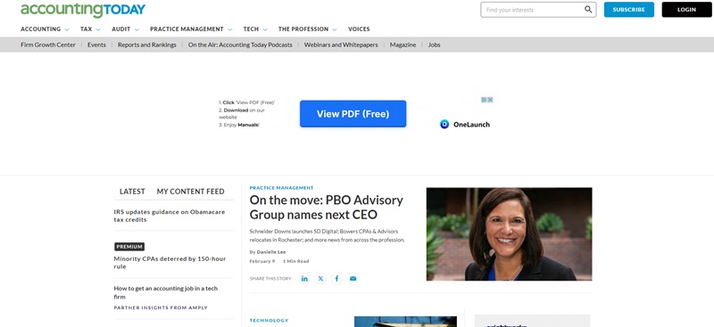
Accounting Today is a leading online resource for public accountants.
The website offers an array of professional news, articles, blogs, and tools related to the world of accounting.
Straightforward Navigation:
- With an easy-to-understand menu, it’s simple to find your way around. You can explore topics like tax, tech, practice management, and more.
- The website also includes easy access to webinars, videos, and podcasts.
Clean and Professional Design:
- The site carries a professional look that is suitable for its target audience.
- Innovative use of color and breaking news in a ticker-style format makes key information stand out.
Resourceful and Current Content:
- Fresh and topical articles from experts in the field regularly update readers about the latest happenings in the world of accounting.
- A special feature section covers upcoming events and useful resources for tax season.
In short, Accounting Today provides a wealth of up-to-date, relevant content in a user-friendly format.
Easy navigation, a clean design, and a wide array of resources make it a standout online hub for accounting professionals.
Mahil CPA
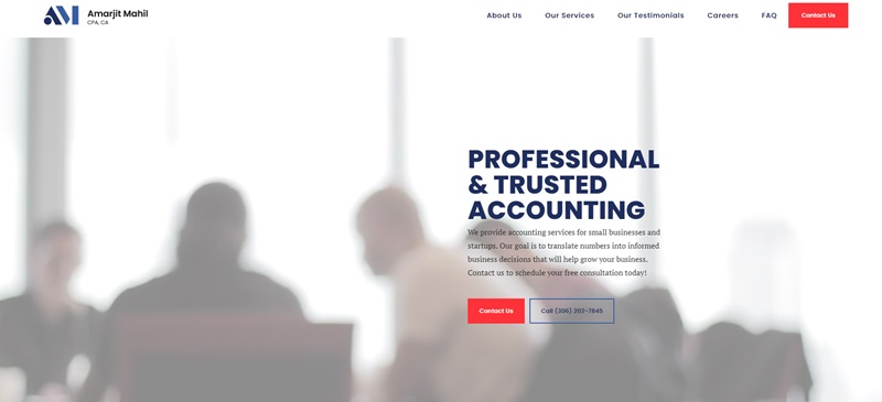
Mahil CPA, based in Saskatoon, SK, is a chartered professional accounting firm specializing in providing personalized accounting services to small businesses and startups.
The firm’s goal is to help clients grow their businesses by translating numbers into smart, informed business decisions.
Easy-to-use design and navigation
- A straightforward menu helps users explore the site smoothly, quickly finding essential information about the company and its services
- A Contact Us button is prominently displayed, making it simple for users to schedule their free consultation
Clean and professional look
- The website features a clear and organized layout, allowing users to focus on the important content
- A mix of professional images and crisp typography adds to the polished appearance
Informative and engaging content
- The site showcases the expertise of the firm’s professionals through detailed descriptions of their services and qualifications
- Testimonials from satisfied clients provide newcomers with valuable insights into the firm’s quality of service
- A ‘Frequently Asked Questions’ section helps answer users’ concerns, demonstrating the company’s commitment to transparency
In conclusion, Mahil CPA’s website offers a clean, professional design with easy navigation and an array of informative content.
With a user-friendly layout and engaging client testimonials, the site creates an inviting impression for those searching for reliable accounting services.
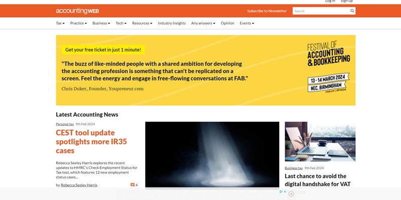
AccountingWEB UK
AccountingWEB UK is a website for folks who work with numbers for a living—like accountants and tax pros—and those who want to learn about the latest news in the field of accounting in the United Kingdom.
Handy and Clear Navigation:
- You’ll find a menu that takes you exactly where you need to go without any hassle
- They’ve made it super simple to move around the site with big buttons and links
Fresh and Up-to-Date Design:
- The site uses colors and pictures that catch your eye and keep you interested
- Important news stands out right away because of how they use bold headlines and bullet points
Packed Full of Cool Information:
- They tell you all about the new rules for taxes and an online tool to help figure out tax stuff
- The site has stories about the money that goes in and out of businesses and how to handle it the best way
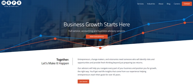
MRPR
MRPR is a premier Michigan CPA firm established in 1974, which offers full-service accounting and business advisory services.
The company thrives by partnering with entrepreneurs and businesses, guiding them through important decisions every step of the way.
Simple Navigation and User-friendly Experience
- The site has an organized menu that helps users easily find information about offered services and expertise
- A “Client Portal” button is also present, indicating the website’s readiness to assist customers with their accounting needs
Clean and Professional Design
- The layout is visually appealing and keeps visitors engaged with a mix of text, images, and multimedia content
- Use of different typography styles and colors emphasizes important information, providing a professional look at the same time
Informative and Engaging Content
- MRPR showcases its experience and commitment to clients by providing accessible expert advice, rapid response times, and big-picture thinking
- Testimonials from satisfied clients offer a glimpse into their positive experiences with the firm and serve as powerful evidence of the tailored, standout services MRPR delivers
In conclusion, MRPR’s website achieves a great balance between professional design and user-friendly experience.
Combining easy navigation with valuable and engaging content, the site leaves potential clients with a strong impression of the firm’s expertise and commitment to helping businesses succeed.
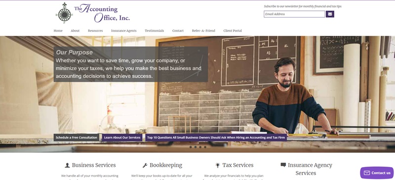
The Accounting Office Inc.
The Accounting Office Inc. is a website designed to help small business owners all over the nation.
Their team, based in Northville, Michigan, is packed with people who are good at handling money matters including bookkeeping, accounting, and tax needs.
Easy Peasy Navigation:
- The menu is a breeze to use, helping visitors get to where they need to go without trouble.
- There is a “Client Portal” button available for customers needing assistance with their accounts—it couldn’t get any easier!
Sharp and Professional Look:
- The website is neatly designed with clear text, cool pictures, and multimedia content to keep visitors interested.
- Certain information is highlighted with different fonts and colors, adding a professional touch.
Info-packed and Engaging Content:
- The Accounting Office Inc. showcases its talent and commitment to its clients through detailed info about its services.
- The website features testimonials from happy clients, letting new visitors know about the awesome services they offer.
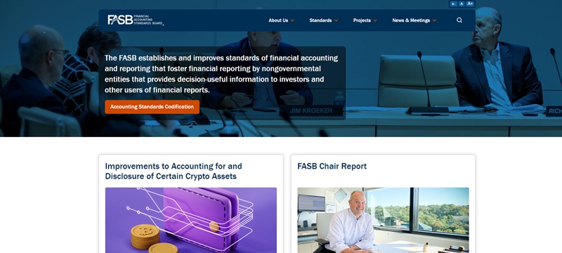
FASB
FASB or the Financial Accounting Standards Board is a super important organization that makes rules on how companies should make their money reports.
It’s like the rule-maker for all things money-report or finance-related!
Snappy and Clear Navigation:
- The website has a menu that helps you go where you want to, quick and easy. You will have no problem exploring their website, whether you are looking for news, meetings, projects, or their latest updates.
- There’s also a URL button for folks needing updates about what FASB is up to and their progress on projects.
Professional and Neat Appearance:
- The website looks sharp, with clear text, multimedia content, and fancy features that keep visitors interested.
- They really know how to highlight important stuff by using different fonts and colors—trust me, you won’t miss a thing!
Informative and Cool Content:
- Are you interested in the latest accounting rules? Or do you want to know more about FASB’s projects? If that’s a ‘yes’, then this is the perfect place for you.
- They do a great job in sharing what they are up to, so you will always be up-to-date.
IRS
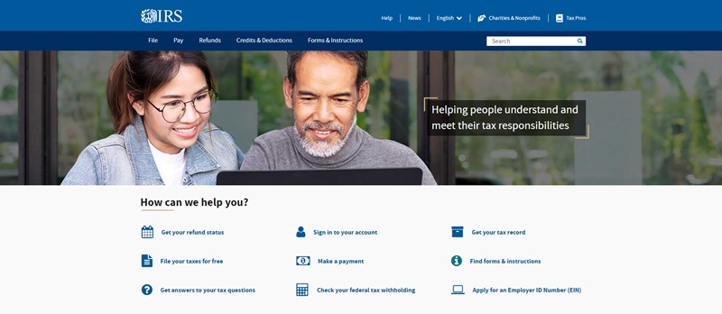
IRS, short for Internal Revenue Service, is all about taxes in the United States.
This organization makes sure everyone pays their fair share of taxes.
Their website has loads of information to help folks understand their taxes and how to pay them.
Quick and Clear Navigation:
- The site has a menu that helps you find what you need without any hassle. Whether it’s viewing your tax records, uploading documents, or checking your refund status – it’s all there.
- A very helpful feature is the “Taxpayer Assistance Center Locator”, which helps you find your nearest IRS office.
Clean and Organized Look:
- The website is tidy and professional with clear text that guides visitors through what can be a tricky topic.
- They smartly highlight sections like “Your Online Account” or “Where’s My Refund?” so you can quickly find these important tools.
Informative and User-friendly Content:
- This site is a goldmine of tax information! From how to estimate your tax withholdings to identity theft protection, it’s got you covered.
- The site even offers a free tool for preparing and filing federal income taxes online.
Wrapping it up, the IRS website shines in its ability to make complicated tax stuff simple to understand. With an easy-to-use design, clear directions, and tons of helpful information, it’s a go-to place for managing your taxes effectively.
FAQ On Accountant Websites
1. What’s the number one thing to consider when designing my accountant website?
Think about what your clients need. It’s like building a house. If the people living there love to cook, you’d design a nice kitchen, right? Same deal with a website – start with services like online booking for appointments, easy access to tax forms, and tips on managing finances.
2. Can you give me an example of an effective accountant website layout?
Absolutely! Imagine a homepage with a quick summary of your services, a friendly photo of you or your team, and a super-easy way for clients to contact you. Take a look at websites like Bench or TurboTax for some neat layouts that are all about clear info and user-friendliness.
3. How important are testimonials on an accountant’s website?
Real talk – they’re gold! Testimonials are like having a crowd of happy clients telling potential customers that you’re the best. Put them front and center so visitors see proof that you’re trustworthy and awesome at what you do.
4. What content should I include on my accountant website?
Don’t skip the essentials! Make sure you’ve got a clear list of your services, about you or your firm’s background, client testimonials, a blog with helpful tips, and how to reach you. It’s like making sure your toolbox has all the right tools.
5. How often should I update the website content?
Keep it fresh! Updating your site regularly with blog posts or tax tips keeps people coming back for more. Think of it like a garden – you wouldn’t just plant it and forget it, right? You’re aiming to water and care for it, so it keeps growing.
6. Should my accountant’s website be mobile-friendly?
For sure! Everyone’s on their phones these days. If your website’s hard to read on a phone, that’s like having a store with a locked front door. You want it to be easy for folks to pop in, no matter what device they’re using.
7. How do I make my accountant’s website stand out?
Here’s the secret ingredient – personality. Add bits about what makes your firm unique. Maybe you’re a whiz at finding tax savings or you make finance fun. It’s like adding a secret spice to your favorite recipe. It just makes it better!
8. Do I need a blog on my accountant’s website?
Yes, a blog can be a superpower. It’s a chance to share your knowledge and help people with their questions about finances. Think of it like helping a buddy understand their taxes over coffee. It’s friendly, and helpful, and keeps them coming back to you for advice.





Leave a Reply